


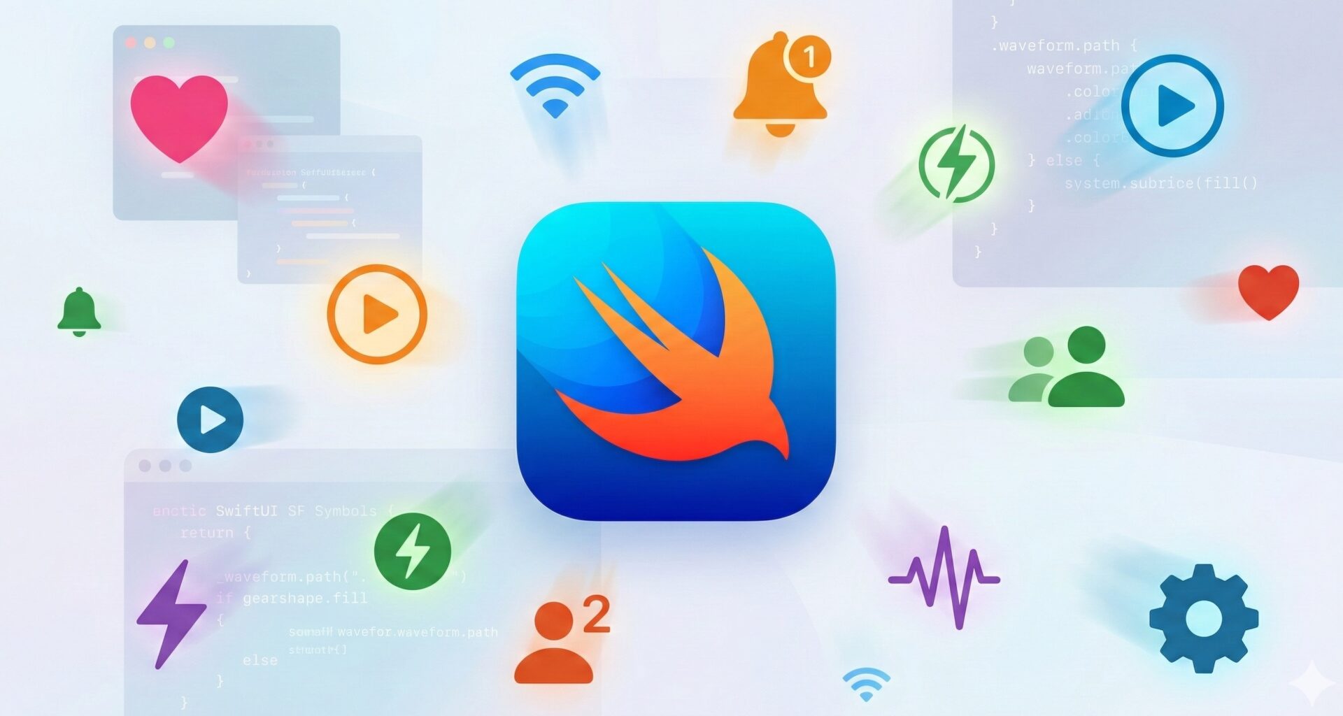
For years, icons in our iOS applications were second-class citizens: static images (PNGs or PDF vectors) that lived and died without moving. If you wanted to animate an icon, you had to open After Effects, export a Lottie file, or struggle with CAKeyframeAnimation in UIKit.
Then came SF Symbols. First, it gave us scalable vectors. Then, color layers. And with the arrival of iOS 17 and watchOS 10, Apple unleashed the true power of its iconography: Symbol Effects.
We are no longer talking about simply rotating an image 360 degrees. We are talking about semantic animations, embedded into the font itself, where the icon’s layers move, bounce, blink, and transform with an organic physics that would be nearly impossible to replicate manually.
In this tutorial, we will dissect the symbolEffect API, explore the different animation behaviors, and learn how to create interfaces that feel alive animating SF Symbols in SwiftUI.
Understanding the Magic: What Makes an SF Symbol Move?
Before writing code, we must understand the underlying technology. SF Symbols are not simple SVGs. They are highly sophisticated variable fonts.
Each symbol contains metadata about its layers. Apple has annotated thousands of symbols to define which parts are “foreground,” which are “background,” and how they should move. For example, in the wifi symbol, each arc is a distinct layer. In bell.badge, the bell and the badge are separate entities.
When you apply an animation, the system isn’t warping pixels; it is interpolating the vector paths of specific layers based on those annotations. This is what allows a “Variable Color” animation to know exactly in what order to light up the WiFi bars.
1. The Universal Modifier: .symbolEffect
In iOS 17, everything revolves around a new view modifier: .symbolEffect.
Forget about complex withAnimation or @State for simple rotations. The system now handles the animation lifecycle.
The Basic Syntax
Image(systemName: "wifi")
    .font(.system(size: 60))
    .symbolEffect(.variableColor)
With just that line, the WiFi icon will start illuminating its bars sequentially and indefinitely. No booleans, no onAppear.
The 4 Main Behaviors
Apple groups animations into four semantic categories. Choosing the right one is vital for UX:
- Indefinite: Happens forever. Ideal for loading states or background activity.
- Discrete: Happens once and stops. Ideal for button feedback.
- Transition: Happens when the symbol appears or disappears.
- Content Transition: Happens when one symbol changes to another (e.g., Play → Pause).
2. Activity Animations (Indefinite)
These are perfect for communicating that the app is “thinking” or processing, without resorting to the boring ProgressView.
Variable Color: The King of Feedback
The .variableColor effect is visually the most impressive. It uses layer opacity to create movement.
struct LoadingView: View {
    @State private var isActive = true

    var body: some View {
        VStack {
            // Default style (cumulative)
            Image(systemName: "wifi")
                .symbolEffect(.variableColor.iterative, isActive: isActive)

            // Reversing style and faster
            Image(systemName: "arrow.triangle.2.circlepath")
                .symbolEffect(
                    .variableColor.iterative.reversing,
                    options: .speed(2.0),
                    isActive: isActive
                )
        }
    }
}
Variable Color Options:
.iterative: Lights up one layer at a time (like a scanner)..cumulative: Fills up the layers (like a loading bar)..reversing: Goes back and forth (ping-pong).
Pulse: The “Breathing” of UI
Ideal for voice recording, “live” states, or important alerts. It modifies the overall opacity smoothly.
Image(systemName: "recordingtape")
    .symbolEffect(.pulse)
    .foregroundStyle(.red)
3. Discrete Animations (User Feedback)
Here is where the UI becomes tactile. We want the icon to react when the user touches it. For this, we use the valueparameter. The effect triggers every time the value changes.
Bounce
The .bounce effect applies elastic physics. It is subtle and playful.
struct LikeButton: View {
    @State private var liked = false
    @State private var bounceCount = 0

    var body: some View {
        Button {
            liked.toggle()
            bounceCount += 1 // Trigger
        } label: {
            Image(systemName: liked ? "heart.fill" : "heart")
                .font(.largeTitle)
                .foregroundStyle(liked ? .red : .gray)
                // Runs every time bounceCount changes
                .symbolEffect(.bounce, value: bounceCount)
        }
    }
}
Wiggle
Perfect for indicating errors (like an incorrect password) or notifications (a ringing bell).
Image(systemName: "bell.fill")
    .symbolEffect(.wiggle, value: notificationCount)
There are variants like .wiggle.left, .wiggle.right, or .wiggle.clockwise if you need a specific direction.
4. The Magic of .contentTransition (Morphing)
Here is where SF Symbols truly shines over any other iconography. When you switch from one icon to another, SwiftUI can intelligently interpolate the shapes using .replace.
Previously, an icon change was a hard cut or a simple fade. Now, common parts of the icons remain, and new parts are born from the old ones.
The “Replace” Effect
struct PlayerButton: View {
    @State private var isPlaying = false

    var body: some View {
        Button {
            isPlaying.toggle()
        } label: {
            Image(systemName: isPlaying ? "pause.circle.fill" : "play.circle.fill")
                .font(.system(size: 80))
                // This is the key:
                .contentTransition(.symbolEffect(.replace))
        }
    }
}
What happens under the hood?
- If you use
.replace.downUp, the old icon falls and the new one rises. - If you use
.replace.magic(the default in many cases), the system tries to connect similar strokes. The circle of the “Play” button doesn’t disappear; it remains, and only the triangle transforms into the two pause bars. It is stunning visual continuity.
5. Granular Control: Options and Repeats
The .symbolEffect modifier accepts an options parameter that allows us to fine-tune the physics.
- Speed:
.speed(3.0)makes the effect three times faster. - Repeat:
.repeat(3)runs the animation three times and stops..repeatingmakes it infinite.
Image(systemName: "antenna.radiowaves.left.and.right")
    .symbolEffect(
        .variableColor.iterative,
        options: .repeating.speed(0.5)
    )
6. Advanced Level: PhaseAnimator and Keyframes
Sometimes, predefined effects (Bounce, Pulse, Wiggle) are not enough. Maybe you want an icon to rotate 360 degrees, then scale up, and then return to its place.
For this, SwiftUI offers PhaseAnimator. This is not exclusive to SF Symbols, but it works wonderfully with them.
Creating a Custom Animation Sequence
Imagine an “Alarm” icon that we want to rotate, scale, and change color in a sequence.
enum AlarmPhase: CaseIterable {
    case initial
    case rotateLeft
    case rotateRight
    case zoom

    var rotation: Double {
        switch self {
        case .rotateLeft: return -15
        case .rotateRight: return 15
        default: return 0
        }
    }

    var scale: Double {
        switch self {
        case .zoom: return 1.5
        default: return 1.0
        }
    }
}

struct AlarmView: View {
    @State private var trigger = false

    var body: some View {
        VStack {
            Image(systemName: "alarm.fill")
                .font(.largeTitle)
                .phaseAnimator(trigger ? AlarmPhase.allCases : [.initial], trigger: trigger) { content, phase in
                    content
                        .rotationEffect(.degrees(phase.rotation))
                        .scaleEffect(phase.scale)
                        .foregroundStyle(phase == .zoom ? .red : .primary)
                } animation: { phase in
                    switch phase {
                    case .zoom: return .spring(bounce: 0.5) // Strong bounce at the end
                    default: return .linear(duration: 0.1)  // Fast vibration
                    }
                }

            Button("Wake Up") { trigger.toggle() }
        }
    }
}
With PhaseAnimator, we define discrete states, and SwiftUI interpolates between them. It is much cleaner than nesting withAnimation with completion handlers.
7. Best Practices and Performance
Animating symbols is cheap in terms of CPU compared to animating rasterized images, but it is not free.
Accessibility (A11y)
Not all users tolerate excessive motion well. Some suffer from vestibular disorders. You must always respect the user’s “Reduce Motion” setting.
Fortunately, Apple does this for you. Standard effects like .bounce or .variableColor automatically adjust or disable themselves if the user has Reduce Motion enabled in iOS settings.
However, if you use PhaseAnimator or custom animations, you must verify it manually:
@Environment(\.accessibilityReduceMotion) var reduceMotion

// In your view
.phaseAnimator(...) { content, phase in
    // If reduceMotion is true, override excessive rotation or scale
    content.scaleEffect(reduceMotion ? 1.0 : phase.scale)
}
Battery Usage
.indefinite effects (like an infinite loading spinner) consume battery as the screen rendering is constantly updating (60 or 120Hz).
- Golden Rule: Use
isActiveto stop the animation when the view is not visible or the action has finished. Do not leave a.variableColorrunning in a hidden view under a navigation tab.
8. Compatibility and Support
It is important to note that:
- iOS 16 and earlier: These
.symbolEffectmodifiers do not exist. If your app supports iOS 15/16, you will need to useif #available(iOS 17, *)blocks or keep your old animations as a fallback. - Custom Symbols: If you design your own icons in the SF Symbols 5+ app, you must ensure you annotate the layers correctly if you want
.variableColorto work. Otherwise, the system will treat the entire icon as a single layer.
Conclusion
The introduction of Symbol Effects in SwiftUI marks the end of static icons. We now have a rich and expressive visual language that requires almost zero implementation effort.
The difference between a “good” app and a “premium” app often lies in these micro-details: the bell that shakes when receiving a notification, the heart that bounces elastically when liked, or the pause icon that magically morphs into play.
As SwiftUI developers, we hold the most advanced iconography library in the world in our hands. Use it not just to decorate, but to communicate.
If you have any questions about this article, please contact me and I will be happy to help you 🙂. You can contact me on my X profile or on my Instagram profile.