


As an iOS Developer, one of the most common tasks you will face is creating interactive and highly customizable user interfaces. Allowing the user to choose their own colors for themes, tags, or drawings is a premium feature that adds a lot of value to any app.
In this extensive tutorial, we will delve into exactly what a color picker in SwiftUI is, how to use the native solution Apple provides, and, most importantly, how to create our own custom color picker from scratch using Swift programming. Additionally, we will make sure our code is compatible with the entire ecosystem: iOS, macOS, and the ever-challenging watchOS, all from a single project in Xcode.
If you want to master SwiftUI and take your Swift skills to the next level, join me in this step-by-step guide.
1. What is a Color Picker in SwiftUI?
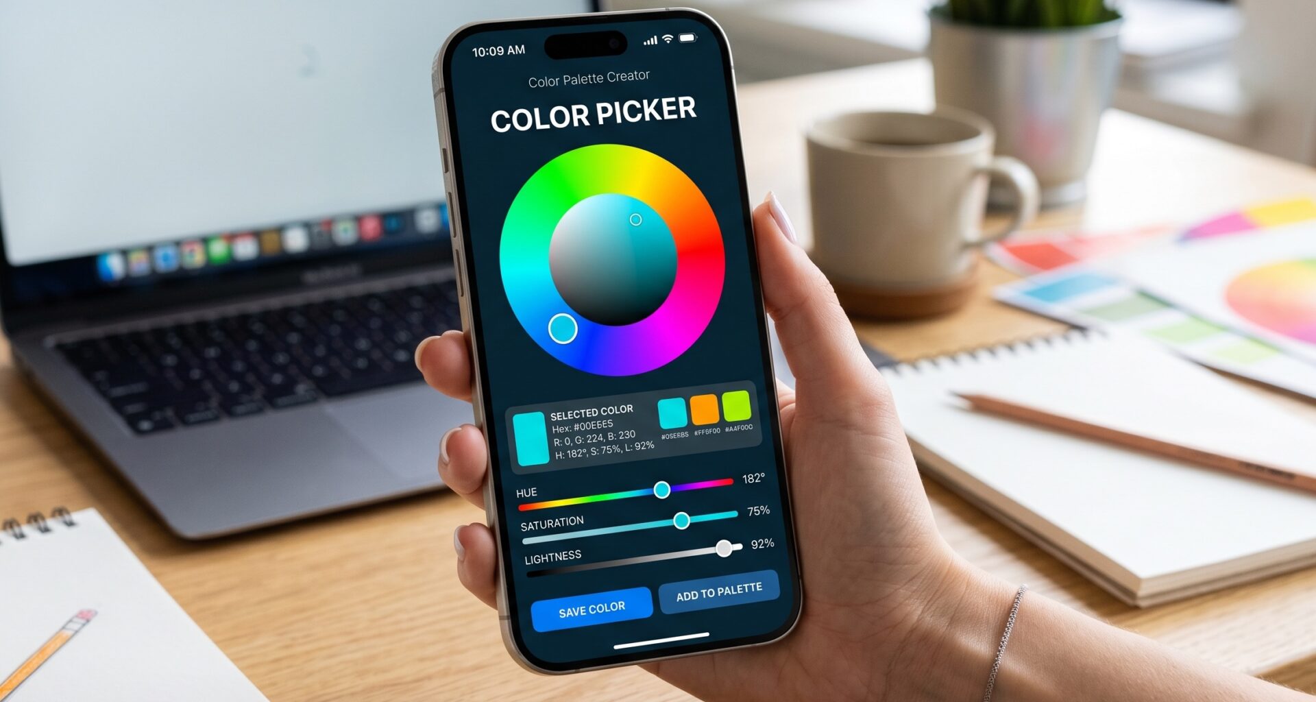
A color picker in SwiftUI is a user interface control that allows users to select a color from a palette, a spectrum, or by entering hexadecimal or RGB values.
Apple introduced the native ColorPicker view in iOS 14 and macOS 11. This view invokes the system’s color picker, providing a familiar and powerful user experience. With a simple line of code in Xcode, developers can integrate a tool that handles opacity, full-spectrum selection, and saving favorite colors.
However, there is a critical detail every iOS Developer should know: the native ColorPicker is not available on watchOS or tvOS. Therefore, if we are building a truly universal app, we need to understand how to create our own interface using the fundamentals of Swift programming.
2. Setting up the Environment in Xcode
Before writing our code, we need to set up our workspace.
- Open Xcode and select Create a new Xcode project.
- In the Multiplatform tab, choose the App template.
- Name your project (for example,
UniversalColorPicker). - Make sure the selected interface is SwiftUI and the language is Swift.
By creating a multiplatform project, Xcode provides us with a shared folder structure. We will write our code in a way that automatically adapts to the device it is running on.
3. Implementation of the Native ColorPicker (iOS and macOS)
Let’s start by exploring the native solution. It is fast, efficient, and perfect if your app is only targeting iOS or Mac devices.
Open the ContentView.swift file and modify the code to include the ColorPicker view. In SwiftUI, controls that modify a value need a state (@State) to store and react to that change.
import SwiftUI

struct StandardPickerView: View {
    // 1. We define the state to store the selected color
    @State private var selectedColor: Color = .blue

    var body: some View {
        VStack(spacing: 30) {
            // A rectangle to preview the color
            RoundedRectangle(cornerRadius: 15)
                .fill(selectedColor)
                .frame(width: 200, height: 150)
                .shadow(radius: 10)

            // 2. The native Color Picker
            ColorPicker("Select your favorite color", selection: $selectedColor)
                .padding()
                .background(Color.gray.opacity(0.1))
                .cornerRadius(10)
        }
        .padding()
    }
}
Understanding the Swift code:
@State: This property wraps our color. Every time the user chooses a new color, SwiftUI automatically redraws the view (in this case, updating the color of theRoundedRectangle).ColorPicker: Takes a title (which can be hidden using.labelsHidden()) and aBinding(indicated by the$symbol) to our state variable.
Disabling opacity (Alpha Channel)
Sometimes, we don’t want the user to choose a semi-transparent color, as it could ruin the contrast of our UI. Swift programming allows us to easily disable this by adding the supportsOpacity parameter:
ColorPicker("Color without transparency",
            selection: $selectedColor,
            supportsOpacity: false)
4. The Challenge: Support for watchOS
If you try to compile the above code for an Apple Watch target in Xcode, you will get a compilation error. As mentioned, the native ColorPicker API does not exist on Apple’s smartwatch.
For a senior iOS Developer, this is not a blocker, but an opportunity. We are going to create a fully custom color picker in SwiftUI that works across all platforms. We will design a grid of predefined colors from which the user can select one.
5. Creating a Custom Color Picker (Multiplatform)
Our goal is to create a reusable component. We will use a LazyVGrid for iOS and macOS (which have larger screens) and an adaptive system that also looks great on the small screen of an Apple Watch.
Step 5.1: Defining the Color Palette
First, let’s create an array with the colors we want to offer our users.
import SwiftUI

struct ColorPalette {
    static let colors: [Color] = [
        .red, .orange, .yellow, .green, .mint,
        .teal, .cyan, .blue, .indigo, .purple,
        .pink, .brown, .gray, .black
    ]
}
Step 5.2: Building the Custom Picker View
Create a new Swift file named CustomColorPicker.swift. Here we will define our component.
import SwiftUI

struct CustomColorPicker: View {
    // Binding so the parent view knows the selected color
    @Binding var selection: Color

    // Adaptive grid configuration
    let columns = [
        GridItem(.adaptive(minimum: 44, maximum: 60))
    ]

    var body: some View {
        ScrollView {
            LazyVGrid(columns: columns, spacing: 15) {
                ForEach(ColorPalette.colors, id: \.self) { color in
                    Circle()
                        .fill(color)
                        .frame(width: 44, height: 44)
                        // We add a dynamic border if the color is selected
                        .overlay(
                            Circle()
                                .stroke(Color.primary, lineWidth: selection == color ? 3 : 0)
                        )
                        // Scale effect when selected
                        .scaleEffect(selection == color ? 1.1 : 1.0)
                        .animation(.spring(), value: selection)
                        .onTapGesture {
                            // We update the state when the user taps a color
                            selection = color
                        }
                        // Accessibility for VoiceOver
                        .accessibilityLabel("Color \(color.description)")
                        .accessibilityAddTraits(selection == color ? .isSelected : .isButton)
                }
            }
            .padding()
        }
    }
}
This code is the core of a good color picker in SwiftUI. By using LazyVGrid with GridItem(.adaptive(...)), we instruct SwiftUI to fit as many color circles as possible in a row before moving to the next one. This is pure Swift magic: the same code will adapt to the giant screen of a Mac and the vertical screen of an iPhone.
Step 5.3: Conditional Integration in ContentView
Now that we have both options (native and custom), let’s integrate them smartly. If we are on iOS or macOS, we will use the native one (or the custom one if the user prefers). If we are on watchOS, we will force the use of our custom picker.
Swift programming offers us compiler directives (#if os(...)) to handle these platform differences directly in Xcode.
Go back to your ContentView.swift:
import SwiftUI

struct ContentView: View {
    @State private var userColor: Color = .mint
    @State private var showCustomPicker: Bool = false

    var body: some View {
        NavigationView {
            VStack(spacing: 20) {

                // UI Preview
                ZStack {
                    RoundedRectangle(cornerRadius: 20)
                        .fill(userColor.gradient) // We use the new gradient system from Swift 4+
                        .frame(height: 200)
                        .shadow(color: userColor.opacity(0.5), radius: 10, x: 0, y: 5)

                    Text("Hello, SwiftUI!")
                        .font(.largeTitle)
                        .fontWeight(.bold)
                        .foregroundColor(.white)
                }
                .padding()

                #if os(watchOS)
                // On watchOS, we directly show our custom picker
                CustomColorPicker(selection: $userColor)
                #else
                // On iOS and macOS, we offer the native picker
                Form {
                    Section(header: Text("Theme Settings")) {
                        ColorPicker("Select a system color", selection: $userColor)

                        Toggle("Use custom palette", isOn: $showCustomPicker)
                    }
                }
                .cornerRadius(15)
                .padding(.horizontal)
                #endif

                Spacer()
            }
            .navigationTitle("Themes")
            // We present the custom palette as a modal on iOS/macOS
            .sheet(isPresented: $showCustomPicker) {
                NavigationView {
                    CustomColorPicker(selection: $userColor)
                        .navigationTitle("Exclusive Palette")
                        #if os(iOS)
                        .navigationBarTitleDisplayMode(.inline)
                        .toolbar {
                            ToolbarItem(placement: .navigationBarTrailing) {
                                Button("Close") {
                                    showCustomPicker = false
                                }
                            }
                        }
                        #endif
                }
            }
        }
    }
}
6. Best Practices and Accessibility in your Color Picker
As an iOS Developer, writing code that works is only half the job. The other half is ensuring the code is maintainable, efficient, and accessible to all users.
Accessibility (VoiceOver)
In the code of our CustomColorPicker, we added accessibility modifiers:
.accessibilityLabel("Color \(color.description)")
.accessibilityAddTraits(selection == color ? .isSelected : .isButton)
This is crucial. If a blind user uses VoiceOver, the system will read the color name instead of just saying “button”. In addition, it will inform them if that color is currently selected. In Swift programming, accessibility is a first-class citizen, and we must never forget it.
Performance
Using LazyVGrid instead of a combination of regular VStack and HStack ensures that, if in the future you decide to add 100 colors to your palette, the app will not consume all the device’s memory. “Lazy” views in SwiftUI only render the elements that are currently visible on the screen, drastically improving performance, a vital detail especially for watchOS.
7. Advanced Trick: Extracting Hexadecimals in Swift
Often, when working with a color picker in SwiftUI, the design team or a backend API will ask you to send the selected color in hexadecimal format (e.g., #FF5733). The Color type in SwiftUI does not have a direct way to extract this by default across all versions, but we can solve this by using the extension capabilities of Swift programming and dropping down to the UIColor (on iOS/watchOS) or NSColor (on macOS) level.
Add this extension to your Xcode project to convert your selection to Hex:
#if canImport(UIKit)
import UIKit
typealias PlatformColor = UIColor
#elseif canImport(AppKit)
import AppKit
typealias PlatformColor = NSColor
#endif

extension Color {
    func toHex() -> String? {
        let platformColor = PlatformColor(self)
        var red: CGFloat = 0
        var green: CGFloat = 0
        var blue: CGFloat = 0
        var alpha: CGFloat = 0

        platformColor.getRed(&red, green: &green, blue: &blue, alpha: &alpha)

        let rgb: Int = (Int)(red*255)<<16 | (Int)(green*255)<<8 | (Int)(blue*255)<<0

        return String(format: "#%06x", rgb)
    }
}
Now, you could add a text below your preview showing the exact code:Text("Hex Code: \(userColor.toHex() ?? "Unknown")")
Conclusion
Integrating a color picker in SwiftUI is an excellent way to add personalization to your app. As we have seen, the native ColorPicker provided by Apple is extremely powerful for iOS and macOS. However, to become a complete iOS Developer, knowing how to build your own custom controls allows you to overcome the limitations of platforms like watchOS.
Through Swift programming, we have created an adaptive, fluid, and accessible interface. You have learned to handle states (@State and @Binding), structure grid views, and use compiler directives in Xcode to compile different code depending on the operating system.