

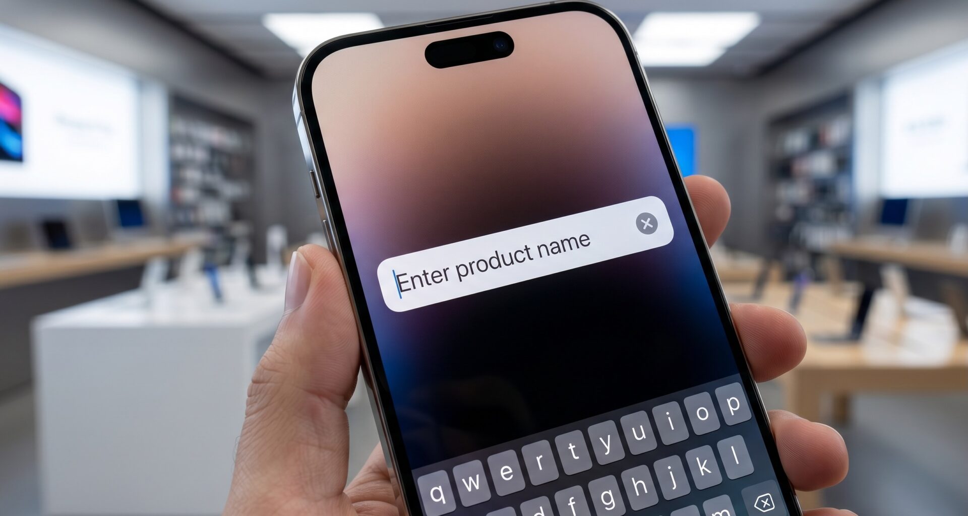

The transition from UIKit to SwiftUI has revolutionized the way we build user interfaces in the Apple ecosystem. For any modern iOS Developer, mastering this declarative framework is essential. However, in this transition, some components we took for granted in UIKit require a different approach. One of the most classic examples is implementing a clear button in a TextField in SwiftUI.
In UIKit, achieving this was as simple as accessing the clearButtonMode property of a UITextField. In SwiftUI, Apple invites us to think more compositionally. Although the framework does not provide a direct one-step native modifier for this across all its platforms, it offers incredibly powerful tools to build our own clean, reactive, and reusable solution.
In this extensive and detailed tutorial, we will explore step-by-step how to create and integrate a clear button into your text fields using Swift programming. We will cover UI creation, state management, refactoring via ViewModifier, and how to ensure our solution works flawlessly on iOS, macOS, and watchOS using Xcode.
1. The Current Ecosystem of Swift Programming
Before diving into the code, it is vital to understand why SwiftUI tackles UI problems the way it does. Swift programming leans heavily towards declarative and reactive paradigms. Instead of telling the system how to make changes (imperative), we tell the system what the final state of the UI should be based on the current data.
As an iOS Developer, your job in Xcode is no longer dragging elements onto a Storyboard and connecting @IBOutlet or @IBAction. You now build lightweight views that react to state changes (like @State or @Binding).
This philosophy is what we will apply to build our clear button in a TextField in SwiftUI. Instead of looking for a hidden property, we will compose basic views (TextField, Button, Image) to create a fluid and consistent user experience.
2. Understanding the TextField in SwiftUI
A TextField in SwiftUI is a control that allows the user to input a single line of text. Its basic operation requires a state variable to store the text the user is typing.
Let’s look at the most fundamental example in Swift:
import SwiftUI

struct BasicTextFieldView: View {
    @State private var userInput: String = ""

    var body: some View {
        TextField("Type your name...", text: $userInput)
            .textFieldStyle(.roundedBorder)
            .padding()
    }
}
In this code:
@Stateindicates thatuserInputis the source of truth for this view.- The
$symbol in$userInputcreates a Binding (two-way connection). When the user types, the variable updates; if the variable changes from the code, theTextFieldreflects that change immediately.
This bidirectional nature is the key to implementing our clear button. If we can get a button to change userInput to an empty string "", the TextField will automatically clear on the screen.
3. The Basic Solution: Using an HStack
The most straightforward approach to add a clear button in a TextField in SwiftUI is to group the text field and a button inside an HStack (Horizontal Stack) or use an overlay.
Let’s build the first iteration directly in our main view:
import SwiftUI

struct BasicClearableTextField: View {
    @State private var searchQuery: String = ""

    var body: some View {
        HStack {
            TextField("Search in the app...", text: $searchQuery)
                .padding(.vertical, 10)
                .padding(.horizontal, 15)

            // Clear Button
            if !searchQuery.isEmpty {
                Button(action: {
                    // Action to clear the text
                    self.searchQuery = ""
                }) {
                    Image(systemName: "xmark.circle.fill")
                        .foregroundColor(.gray)
                        .padding(.trailing, 10)
                }
            }
        }
        .background(Color(UIColor.secondarySystemBackground))
        .cornerRadius(10)
        .padding()
    }
}
Code Analysis:
- Conditional
if !searchQuery.isEmpty: One of the great advantages of SwiftUI is its ability to render views conditionally in a very clean way. The “X” button will only appear if there is text in the field. - SF Symbols: We use
Image(systemName: "xmark.circle.fill"). Apple provides thousands of built-in vector icons that behave like text and scale perfectly. - Button Action: We simply assign
""to our@State. Thanks to the reactivity of Swift, the UI updates instantly.
While this approach works, if you are an iOS Developer working on a real app with multiple screens, you won’t want to copy and paste this HStack block every time you need a text field with a clear button. We need to refactor.
4. Level 1 Refactoring: Creating a Reusable Component
The golden rule in SwiftUI development is modularity. Let’s extract this logic into an independent visual component that we can instantiate anywhere in our Xcode project.
import SwiftUI

/// A custom TextField component that includes an automatic clear button.
struct ClearableTextFieldComponent: View {

    // Configuration properties
    var placeholder: String
    @Binding var text: String

    var body: some View {
        HStack {
            TextField(placeholder, text: $text)
                // Disable autocapitalization by default for searches
                .textInputAutocapitalization(.never)
                .disableAutocorrection(true)

            if !text.isEmpty {
                Button(action: {
                    // Add a subtle animation when clearing
                    withAnimation {
                        self.text = ""
                    }
                }) {
                    Image(systemName: "multiply.circle.fill")
                        .foregroundColor(Color.secondary)
                }
                // Improve the hit target for better UX
                .buttonStyle(.plain)
            }
        }
        .padding(8)
        .background(
            RoundedRectangle(cornerRadius: 8)
                .fill(Color(UIColor.systemGray6))
        )
        .overlay(
            RoundedRectangle(cornerRadius: 8)
                .stroke(Color.gray.opacity(0.3), lineWidth: 1)
        )
    }
}
Why do we use @Binding here?
Unlike @State (which manages internal local data of the view), @Binding allows this component to modify a variable that lives in the “parent” view that called it.
How to use it in your app:
struct ContentView: View {
    @State private var email: String = ""

    var body: some View {
        VStack(spacing: 20) {
            Text("Log In")
                .font(.largeTitle)

            // Using our reusable component
            ClearableTextFieldComponent(placeholder: "Email address", text: $email)
                .padding(.horizontal)

            Spacer()
        }
        .padding(.top)
    }
}
This solution is robust, but it alters the view hierarchy. We are wrapping the TextField inside other layout structures. What if we want to apply this as a simple native SwiftUI modifier?
5. The Definitive Solution (Pro Mode): Using ViewModifier
For a senior iOS Developer, the most “idiomatic” or natural way to implement a clear button in a TextField in SwiftUI is through a ViewModifier.
View modifiers allow us to attach additional behaviors and interfaces to existing views, maintaining the fluent syntax (dot chaining) characteristic of SwiftUI.
Step 5.1: Create the ViewModifier
import SwiftUI

struct ClearButtonModifier: ViewModifier {
    @Binding var text: String

    func body(content: Content) -> some View {
        ZStack(alignment: .trailing) {
            content

            if !text.isEmpty {
                Button(action: {
                    self.text = ""
                }) {
                    Image(systemName: "xmark.circle.fill")
                        .foregroundColor(Color(UIColor.opaqueSeparator))
                }
                .padding(.trailing, 8) // Adjust so it's not glued to the edge
                // Prevent the button from taking focus unexpectedly on macOS/tvOS
                .buttonStyle(PlainButtonStyle())
            }
        }
    }
}
Step 5.2: Extend the view (View Extension)
For our modifier to be used exactly like Apple’s native modifiers in Xcode, we create an extension on View.
extension View {
    /// Adds a clear button to any view that contains bound text (Binding).
    func clearButton(text: Binding<String>) -> some View {
        self.modifier(ClearButtonModifier(text: text))
    }
}
Step 5.3: The Final Result in Use
Now look how incredibly clean our interface code is:
struct AdvancedSearchView: View {
    @State private var searchText: String = ""

    var body: some View {
        VStack {
            TextField("Search your favorite artist...", text: $searchText)
                .padding()
                // Here we use our custom modifier
                .clearButton(text: $searchText)
                .background(Color.gray.opacity(0.1))
                .cornerRadius(10)
                .padding()
        }
    }
}
This is the preferred way in modern Swift programming. It keeps the TextField declaration as the main view and simply “injects” the clear button functionality via an overlay (ZStack inside the modifier).
6. Cross-Platform Considerations: iOS, macOS, and watchOS
As a developer in the Apple ecosystem, you rarely write code for just one device. SwiftUI promises “Learn once, apply anywhere.” Let’s see how our solution behaves across different platforms using Xcode.
On iOS and iPadOS
Our ViewModifier solution works perfectly here. The only design consideration is ensuring the hit target of the clear button is at least 44×44 points, according to Apple’s Human Interface Guidelines. We could add a .frame(width: 44, height: 44) around the Image inside our button to guarantee this.
On macOS
On the Mac, users interact with a mouse or trackpad. The native macOS TextField has a different visual style. If we use our ClearButtonModifier, we must be careful with the .textFieldStyle().
#if os(macOS)
TextField("Search files...", text: $searchQuery)
    .textFieldStyle(.roundedBorder)
    // On macOS, it's sometimes useful to add an onHover effect
    .clearButton(text: $searchQuery)
#endif
On macOS, the PlainButtonStyle() we included in step 5.1 is crucial, as standard buttons on macOS have heavy borders and backgrounds by default.
On watchOS
The Apple Watch has extremely limited screen space and unique input methods (Scribble, Dictation, QWERTY keyboard on Ultra/Series 7+ models). Adding an inline button inside a TextField on watchOS can consume precious horizontal space. In many cases, it is preferable on watchOS to omit the integrated clear button in favor of letting the user use the physical “Delete” button on the native watch keyboard.
If you decide to include it, you must substantially reduce the paddings in your modifier using conditional compilation:
#if os(watchOS)
    .padding(.trailing, 2)
#else
    .padding(.trailing, 8)
#endif
7. Best Practices: Accessibility and Animations
A top-tier iOS Developer not only makes the app look good but ensures it is usable by everyone.
Accessibility (VoiceOver)
If we don’t tell VoiceOver what that “X” icon does, a visually impaired user will only hear “Button.” We must add context.
Let’s go back to our button inside the ViewModifier and improve the code:
Button(action: {
    self.text = ""
}) {
    Image(systemName: "xmark.circle.fill")
        .foregroundColor(Color.secondary)
}
.accessibilityLabel("Clear text")
.accessibilityHint("Clears all the content from the search text field.")
With this, VoiceOver will read: “Clear text, button. Clears all the content from the search text field.” This exponentially improves the user experience.
Fluid Animations
When the text goes from being empty to having a character (or vice versa), the button appears or disappears. If this change is abrupt, the interface will feel unrefined.
Adding a transition solves this in SwiftUI:
if !text.isEmpty {
    Button(action: {
        withAnimation(.easeInOut(duration: 0.2)) {
            self.text = ""
        }
    }) {
        Image(systemName: "xmark.circle.fill")
    }
    .transition(.opacity.combined(with: .scale))
}
Note: For the transition to take effect while typing, it is sometimes necessary to apply an .animation(.default, value: text) to the container.
8. Optimizing the Workflow in Xcode (Previews)
Xcode offers a fantastic feature called Canvas/Previews. When developing reusable UI components like this, we should create robust previews that allow us to test the component without compiling in the simulator.
struct ClearableTextField_Previews: PreviewProvider {
    // We use a wrapper to handle @State in the Preview
    struct PreviewWrapper: View {
        @State private var textWithContent = "SwiftUI Rocks"
        @State private var emptyText = ""

        var body: some View {
            VStack(spacing: 30) {
                Text("Previews")
                    .font(.headline)

                TextField("With content...", text: $textWithContent)
                    .textFieldStyle(.roundedBorder)
                    .clearButton(text: $textWithContent)

                TextField("No content...", text: $emptyText)
                    .textFieldStyle(.roundedBorder)
                    .clearButton(text: $emptyText)
            }
            .padding()
            .previewLayout(.sizeThatFits)
        }
    }

    static var previews: some View {
        PreviewWrapper()
        // We also test in dark mode
        PreviewWrapper()
            .preferredColorScheme(.dark)
    }
}
Setting up these previews will save you hours of compilation time and guarantee that your Swift programming implementation reacts well to different states and modes (light/dark).
9. An Alternative: Integrating UIKit with UIViewRepresentable
Although the primary goal is to do everything natively in SwiftUI, as an iOS Developer you should know there is a “Plan B.” If you strictly need to replicate the 100% exact behavior of UIKit’s UITextField (for example, specific keyboard behaviors or legacy integrations), you can wrap a UITextField using UIViewRepresentable.
Here is a quick glance at what that integration would look like:
import SwiftUI
import UIKit

struct LegacyTextField: UIViewRepresentable {
    var placeholder: String
    @Binding var text: String

    func makeUIView(context: Context) -> UITextField {
        let textField = UITextField()
        textField.placeholder = placeholder
        textField.borderStyle = .roundedRect
        // The magic of UIKit! A native clear button in one line.
        textField.clearButtonMode = .whileEditing
        textField.delegate = context.coordinator
        return textField
    }

    func updateUIView(_ uiView: UITextField, context: Context) {
        uiView.text = text
    }

    func makeCoordinator() -> Coordinator {
        Coordinator(self)
    }

    class Coordinator: NSObject, UITextFieldDelegate {
        var parent: LegacyTextField

        init(_ parent: LegacyTextField) {
            self.parent = parent
        }

        func textFieldDidChangeSelection(_ textField: UITextField) {
            parent.text = textField.text ?? ""
        }
    }
}
When to use this method? Generally, never unless you have a very specific business requirement that you cannot achieve with the pure SwiftUI approach. Wrapping UIKit adds performance overhead and boilerplate code (coordinators, delegates) that break the purity of your declarative architecture. The ViewModifier method (Section 5) is superior in 99% of cases.
10. Conclusion and Next Steps
Building a clear button in a TextField in SwiftUI is much more than simply adding an ‘X’ to the screen. It is an excellent opportunity to deeply understand modern Swift programming.
Throughout this tutorial, we have seen how to:
- Declare states and bind data bidirectionally (
@Stateand@Binding). - Compose complex views from primitive shapes (
HStack,ZStack). - Refactor repetitive code into Custom Components and
ViewModifiers. - Ensure Accessibility so the app is inclusive.
- Prepare the UI for the entire ecosystem using conditional directives in Xcode.
Being an excellent iOS Developer today means mastering abstraction. By encapsulating this clear button behavior in an extension modifier, you have enriched your own personal tool library. The next time you start a project in Xcode, you will simply drag your ClearButtonModifier.swift file into the project and have this functionality ready to be used throughout your app in seconds.