





As an iOS Developer, you know that the Apple ecosystem evolves at a breakneck pace. Every year, Xcode and SwiftUI give us new tools that simplify our work. However, there are times when native solutions are not enough. Whether due to design constraints from your UI/UX team, the need to maintain a strict brand identity, or simply because you are developing for platforms where certain controls do not exist (like watchOS), knowing how to create components from scratch is what separates a junior developer from a true expert in Swift programming.
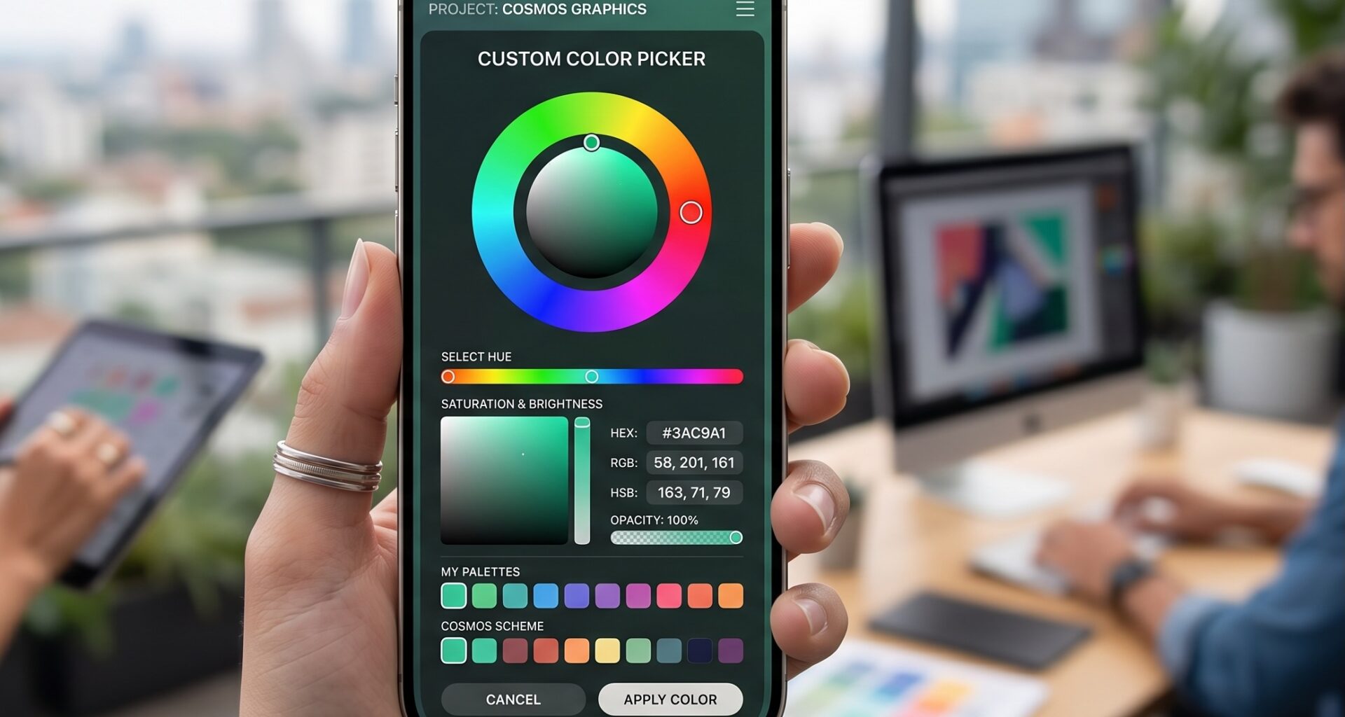
In this extensive tutorial, we will dive deep into SwiftUI to build a Custom Color Picker in SwiftUI. We won’t limit ourselves to a single platform; we will design a truly universal component that will work flawlessly on iOS, macOS, and watchOS.
1. Why build a Custom Color Picker in SwiftUI?
Apple introduced the native ColorPicker view in iOS 14 and macOS 11. It is a fantastic tool that invokes the operating system’s color picker, allowing the user to choose colors via a grid, a continuous spectrum, or by entering hexadecimal codes.
So, why bother making a custom one?
- Lack of support on watchOS and tvOS: The native
ColorPickeris simply not available on these platforms. If you are building a real cross-platform app, you need an alternative. - Palette Control: Often, you don’t want the user to choose any color. If you have a simple drawing app or a notes app, you might only want to offer 10 or 12 specific colors that fit your application’s theme.
- Integrated User Experience (UX): The native picker is often presented as a modal or popover. A Custom Color Picker in SwiftUI allows you to integrate color selection directly into your inline view, reducing friction and clicks.
2. Setting up the Project in Xcode
To begin our journey in Swift programming, let’s set up our development environment.
- Open Xcode (make sure you are using version 14 or higher to take advantage of the framework’s latest improvements).
- Select Create a new Xcode project.
- At the top, choose the Multiplatform tab and then select the App template.
- Name your project, for example,
ProCustomColorPicker. - Verify that the interface is set to SwiftUI and the language to Swift.
By using the Multiplatform template, Xcode will automatically configure the targets for iOS and macOS (and you can easily add watchOS). This means we will write our code once and adapt it as needed.
3. Phase 1: Designing the Data Model and Palette
A good iOS Developer knows that the user interface should be separated from the data. For our Custom Color Picker in SwiftUI, we will first define the colors we want to display.
Create a new Swift file named ColorPalette.swift and add the following code:
import SwiftUI

// We define a static structure to keep our colors organized
struct ColorPalette {
    static let mainColors: [Color] = [
        .red, .orange, .yellow, .green, .mint,
        .teal, .cyan, .blue, .indigo, .purple,
        .pink, .brown, .gray, .black, .white
    ]

    // We can create thematic palettes
    static let pastelColors: [Color] = [
        Color(red: 1.0, green: 0.8, blue: 0.8),
        Color(red: 0.8, green: 1.0, blue: 0.8),
        Color(red: 0.8, green: 0.8, blue: 1.0),
        Color(red: 1.0, green: 0.9, blue: 0.8)
    ]
}
Using an array of SwiftUI Color is straightforward and efficient. Furthermore, by encapsulating it in a struct, we keep our code clean and scalable.
4. Phase 2: Building the Adaptive Grid
This is where the magic of SwiftUI comes in. We want our colors to be displayed in a grid. On iOS and macOS, we want multiple columns. On watchOS, we want fewer columns so that the tap targets remain large enough.
To achieve this elegantly in Swift, we will use LazyVGrid.
Create a new SwiftUI view file named PaletteColorPicker.swift:
import SwiftUI

struct PaletteColorPicker: View {
    // 1. Shared state. The Binding allows the parent view to read and write this value.
    @Binding var selectedColor: Color

    // 2. We define the options this picker will show.
    let colors: [Color]

    // 3. Adaptive Grid Configuration.
    // .adaptive tells SwiftUI to fit as many columns as possible,
    // with a minimum width of 45 points.
    let columns = [
        GridItem(.adaptive(minimum: 45, maximum: 60), spacing: 15)
    ]

    var body: some View {
        ScrollView {
            LazyVGrid(columns: columns, spacing: 15) {
                ForEach(colors, id: \.self) { color in
                    colorButton(for: color)
                }
            }
            .padding()
        }
    }

    // We separate the individual button logic to keep the body clean
    @ViewBuilder
    private func colorButton(for color: Color) -> some View {
        let isSelected = selectedColor == color

        Circle()
            .fill(color)
            .frame(height: 45)
            // Add a subtle shadow for depth
            .shadow(color: color.opacity(0.4), radius: 3, x: 0, y: 2)
            // If selected, we show an outer ring
            .overlay(
                Circle()
                    .stroke(Color.primary, lineWidth: isSelected ? 3 : 0)
                    .padding(-4) // Expands the border outwards
            )
            // A small scale animation when selected
            .scaleEffect(isSelected ? 1.1 : 1.0)
            // Make the entire area tappable
            .onTapGesture {
                withAnimation(.spring(response: 0.3, dampingFraction: 0.6)) {
                    selectedColor = color
                }
            }
            // Accessibility: Vital in professional Swift programming
            .accessibilityLabel(Text("Color"))
            .accessibilityValue(Text(color.description))
            .accessibilityAddTraits(isSelected ? [.isSelected, .isButton] : [.isButton])
    }
}
Technical Explanation for the iOS Developer
LazyVGridandGridItem(.adaptive(...)): This is crucial for cross-platform adaptability. Instead of hardcodingHStackandVStackand calculating screen widths manually, SwiftUI does the math for us. If you run this on an iPad, you might see 10 columns. On an Apple Watch, you’ll see 3..spring()Animation: In UI-oriented Swift programming, details matter. Using a spring animation instead of a linear one makes the interface feel organic and premium.- Accessibility: I have included
accessibilityAddTraits. Never underestimate the importance of VoiceOver. A Custom Color Picker in SwiftUI is useless if a portion of your user base cannot interact with it.
5. Phase 3: The Sliders Challenge (RGB Picker)
A palette picker is nice, but what if we want a Custom Color Picker in SwiftUI that allows selecting any continuous color?
Let’s add another view to our project. We will create a slider-based picker for Red, Green, and Blue (RGB). This is an excellent Swift programming practice to understand how to derive state.
Create a file named RGBColorPicker.swift:
import SwiftUI

struct RGBColorPicker: View {
    @Binding var selectedColor: Color

    // Internal states to handle slider values (0.0 to 1.0)
    @State private var red: Double = 0.5
    @State private var green: Double = 0.5
    @State private var blue: Double = 0.5

    var body: some View {
        VStack(spacing: 25) {

            // Current color preview
            RoundedRectangle(cornerRadius: 15)
                .fill(Color(red: red, green: green, blue: blue))
                .frame(height: 100)
                .shadow(radius: 5)
                .overlay(
                    RoundedRectangle(cornerRadius: 15)
                        .stroke(Color.secondary.opacity(0.3), lineWidth: 1)
                )

            VStack(spacing: 15) {
                colorSlider(value: $red, color: .red, label: "Red")
                colorSlider(value: $green, color: .green, label: "Green")
                colorSlider(value: $blue, color: .blue, label: "Blue")
            }
        }
        .padding()
        // When sliders change, we update the main color
        .onChange(of: red) { _ in updateMainColor() }
        .onChange(of: green) { _ in updateMainColor() }
        .onChange(of: blue) { _ in updateMainColor() }
        // When the view appears, we initialize the sliders with the selected color
        .onAppear {
            extractRGB(from: selectedColor)
        }
    }

    // Reusable Slider Builder
    @ViewBuilder
    private func colorSlider(value: Binding<Double>, color: Color, label: String) -> some View {
        HStack {
            Text(label.prefix(1)) // First letter (R, G, B)
                .font(.headline)
                .foregroundColor(color)
                .frame(width: 20)

            Slider(value: value, in: 0...1)
                .accentColor(color)

            // Show value from 0 to 255
            Text("\(Int(value.wrappedValue * 255))")
                .font(.subheadline)
                .monospacedDigit()
                .frame(width: 40, alignment: .trailing)
        }
    }

    private func updateMainColor() {
        selectedColor = Color(red: red, green: green, blue: blue)
    }

    // Advanced Swift programming function to extract RGB
    private func extractRGB(from color: Color) {
        #if canImport(UIKit)
        // For iOS, tvOS, and watchOS
        var r: CGFloat = 0
        var g: CGFloat = 0
        var b: CGFloat = 0
        var a: CGFloat = 0

        // We convert to UIColor to extract components
        if UIColor(color).getRed(&r, green: &g, blue: &b, alpha: &a) {
            red = Double(r)
            green = Double(g)
            blue = Double(b)
        }
        #elseif canImport(AppKit)
        // For macOS
        var r: CGFloat = 0
        var g: CGFloat = 0
        var b: CGFloat = 0
        var a: CGFloat = 0

        // We convert to NSColor to extract components
        if let nsColor = NSColor(color).usingColorSpace(.sRGB) {
            nsColor.getRed(&r, green: &g, blue: &b, alpha: &a)
            red = Double(r)
            green = Double(g)
            blue = Double(b)
        }
        #endif
    }
}
Senior-Level Swift Details
Extracting the RGB components from the SwiftUI Color type has historically been tricky because Color is a view, not just a data model. In our extractRGB function, we use the compiler directives #if canImport(UIKit) and #elseif canImport(AppKit) from Xcode.
This is essential for an iOS Developer creating cross-platform code. On iOS and watchOS we use UIColor under the hood, while on macOS we use NSColor. This level of detail ensures our Custom Color Picker in SwiftUI never fails to compile, regardless of the destination.
6. Phase 4: Creating the Unified Component
Now we have two powerful pickers: a palette one and an RGB one. Let’s unite them into a single master control, mimicking the tab behavior that Apple uses in its own applications.
Create UniversalColorPicker.swift:
import SwiftUI

struct UniversalColorPicker: View {
    @Binding var selection: Color
    @State private var pickerMode: PickerMode = .palette

    enum PickerMode {
        case palette
        case rgb
    }

    var body: some View {
        VStack(spacing: 0) {
            // Segmented Control to switch modes
            Picker("Picker Mode", selection: $pickerMode) {
                Text("Palette").tag(PickerMode.palette)
                Text("Sliders").tag(PickerMode.rgb)
            }
            .pickerStyle(SegmentedPickerStyle())
            .padding()

            // Show the corresponding view based on the mode
            Group {
                if pickerMode == .palette {
                    PaletteColorPicker(selectedColor: $selection, colors: ColorPalette.mainColors)
                        // Smooth transition when switching tabs
                        .transition(.asymmetric(insertion: .move(edge: .leading), removal: .move(edge: .trailing)))
                } else {
                    RGBColorPicker(selectedColor: $selection)
                        .transition(.asymmetric(insertion: .move(edge: .trailing), removal: .move(edge: .leading)))
                }
            }
            .animation(.easeInOut, value: pickerMode)

            Spacer(minLength: 0)
        }
        .background(Color(UIColor.systemBackground)) // Adaptive background color
        .cornerRadius(20)
    }
}
Note: If you compile strictly for macOS, UIColor.systemBackground will throw an error, you can use Color(NSColor.windowBackgroundColor) conditionally, or simply Color.white / Color.black or leave the background transparent.
7. Phase 5: Specific Adaptation for watchOS
As mentioned at the beginning, the biggest challenge of a Custom Color Picker in SwiftUI is watchOS, due to its small screen. The segmented Picker and the Sliders work differently on an Apple Watch.
Being a meticulous iOS Developer, we will optimize our unified view for the watch using the compiler directives that Xcode provides.
Let’s modify the main app view (ContentView.swift) to demonstrate how we would use this conditionally:
import SwiftUI

struct ContentView: View {
    @State private var myAppColor: Color = .mint
    @State private var isPickerPresented: Bool = false

    var body: some View {
        NavigationView {
            VStack(spacing: 40) {
                // Our main design element that reacts to the color
                Image(systemName: "paintpalette.fill")
                    .resizable()
                    .scaledToFit()
                    .frame(width: 150, height: 150)
                    .foregroundColor(myAppColor)
                    .shadow(color: myAppColor.opacity(0.6), radius: 20, x: 0, y: 10)

                Text("Customize your Theme")
                    .font(.title2)
                    .fontWeight(.semibold)

                #if os(watchOS)
                // On watchOS, the screen is so small that it's better to use a NavigationLink
                // instead of a modal or a huge inline control.
                NavigationLink(destination: PaletteColorPicker(selectedColor: $myAppColor, colors: ColorPalette.mainColors)) {
                    Text("Change Color")
                }
                #else
                // On iOS and macOS, we can show a button that opens a Sheet
                Button(action: {
                    isPickerPresented.toggle()
                }) {
                    Text("Open Color Picker")
                        .font(.headline)
                        .foregroundColor(.white)
                        .padding()
                        .frame(maxWidth: .infinity)
                        .background(myAppColor)
                        .cornerRadius(15)
                }
                .padding(.horizontal, 40)
                #endif

                Spacer()
            }
            .padding(.top, 50)
            .navigationTitle("Settings")
            #if os(iOS) || os(macOS)
            // We present our UniversalColorPicker as an interactive modal
            .sheet(isPresented: $isPickerPresented) {
                UniversalColorPicker(selection: $myAppColor)
                    // We make the modal medium-sized on iOS 16+
                    .presentationDetents([.medium, .large])
                    .presentationDragIndicator(.visible)
            }
            #endif
        }
    }
}
Analyzing the Integration
In this final part, we have achieved the holy grail of modern Swift programming:
- On iOS/macOS: The user sees an elegant button that brings up an interactive Bottom Sheet (thanks to
.presentationDetents). Inside that modal, they have the option to switch between the palette or seamlessly use the RGB sliders. - On watchOS: We ignore the RGB sliders (which are very cumbersome on the watch screen) and the heavy modal. Instead, we use the native
NavigationLinkcomponent that pushes ourPaletteColorPickerview onto the navigation stack. Thanks to the nature of our code, theLazyVGridwill automatically adapt to show smaller columns perfect for the user’s finger on their wrist.
8. Optimizations and Final Considerations
Performance
When working with a Custom Color Picker in SwiftUI, especially if you decide to expand your palette to hundreds of colors, using LazyVGrid ensures your app won’t suffer frame drops. Lazy views only instantiate into memory the color circles that the user is currently seeing on the screen.
Data Persistence
In a real app, you will want to save the color chosen by the user so that, when closing and opening the app, the color is maintained. Since the Color type does not conform to Codable directly, you can save the RGB values we extracted in step 5 inside UserDefaults or CoreData, and rebuild the color when the app starts.
Testing in Xcode
Make sure to take advantage of Xcode‘s Previews. You can set up different PreviewProviders to simulate Dark Mode, different dynamic text sizes, and different devices (iPhone SE, iPad Pro, Apple Watch Series 8) simultaneously without needing to boot up multiple full simulators.
Conclusion
As an iOS Developer, learning to create custom components gives you the freedom to build exactly what your product needs. Throughout this tutorial, we’ve reviewed advanced Swift programming concepts: from handling adaptive layout flows with LazyVGrid, to state manipulation with @Binding, to the strategic use of cross-platform compilation macros and extracting underlying UI components (UIKit/AppKit).