

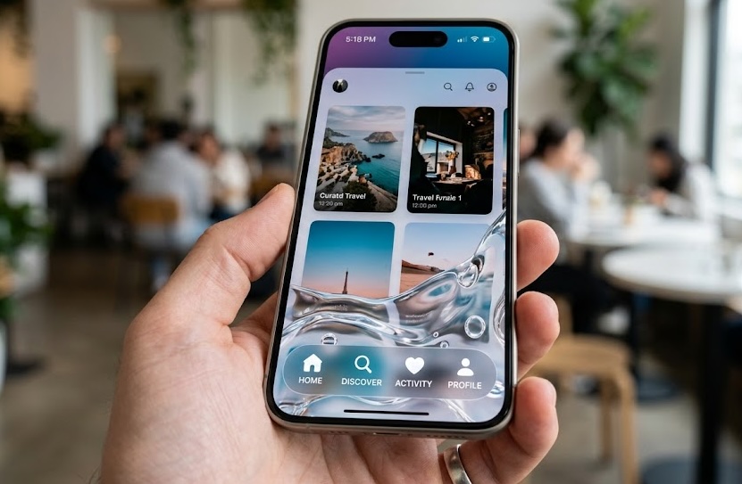

How to Apply the Liquid Glass Effect to a Toolbar in SwiftUI Starting with iOS 26
The arrival of iOS 26 introduces important visual improvements for developers using SwiftUI. One of the most notable is Liquid Glass, the new design language that provides a more dynamic, translucent, and adaptable appearance to interface elements. For any iOS Developer, learning how to integrate this new effect into components such as toolbars is essential for creating modern applications ready for Apple’s latest operating systems.
In this tutorial, we will learn how to create a Liquid Glass Toolbar in SwiftUI, how to apply its main modifiers, and how to reuse this interface in projects developed with Swift for iOS, macOS, and watchOS using Xcode.
The goal is to help you incorporate this new visual style into your applications using clean, modern, and easily reusable SwiftUI code.
What Is Liquid Glass?
Liquid Glass is the new visual language introduced by Apple for its latest operating systems. Its goal is to create interfaces that feel more alive and adaptable by using translucent materials, depth, reflections, and dynamic changes depending on the content behind them.
Unlike traditional designs based solely on solid colors, Liquid Glass allows certain interface elements to integrate more naturally with their surroundings. Navigation bars, toolbars, buttons, and other controls can adopt a lighter and more dynamic appearance.
For an iOS Developer, this represents an important evolution in the way interfaces are designed with SwiftUI. Instead of manually creating transparency, shadow, and blur effects, the framework provides new tools for applying this style natively.
One of the most interesting applications is creating a Liquid Glass Toolbar in SwiftUI.
Create a Project in Xcode
To get started, open Xcode and create a new project using the App template.
Select:
- Interface: SwiftUI
- Language: Swift
- Platform: iOS
- Deployment Target: iOS 26 or later
Once the project has been created, open the main application file. In this example, we will use a simple interface based on NavigationStack.
The initial code could look like this:
import SwiftUI

struct ContentView: View {

    var body: some View {
        NavigationStack {
            Text("My App")
                .navigationTitle("Home")
        }
    }
}
Create a Traditional Toolbar in SwiftUI
Before applying Liquid Glass, it is important to understand how a standard toolbar works in SwiftUI.
We can add buttons using the .toolbar modifier:
struct ContentView: View {

    var body: some View {
        NavigationStack {
            Text("My App")
                .navigationTitle("Home")
                .toolbar {
                    ToolbarItem(placement: .topBarTrailing) {
                        Button {
                            print("Button tapped")
                        } label: {
                            Image(systemName: "gear")
                        }
                    }
                }
        }
    }
}
This code adds a settings button with a gear icon in the top-right corner of the screen.
In previous versions of SwiftUI, the appearance of the toolbar depended primarily on the operating system and the available materials. With iOS 26, Apple provides new APIs for adapting controls to the new Liquid Glass visual language.
Apply Liquid Glass to a Toolbar
The main idea is to use the new modifiers related to the Liquid Glass material on the elements that make up the interface.
A basic example could look like this:
import SwiftUI

struct ContentView: View {

    var body: some View {
        NavigationStack {
            VStack(spacing: 20) {
                Text("Liquid Glass")
                    .font(.largeTitle)
                    .fontWeight(.bold)

                Text("A modern interface created with SwiftUI")
                    .foregroundStyle(.secondary)
            }
            .navigationTitle("Home")
            .toolbar {
                ToolbarItem(placement: .topBarTrailing) {
                    Button {
                        print("Settings")
                    } label: {
                        Image(systemName: "gear")
                    }
                    .glassEffect()
                }
            }
        }
    }
}
The .glassEffect() modifier applies the Liquid Glass appearance to a compatible element.
This type of API considerably simplifies the developer’s work. Instead of manually building a combination of Material, transparency, shadows, and backgrounds, the system adapts the effect to the characteristics of the platform.
Create a Liquid Glass Toolbar with Multiple Buttons
A toolbar can contain more than one element. In this case, it is recommended to group controls that are part of the same visual action.
For example:
.toolbar {
    ToolbarItemGroup(placement: .topBarTrailing) {

        Button {
            print("Search")
        } label: {
            Image(systemName: "magnifyingglass")
        }

        Button {
            print("Share")
        } label: {
            Image(systemName: "square.and.arrow.up")
        }

        Button {
            print("Settings")
        } label: {
            Image(systemName: "gear")
        }
    }
}
In an interface compatible with Liquid Glass, these controls can be visually integrated into the new material system.
A good practice in SwiftUI is to avoid applying too many visual effects individually when controls are part of the same group. The system can provide a more coherent composition when elements are presented as a single unit.
Customize the Appearance of the Elements
One of the advantages of Liquid Glass is that it is not limited to a simple transparency effect. Elements can react visually to the content behind them.
We can create a reusable button:
struct GlassToolbarButton: View {

    let systemImage: String
    let action: () -> Void

    var body: some View {
        Button(action: action) {
            Image(systemName: systemImage)
                .font(.headline)
        }
        .glassEffect()
    }
}
We can then use it from the toolbar:
.toolbar {
    ToolbarItemGroup(placement: .topBarTrailing) {

        GlassToolbarButton(systemImage: "magnifyingglass") {
            print("Search")
        }

        GlassToolbarButton(systemImage: "gear") {
            print("Settings")
        }
    }
}
This approach is especially interesting for an iOS Developer working on large projects. The interface is better organized, and the same components can be reused across different screens.
Create a Toolbar with Dynamic Actions
A modern toolbar usually needs to react to the state of the application.
For example, we can create a button that changes depending on whether an element is selected:
struct ContentView: View {

    @State private var isFavorite = false

    var body: some View {
        NavigationStack {
            Text("Content")
                .navigationTitle("Details")
                .toolbar {
                    ToolbarItem(placement: .topBarTrailing) {
                        Button {
                            isFavorite.toggle()
                        } label: {
                            Image(systemName: isFavorite
                                      ? "star.fill"
                                      : "star")
                        }
                        .glassEffect()
                    }
                }
        }
    }
}
Thanks to @State, the interface is automatically updated whenever the value of isFavorite changes.
This is one of the main advantages of SwiftUI compared to traditional interface systems: the application state and its visual representation are directly connected.
Liquid Glass and Cross-Platform Compatibility
One of the most interesting aspects of this technology is that it can be used across different Apple platforms.
- iOS
- iPadOS
- macOS
- watchOS
Swift and SwiftUI code can be reused to a great extent, although the position and behavior of toolbars may change depending on the device.
For example:
struct SharedToolbar: ToolbarContent {

    var body: some ToolbarContent {
        ToolbarItem {
            Button {
                print("Action")
            } label: {
                Image(systemName: "plus")
            }
        }
    }
}
This component can be used in different views:
.toolbar {
    SharedToolbar()
}
The advantage is that we can create a consistent visual experience without duplicating the entire application logic.
On macOS, a toolbar can have more horizontal space and different placements. On watchOS, the available space is much more limited. For this reason, even if the code is shared, the design must adapt to each platform.
Use #available to Control Compatibility
If your application also supports earlier versions of iOS, it is important to check the availability of the Liquid Glass APIs.
We can use:
if #available(iOS 26, *) {
    // Code compatible with Liquid Glass
} else {
    // Alternative interface
}
In a real application, you can also create a view that uses a different implementation depending on the available operating system version.
For example:
struct ModernToolbarButton: View {

    let action: () -> Void

    var body: some View {
        Button(action: action) {
            Image(systemName: "plus")
        }
        .modifier(GlassModifier())
    }
}
The modifier could be responsible for applying the appropriate style depending on the available version.
This strategy is especially important in commercial applications that still maintain compatibility with several generations of iPhone.
Best Practices When Using Liquid Glass
Although Liquid Glass allows you to create visually attractive interfaces, you should avoid applying effects excessively.
Use the Effect to Highlight Actions
Primary buttons can benefit from the Liquid Glass appearance. However, a toolbar filled with visual elements can become confusing.
Maintain a Visual Hierarchy
The most important actions should be easy to identify. The new material should not replace a well-structured navigation system.
Check Contrast
Transparency can affect readability. It is important to test the application with different backgrounds and accessibility settings.
Test on Different Devices
An interface that works correctly on an iPhone may require adjustments on iPad, Mac, or Apple Watch.
Do Not Rely Solely on Visual Appearance
The design should remain usable even if the user enables accessibility options or reduces certain visual effects.
Conclusion
The arrival of Liquid Glass opens up new possibilities for developing modern interfaces with SwiftUI. For any iOS Developer, learning how to create a Liquid Glass Toolbar in SwiftUI is an excellent way to take advantage of the new visual capabilities of iOS 26.
Thanks to the new APIs, we can create toolbars with a more dynamic appearance that integrates with and adapts to the application’s content without having to manually build every transparency and depth effect.
In addition, the use of reusable components makes it possible to share much of the code between iOS, macOS, and watchOS. By combining Swift, SwiftUI, and Xcode, developers can create cross-platform applications with a modern codebase and a consistent visual experience.
If you are learning Swift programming or developing professional applications for the Apple ecosystem, iOS 26 and Liquid Glass represent an opportunity to review your interfaces and adapt them to Apple’s new design language. The key is to use the effect moderately, maintain a good visual hierarchy, and take advantage of the declarative power of SwiftUI to create reusable and easy-to-maintain components.