


In the current Apple development ecosystem, Swift programming has evolved drastically. If you are an iOS developer coming from UIKit, you likely remember the days of delegates and class inheritance to create custom components. However, with the arrival of SwiftUI, the paradigm has shifted towards composition and declaration.
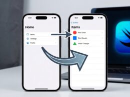
One of the most common challenges when working with Xcode and building scalable interfaces is code reuse. How do we create a generic container? How do we design a “Card” or a “Modal” that accepts any content inside? The answer lies in a fundamental technique: passing a view as a parameter with SwiftUI.
In this tutorial, we will break down the architecture, syntax, and best practices to master this technique, allowing you to create robust applications for iOS, macOS, and watchOS.
The Problem: The Rigidity of Hardcoded Views
Imagine you are developing an application and need an “Information Card” that has a rounded background, a shadow, and specific padding.
A beginner might create something like this:
struct UserCard: View {
    var body: some View {
        VStack {
            Text("Username")
            Image(systemName: "person.fill")
        }
        .padding()
        .background(Color.white)
        .cornerRadius(10)
        .shadow(radius: 5)
    }
}
This works for a user. But what if you need the same card to display a product, an alert, or a chart? You would have to duplicate all the styling code (padding, background, cornerRadius, shadow). This violates the DRY (Don’t Repeat Yourself) principle.
The professional solution is to abstract the container so that it accepts any view as content.
Key Concepts: Generics and ViewBuilder
To understand how to pass a view as a parameter with SwiftUI, we need to master two Swift concepts:
- Generics: Allow your structure (
struct) to accept any type that conforms to theViewprotocol. - @ViewBuilder: A result builder that allows writing declarative code (like
VStackstacks or lists) inside the closures we pass as parameters.
Anatomy of a Generic View
To pass a view, we cannot simply use the View type as if it were a class, because View is a protocol with an associatedtype (the Body). Therefore, we must use generics.
The basic signature looks like this:
struct Container<Content: View>: View {
    let content: Content

    var body: some View {
        content
            .padding()
            // Additional styles
    }
}
Step-by-Step Tutorial: Creating Your First Reusable Component
We are going to build a component called GenericCard. This component will encapsulate all the visual styling but leave it up to the developer to decide what goes inside.
Step 1: Define the Generic Structure
Open Xcode and create a new SwiftUI file.
import SwiftUI

struct GenericCard<Content: View>: View {
    // Property to store the view we will receive
    let content: Content

    // Initializer
    init(@ViewBuilder content: () -> Content) {
        self.content = content()
    }

    var body: some View {
        content
            .padding()
            .background(Color(UIColor.systemBackground))
            .cornerRadius(16)
            .shadow(color: Color.black.opacity(0.1), radius: 4, x: 0, y: 2)
            .padding(.horizontal)
    }
}
Code Analysis
<Content: View>: We tell Swift thatGenericCardwill work with an unknown type calledContent, but we guarantee that this type behaves like aView.@ViewBuilder content: () -> Content: The initializer parameter is a closure (a function) that accepts no arguments and returns ourContent. The@ViewBuildertag is magic: it allows us to pass multiple views (e.g., an image and text) without manually wrapping them in aGrouporVStackwhen calling the function.
Step 2: Implementation in a Parent View
Now, let’s see how an iOS developer would use this component in practice:
struct MainScreen: View {
    var body: some View {
        ScrollView {
            VStack(spacing: 20) {

                // Example 1: Card with Text
                GenericCard {
                    Text("Hello, I am a simple card")
                        .font(.headline)
                }

                // Example 2: Complex Card
                GenericCard {
                    HStack {
                        Image(systemName: "star.fill")
                            .foregroundColor(.yellow)
                        VStack(alignment: .leading) {
                            Text("Favorite")
                                .bold()
                            Text("Added 5 min ago")
                                .font(.caption)
                                .foregroundColor(.gray)
                        }
                    }
                }
            }
        }
        .background(Color(UIColor.systemGroupedBackground))
    }
}
Pro Tip: Notice how the “trailing closure” syntax (the code block after
GenericCard) makes our custom component feel native, just like aVStackor aScrollView.
Advanced Level: Multiple Views as Parameters
Sometimes, passing a view as a parameter in SwiftUI is not enough. What if you need a view for the Header and another for the main content?
This is a common pattern in modern interface design. Let’s create a LayoutWithHeader component.
Definition with Multiple Generics
We need two generic types: one for the Header and one for the Content.
struct LayoutWithHeader<Header: View, Content: View>: View {
    let header: Header
    let content: Content

    init(@ViewBuilder header: () -> Header,
         @ViewBuilder content: () -> Content) {
        self.header = header()
        self.content = content()
    }

    var body: some View {
        VStack(spacing: 0) {
            // Header Zone
            header
                .font(.largeTitle)
                .padding()
                .frame(maxWidth: .infinity, alignment: .leading)
                .background(Color.blue.opacity(0.1))

            Divider()

            // Content Zone
            content
                .padding()
        }
    }
}
Using the Advanced Component
struct DashboardView: View {
    var body: some View {
        LayoutWithHeader(header: {
            Text("Control Panel")
                .bold()
        }, content: {
            LazyVGrid(columns: [GridItem(.flexible()), GridItem(.flexible())]) {
                // Your widgets here
                Text("Widget 1")
                Text("Widget 2")
            }
        })
    }
}
This pattern is extremely powerful for defining master Layouts in your application, ensuring visual consistency across all screens.
Optimization and Optionals: The EmptyView Trick
A frequent scenario in advanced Swift programming is optionality. What if I want my card to have an optional footer?
We can use extensions and the where clause to create convenience initializers.
struct AdvancedCard<Content: View, Footer: View>: View {
    let content: Content
    let footer: Footer

    init(@ViewBuilder content: () -> Content, @ViewBuilder footer: () -> Footer) {
        self.content = content()
        self.footer = footer()
    }

    var body: some View {
        VStack {
            content
            Divider()
            footer.font(.caption).foregroundColor(.secondary)
        }
        .padding()
        .background(Color.white)
        .cornerRadius(8)
    }
}

// Extension for when we DO NOT want a footer
extension AdvancedCard where Footer == EmptyView {
    init(@ViewBuilder content: () -> Content) {
        self.content = content()
        self.footer = EmptyView() // SwiftUI optimizes this and renders nothing
    }
}
Now you can instantiate AdvancedCard with or without a footer, keeping the code clean and Swifty.
Cross-Platform Compatibility: iOS, macOS, and watchOS
One of the great promises of SwiftUI is “Learn once, apply everywhere.” The technique of passing views as parameters is 100% compatible across platforms.
However, as a good iOS developer, you must consider UX differences:
- iOS: Touch controls require hit targets of at least 44x44pt. Your generic container should respect this.
- macOS: Paddings are usually smaller, and mouse clicks are used more often. You can use conditional modifiers
#if os(macOS)inside your container component to adjust padding. - watchOS: Space is premium. When passing views as parameters for the Apple Watch, ensure you don’t nest too many containers with large margins, or the content will disappear.
Example of conditional adjustment inside our generic component:
var body: some View {
    content
        .padding(platformPadding)
}

var platformPadding: CGFloat {
    #if os(watchOS)
    return 4
    #elseif os(macOS)
    return 8
    #else
    return 16 // iOS
    #endif
}
Common Mistakes and Performance
When working with SwiftUI and dynamic views, it is easy to fall into traps that degrade app performance.
1. Avoid AnyView if possible
Sometimes you will see code that returns AnyView to “erase” the view type and make it dynamic.
- Bad Practice:
func getView() -> AnyView { ... } - Why it’s bad:
AnyViewprevents SwiftUI’s “diffing” engine from working efficiently. SwiftUI cannot know if the view has changed structurally, so it often redraws the entire view unnecessarily. - Solution: Always use Generics and
@ViewBuilderas taught above. They maintain the structural identity of the view.
2. Watch out for heavy init
A View‘s initializer (init) is called very frequently. Do not perform heavy calculations, network calls, or complex business logic inside your container component’s init. Limit yourself to assigning properties and @ViewBuilder closures.
Conclusion
Mastering the art of passing a view as a parameter with SwiftUI is what separates a junior programmer from a software architect in the Apple environment. This technique allows you to:
- Reduce Technical Debt: Less duplicated code means fewer bugs.
- Design Consistency: If you change the corner radius in your
GenericCard, the entire app updates automatically. - Flexibility: You can use the same basic components to build totally different interfaces on iOS, macOS, and watchOS.
If you have any questions about this article, please contact me and I will be happy to help you 🙂. You can contact me on my X profile or on my Instagram profile.