

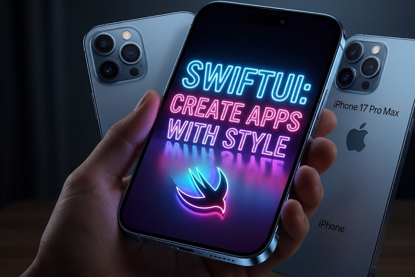

If you are an iOS Developer looking to give a modern and cyberpunk touch to your interfaces, mastering the neon effect in SwiftUI is an excellent skill to add to your repertoire. Unlike UIKit, where creating multiple shadows and complex glows required interacting directly with CALayer, SwiftUI allows us to achieve spectacular results in a declarative way, with less code and optimized performance.
In this Swift programming tutorial, we are going to create a neon glow effect from scratch using Xcode. We will design it so that it is completely reusable and multiplatform, working perfectly on iOS, macOS, and watchOS.
The Anatomy of a Neon Effect
Before writing any Swift code, it is essential to understand what makes our eyes perceive a flat color as a glowing neon tube. A convincing neon effect is not just a colored shadow; it is composed of three main layers:
- The Core: This is the center of the object (text or shape). It is usually a very light color, almost white, or a very bright and desaturated version of the neon color.
- The Inner Glow: A small diffusion around the core that gives the feeling that light is emanating from the center.
- The Outer Glow: Several layers of shadows with different blur radii (
blur). The superimposition of a hard, small shadow with a soft, extensive shadow creates the volumetric lighting effect.
Step 1: Setting up the Environment in Xcode
To get started, open Xcode and create a new project.
- Select File > New > Project.
- In the Multiplatform tab, choose App. This ensures that our SwiftUI code will be ready to compile on all three operating systems without complex additional configurations.
- Name your project (for example,
NeonEffectTutorial) and make sure the interface selected is SwiftUI and the language is Swift.
Step 2: Creating the Reusable Modifier
In SwiftUI, the best practice for applying complex styles to multiple views is to create a custom ViewModifier or an extension on View. This keeps our main view clean and allows us to apply the neon effect in SwiftUI to texts, geometric shapes, or buttons with a single line of code.
Create a new Swift file named NeonStyleModifier.swift and add the following code:
import SwiftUI

struct NeonStyleModifier: ViewModifier {
    var color: Color
    var blurRadius: CGFloat

    func body(content: Content) -> some View {
        content
            // The bright core (slightly lighter than the base color)
            .foregroundColor(.white)
            .colorMultiply(color.opacity(0.8))

            // First layer: Intense and close glow
            .shadow(color: color, radius: blurRadius / 3, x: 0, y: 0)

            // Second layer: Medium diffusion
            .shadow(color: color, radius: blurRadius, x: 0, y: 0)

            // Third layer: Extensive diffusion for the neon aura
            .shadow(color: color.opacity(0.5), radius: blurRadius * 2, x: 0, y: 0)
    }
}
What is happening here?
- We use
colorMultiplyalongside a base.whiteto ensure the core maintains readability and luminosity, while being tinted by our neon color. - We stack three
.shadowmodifiers. In UI-oriented Swift programming, shadows are drawn behind the view. By centering them (x: 0, y: 0) and varying theradius, we create a light gradient that fades smoothly.
To make this modifier as easy to use as native SwiftUI modifiers, let’s create an extension on View:
extension View {
    func neonEffect(color: Color, blurRadius: CGFloat = 10) -> some View {
        self.modifier(NeonStyleModifier(color: color, blurRadius: blurRadius))
    }
}
Step 3: Applying the Effect to Texts and Shapes
Now let’s go to our ContentView.swift file and see the magic in action. For a neon effect in SwiftUI to stand out, we need a dark background.
import SwiftUI

struct ContentView: View {
    var body: some View {
        ZStack {
            // Dark background to contrast the light
            Color.black.ignoresSafeArea()

            VStack(spacing: 50) {
                // Example 1: Neon Text
                Text("SWIFTUI")
                    .font(.system(size: 60, weight: .black, design: .rounded))
                    .neonEffect(color: .cyan, blurRadius: 15)

                // Example 2: Neon Shape
                RoundedRectangle(cornerRadius: 20)
                    .stroke(lineWidth: 6)
                    .frame(width: 200, height: 80)
                    .neonEffect(color: .pink, blurRadius: 12)
                    .overlay(
                        Text("NEON")
                            .font(.title.bold())
                            .foregroundColor(.white)
                            .shadow(color: .pink, radius: 5)
                    )

                // Example 3: Icon (SF Symbol)
                Image(systemName: "bolt.fill")
                    .font(.system(size: 80))
                    .neonEffect(color: .yellow, blurRadius: 20)
            }
        }
    }
}
When you render this in Xcode, you will see how all three elements seem to emit their own light. The key is in the thickness (using thick fonts like .black or wide strokes) to give enough “body” to the neon core.
Step 4: Optimizing for Multiplatform (macOS and watchOS)
One of the wonders of being an iOS Developer today is that SwiftUI transfers a lot of our work to other Apple ecosystems. However, the hardware of an Apple Watch is not the same as that of a Mac Studio.
Rendering multiple overlapping shadows is an expensive operation for the GPU. On iOS and macOS, performance is usually flawless, but on watchOS, abusing shadows with large blur radii can cause frame rate (FPS) drops.
We can make our extension “smart” by detecting the platform and adjusting the effect:
extension View {
    func adaptiveNeonEffect(color: Color) -> some View {
        #if os(watchOS)
        // On watchOS: we simplify to a single strong shadow to optimize battery and GPU
        self
            .foregroundColor(color.opacity(0.9))
            .shadow(color: color, radius: 5, x: 0, y: 0)
        #else
        // On iOS and macOS: we apply the full 3-layer effect
        self.modifier(NeonStyleModifier(color: color, blurRadius: 15))
        #endif
    }
}
Using compiler directives like #if os(watchOS) is an essential technique in modern Swift programming to maintain a Single Source of Truth without sacrificing platform-specific performance.
Step 5: Taking it to the Next Level with Animations
A neon sign is not complete if it doesn’t have life. Real signs flicker or pulse. Thanks to the SwiftUI animation engine, adding a heartbeat effect is extremely simple.
Let’s modify our view so that the blur radius animates constantly:
struct PulsatingNeonView: View {
    @State private var isPulsating = false

    var body: some View {
        ZStack {
            Color(red: 0.05, green: 0.05, blue: 0.1).ignoresSafeArea()

            Text("OPEN")
                .font(.system(size: 70, weight: .heavy, design: .monospaced))
                // We animate the core's opacity for the flickering
                .opacity(isPulsating ? 1.0 : 0.7)
                .neonEffect(color: .green, blurRadius: isPulsating ? 20 : 10)
                .animation(
                    .easeInOut(duration: 1.0).repeatForever(autoreverses: true),
                    value: isPulsating
                )
                .onAppear {
                    isPulsating.toggle()
                }
        }
    }
}
By changing the isPulsating value, the animation smoothly interpolates both the size of the shadow radius and the core’s opacity, creating a breathing glow effect that instantly captures the user’s attention.
Summary and Best Practices
As an iOS Developer, when implementing a neon effect in SwiftUI using Xcode, you should keep the following in mind:
- Contrast: Neon needs darkness. Ensure your backgrounds are black or very dark tones (like deep navy blue or charcoal gray).
- Light Layers: A good neon is not just one shadow; it is the sum of a solid core, an inner glow, and a wide outer scattering.
- Performance: Use Swift compiler directives to limit graphic layers on devices with hardware constraints, such as the Apple Watch.
- Accessibility: Do not rely solely on color or brightness to convey critical information in your app, as users with visual sensitivities or contrast issues might not perceive it correctly.
Mastering these SwiftUI techniques not only improves the aesthetics of your apps but also teaches you how the framework handles modifier stacking and the underlying graphics rendering.