


In mobile application development, visual feedback is the cornerstone of a good user experience (UX). Nothing frustrates a user more than a frozen application without knowing if it’s working in the background or if it has simply crashed. For an iOS Developer, managing these waits is crucial. This is where Apple’s native component comes into play: the ProgressView.
With the arrival of modern Swift programming and the declarative paradigm, implementing loading indicators has gone from being a tedious task with UIActivityIndicatorView or UIProgressView in UIKit, to being a fluid and powerful experience in SwiftUI. In this comprehensive tutorial, we will explore what it is, how it works, and how to fully customize a ProgressView in SwiftUI for your iOS, macOS, and watchOS apps using Xcode.
What is a ProgressView in SwiftUI?
A ProgressView is a structural view in SwiftUI designed to show the progress of a task towards completion. Unlike older imperative approaches, this component automatically adapts to the platform context and operating system style.
Fundamentally, there are two types of ProgressView that every iOS Developer must know:
- Indeterminate: Used when we don’t know how long the task will take (the classic spinner or rotating wheel). It indicates that “something is happening”.
- Determinate: Used when we can quantify progress (a bar filling from 0% to 100%). It indicates “how much is left”.
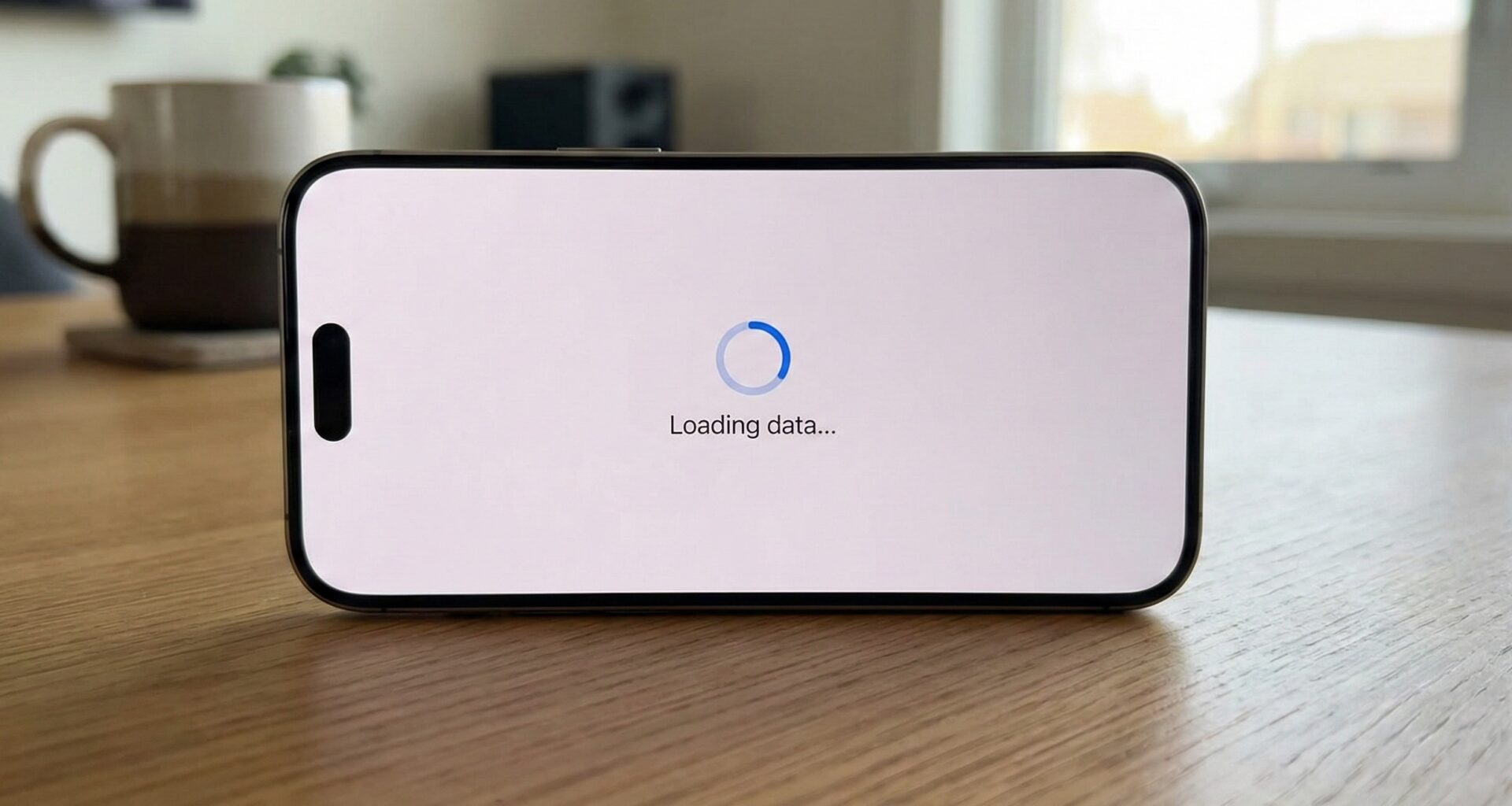
1. Implementing an Indeterminate ProgressView
The most common use case is loading data from an API or waiting for a background process. In Xcode, the most basic implementation is incredibly simple.
struct BasicLoaderView: View {
    var body: some View {
        VStack {
            Text("Loading profile...")
            ProgressView()
        }
    }
}
By writing ProgressView() without parameters, SwiftUI infers that you want an indeterminate style. On iOS, this renders the classic rotating activity indicator (spinner). On macOS, it might appear as a spinner or a barber-pole bar depending on the context.
Adding a Label
A good accessibility and UX practice is to describe what is happening. The ProgressView initializer allows attaching a label that the system will position appropriately.
ProgressView("Connecting to server...")
Although visually it is sometimes preferable to create your own hierarchy with a VStack and a custom Text to have more control over font and color, using the initializer with a label guarantees that VoiceOver reads the state correctly for visually impaired users.
2. Determinate ProgressView: Visualizing Percentages
When you download a file or process a batch of images in Swift, you need to show actual progress. For this, we use the initializer that accepts a value (current value) and a total (maximum value).
struct DownloadProgressView: View {
    @State private var progress = 0.5 // 50% completed

    var body: some View {
        VStack(spacing: 20) {
            ProgressView(value: progress, total: 1.0)
                .padding()

            Button("Increment") {
                if progress < 1.0 {
                    progress += 0.1
                }
            }
        }
    }
}
By default, if you don’t specify the total, SwiftUI assumes it is 1.0. This renders a standard system Linear Progress Bar.
3. Customization with ProgressViewStyle
Here is where Swift programming with SwiftUI shines. Just like buttons have styles, the ProgressView supports the .progressViewStyle() modifier. This allows us to radically change the appearance without changing the logic.
Native Styles
Depending on the platform (iOS, macOS, watchOS), we have access to different styles:
.circular: Forces the spinner style, even if you have a determinate value (useful for small ring charts)..linear: Forces the horizontal bar..automatic: The default behavior.
VStack {
    // Classic spinner
    ProgressView()
        .progressViewStyle(.circular)
        .tint(.purple) // Change color in iOS 15+
        .scaleEffect(2.0) // Make it bigger

    // Progress bar
    ProgressView(value: 0.7)
        .progressViewStyle(.linear)
        .tint(.orange)
}
4. Creating a Custom Style (Custom ProgressViewStyle)
For an iOS Developer who needs to follow a strict design guide, native styles might fall short. SwiftUI allows us to create our own styles by conforming to the ProgressViewStyle protocol. This gives us total control over rendering.
Let’s create a custom progress bar that is a capsule with a gradient and a shadow, something very common in modern apps.
struct GradientBarStyle: ProgressViewStyle {
    var height: CGFloat = 20
    var colors: [Color] = [.blue, .purple]

    func makeBody(configuration: Configuration) -> some View {
        // We get the completed fraction (0.0 to 1.0)
        let fraction = configuration.fractionCompleted ?? 0

        return GeometryReader { geometry in
            ZStack(alignment: .leading) {
                // Bar background (track)
                Capsule()
                    .fill(Color.gray.opacity(0.2))
                    .frame(height: height)

                // Bar fill
                Capsule()
                    .fill(LinearGradient(gradient: Gradient(colors: colors),
                                         startPoint: .leading,
                                         endPoint: .trailing))
                    .frame(width: geometry.size.width * CGFloat(fraction),
                           height: height)
                    .animation(.spring(), value: fraction) // Smooth animation
            }
        }
        .frame(height: height)
    }
}
Now, applying this style in your main view is trivial:
ProgressView(value: 0.6)
    .progressViewStyle(GradientBarStyle(height: 15, colors: [.green, .blue]))
    .padding()
5. Working with Foundation Progress
In complex Xcode projects, you might be using the native Foundation Progress object (very common when using URLSession or CloudKit). SwiftUI has a specific initializer for this.
struct TaskProgressView: View {
    let progressObject: Progress

    var body: some View {
        // SwiftUI automatically observes changes in the Progress object
        ProgressView(progressObject)
    }
}
This automatically binds the UI with the business logic, eliminating the need to manually update @State variables.
6. Cross-Platform Considerations: iOS, macOS, and watchOS
As Apple ecosystem developers, we often write shared code. The ProgressView behaves intelligently on each system:
- iOS: Prioritizes tactility and readable size. The
.linearstyle occupies available horizontal width. - watchOS: Space is gold. An indeterminate
ProgressViewis very common. If you use a determinate one, consider wrapping it in a ring style or using high-contrast colors against the black background. - macOS: Here the ProgressView tends to be thinner and more discrete. It is common to see it in toolbars or at the bottom of windows.
7. Integration with AsyncImage
One of the most practical uses of a ProgressView in modern SwiftUI is inside AsyncImage to show an indicator while a photo downloads from the internet.
AsyncImage(url: URL(string: "https://example.com/photo.jpg")) { phase in
    switch phase {
    case .empty:
        ProgressView() // Shows while loading
            .controlSize(.large)
    case .success(let image):
        image.resizable().aspectRatio(contentMode: .fit)
    case .failure:
        Image(systemName: "exclamationmark.triangle")
    @unknown default:
        EmptyView()
    }
}
8. Accessibility and Best Practices
For a senior iOS Developer, accessibility is not optional. The ProgressView comes with built-in support, but you must configure it correctly:
- Use descriptive labels whenever possible.
- If you use a custom style that doesn’t show text, use
.accessibilityLabel()and.accessibilityValue().
ProgressView(value: 0.5)
    .accessibilityLabel("Downloading update")
    .accessibilityValue("50 percent")
Conclusion
The ProgressView in SwiftUI is a deceptively simple tool. Beneath its minimalist surface, it hides enormous power to communicate application state to the user. From simple spinners to custom loading bars with complex animations, mastering this component is essential in current Swift programming.
If you have any questions about this article, please contact me and I will be happy to help you  . You can contact me on my X profile or on my Instagram profile.


