

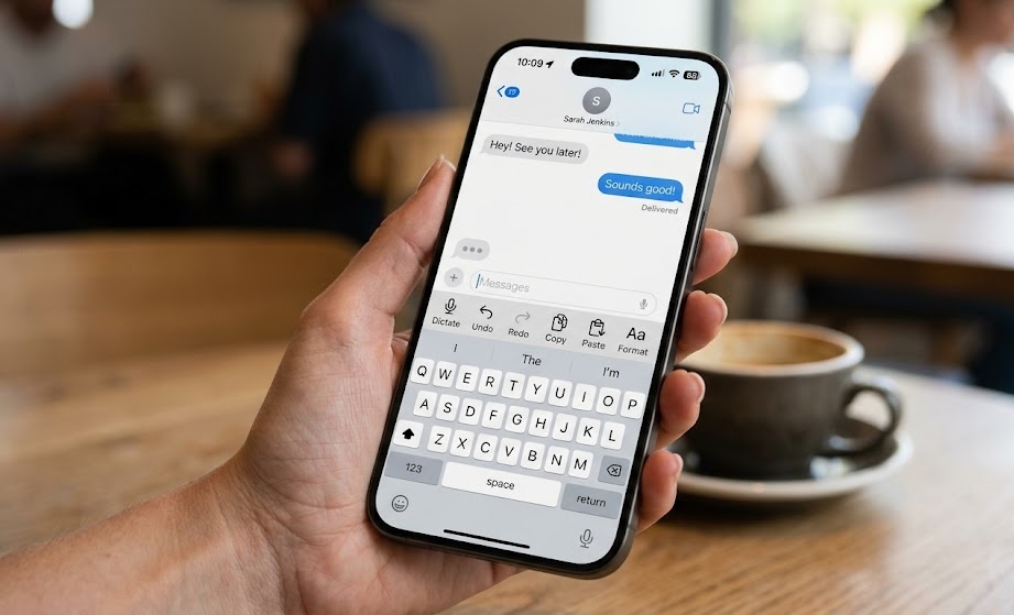

Improving the user experience is one of the main missions of every iOS Developer. When designing interfaces that require text input, the on-screen keyboard can become an obstacle if not managed correctly. One of the best ways to optimize UX is learning how to add a keyboard toolbar in SwiftUI.
In this Swift programming tutorial, you will learn how to implement this functionality using Xcode and SwiftUI, ensuring your code is clean, modern, and compatible not only with iOS, but also with macOS and watchOS.
Why use a keyboard toolbar?
Screen space is sacred, especially on mobile devices and wearables. When entering data into a form, users often need quick actions like jumping to the next field, hiding the keyboard, or inserting special characters.
Implementing this feature with Swift used to require manipulating inputAccessoryView in UIKit, a tedious process that added boilerplate to our project. Today, thanks to SwiftUI, we can achieve this declaratively with just a few lines of code.
Setting up the environment in Xcode
To get started, open Xcode and create a new App project. Make sure to select SwiftUI as the interface and Swift as the programming language. If you want your application to be cross-platform, check the Multiplatform box when creating the project.
Basic Implementation on iOS
Let’s start with the most common use case: an app for iPhone or iPad. On iOS, the toolbar is anchored directly above the native keyboard.
The key modifier we will use is .toolbar(), combined with the ToolbarItemGroup(placement: .keyboard) component.
Here is a practical and detailed example:
import SwiftUI

struct KeyboardToolbarView: View {
    @State private var textInput: String = ""
    @FocusState private var isInputActive: Bool

    var body: some View {
        NavigationStack {
            VStack(spacing: 20) {
                Text("Registration Form")
                    .font(.title)
                    .bold()

                TextField("Type something here...", text: $textInput)
                    .textFieldStyle(.roundedBorder)
                    .padding()
                    .focused($isInputActive) // Controls the keyboard focus

                Spacer()
            }
            .padding()
            .navigationTitle("iOS Developer Tutorial")
            .toolbar {
                // We define that the toolbar belongs to the keyboard
                ToolbarItemGroup(placement: .keyboard) {
                    Spacer() // Pushes the button to the right

                    Button(action: {
                        isInputActive = false // Closes the keyboard
                    }) {
                        Text("Done")
                            .bold()
                            .foregroundColor(.blue)
                    }
                }
            }
        }
    }
}

#Preview {
    KeyboardToolbarView()
}
Code analysis:
@FocusState: This property is fundamental in modern Swift programming. It allows us to track and programmatically modify whether an interface element (like aTextField) has focus. By changingisInputActivetofalse, the keyboard is automatically dismissed.ToolbarItemGroup(placement: .keyboard): Tells SwiftUI that the elements within this group should not go in the top navigation bar, but in the keyboard accessory area.
Bringing the toolbar to macOS and watchOS
One of the biggest appeals of being an iOS Developer today is the ability to create universal apps. However, keyboard behavior varies drastically across platforms:
- macOS: There is no virtual on-screen keyboard (unless activated for accessibility). The keyboard toolbar is usually omitted or adapts to the window’s toolbar.
- watchOS: Text input is done via dictation, Scribble, or a tiny keyboard on newer models.
To achieve robust code that compiles without errors across the entire Apple ecosystem, we must use conditional compilation.
Cross-platform code adaptation
Next, we will update our view so that it responds natively and intelligently on each operating system:
import SwiftUI

struct MultiplatformKeyboardView: View {
    @State private var username: String = ""
    @FocusState private var isFieldFocused: Bool

    var body: some View {
        VStack {
            TextField("Username", text: $username)
                .textFieldStyle(.roundedBorder)
                .focused($isFieldFocused)
                .padding()

            #if os(macOS)
            Text("Press Enter to confirm")
                .font(.caption)
                .foregroundColor(.gray)
            #endif
        }
        .toolbar {
            #if os(iOS)
            // Specific bar for the iOS touch keyboard
            ToolbarItemGroup(placement: .keyboard) {
                Button("Clear") {
                    username = ""
                }
                Spacer()
                Button("Done") {
                    isFieldFocused = false
                }
            }
            #elseif os(watchOS)
            // On watchOS, we place an action in the main toolbar of the input view
            ToolbarItem(placement: .primaryAction) {
                Button("OK") {
                    isFieldFocused = false
                }
            }
            #typealias
            #endif
        }
    }
}
Behavior by platform in Xcode:
- On iOS: The user will see the “Clear” and “Done” buttons just above the keyboard.
- On watchOS: When invoking text input, the contextual button will integrate into the Apple Watch input interface, making it easy to validate the text.
- On macOS: The
.keyboardmodifier will have no detrimental visual effect, preventing the app from breaking and maintaining workflow consistency.
UX Best Practices when adding a keyboard toolbar in SwiftUI
Modifying the keyboard can be a double-edged sword if certain design guidelines are not followed:
- Keep it simple: Do not clutter the accessory bar with too many buttons. A maximum of two or three actions (like Previous, Next, and Done) is ideal.
- Use recognizable icons: Instead of plain text, you can use
Image(systemName:)with SF Symbols (for example,chevron.upandchevron.downto navigate between fields). - Manage the keyboard type: Make sure to combine your toolbar with the appropriate keyboard type using
.keyboardType(.numberPad)or.keyboardType(.emailAddress)as appropriate.
Advanced Example: Navigating between multiple fields
In real-world applications, we rarely have just a single text field. Let’s create a complex form where the toolbar allows the user to jump from one field to another fluidly.
import SwiftUI

enum FormField {
    case name, email, phone
}

struct AdvancedFormView: View {
    @State private var name = ""
    @State private var email = ""
    @State private var phone = ""

    @FocusState private var focusedField: FormField?

    var body: some View {
        Form {
            Section(header: Text("Personal Data")) {
                TextField("Name", text: $name)
                    .focused($focusedField, equals: .name)
                    .submitLabel(.next)

                TextField("Email", text: $email)
                    .focused($focusedField, equals: .email)
                    .keyboardType(.emailAddress)
                    .submitLabel(.next)

                TextField("Phone", text: $phone)
                    .focused($focusedField, equals: .phone)
                    .keyboardType(.phonePad)
                    .submitLabel(.done)
            }
        }
        .toolbar {
            ToolbarItemGroup(placement: .keyboard) {
                // Navigation buttons
                HStack {
                    Button(action: goToPreviousField) {
                        Image(systemName: "chevron.up")
                    }
                    .disabled(focusedField == .name)

                    Button(action: goToNextField) {
                        Image(systemName: "chevron.down")
                    }
                    .disabled(focusedField == .phone)

                    Spacer()

                    Button("Hide") {
                        focusedField = nil
                    }
                }
            }
        }
    }

    private func goToPreviousField() {
        switch focusedField {
        case .email: focusedField = .name
        case .phone: focusedField = .email
        default: break
        }
    }

    private func goToNextField() {
        switch focusedField {
        case .name: focusedField = .email
        case .email: focusedField = .phone
        default: break
        }
    }
}
This pattern exponentially elevates the quality of your software, demonstrating a solid mastery of Swift programming applied to accessibility and usability.
Conclusion
Adding a keyboard toolbar in SwiftUI is an intuitive process thanks to the declarative design of Apple’s framework. As we have seen, mastering tools like @FocusState and ToolbarItemGroup allows you, as an iOS Developer, to build highly interactive and efficient interfaces in Xcode.