


Designing clean and cohesive interfaces is one of the biggest challenges you face as an iOS Developer. When you have multiple related actions on a screen—such as media playback controls, text editing tools, or filtering actions—presenting them in isolation can confuse the user and clutter the interface. This is where ControlGroup in SwiftUI comes into play, a fundamental tool in modern Swift programming.
In this tutorial, we will explore in depth what it is, how it works, and how you can implement this semantic container in your projects using Xcode to create consistent experiences across iOS, macOS, and watchOS.
What is ControlGroup in SwiftUI?
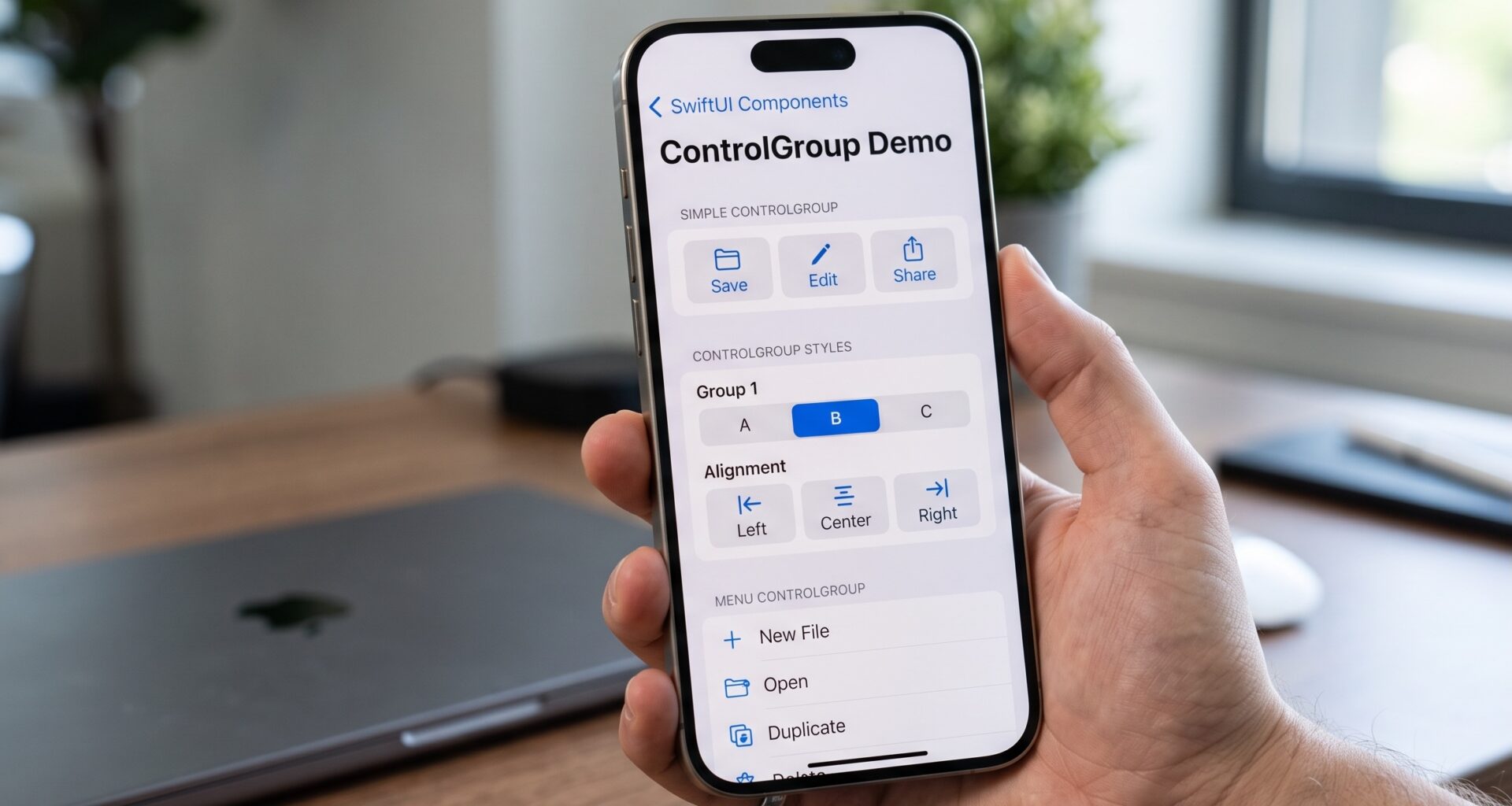
In the SwiftUI ecosystem, a ControlGroup is a view container that visually and semantically groups related interactive controls, such as buttons or toggles. Instead of placing multiple loose buttons in an HStack or VStack, wrapping them in a ControlGroup tells the operating system that these actions form part of the same logical unit.
The great value of using Swift for this task is its adaptability. The same block of code written in Xcode will render completely differently depending on the platform and context:
- In an iOS toolbar, it will appear as a unified block with separators.
- In a context menu, it will be displayed in a compact row.
- In macOS, it will adopt the look of native segmented controls.
- In watchOS, it will maximize the use of limited screen space by grouping elements into capsules or linked circles.
Basic Syntax in Xcode
The fundamental implementation in Swift programming is extremely simple. You only need to wrap your controls within the initialization block of the ControlGroup.
import SwiftUI

struct BasicControlGroupView: View {
    var body: some View {
        ControlGroup {
            Button(action: { print("Decrease") }) {
                Label("Less", systemImage: "minus")
            }

            Button(action: { print("Reset") }) {
                Label("Reset", systemImage: "arrow.counterclockwise")
            }

            Button(action: { print("Increase") }) {
                Label("More", systemImage: "plus")
            }
        }
        .padding()
    }
}
In this example, instead of rendering three independent buttons floating in the view, SwiftUI joins them into a single “pill” or segment, depending on the operating system. Dividers between buttons are added automatically.
Implementation by Platform
As an iOS Developer, your goal is rarely to build an app that looks exactly the same on all Apple screens. The Human Interface Guidelines (HIG) dictate different rules for each device. Let’s see how ControlGroup in SwiftUI handles these differences for you.
1. ControlGroup on iOS and iPadOS
On iOS, the most common and powerful use of this component occurs within toolbars (Toolbar) and context menus (ContextMenu). When you group elements here, the system understands that it should treat them as a single interactive unit.
struct iOSToolbarView: View {
    var body: some View {
        NavigationStack {
            Text("Editor content")
                .toolbar {
                    ToolbarItem(placement: .bottomBar) {
                        ControlGroup {
                            Button { /* Action */ } label: {
                                Image(systemName: "bold")
                            }
                            Button { /* Action */ } label: {
                                Image(systemName: "italic")
                            }
                            Button { /* Action */ } label: {
                                Image(systemName: "underline")
                            }
                        }
                    }
                }
        }
    }
}
On an iPhone, this code will generate a group of buttons joined by subtle vertical dividing lines, perfect for text editing tools.
2. ControlGroup on macOS
The desktop paradigm is different. On macOS, grouping controls is usually presented via Segmented Controls in the top toolbar or within complex forms. When compiling the Swift code for Mac, you will notice that the component acquires a classic macOS grayish background and more rectangular edges, seamlessly integrating with the visual environment of the platform without you having to modify a single logical line.
3. ControlGroup on watchOS
The Apple Watch screen doesn’t forgive wasted pixels. Using this component on watchOS is vital for grouping secondary actions, such as music controls or workout routines. SwiftUI will adapt the buttons to fit into a horizontal capsule that optimizes the touch area (the hit target), ensuring the user can tap the correct button even while moving.
Styles and Modifiers: ControlGroupStyle
The true power for an advanced iOS Developer lies in customization. SwiftUI provides a modifier called .controlGroupStyle() that allows you to alter the behavior and appearance of the entire group without modifying the internal buttons.
| ControlGroup Style | Description and Behavior |
|---|---|
.automatic |
(Default). The system chooses the style based on context (e.g., toolbar vs. main view). |
.navigation |
Specifically designed to look like navigation controls, grouping elements into a solid rounded shape. |
.palette |
Displays controls as a tool palette. It is ideal for drawing applications or color pickers. |
.menu |
Converts the group into a dropdown menu if space is limited, or groups them as context menu items. |
Apply the modifier directly to the main container in Xcode:
ControlGroup {
    Button("Copy", action: copyAction)
    Button("Paste", action: pasteAction)
}
.controlGroupStyle(.navigation)
Creating your own CustomControlGroupStyle
If the default styles don’t fit your application’s design system, Swift allows you to define exactly how you want these groups to render. This is achieved by adopting the ControlGroupStyle protocol.
Below, we will build a custom style that adds a gradient background and custom separators, step by step:
- Define the style structure: Create a structure that conforms to the
ControlGroupStyleprotocol. You will need to implement themakeBody(configuration:)method. - Use the configuration: The
configurationparameter gives you access to the group’s content viaconfiguration.content. You must place this content inside your own visual containers. - Apply the style: To make it easy to use, create an extension on
ControlGroupStylethat instantiates your new custom design.
Here is the complete implementation in Xcode:
import SwiftUI

// 1. Style definition
struct NeumorphicControlGroupStyle: ControlGroupStyle {
    func makeBody(configuration: Configuration) -> some View {
        HStack(spacing: 8) {
            // 2. Extract the content
            configuration.content
                // Modifiers applied to internal buttons
                .buttonStyle(.plain)
                .padding(.horizontal, 12)
                .padding(.vertical, 8)
                .background(
                    RoundedRectangle(cornerRadius: 8)
                        .fill(Color.gray.opacity(0.2))
                )
        }
        .padding(6)
        .background(
            RoundedRectangle(cornerRadius: 12)
                .fill(Color.white)
                .shadow(color: .gray.opacity(0.3), radius: 5, x: 5, y: 5)
                .shadow(color: .white, radius: 5, x: -5, y: -5)
        )
    }
}

// 3. Extension for ease of use
extension ControlGroupStyle where Self == NeumorphicControlGroupStyle {
    static var neumorphic: NeumorphicControlGroupStyle {
        NeumorphicControlGroupStyle()
    }
}

// Usage in view
struct CustomStyleView: View {
    var body: some View {
        ControlGroup {
            Button(action: {}) { Image(systemName: "backward.fill") }
            Button(action: {}) { Image(systemName: "play.fill") }
            Button(action: {}) { Image(systemName: "forward.fill") }
        }
        .controlGroupStyle(.neumorphic)
    }
}
By using this approach in Swift programming, you keep the semantics of the ControlGroup intact (the system knows they are grouped controls) but take absolute control over the rendered pixels.
Best Practices and Accessibility
Mastering ControlGroup in SwiftUI isn’t just about knowing the syntax, but knowing when to use it. Here are the keys that separate a good developer from an excellent iOS Developer:
- Content limits: Do not insert complex views (like maps or full lists) inside a control group. This container is strictly designed for interactive elements like
Button,Toggle,Menu, orPicker. - Semantic Meaning over Aesthetics: If you just want three buttons next to each other, use an
HStack. Only useControlGroupif the actions are conceptually linked (e.g., “Align Left”, “Center”, “Align Right”). This is vital for assistive technologies like VoiceOver. - Text management: Avoid extremely long text labels inside grouped buttons. Instead, prioritize the use of icons (
Image(systemName:)via SF Symbols) and ensure you provide proper accessibility labels.
// Correct accessibility example
ControlGroup {
    Button(action: likePost) {
        Image(systemName: "heart")
    }
    .accessibilityLabel("Like")

    Button(action: sharePost) {
        Image(systemName: "square.and.arrow.up")
    }
    .accessibilityLabel("Share post")
}
VoiceOver will understand the grouping and present these options to the visually impaired user logically, indicating that they are interacting with a group of related controls.
Handling Forms and Menus
An area where SwiftUI shines especially is its adaptability within larger containers, such as a Form or a Menu.
If you place your ControlGroup inside a form (the standard view for settings and preferences in iOS), Xcode will automatically render the group without the heavy external visual container, so it doesn’t clash with the form’s grouped list style.
struct SettingsFormView: View {
    var body: some View {
        Form {
            Section(header: Text("Appearance")) {
                ControlGroup {
                    Button("Light") { /* Set Light */ }
                    Button("Dark") { /* Set Dark */ }
                    Button("Auto") { /* Set Auto */ }
                }
            }
        }
    }
}
Similarly, if this group of buttons appears inside a dropdown menu, SwiftUI will transform it into a horizontal row within the vertical options of the menu, saving precious space and providing easy access to quick actions.
Conclusion
The strategic use of ControlGroup in SwiftUI is an indispensable step for creating professional-quality interfaces. Throughout this guide, we have seen how Swift programming allows you to group logical actions semantically, saving you hours of development by letting Xcode manage the complex visual differences across iOS, macOS, and watchOS.