


Welcome to a new tutorial where we will take your interface design skills to the next level. If you are an iOS Developer looking to create striking visual experiences and display data intuitively, you are in the right place.
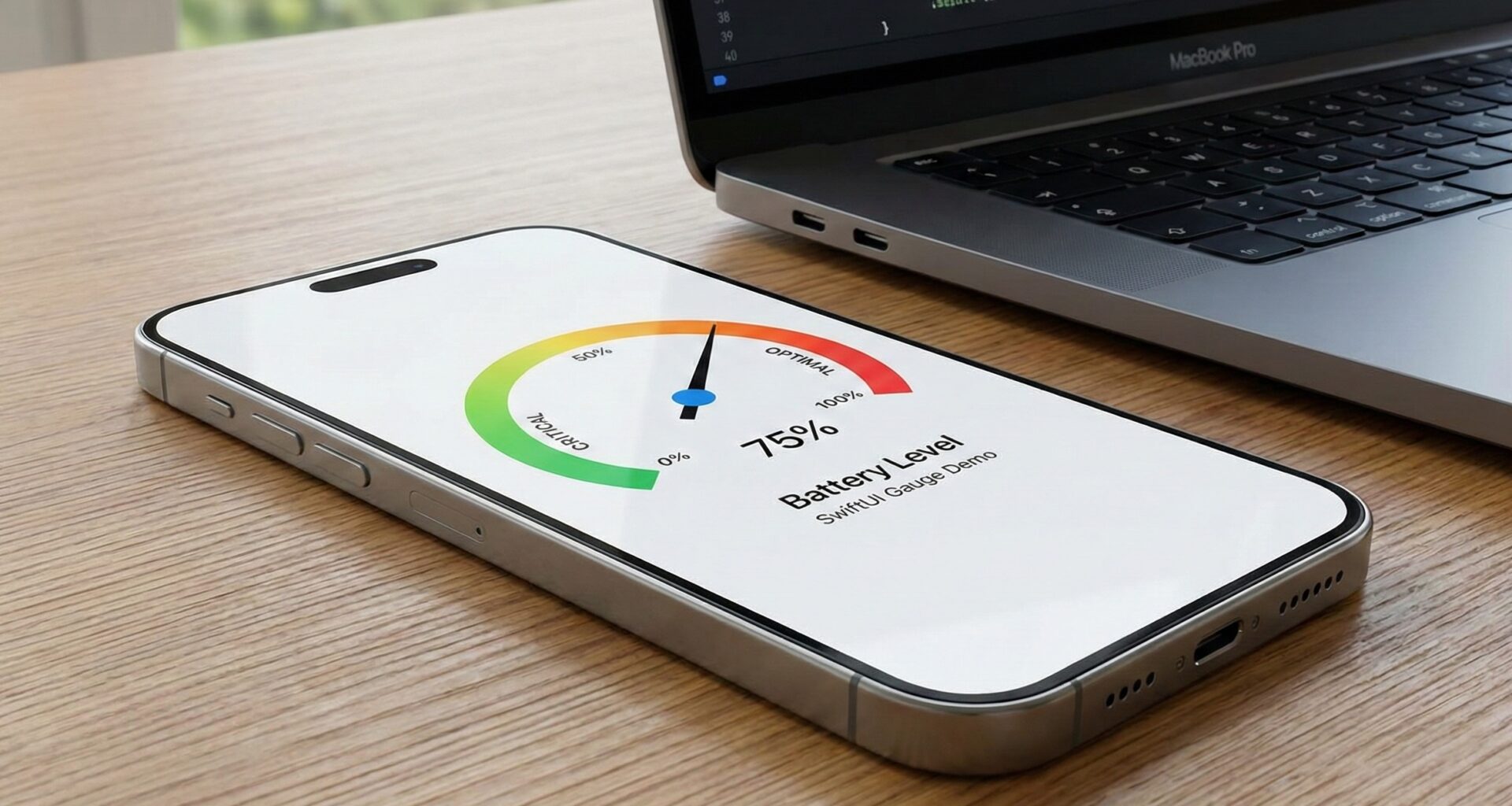
Today we are going to dive deep into one of the most versatile and attractive components Apple has introduced in recent years: the Gauge in SwiftUI. Whether you are building a dashboard for a smart car, a health app, or a lock screen widget, mastering this element is fundamental in modern Swift programming.
Throughout this extensive article, you will not only learn what it is, but also how to implement it, customize it, and adapt it to shine on iOS, macOS, and watchOS using Xcode.
1. What is a Gauge in SwiftUI?
In the world of Swift programming, data representation is key to user retention. A Gauge in SwiftUI is a view specifically designed to show a current value within a finite range.
Think of a car’s speedometer, your iPhone’s battery indicator, or your Apple Watch’s activity rings. They all represent a value that has a known minimum and maximum.
Before the arrival of this native component in iOS 16 and macOS 13, developers had to create these views from scratch using Path, GeometryReader, and a lot of trigonometry for circular gauges. Now, SwiftUI offers us an elegant, declarative, and highly optimized solution with just a couple of lines of code.
Why should you use it?
As an iOS Developer, your goal is to reduce the user’s cognitive friction. A Gauge allows users to:
- Understand context instantly: A quick glance reveals if a metric is high, low, or within a normal range.
- Save space: Especially on watchOS or in widgets, where screen real estate is scarce.
- Maintain system consistency: By using native SwiftUI components, your app will feel like a natural extension of the Apple ecosystem.
2. The Anatomy of a Gauge
To master the Gauge in SwiftUI, we first need to understand its parts. The Swift API for this component is surprisingly flexible. A complete Gauge consists of:
- Value: The dynamic number you are measuring (e.g., 75).
- Bounds (Range): The lower and upper limits (e.g., from 0 to 100). If you don’t specify one, SwiftUI assumes a range of 0.0 to 1.0.
- Label: Describes what the Gauge is measuring (e.g., “Speed”).
- Minimum Value Label: Shows the lower limit (e.g., “0”).
- Maximum Value Label: Shows the upper limit (e.g., “100”).
- Current Value Label: Shows the exact value in text (e.g., “75 km/h”).
3. Your First Gauge in Xcode: Step by Step
Let’s get our hands dirty. Open Xcode, create a new SwiftUI project, and navigate to your ContentView.swift. We are going to create the simplest battery indicator possible.
import SwiftUI

struct ContentView: View {
    // 1. We define our state
    @State private var batteryLevel: Double = 0.45

    var body: some View {
        VStack(spacing: 40) {

            // 2. The most basic Gauge
            Gauge(value: batteryLevel) {
                Text("Battery")
            }
            .padding()

            // A slider to interact with the value
            Slider(value: $batteryLevel, in: 0...1)
                .padding()
        }
    }
}
Analyzing the Swift code:
In this example, we haven’t defined a range (in:), so SwiftUI assumes that batteryLevel moves between 0.0 and 1.0. The final block ({ Text("Battery") }) provides the main label for accessibility purposes, although in the default iOS style, this label might not be visible unless you change the style.
4. Gauge Styles: Adapting to the Design
The real magic of the Gauge in SwiftUI lies in the GaugeStyle. Just like with buttons or lists, Apple provides several predefined styles that drastically change the appearance of the component without having to alter the underlying logic of your Swift code.
Let’s explore the available styles by applying the .gaugeStyle() modifier:
A. Linear Style (LinearCapacityGaugeStyle)
This is the default style on iOS and macOS. It displays a horizontal progress bar.
Gauge(value: speed, in: 0...200) {
    Text("Speed")
} currentValueLabel: {
    Text("\(Int(speed)) km/h")
} minimumValueLabel: {
    Text("0")
} maximumValueLabel: {
    Text("200")
}
.gaugeStyle(.linearCapacity) // Optional, it is the default on iOS
B. Accessory Styles
These styles were originally designed for watchOS complications and iOS lock screen widgets. They are circular or compact.
.accessoryCircular: Displays a circular ring that fills up, with thecurrentValueLabelin the center..accessoryCircularCapacity: A closed ring where the progress is marked in a slightly denser way..accessoryLinearCapacity: A small and compact bar, perfect for inline widgets.
HStack(spacing: 30) {
    // Circular Style
    Gauge(value: 0.7) {
        Text("CPU")
    } currentValueLabel: {
        Text("70%")
    }
    .gaugeStyle(.accessoryCircular)
    .tint(.blue)

    // Circular Capacity Style
    Gauge(value: 0.4) {
        Text("RAM")
    } currentValueLabel: {
        Text("40%")
    }
    .gaugeStyle(.accessoryCircularCapacity)
    .tint(.purple)
}
5. Advanced Customization of Colors and Gradients
A senior iOS Developer knows that an interface must not only work but look spectacular. SwiftUI makes coloring a Gauge child’s play using the .tint() modifier.
But we are not limited to solid colors. We can use gradients to indicate warning states (e.g., green when the temperature is normal, red when it is hot).
struct ThermometerView: View {
    @State private var temperature: Double = 38.0

    // We define a gradient that goes from blue (cold) to red (hot)
    let tempGradient = Gradient(colors: [.blue, .green, .yellow, .orange, .red])

    var body: some View {
        Gauge(value: temperature, in: -10...50) {
            Text("Temperature")
        } currentValueLabel: {
            Text("\(Int(temperature))°C")
                .font(.title2.bold())
        } minimumValueLabel: {
            Text("-10")
                .foregroundColor(.blue)
        } maximumValueLabel: {
            Text("50")
                .foregroundColor(.red)
        }
        .gaugeStyle(.linearCapacity)
        // We apply the gradient to the Gauge
        .tint(tempGradient)
        .padding()
    }
}
When using a Gradient, SwiftUI automatically maps the start of the gradient to the minimum value and the end of the gradient to the maximum value. As the value goes up, the indicator bar will fill with the corresponding colors.
6. Cross-Platform Development: iOS, macOS, and watchOS
One of the great promises of Swift programming with SwiftUI is “Learn once, apply anywhere”. The Gauge in SwiftUI is an excellent example of this, but as a good iOS Developer, you must know the subtleties of each platform in Xcode.
On iOS and iPadOS
On mobile devices, linear Gauges are excellent for settings screens (like iPhone storage) or dashboards in finance and health apps. However, with the arrival of Live Activities and Lock Screen Widgets, the .accessoryCircular styles have become incredibly popular. They allow you to display crucial data right on the user’s home screen.
On macOS
On the Mac, horizontal space is abundant. Linear Gauges fit perfectly in preference windows or system monitoring apps that live in the top menu bar. SwiftUI automatically adapts typography and spacing so it feels native in the macOS windowing environment.
On watchOS
This is where the Gauge truly shines. Apple Watch screens are small, and users interact with them in bursts of a few seconds.
On watchOS, Gauges are the backbone of Complications. By using .gaugeStyle(.accessoryCircular) inside a watchOS widget, Xcode ensures the Gauge adapts to the user’s watch face, automatically taking on the accent color the user has set on their Apple Watch.
// Typical example in a watchOS environment for a complication
Gauge(value: steps, in: 0...10000) {
    Image(systemName: "figure.walk")
} currentValueLabel: {
    Text("\(steps)")
}
.gaugeStyle(.accessoryCircular)
.tint(.green)
7. Pushing SwiftUI to the Limit: Custom GaugeStyle
Although the default styles are great, sometimes your team’s designer has a very specific vision that doesn’t fit the standard. As an expert in Swift programming, you can create your own GaugeStyle.
To do this, we need to create a struct that adopts the GaugeStyle protocol and implements the makeBody(configuration:) method.
Imagine we want a “Segmented progress bar” style Gauge (like health bars in retro video games).
struct SegmentedGaugeStyle: GaugeStyle {
    var segments: Int = 10
    var activeColor: Color = .green
    var inactiveColor: Color = .gray.opacity(0.3)

    func makeBody(configuration: Configuration) -> some View {
        // configuration.value gives us a fraction between 0.0 and 1.0
        let activeSegments = Int(configuration.value * Double(segments))

        return VStack(alignment: .leading, spacing: 8) {
            // We show the label
            configuration.label
                .font(.headline)

            HStack(spacing: 4) {
                ForEach(0..<segments, id: \.self) { index in
                    Rectangle()
                        .fill(index < activeSegments ? activeColor : inactiveColor)
                        .frame(height: 20)
                        .cornerRadius(2)
                }
            }

            HStack {
                configuration.minimumValueLabel
                    .font(.caption)
                Spacer()
                configuration.currentValueLabel
                    .font(.caption.bold())
                Spacer()
                configuration.maximumValueLabel
                    .font(.caption)
            }
        }
    }
}

// Extension to use it easily like native styles
extension GaugeStyle where Self == SegmentedGaugeStyle {
    static var segmented: SegmentedGaugeStyle {
        SegmentedGaugeStyle()
    }
}
Now, in your main SwiftUI view, you simply apply it like this:
Gauge(value: 0.7) {
    Text("Course Progress")
} currentValueLabel: {
    Text("70%")
} minimumValueLabel: {
    Text("0%")
} maximumValueLabel: {
    Text("100%")
}
.gaugeStyle(.segmented)
.padding()
Boom! You have extended the capabilities of Xcode and SwiftUI with a completely custom and reusable component.
8. Animating Changes in your Gauge
In Swift programming, static interfaces can seem boring. SwiftUI makes it easy to animate value changes in your Gauge. When the underlying value of your @State variable changes, you can wrap that change in a withAnimation block.
struct AnimatedGaugeView: View {
    @State private var downloadProgress: Double = 0.0

    var body: some View {
        VStack(spacing: 50) {
            Gauge(value: downloadProgress) {
                Text("Downloading...")
            }
            .gaugeStyle(.accessoryCircularCapacity)
            .scaleEffect(2.0) // Make it larger to see it clearly
            .tint(downloadProgress == 1.0 ? .green : .blue)
            // We implicitly animate the view when the progress changes
            .animation(.spring(response: 0.5, dampingFraction: 0.6), value: downloadProgress)

            Button("Simulate Download") {
                // We generate a random value change simulating network activity
                withAnimation {
                    downloadProgress += Double.random(in: 0.1...0.3)
                    if downloadProgress > 1.0 { downloadProgress = 1.0 }
                }
            }
            .buttonStyle(.borderedProminent)
            .disabled(downloadProgress == 1.0)
        }
    }
}
9. Accessibility: The Responsibility of a Good iOS Developer
You should never forget the users who interact with your applications through VoiceOver. Fortunately, a Gauge in SwiftUI comes with excellent out-of-the-box accessibility support. However, it is your job as an iOS Developer to ensure the transmitted information makes sense.
By default, VoiceOver will read the Gauge’s value as a percentage if you don’t provide context. If your Gauge measures something specific (like decibels or liters), you should use the .accessibilityValue() modifier.
Gauge(value: waterIntake, in: 0...3000) {
    Text("Water Intake")
}
.accessibilityValue("\(Int(waterIntake)) milliliters out of 3000 recommended")
This way, instead of VoiceOver reading a confusing “50 percent”, it will say something useful and human like “1500 milliliters out of 3000 recommended”.
10. Best Practices when using Gauges in your Projects
To wrap up this tutorial, I want to share some design and engineering tips for implementing a Gauge in SwiftUI in your Xcode projects:
- Don’t clutter the screen: Gauges catch the eye. If you have 10 on a single screen, the user won’t know where to look. Use them only for your app’s most important Key Performance Indicators (KPIs).
- Always provide context: A Gauge without a
minimumValueLabelormaximumValueLabel(when the range isn’t intuitively obvious) is useless. If a tire pressure gauge reads “32”, is that too much or too little? Context is everything. - Leverage space in widgets: If you are creating an iOS Lock Screen widget or a watchOS complication, use
.accessoryCircular. It’s the industry standard and what Apple users visually expect. - Color contrast: If you are going to create custom gradients or colors, ensure they pass accessibility contrast tests in both Light Mode and Dark Mode on iOS.
Conclusion
And there you have it! You have gone from knowing the theoretical concept to mastering the creation, styling, animation, and advanced customization of a Gauge in SwiftUI. This is a phenomenal tool in the arsenal of any iOS Developer dedicated to Swift programming.
The beauty of SwiftUI lies in how it allows us to write less code while achieving visually stunning results across multiple platforms (iOS, macOS, and watchOS) simultaneously thanks to tools like Xcode.
Now that you have learned how to integrate and master Gauges, the limit is your imagination.
If you have any questions about this article, please contact me and I will be happy to help you 🙂. You can contact me on my X profile or on my Instagram profile.