


If you are an iOS Developer looking to take your app interfaces to the next level, you know that details matter. Generic user interfaces get the job done, but custom designs are what truly captivate users and stand out on the App Store. One of the most attractive and modern elements you can implement today is a curved Tab Bar in SwiftUI.
In this extensive programming tutorial, we are going to dive deep into Swift programming to build a custom Tab Bar from scratch with an elegant central curve. Best of all, we won’t limit ourselves to a single platform; we will leverage the power of SwiftUI and Xcode to adapt this component for iOS, macOS, and watchOS.
1. Why an iOS Developer should master custom interfaces
Apple’s ecosystem is known for its extreme attention to design. As an iOS Developer, mastering Swift programming allows you to go beyond the standard components provided by UIKit or the default implementations of SwiftUI.
A curved Tab Bar in SwiftUI is not just an aesthetic whim; it offers key advantages in User Experience (UX):
- Focus of attention: The central curve, often accompanied by a Floating Action Button (FAB), directs the user’s gaze toward the app’s primary action (e.g., creating a new post, scanning a code, or adding a transaction).
- Brand identity: It allows you to break out of the standard mold and give your application a unique visual personality.
- Ergonomics: On large screens (like the Pro Max models), a large, elevated central button is easier to reach with the thumb.
2. Setting up the Environment in Xcode
Before writing our first line of code, we need to set up our workspace.
- Open Xcode (make sure you have the latest version to take advantage of the newest SwiftUI features).
- Select Create a new Xcode project.
- In the Multiplatform tab, choose the App template. This will give us a starting point for iOS and macOS. Later, we will add the watchOS target if it wasn’t included automatically.
- Name your project (e.g.,
CurvedTabBarApp). - Ensure the interface selected is SwiftUI and the language is Swift.
Project Structure
To maintain good Swift programming practices, we will organize our code into folders (Groups):
Model: For our tab data.Views: For our main views.Components: Here is where the magic of our curved Tab Bar in SwiftUI will live.Shapes: For the mathematical logic of the curve.
3. The Math of Design: Drawing the Curve
The heart of this tutorial is the creation of the curved shape. In SwiftUI, we can draw any shape imaginable using the Shape protocol and its path(in rect: CGRect) method.
To achieve the notch or curve where our central button will sit, we need to understand Bézier curves. We will use the addCurve(to:control1:control2:) method to trace a smooth transition from the flat top edge down into a central “valley”.
Create a new Swift file named CurvedShape.swift inside the Shapes folder and add the following code:
import SwiftUI

struct CurvedShape: Shape {
    func path(in rect: CGRect) -> Path {
        var path = Path()

        // Start at the top left corner
        path.move(to: CGPoint(x: 0, y: 0))

        // Draw a straight line until just before the center (where the curve starts)
        let mid = rect.width / 2
        let curveWidth: CGFloat = 80 // Total width of the curve
        let curveDepth: CGFloat = 40 // Depth of the curve

        path.addLine(to: CGPoint(x: mid - (curveWidth / 2), y: 0))

        // First half of the curve (going down)
        path.addCurve(
            to: CGPoint(x: mid, y: curveDepth),
            control1: CGPoint(x: mid - 20, y: 0),
            control2: CGPoint(x: mid - 20, y: curveDepth)
        )

        // Second half of the curve (going up)
        path.addCurve(
            to: CGPoint(x: mid + (curveWidth / 2), y: 0),
            control1: CGPoint(x: mid + 20, y: curveDepth),
            control2: CGPoint(x: mid + 20, y: 0)
        )

        // Continue the straight line to the top right corner
        path.addLine(to: CGPoint(x: rect.width, y: 0))

        // Go down to the bottom right corner
        path.addLine(to: CGPoint(x: rect.width, y: rect.height))

        // Go to the bottom left corner
        path.addLine(to: CGPoint(x: 0, y: rect.height))

        // Close the path
        path.closeSubpath()

        return path
    }
}
Code Analysis (For the curious iOS Developer)
curveWidthandcurveDepth: These variables control the width and depth of the “valley”. By adjusting these values, you can make the curve steeper or more subtle.- Control points (
control1,control2): These points act like “magnets” pulling the line to form the smooth Bézier curve instead of a jagged “V” shaped straight line.
4. Defining the Data Model
To make our Tab Bar dynamic and reusable, let’s define what information represents a tab. Create a TabItem.swift file:
import SwiftUI

enum TabItem: String, CaseIterable {
    case home = "house.fill"
    case search = "magnifyingglass"
    case favorites = "heart.fill"
    case profile = "person.fill"

    var title: String {
        switch self {
        case .home: return "Home"
        case .search: return "Search"
        case .favorites: return "Favorites"
        case .profile: return "Profile"
        }
    }
}
Using an enum is an excellent Swift programming practice because it guarantees type safety and makes it easy to iterate through all possible cases using CaseIterable.
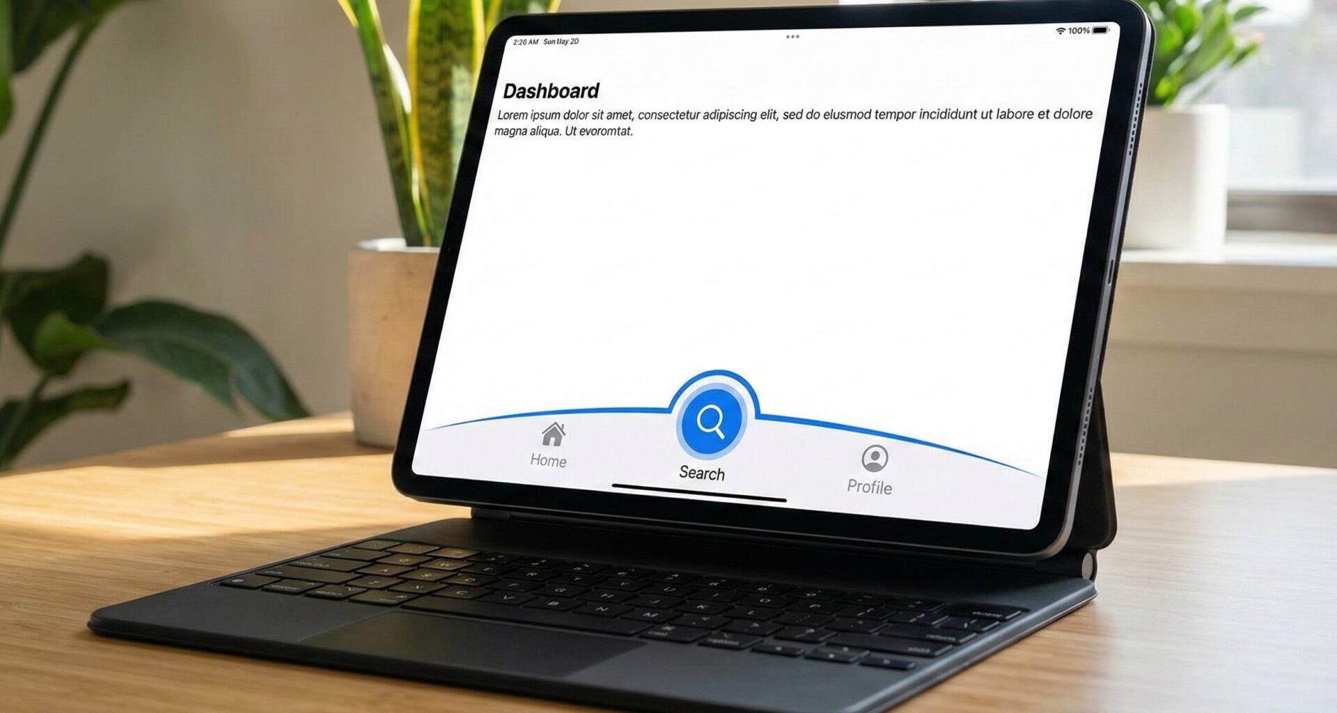
5. Building the Curved Tab Bar in SwiftUI
Now that we have the mathematical shape and our data, let’s assemble the main visual piece. Create a file named CustomTabBar.swift.
Here we must keep something crucial in mind: Xcode and the SwiftUI framework handle spatial layout very well with HStack, but since we want to add a central button that rises above the bar, we will use a ZStack along with an HStack.
import SwiftUI

struct CustomTabBar: View {
    @Binding var selectedTab: TabItem
    var action: () -> Void // Action for the central button

    var body: some View {
        ZStack {
            // 1. The background with the curved shape
            CurvedShape()
                .fill(Color(UIColor.systemBackground))
                .shadow(color: Color.black.opacity(0.1), radius: 10, x: 0, y: -5)
                .frame(height: 80)

            // 2. The Tab Bar icons
            HStack {
                ForEach(TabItem.allCases.prefix(2), id: \.self) { tab in
                    TabBarButton(tab: tab, selectedTab: $selectedTab)
                }

                // Spacer to leave room for the central button
                Spacer()
                    .frame(width: 80)

                ForEach(TabItem.allCases.suffix(2), id: \.self) { tab in
                    TabBarButton(tab: tab, selectedTab: $selectedTab)
                }
            }
            .padding(.horizontal, 25)

            // 3. The Central Floating Action Button (FAB)
            Button(action: action) {
                Image(systemName: "plus")
                    .font(.system(size: 24, weight: .bold))
                    .foregroundColor(.white)
                    .frame(width: 60, height: 60)
                    .background(
                        Circle()
                            .fill(LinearGradient(gradient: Gradient(colors: [Color.blue, Color.purple]), startPoint: .topLeading, endPoint: .bottomTrailing))
                    )
                    .shadow(color: .purple.opacity(0.4), radius: 10, x: 0, y: 5)
            }
            .offset(y: -25) // Move it up to fit perfectly into the curve
        }
    }
}

// Subcomponent for each individual button
struct TabBarButton: View {
    var tab: TabItem
    @Binding var selectedTab: TabItem

    var body: some View {
        GeometryReader { proxy in
            Button(action: {
                withAnimation(.spring(response: 0.3, dampingFraction: 0.7)) {
                    selectedTab = tab
                }
            }) {
                VStack(spacing: 4) {
                    Image(systemName: tab.rawValue)
                        .font(.system(size: 22))
                        .foregroundColor(selectedTab == tab ? .blue : .gray)

                    if selectedTab == tab {
                        Circle()
                            .fill(Color.blue)
                            .frame(width: 5, height: 5)
                            .matchedGeometryEffect(id: "TabIndicator", in: animationNamespace)
                    }
                }
                .frame(maxWidth: .infinity, maxHeight: .infinity)
            }
        }
        .frame(height: 50)
    }

    @Namespace private var animationNamespace
}
Fluid Animations
Notice the use of matchedGeometryEffect and withAnimation(.spring()). A true iOS Developer knows that static animations are boring. By using matchedGeometryEffect, when the user taps another tab, the small blue dot below the icon will smoothly “fly” to the new icon, providing a visual delight that elevates the quality of the curved Tab Bar in SwiftUI.
6. Cross-Platform Integration: iOS, macOS, and watchOS
As promised, this tutorial covers cross-platform development in Xcode. Modern Swift programming with SwiftUI allows us to reuse logic, but the UX varies dramatically across an iPhone, a Mac, and an Apple Watch.
Here we will use conditional compilation (#if os()) to adapt our main view (ContentView.swift).
Implementation in ContentView
import SwiftUI

struct ContentView: View {
    @State private var currentTab: TabItem = .home

    var body: some View {
        #if os(iOS)
        iOSLayout()
        #elseif os(macOS)
        macOSLayout()
        #elseif os(watchOS)
        watchOSLayout()
        #endif
    }

    // MARK: - iOS Layout
    @ViewBuilder
    func iOSLayout() -> some View {
        ZStack(alignment: .bottom) {
            // Main Content
            TabView(selection: $currentTab) {
                Text("Home View").tag(TabItem.home)
                Text("Search View").tag(TabItem.search)
                Text("Favorites View").tag(TabItem.favorites)
                Text("Profile View").tag(TabItem.profile)
            }
            // Hide the native TabBar
            .toolbar(.hidden, for: .tabBar)

            // Our Custom Curved Tab Bar
            CustomTabBar(selectedTab: $currentTab) {
                print("Central button pressed on iOS")
            }
            .padding(.bottom, UIApplication.shared.windows.first?.safeAreaInsets.bottom == 0 ? 15 : 0)
        }
        .ignoresSafeArea(.keyboard, edges: .bottom)
    }

    // MARK: - macOS Layout
    @ViewBuilder
    func macOSLayout() -> some View {
        NavigationSplitView {
            // On macOS, a SideBar is usually better than a bottom Tab Bar
            List(selection: $currentTab) {
                ForEach(TabItem.allCases, id: \.self) { tab in
                    Label(tab.title, systemImage: tab.rawValue)
                        .tag(tab)
                }
            }
            .listStyle(SidebarListStyle())

            Button("Main Action") {
                print("Mac action button pressed")
            }
            .buttonStyle(.borderedProminent)
            .padding()

        } detail: {
            // Content
            Text("You are in the section: \(currentTab.title)")
                .font(.largeTitle)
        }
    }

    // MARK: - watchOS Layout
    @ViewBuilder
    func watchOSLayout() -> some View {
        // On the small watch screen, a curved bottom TabBar makes no spatial sense.
        // We use watchOS's native paginated TabView for a proper UX.
        TabView(selection: $currentTab) {
            VStack {
                Image(systemName: TabItem.home.rawValue).font(.title)
                Text("Home")
            }
            .tag(TabItem.home)

            VStack {
                Image(systemName: TabItem.search.rawValue).font(.title)
                Text("Search")
            }
            .tag(TabItem.search)

            // We replace the floating button with a quick action main view
            Button(action: {
                print("Action on watchOS")
            }) {
                Image(systemName: "plus.circle.fill")
                    .font(.system(size: 60))
                    .foregroundColor(.blue)
            }
            .buttonStyle(PlainButtonStyle())
            .tag(TabItem.favorites) // Using a temporary tag for the example
        }
        .tabViewStyle(PageTabViewStyle())
    }
}
Understanding Cross-Platform Architecture
This is the true power of Swift and SwiftUI.
- iOS: We render our curved Tab Bar in SwiftUI anchored to the bottom of the screen using a
ZStack. We are careful withsafeAreaInsetsto ensure the bar doesn’t overlap with the iPhone’s home indicator. - macOS: Forcing a mobile-style bottom Tab Bar on a Mac breaks Apple’s Human Interface Guidelines (HIG). Like a good iOS Developer (and Mac Developer), we transform the navigation into a side
NavigationSplitView, which is idiomatic for desktop, maintaining the sameTabItemenum as the source of truth. - watchOS: The screen is extremely limited. Rendering Bézier curves here would take up valuable content space. We adapt our data structure to a
PageTabViewStyle(), which is the natural way users navigate on their watch.
7. Advanced Optimization and Best Practices in Xcode
If you are going to publish a tutorial or take this implementation into a commercial production app on the App Store, you need to ensure your code is robust.
A. Accessibility
Never forget accessibility. In the TabBarButton view, add accessibility modifiers so VoiceOver can read them correctly:
Button(action: { /* ... */ }) { /* ... */ }
.accessibilityLabel(Text(tab.title))
.accessibilityAddTraits(selectedTab == tab ? .isSelected : [])
B. Performance and GeometryReader
Many developers abuse GeometryReader, which can cause excessive layout calculations in SwiftUI resulting in frame drops or “jankiness” during scrolling. In our CurvedShape code, we don’t use GeometryReader at all; we directly pass the CGRect provided by the Shape protocol. This guarantees lightning-fast graphical performance processed directly by Apple’s graphics engine.
C. Dark Mode
Using system colors like UIColor.systemBackground in iOS (or NSColor.windowBackgroundColor in macOS if you were drawing it there) ensures that when the user switches their device to Dark Mode, your curved Tab Bar in SwiftUI automatically inverts its background without requiring additional conditional code from you. Shadows should also be adjusted (using semi-transparent colors instead of opaque gray) so they look good in both schemes.
Conclusion
You have just built and thoroughly understood a top-tier user interface component. As an iOS Developer, learning Swift programming at this level—manipulating Path, mastering transitions with matchedGeometryEffect, and orchestrating cross-platform logic in Xcode—is what differentiates junior programmers from senior app architects.
The curved Tab Bar in SwiftUI is just the beginning. You can experiment by adding a gradient instead of a solid color, or perhaps make the curve animate responsively depending on which side of the screen the user touches. The limit is dictated by your creativity and the powerful declarative API of SwiftUI.
If you have any questions about this article, please contact me and I will be happy to help you 🙂. You can contact me on my X profile or on my Instagram profile.