


As an iOS Developer, one of the biggest challenges in your daily workflow is ensuring that the design delivered by the UI/UX team looks exactly the same on the final device’s screen. For years, this pixel-to-code translation was a tedious process prone to precision errors. However, with the evolution of Swift programming and declarative user interface frameworks, the landscape has completely changed.
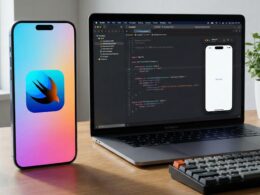
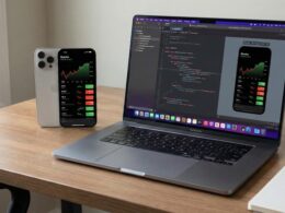
In this comprehensive tutorial, you will learn step-by-step how to convert Sketch to SwiftUI, creating beautiful, scalable, accessible, and highly functional interfaces. Best of all, this knowledge won’t be limited exclusively to iPhone screens; we will teach you how to leverage the combined power of SwiftUI and Xcode to bring your designs to multiple platforms like iOS, macOS, and watchOS using a single unified language: Swift.
1. The New Paradigm of the iOS Developer: Thinking in Declarative Format
Before opening your design tool in Sketch or initializing your environment in Xcode, it is crucial to understand how the conceptual bridge between design and code works under modern standards. In the past, working with UIKit, we thought in absolute coordinates (X and Y axes), complex Auto Layout constraints, and imperative patterns (indicating step-by-step how to build and modify the view).
Today, with the rise of SwiftUI, our mindset shifts towards a declarative model: we describe *what* should be shown on the screen based on the current state of the application. When you look at a finished design in Sketch, you should no longer see it as a flat, static canvas, but as a hierarchical tree of dynamic components. This is the fundamental essence of contemporary Swift programming. Each layer group, artboard, or modular component in Sketch will translate almost directly to layout containers in your code, such as structural stacks (VStack, HStack, and ZStack).
Why Sketch and SwiftUI are the perfect combination for production
- Vectorial and Mathematical Nature: Sketch is inherently vector-based, and SwiftUI renders all its elements based on pure screen mathematics. A 12px border corner radius defined by a designer in Sketch translates directly to a logical code modifier using a simple extension method in Swift.
- Symbols equivalent to Reusable Components: The so-called “Symbols” within the Sketch ecosystem are conceptually and practically equivalent to reusable
Viewstructures in SwiftUI. This allows you to modularize your interface and maintain a DRY (Don’t Repeat Yourself) principle. - Unified Development Ecosystem: By writing optimized declarative code in Xcode, the UI you compile based on your Sketch file can be natively exported to all Apple hardware with marginal modifications, accelerating the “Time-to-Market” of any digital product.
2. Analyzing the Sketch Design Before Coding
The most common mistake of a junior iOS Developer is opening a new file in Xcode and starting to type interface code without having meticulously dissected the anatomy of the original design. For this tutorial, we will take a standard but complex component as an example: a professionally designed “User Profile Card” in Sketch.
Step 2.1: Identifying Boxes and Containers (The Box Model)
Open your Sketch file. Select the artboard containing the profile card. You will see that it is visually composed of the following elements:
- A background container (A rectangle with rounded corners, a subtle gradient, and a drop shadow).
- A user avatar (A circularly cropped image with a contrasting top border).
- Text blocks (The user’s name in bold typography and their role or profession just below in a more neutral tone).
- Social interaction buttons (Aligned horizontally next to each other at the base of the card).
Let’s mentally map this distribution to logical SwiftUI containers:
- The vertical alignment grouping the Avatar, Text block, and Buttons will be structured under a
VStack(Vertical Stack). - The action buttons placed side by side will be grouped within an
HStack(Horizontal Stack). - The background container that sits behind all our interactive content can be elegantly resolved using a
ZStack(Depth Stack) or directly using the versatile.background()modifier on our main stack.
Step 2.2: Comprehensive Audit of Design Tokens
In the right panel of Sketch (the Inspector), do a detailed technical inspection of the following values and note them down:
- Color Palette: Extract the exact hexadecimal (HEX) or RGB codes for both active states and backgrounds. Identify if there are complex gradients and note their stops and tilt angles.
- Typography System: Identify the font family (e.g., San Francisco or New York), font weight (Bold, Semibold, Regular, Light), size in points (pt), and character spacing or line height (Kerning/Line Height).
- Visual Effects and Shadows: Document the offset values on the X axis, Y axis, blur level (Blur), and spread (Spread), along with the exact opacity expressed in alpha channels of that shadow.
3. Setting Up the Multiplatform Project in Xcode
Once the analysis and data collection from Sketch is complete, it’s time to initialize the development environment within our preferred IDE. We will set up a structured project to natively support multiple platforms concurrently.
- Launch Xcode and select the option to create a new project: “Create a new Xcode project”.
- In the template selection window, click on the top tab named Multiplatform and then select the App icon. Click next.
- Assign a descriptive name to your product (for this guide, we’ll use
SketchToSwiftUI). - Strictly validate that the interface selected by default is SwiftUI and that the main development language is set to Swift.
By opting for a multiplatform project architecture, Xcode will automatically segment an organizational structure that includes a shared code directory. The direct benefit of modern Swift programming under this paradigm is that about 90% of the source code determining the logic and visual layout of your interface will reside in this shared layer. We will only make small, surgical code bifurcations to optimize the end-user experience on the wrist (watchOS) or in desktop window management on macOS systems.
4. Extracting Graphic Resources (Assets) from Sketch to Xcode
To ensure that the process of converting from Sketch to SwiftUI is meticulously faithful to the original concept, we must migrate all graphic resources ensuring their maximum resolution and technical fidelity.
Proper Export of Graphic Elements and Iconography
- Within the Sketch interface, select the vector layers corresponding to action icons and static images (like the sample avatar photo).
- Go to the bottom right corner of the inspector panel and click on the Make Exportable option.
- To ensure full scalability on Retina displays, export vector elements using native PDF or SVG formats. Xcode processes vector files completely natively, eliminating the historical need to compile individual assets into rasterized @1x, @2x, and @3x resolutions.
- Navigate in your Xcode project to the resource catalog file named
Assets.xcassets, create a new group, and drag and drop your SVG or PDF files. Make sure to check the “Preserve Vector Data” box in the properties panel to maintain the mathematical capabilities of the vector at runtime.
Centralized Configuration of the Color System (Color Sets)
Writing hardcoded hexadecimal color codes throughout your code files is considered a bad architectural practice. Instead, we will use the Asset catalog to abstract our color tokens:
- Inside your
Assets.xcassets, right-click on the element sidebar and select the New Color Set option. - Name this resource faithfully respecting the nomenclature of the design system established in your Sketch file (e.g.,
BrandPrimary). - In the attributes panel, change the input method to Hexadecimal format and enter the exact values copied from Sketch. Additionally, this infrastructure allows you to define a specific color variant for Light Mode and another for Dark Mode in the same asset, a fundamental requirement to stand out as a professional iOS Developer today.
5. The Core of the Tutorial: Converting from Sketch to SwiftUI Step by Step
With our entire configuration suite set up, let’s move on to writing the source code that will bring our profile card to life. We will create an independent modular component called ProfileCardView.
5.1: Establishing the Structural Skeleton Using Stacks
If the analyzed view in Sketch determines that a set of elements are stacked linearly vertically, we will start our structure by implementing a VStack container in SwiftUI:
import SwiftUI

struct ProfileCardView: View {
    var body: some View {
        VStack(spacing: 16) {
            // The Avatar component will be integrated here

            // The hierarchical Text block will be integrated here

            // The Buttons HStack container will be integrated here
        }
        .padding(24)
        .background(Color("CardBackground")) // Custom color extracted from Sketch
        .cornerRadius(20)
    }
}
Advanced technical note: The spacing: 16 initialization property configured in our VStack mathematically responds to the exact distance in pixels that you can measure within the Sketch environment by holding down the Option (⌥) key between different selected layers.
5.2: Translating Visual Layers to Native SwiftUI Components
The Avatar Component: In Sketch, our avatar is represented by a circular container with symmetrical dimensions of 80×80 pixels with an embedded image mask. The native and intuitive equivalent using Swift programming is built as follows:
Image("avatar_sample")
    .resizable()
    .aspectRatio(contentMode: .fill)
    .frame(width: 80, height: 80)
    .clipShape(Circle())
    .shadow(color: Color.black.opacity(0.1), radius: 10, x: 0, y: 5)
Look closely at how each attribute defined in Sketch’s Properties Inspector (width and height dimensions, opacities, and shadow blurs) sequentially translates into clean, chainable modifiers in Swift.
The Hierarchical Typography Block: Let’s assume that in Sketch the main title exposes the following characteristics: *Font: SF Pro Display, Weight: Bold, Size: 24pt, Color: #333333*. The role subtitle exposes: *Weight: Medium, Size: 14pt, Secondary Color*. Your semantic translation into clean code would be:
VStack(spacing: 4) {
    Text("Maria Lopez")
        .font(.system(size: 24, weight: .bold, design: .default))
        .foregroundColor(Color("TextPrimary"))

    Text("Senior iOS Developer")
        .font(.system(size: 14, weight: .medium))
        .foregroundColor(.secondary)
}
5.3: The Effects Inspector: Advanced Shadows and Outline Borders
The process to successfully convert Sketch to SwiftUI requires extreme attention to fine detail. Drop shadows in design software use Blur Radius and Spread parameters. In Apple’s framework, the structural .shadow() modifier receives a radius (radius) that equates to approximately half the blur value set in Sketch, accompanied by the corresponding directional integer offsets for x and y.
If your Sketch design stipulates that one of the bottom buttons does not have a solid background, but only a stylized outer linear border, the correct way to render that behavior in code is by applying a stroke overlay:
Button(action: {
    // Button operational logic
}) {
    Text("Contact")
        .font(.headline)
        .frame(maxWidth: .infinity)
        .padding()
        .background(Color.clear)
        .foregroundColor(Color("BrandPrimary"))
        .overlay(
            RoundedRectangle(cornerRadius: 12)
                .stroke(Color("BrandPrimary"), lineWidth: 2) // Exact representation of Sketch's outer border
        )
}
5.4: Assembling the Complete View Architecture
By unifying all our previously analyzed fine-grained components, the final architecture of our modular structure built with SwiftUI is consolidated as follows:
struct ProfileCardView: View {
    var body: some View {
        VStack(spacing: 20) {
            Image("avatar_sample")
                .resizable()
                .aspectRatio(contentMode: .fill)
                .frame(width: 100, height: 100)
                .clipShape(Circle())
                .shadow(color: Color.black.opacity(0.15), radius: 8, x: 0, y: 4)

            VStack(spacing: 6) {
                Text("Maria Lopez")
                    .font(.system(size: 24, weight: .bold))
                    .foregroundColor(.primary)

                Text("Senior iOS Developer")
                    .font(.subheadline)
                    .foregroundColor(.secondary)
            }

            HStack(spacing: 16) {
                Button(action: {}) {
                    Text("Message")
                        .fontWeight(.semibold)
                        .foregroundColor(.white)
                        .frame(maxWidth: .infinity)
                        .padding(.vertical, 12)
                        .background(Color.blue)
                        .cornerRadius(10)
                }

                Button(action: {}) {
                    Text("Follow")
                        .fontWeight(.semibold)
                        .foregroundColor(.blue)
                        .frame(maxWidth: .infinity)
                        .padding(.vertical, 12)
                        .overlay(
                            RoundedRectangle(cornerRadius: 10)
                                .stroke(Color.blue, lineWidth: 2)
                        )
                }
            }
        }
        .padding(24)
        .background(Color(.systemBackground))
        .cornerRadius(20)
        .shadow(color: Color.black.opacity(0.08), radius: 15, x: 0, y: 10)
        .padding(.horizontal)
    }
}
6. Ecosystem Multiplatform Adaptability: iOS, macOS, and watchOS
As we highlighted at the beginning of this article, the key competencies of a top-tier iOS Developer lie in the ability to squeeze the versatility of Swift programming to deploy efficient and native software across the entire spectrum of Apple devices. The profile card component we just coded will fluidly adapt to an iPhone terminal but requires optimization strategies to shine in Mac environments or on the small screens of smartwatches.
Layout Adaptation via Compiler Directives
We can instruct the Xcode compiler using conditional macros like #if os() to surgically modify the structure or behavior of components based on the operating system on which the application is running:
struct ProfileCardView: View {
    var body: some View {
        VStack(spacing: 16) {
            // The Avatar and text section remain shared

            #if os(iOS)
            // Display a horizontal layout optimized for iPhone touch screens
            ActionButtonsCompactHStack()
            #elseif os(macOS)
            // Display a layout adapted to the mouse pointer and desktop context menus
            ActionButtonsDesktopLayout()
            #elseif os(watchOS)
            // Restructure the UI by stacking buttons vertically due to screen width limitations
            ActionButtonsWatchOSVerticalStack()
            #endif
        }
    }
}
Fluid and Intrinsic Dynamic Adaptation
Fortunately, SwiftUI provides advanced native mechanisms to mitigate the excessive use of precompilation conditionals. If we choose to implement native typographic semantic styles such as .font(.title) or .font(.body) instead of setting hard numerical values in points, the operating system’s internal engine will scale and readjust text proportions completely organically. The design will adapt ideally on a large Studio Display monitor running macOS, as well as in the ultra-compact dimensions of a latest-generation Apple Watch Ultra.
Additionally, modern composition tools in the Swift language like the conditional container ViewThatFits automatically evaluate the dimensions of the available screen space in real time, selecting the alternative interface design variant that best accommodates current physical hardware constraints without causing pixel overflows.
7. Specialized Tools and Plugins to Accelerate Your Workflow
Although deep knowledge for manually translating components is a mandatory technical skill for any experienced developer, the current market offers multiple automated tools to optimize your delivery times when you need to convert Sketch to SwiftUI in high-speed development environments:
- Native Sketch Plugins: There are various utilities created by the global development community that allow you to select any layer or complex vector group directly on the Sketch artboard and immediately export a functional code snippet with all color parameters, stylized borders, and shadows ready for use.
- Handoff Systems like Zeplin or Avocode: These specialized platforms act as intermediate bridges in large multidisciplinary teams. They have the ability to process source Sketch files and generate automatic source code extensions in Swift containing the entire semantic structure of global colors and typographic fonts, minimizing human transcription errors.
- The Xcode Previews Canvas: The real operational revolution in building contemporary software is the live preview system within Xcode. By placing your open Sketch file on a secondary monitor and your development environment on the main screen, every incremental modification made in your source code will render instantly in the interactive simulators of the development canvas without needing to compile the whole application.
8. Golden Rules and Best Practices in Software Engineering
To successfully conclude this technical specialization tutorial, we’ve compiled the best user interface engineering guidelines you should keep in mind in your daily activity as an iOS Developer:
- Banish Fixed Absolute Dimensions: Except for specific icons with immutable dimensions, avoid pigeonholing your containers through restrictive hard frame calls like
.frame(width: 375, height: 200). Always prioritize the smart use of flexible padding (padding), dynamic spacers (Spacer), and maximum expansion constraints (maxWidth: .infinity). This ensures that your product’s interface adapts and flows organically across any device size or split-screen conditions (Split View). - Deconstruct and Modularize Aggressively: If a source code file starts to exceed 150 or 200 lines due to the very high complexity of a design originating in Sketch, it is a clear indicator that you must modularize. Separate logical components into smaller independent structures (like extracting the header or buttons into standalone types). SwiftUI is designed and memory-optimized to process massive trees of ultra-light sub-views incredibly efficiently.
- Prioritize Universal Accessibility: Sketch is a strictly visual environment, but the software product you build must be inclusive. Make sure to complement every graphic and interactive component resulting from the conversion by adding explicit semantic accessibility modifiers via the
.accessibilityLabel()method. This way, users with diverse abilities navigating the system using screen readers like VoiceOver will interact with your app completely naturally. - Adopt the Adaptive Color Approach from Day One: Every time you extract chromatic tokens from Sketch files, proactively demand specific equivalents for dark environments from your design team. Configuring them directly in the Asset Catalog sets in Xcode from early development phases will save your team from costly future refactoring. The framework will automatically resolve aesthetic interface transitions at runtime.
Conclusion
The process focused on converting Sketch to SwiftUI is no longer a tedious, painful translation exposed to constant corrective iterations. Thanks to the development of the declarative paradigm in Swift programming and the suite of advanced technological tools integrated into modern Xcode environments, the task of translating design concepts into real production environments has been transformed into a natural and organic extension of software design.
As a specialized developer, mastering these techniques will grant you the necessary skill to significantly accelerate your development times and empower you to create applications with an excellent level of aesthetic finish and performance, ready to be deployed with pride into the hands of an iPhone user, onto the desktop of a macOS user, or directly onto the wrist of someone wearing an Apple Watch. Apple’s global hardware ecosystem is more unified than ever, and SwiftUI represents the common bridge that makes it possible.