


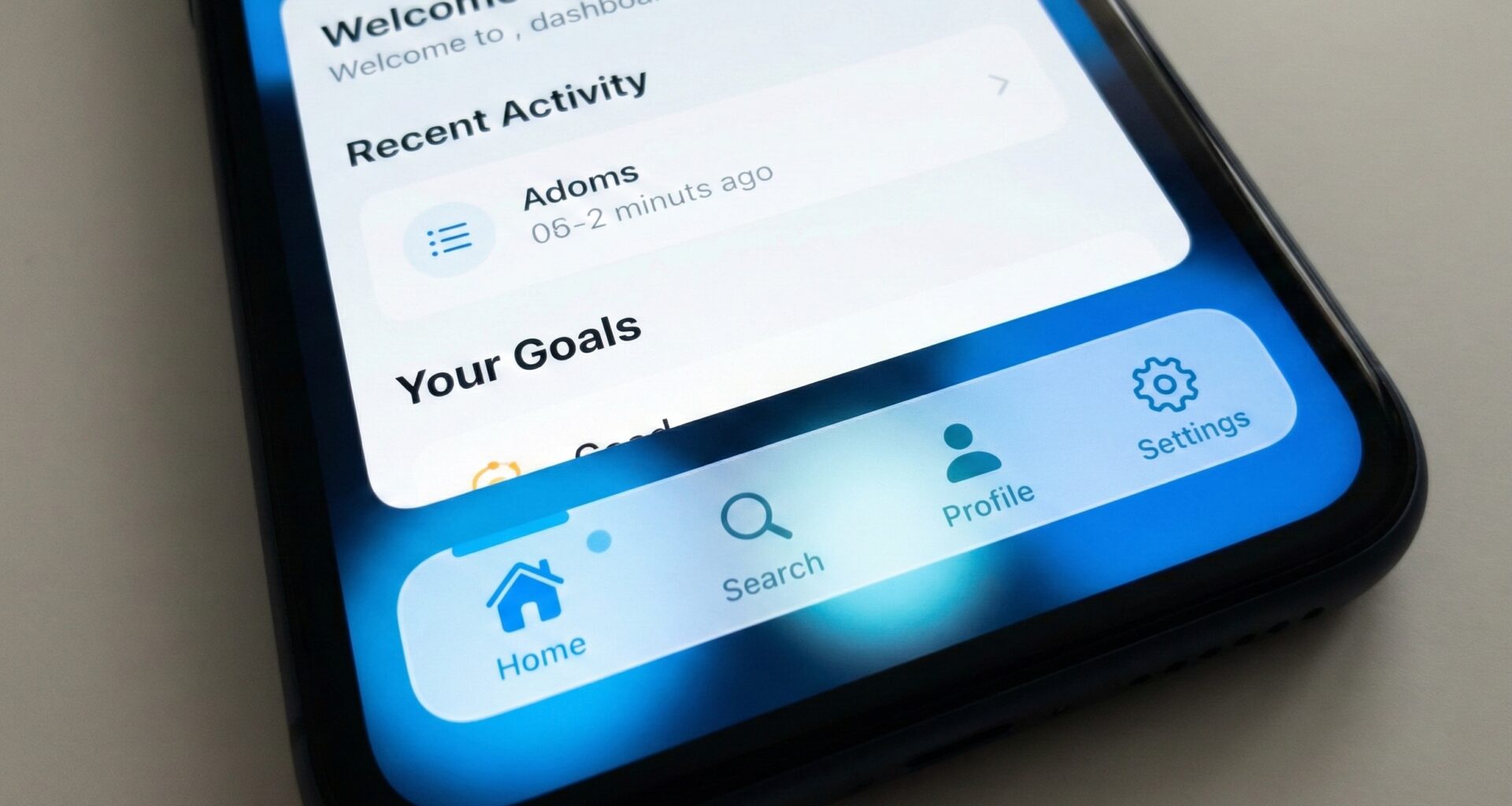
In today’s mobile app development ecosystem, visual differentiation is key. While Apple provides us with robust tools in Xcode, the native TabView component often falls short of modern design demands. If you are an iOS Developer looking to take your Swift programming skills to the next level, this tutorial is for you.
Today we are going to deconstruct and rebuild tab navigation. We won’t just be changing colors; we will create a scalable, animated, and cross-platform architecture that works on iOS, and with logical adaptations, on macOS and watchOS. You will learn to master SwiftUI by manipulating ZStack, MatchedGeometryEffect, and Generics.
1. The Strategy: Why abandon the native TabView?
Apple’s standard TabView is excellent for rapid prototyping and strictly complies with Human Interface Guidelines. However, it has severe limitations:
- It doesn’t allow for easily changing the bar’s height.
- It’s difficult to insert “floating” center buttons (like the “+” button in Instagram or TikTok).
- Selection animations are static and predefined by the system.
To create a Custom TabView in SwiftUI, we must change our mindset. Instead of using the native container, we will orchestrate navigation manually using a state manager. This gives us total control over every pixel and logic.
2. Defining the Data Model (Type-Safe)
In professional Swift programming, we avoid using “Magic Strings” or obscure integer indices. We are going to define our tabs using an Enum. This guarantees type safety and makes iterating in the view easier.
import SwiftUI

// Define the use cases for our navigation
enum Tab: String, CaseIterable {
    case home = "house"
    case search = "magnifyingglass"
    case notifications = "bell"
    case profile = "person"

    // Computed property to get the accessibility title
    var title: String {
        switch self {
        case .home: return "Home"
        case .search: return "Search"
        case .notifications: return "Notifications"
        case .profile: return "Profile"
        }
    }

    // Helper property to get the SF Symbol icon name
    var iconName: String {
        return self.rawValue
    }
}
By conforming to the CaseIterable protocol, we can automatically loop through these tabs with a ForEach, making adding a fifth tab in the future as simple as adding a line to this Enum.
3. Main Container Architecture
The most common mistake when attempting this in Xcode is overlaying a view on top of the native TabView. We won’t do that. We will create a custom container that accepts a @ViewBuilder. This replicates the ease of use of the native SwiftUI API.
struct CustomTabContainerView<Content: View>: View {
    @Binding var selection: Tab
    @ViewBuilder let content: Content

    var body: some View {
        ZStack(alignment: .bottom) {
            // 1. Content Layer
            // We use a ZStack so the content occupies the full screen
            content
                .frame(maxWidth: .infinity, maxHeight: .infinity)
                .ignoresSafeArea() // Important so the background reaches the bottom edge

            // 2. Navigation Layer (Our custom bar)
            CustomTabBar(selection: $selection)
                .padding(.horizontal)
                .padding(.bottom, 24) // Margin to give a floating effect
        }
    }
}
Notice the use of ignoresSafeArea(). In modern design, we often want the content (like a map or a scrollable list) to flow underneath our transparent or floating navigation bar.
4. Designing the CustomTabBar with Advanced Animations
Here lies the visual logic. We will use MatchedGeometryEffect. This is a powerful tool in SwiftUI that allows interpolating the position and size of a view between two different points in the hierarchy. We will use it to smoothly move the background or selection indicator.
struct CustomTabBar: View {
    @Binding var selection: Tab

    // Namespace for the matchedGeometryEffect animation
    @Namespace private var namespace

    var body: some View {
        HStack {
            ForEach(Tab.allCases, id: \.self) { tab in
                tabView(tab: tab)
            }
        }
        .padding(6)
        .background(
            Color.white
                .shadow(color: .black.opacity(0.1), radius: 10, x: 0, y: 5)
        )
        .cornerRadius(30) // Island-style rounded corners
    }

    // Extract the subview to keep code clean
    private func tabView(tab: Tab) -> some View {
        Button {
            // Snappier animation (faster and more elastic)
            withAnimation(.spring(response: 0.3, dampingFraction: 0.7)) {
                selection = tab
            }
        } label: {
            ZStack {
                if selection == tab {
                    // The animated background that "moves" behind the icons
                    Capsule()
                        .fill(Color.blue)
                        .matchedGeometryEffect(id: "selectionIndicator", in: namespace)
                }

                HStack(spacing: 8) {
                    Image(systemName: tab.iconName)
                        .font(.system(size: 20, weight: .semibold))

                    // Show text only if selected to save space
                    if selection == tab {
                        Text(tab.title)
                            .font(.system(size: 14, weight: .semibold))
                            .fixedSize() // Prevents truncation during animation
                    }
                }
                .foregroundColor(selection == tab ? .white : .gray)
                .padding(.vertical, 12)
                .padding(.horizontal, 16)
            }
        }
    }
}
This code creates a “pill” effect that slides from one tab to another. It is a technique highly valued by any senior iOS Developer because it offers a fluid and organic user experience, far superior to the instant switching of the native system.
5. Implementation in the Main View (ContentView)
Now we need to connect the pieces. In our root view, we will manage the state that determines which view is shown. This is where we really see the flexibility of our Custom TabView in SwiftUI.
struct ContentView: View {
    @State private var currentTab: Tab = .home

    // Initializer to hide the native tabbar if necessary
    // although our architecture avoids it completely.
    init() {
        UITabBar.appearance().isHidden = true
    }

    var body: some View {
        CustomTabContainerView(selection: $currentTab) {
            // A switch manages which view is rendered
            switch currentTab {
            case .home:
                HomeView()
            case .search:
                SearchView()
            case .notifications:
                NotificationsView()
            case .profile:
                ProfileView()
            }
        }
    }
}

// Placeholder Views for the example
struct HomeView: View {
    var body: some View {
        Color.blue.opacity(0.1)
            .overlay(Text("Home Screen").font(.title))
            .ignoresSafeArea()
    }
}

struct SearchView: View {
    var body: some View {
        Color.green.opacity(0.1)
            .overlay(Text("Search").font(.title))
            .ignoresSafeArea()
    }
}
// ... Rest of the views ...
6. Cross-Platform Adaptability: macOS and iPadOS
A true expert in Swift and SwiftUI knows that code must be adaptable. A bottom floating bar makes sense on an iPhone, but on a Mac or a landscape iPad, a Sidebar is much more efficient.
We can improve our container using conditional compilation and Size Classes to decide which navigation to show:
struct UniversalNavigationContainer<Content: View>: View {
    @Binding var selection: Tab
    @ViewBuilder let content: Content

    // Detect the platform or horizontal size class
    #if os(iOS)
    @Environment(\.horizontalSizeClass) var sizeClass
    #endif

    var body: some View {
        #if os(macOS)
        // Mac Layout: Sidebar + Content
        HSplitView {
            SidebarView(selection: $selection)
                .frame(minWidth: 200, maxWidth: 250)
            content
        }
        #else
        // iOS Layout
        if sizeClass == .compact {
            // iPhone Portrait: Our Custom TabBar
            CustomTabContainerView(selection: $selection, content: { content })
        } else {
            // iPad Landscape: Sidebar Style
            HStack {
                SidebarView(selection: $selection)
                content
            }
        }
        #endif
    }
}

struct SidebarView: View {
    @Binding var selection: Tab

    var body: some View {
        VStack(alignment: .leading, spacing: 20) {
            ForEach(Tab.allCases, id: \.self) { tab in
                Button(action: { selection = tab }) {
                    Label(tab.title, systemImage: tab.iconName)
                        .foregroundColor(selection == tab ? .blue : .primary)
                        .padding()
                        .background(selection == tab ? Color.blue.opacity(0.1) : Color.clear)
                        .cornerRadius(10)
                }
            }
            Spacer()
        }
        .padding()
    }
}
7. Technical Challenge: Custom Shapes with Path
To finish this advanced Swift programming tutorial, we are going to create a custom shape. Many designs require a curve in the navigation bar (like a convex notch). For this, we must draw with Path.
struct CurvedTabBarShape: Shape {
    func path(in rect: CGRect) -> Path {
        var path = Path()

        // Start points
        path.move(to: CGPoint(x: 0, y: 0))
        path.addLine(to: CGPoint(x: rect.width, y: 0))
        path.addLine(to: CGPoint(x: rect.width, y: rect.height))
        path.addLine(to: CGPoint(x: 0, y: rect.height))

        // Drawing the central curve (simplified)
        let center = rect.width / 2

        path.move(to: CGPoint(x: center - 50, y: 0))

        // Bezier Curve to create the notch
        path.addQuadCurve(
            to: CGPoint(x: center + 50, y: 0),
            control: CGPoint(x: center, y: 50)
        )

        return path
    }
}
You can apply this shape using .clipShape(CurvedTabBarShape()) on your custom bar to achieve a unique look that stands out in the App Store.
Conclusion
As we have seen, creating a Custom TabView in SwiftUI is not just an aesthetic matter; it is a software architecture exercise. By separating navigation logic from the view, we gain maintainability and flexibility.
This approach allows you to:
- Have total control over animations.
- Integrate complex business logic into tab selection (like requiring login before entering the profile).
- Adapt the interface for iOS, macOS, and watchOS from a unified code base in Xcode.
Next time you open a project, don’t settle for the basics. Experiment, break the native components, and build experiences that define the quality of a true iOS Developer.
If you have any questions about this article, please contact me and I will be happy to help you 🙂. You can contact me on my X profile or on my Instagram profile.

