


As an iOS Developer, one of the most common tasks you will face in your day-to-day work is building intuitive, attractive, and highly functional user interfaces. Since the introduction of SwiftUI, Apple’s declarative paradigm has completely transformed Swift programming, allowing us to create complex views with just a few lines of code.
One of the most essential interactive elements in any application is the button. However, a text-only button is often not enough to communicate its function quickly and effectively. This is where icons come into play. In this extensive and detailed tutorial, we will learn step-by-step how to create a button with a system image in SwiftUI, using Apple’s powerful icon library (SF Symbols).
Furthermore, we will see how the Swift and Xcode ecosystem allows us to write this code once and deploy it seamlessly across multiple platforms, including iOS, macOS, and watchOS.
1. Prerequisites and Development Environment
Before we dive into the code, make sure you have your development environment set up. To follow this Swift programming tutorial, you will need:
- Mac: A Mac computer running macOS (preferably the latest stable version).
- Xcode: Apple’s official Integrated Development Environment (IDE). Make sure you have a recent version (Xcode 15 or higher is ideal to take advantage of the latest SwiftUI features).
- SF Symbols (Optional but recommended): You can download the SF Symbols app from the Apple Developer portal. It is an invaluable visual tool for searching, browsing, and previewing the thousands of available system icons.
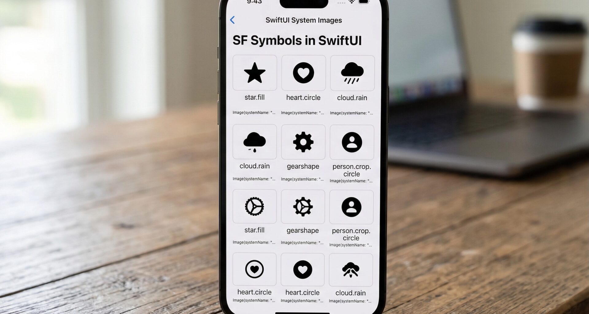
2. What are “System Images” (SF Symbols)?
When we talk about a “system image” in the Apple ecosystem, we are referring to SF Symbols. This is an iconography library designed specifically by Apple to integrate seamlessly with San Francisco, the system font for all its platforms.
The great advantage for an iOS Developer is that you don’t need to design, export, and import dozens of icons in different resolutions (1x, 2x, 3x) into your Xcode Asset Catalog. “System Images” behave like text: they scale without losing quality, respond to Dynamic Type sizes, and support different weights to adapt to your application’s design.
3. The Anatomy of a Button in SwiftUI
In SwiftUI, the structure of a button is incredibly semantic and straightforward. The Button view separates the action (what happens when it’s tapped) from the label (what the button looks like).
The most basic syntax in Swift is as follows:
Button("Click here") {
    // Swift programming logic goes here
    print("The button was pressed")
}
However, when we want to create a button with a system image in SwiftUI, we need to use a different initializer that allows us to define a custom view for the label (the label).
4. Creating Your First Button with an Icon
Let’s get practical. Open Xcode, create a new “App” project using SwiftUI as the interface and Swift as the language.
Head over to your ContentView.swift file. To create a button with a system image in SwiftUI, we will use the Image view, passing it the systemName parameter.
Basic Example: Icon Only
If you want a circular button that only shows a star icon, the code would look like this:
import SwiftUI

struct ContentView: View {
    var body: some View {
        Button(action: {
            print("Star pressed")
        }) {
            Image(systemName: "star.fill")
                .font(.largeTitle) // We adjust the size as if it were text
                .foregroundColor(.yellow) // We give it color
        }
    }
}
What is happening here?
action: Defines the block of code that will be executed.Image(systemName: "star.fill"): Calls the specific icon from the SF Symbols library..font(.largeTitle): Since system images behave like vector fonts, we use the.fontmodifier to change their size.
Practical Example: Icon + Text (The Label component)
Often, the best user experience requires both an icon and text. Although you could build this using an HStack with an Image and a Text inside the button, SwiftUI provides us with a view optimized exactly for this purpose: Label.
import SwiftUI

struct ContentView: View {
    var body: some View {
        Button(action: {
            print("Starting download...")
        }) {
            Label("Download", systemImage: "arrow.down.circle.fill")
                .font(.headline)
                .padding()
                .foregroundColor(.white)
                .background(Color.blue)
                .cornerRadius(10)
        }
    }
}
Using Label is Apple’s most recommended practice. Not only does it perfectly align the text with the icon based on the base font, but it also automatically improves accessibility (VoiceOver).
5. Advanced Button Customization in Xcode
As an iOS Developer, you will want your buttons to stand out and adapt to your brand’s visual identity. Modern Swift programming offers us Style Modifiers that make the code clean and reusable.
Button Style Modifiers (Button Styles)
Starting with recent iterations of SwiftUI, Apple introduced predefined styles that make it easy to create attractive buttons without having to manually define padding, background, and borders.
Let’s see how to apply the .borderedProminent style:
struct ContentView: View {
    var body: some View {
        VStack(spacing: 20) {
            // Prominent Button (ideal for main Call to Actions)
            Button(action: {
                // Action
            }) {
                Label("Confirm Purchase", systemImage: "creditcard.fill")
            }
            .buttonStyle(.borderedProminent)
            .tint(.green) // Changes the main accent color

            // Bordered Button (ideal for secondary actions)
            Button(action: {
                // Action
            }) {
                Label("Add to Favorites", systemImage: "heart")
            }
            .buttonStyle(.bordered)
            .tint(.red)
        }
        .padding()
    }
}
Customizing the behavior of “System Images”
SF Symbols are not flat and boring icons. They support rendering modes and dynamic scaling.
- Image Scale: You can define whether the icon should look small, medium, or large in relation to the accompanying text.
- Symbol Rendering Mode: Many Apple icons have multiple layers. You can render them in a single color (monochrome), with predefined colors by Apple (multicolor), or define the colors of each layer yourself (palette).
Button(action: {
    print("Share")
}) {
    Image(systemName: "square.and.arrow.up.circle.fill")
        .symbolRenderingMode(.palette)
        .foregroundStyle(.white, .blue) // The first color is the arrow/square, the second is the circle background
        .imageScale(.large)
}
This level of customization is what differentiates an average developer from an expert iOS Developer who masters their environment in Xcode.
6. Animations: Bringing Your Buttons to Life (New in iOS 17+)
A static interface can feel outdated. With recent updates in Swift programming, Apple introduced Symbol Effects, a native and ridiculously simple way to animate System Images within SwiftUI.
Let’s say you want a “notification bell” button to bounce slightly when the user taps it.
import SwiftUI

struct NotificationView: View {
    @State private var animateBell = false

    var body: some View {
        Button(action: {
            // We change the state to trigger the animation
            animateBell.toggle()
        }) {
            Label("Notifications", systemImage: "bell.fill")
                .font(.title)
        }
        .buttonStyle(.bordered)
        // The magic of SwiftUI:
        .symbolEffect(.bounce, value: animateBell)
    }
}
With just the line .symbolEffect(.bounce, value: animateBell), the bell icon will physically bounce every time the state variable changes, without needing to write complex animations with withAnimation.
7. Cross-Platform Magic: iOS, macOS, and watchOS
One of the reasons SwiftUI is so revolutionary is its promise: “Learn once, apply anywhere”.
The code we just wrote to create a button with a system image in SwiftUI is not exclusive to the iPhone. If you open Xcode and change the Target of your build to macOS or watchOS, you will realize something amazing: the code compiles and works perfectly without modifications.
Platform Considerations
Although the code is the same, SwiftUI is smart enough to adapt the button’s appearance to the “Human Interface Guidelines” (HIG) of each device:
- iOS/iPadOS: The button will adopt the standard touch area (at least 44×44 points) ideal for fingers, using the characteristic system tints.
- macOS: The button will look smaller and denser, ideal for a mouse pointer, often adopting a “flatter” style or subtle shadows characteristic of the Mac.
- watchOS: The button will stretch and adapt to the deep black background of the Apple Watch OLED screens. Buttons are usually large (“Capsule” or circular) to facilitate quick interaction from the wrist.
This level of adaptability saves you weeks of code rewriting if you decide to expand your mobile app to the watch or desktop computer.
8. Accessibility: Programming for Everyone
A crucial aspect that every iOS Developer must internalize is accessibility. When you decide to create a button with a system image in SwiftUI that only has an icon (without text next to it), you are creating a barrier for users with visual impairments who use VoiceOver.
VoiceOver will read the systemName of the image by default, which is not always friendly (reading “square.and.arrow.up” instead of “Share” is confusing).
To solve this in your Swift programming, you must always provide an accessibilityLabel:
Button(action: {
    // Logic to add to cart
}) {
    Image(systemName: "cart.badge.plus")
        .font(.title2)
}
.accessibilityLabel("Add to shopping cart")
If you use the Label component as we saw in previous sections, SwiftUI automatically uses the text you passed as the accessibility label, making it the most robust and safe option by default.
9. Conclusion and Next Steps
As we have seen throughout this extensive tutorial, to create a button with a system image in SwiftUI goes far beyond simply placing an icon on the screen. We have explored the rich SF Symbols library, how to scale and color using font modifiers and multiple layers, implementing predefined styles, adding smooth animations with Symbol Effects, and the importance of writing accessible code.
The beauty of Swift programming today lies in its declarative elegance. Xcode and SwiftUI handle the heavy lifting of rendering across multiple platforms (iOS, macOS, watchOS), allowing you, the iOS Developer, to focus on what really matters: your application’s logic and the user experience.