


If you are an iOS Developer, you’ve probably realized a universal truth in mobile app development: almost all apps are, at their core, lists of data. From the Instagram feed to the Settings app on your iPhone, lists are the fundamental component of the user interface.
In modern Swift programming, Apple has given us an incredibly powerful tool to handle this: List. However, displaying data is only half the battle; the other half is presentation. This is where the ListStyle in SwiftUI modifier comes into play.
In this tutorial, we will explore in depth what it is, how it works, and how you can leverage this modifier in Xcode to build spectacular, native interfaces using SwiftUI and Swift across the entire Apple ecosystem: iOS, macOS, and watchOS.
The Evolution: From UITableView to List in SwiftUI
Before diving into design, it’s crucial to understand where we come from. Veterans of Swift programming and Objective-C will remember the days of UITableView and UICollectionView. Building a list required configuring delegates (UITableViewDelegate), data sources (UITableViewDataSource), registering cells, calculating heights, and dealing with the dreaded index-out-of-range errors.
SwiftUI changed the game. Now, creating a list requires just a few lines of declarative code.
import SwiftUI

struct BasicListView: View {
    let languages = ["Swift", "Kotlin", "Python", "Ruby"]

    var body: some View {
        List(languages, id: \.self) { language in
            Text(language)
        }
    }
}
This code is beautiful and concise. But what happens if we want this list to look like a settings menu instead of a contact list? That’s where the magic of styles comes in.
What is ListStyle in SwiftUI?
The ListStyle in SwiftUI modifier is an instance method you apply to a List view to drastically alter its visual appearance and interaction behavior, without having to change absolutely any of your underlying data logic or individual rows.
It is the perfect embodiment of the declarative paradigm of SwiftUI: you describe what you want (a grouped list, a plain list, a carousel), and the framework determines how to render it according to the Human Interface Guidelines (HIG) of the platform it’s running on.
The basic syntax is incredibly simple in Swift:
List {
    // Your data here
}
.listStyle(.styleName)
The fascinating thing for any iOS Developer is that the same style can behave differently depending on whether you compile your project in Xcode for an iPhone, a Mac, or an Apple Watch.
Exploring Styles in iOS
iOS is the main playground for most developers. On iOS, SwiftUI offers several predefined styles that cover almost any imaginable use case.
1. PlainListStyle (.plain)
This is the default style in many situations. It presents rows stretching from one edge of the screen to the other, with subtle separators between them. It is ideal for data-heavy applications where you want to maximize screen space.
import SwiftUI

struct PlainListExample: View {
    var body: some View {
        NavigationStack {
            List(1...20, id: \.self) { index in
                Text("List item \(index)")
            }
            .navigationTitle("Plain Style")
            .listStyle(.plain) // Applying the plain style
        }
    }
}
Ideal use case: Contact lists, message feeds, or any screen where content is king and rounded edges would only steal space.
2. GroupedListStyle (.grouped)
Before iOS 13, this was the standard for settings menus. It groups cells into blocks and gives a light gray background to the container View, making the white cells stand out. The cells still touch the side edges of the screen.
import SwiftUI

struct GroupedListExample: View {
    var body: some View {
        NavigationStack {
            List {
                Section(header: Text("Network Settings")) {
                    Text("Wi-Fi")
                    Text("Bluetooth")
                    Text("Cellular Data")
                }

                Section(header: Text("Notifications")) {
                    Text("Sounds")
                    Text("Do Not Disturb")
                }
            }
            .navigationTitle("Grouped Style")
            .listStyle(.grouped) // Applying the grouped style
        }
    }
}
3. InsetListStyle (.inset)
Similar to the plain style, but it adds a small margin (padding) to the sides of the list. It was a transitional style and is less commonly used by developers today, but it’s still useful if you want a plain list that doesn’t touch the edges of the device.
4. InsetGroupedListStyle (.insetGrouped)
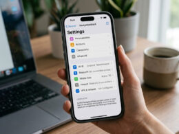
This is currently the “Gold Standard” for any iOS Developer. If you open the Settings app on any modern iPhone, you will see this style. It combines section grouping with side margins and elegantly rounded corners on the cell blocks.
It brings a sense of absolute modernity and cleanliness to any application developed in SwiftUI.
import SwiftUI

struct InsetGroupedListExample: View {
    @State private var isAirplaneModeOn = false

    var body: some View {
        NavigationStack {
            List {
                Section {
                    Toggle("Airplane Mode", isOn: $isAirplaneModeOn)
                    Text("Wi-Fi")
                        .badge("MyHomeNetwork")
                    Text("Bluetooth")
                        .badge("On")
                } footer: {
                    Text("Airplane mode disables all wireless connections.")
                }

                Section {
                    Text("General")
                    Text("Control Center")
                    Text("Display & Brightness")
                }
            }
            .navigationTitle("Settings")
            .listStyle(.insetGrouped) // The modern iOS standard
        }
    }
}
Adapting the Design for macOS
One of the promises of Swift programming and SwiftUI is “Learn once, apply anywhere.” When you open your project in Xcode and add a macOS target, you’ll notice that list concepts change.
Macs have large screens and are operated with a mouse or trackpad. Because of this, the ListStyle in SwiftUI modifier has exclusive options and behaviors adapted for the desktop.
1. SidebarListStyle (.sidebar)
This is arguably the most important style on macOS. It transforms your list into a translucent navigation sidebar (like the one you see in Finder or the Mail app). It automatically applies the correct background material and formats the items to look like top-level menu options.
import SwiftUI

struct MacOSSidebarExample: View {
    let folders = ["Recents", "Applications", "Documents", "Downloads"]
    @State private var selection: String? = "Documents"

    var body: some View {
        NavigationSplitView {
            List(folders, id: \.self, selection: $selection) { folder in
                Label(folder, systemImage: "folder")
            }
            .listStyle(.sidebar) // Native macOS sidebar style
            .navigationTitle("Locations")
        } detail: {
            Text("Viewing contents of: \(selection ?? "Nothing")")
        }
    }
}
Note: On iOS and iPadOS, using .sidebar inside a NavigationSplitView will also render a sidebar properly adapted to the touch device.
2. AlternatingRowBackgrounds (.inset(alternatesRowBackgrounds: true))
In data-driven desktop applications (like spreadsheets or log viewers), it’s very common to have rows with alternating background colors (e.g., white and very light gray) to facilitate horizontal reading. In SwiftUI for macOS, you can easily achieve this.
import SwiftUI

struct MacOSDataListExample: View {
    let transactions = ["Grocery Shopping", "Netflix Payment", "Electric Bill", "Transfer", "Coffee"]

    var body: some View {
        List(transactions, id: \.self) { transaction in
            Text(transaction)
                .padding(.vertical, 4)
        }
        // Apply style with alternating rows for better reading on Mac
        .listStyle(.inset(alternatesRowBackgrounds: true))
    }
}
Mastering the Wrist: watchOS
If you are an iOS Developer who decides to expand your app to the Apple Watch, you’ll encounter the most restrictive yet innovative environment. The screen is tiny, and the main interaction (besides taps) is the Digital Crown.
1. CarouselListStyle (.carousel)
This style is exclusive to watchOS. When you use ListStyle in SwiftUI with the .carousel value, your list takes on a dynamic behavior. As the user turns the Digital Crown, the list items at the top and bottom edges shrink and fade slightly, creating a 3D rolling cylinder effect that is visually very appealing and helps focus the eye on the center item.
import SwiftUI

struct WatchOSCarouselExample: View {
    let workouts = ["Run", "Swim", "Bike", "Yoga", "Strength", "HIIT"]

    var body: some View {
        NavigationStack {
            List(workouts, id: \.self) { workout in
                HStack {
                    Image(systemName: "figure.run.circle.fill")
                        .foregroundColor(.green)
                        .imageScale(.large)
                    Text(workout)
                        .font(.headline)
                }
                .padding(.vertical, 8)
            }
            .navigationTitle("Workouts")
            .listStyle(.carousel) // The magic effect of watchOS
        }
    }
}
2. EllipticalListStyle (.elliptical)
Similar to the carousel, but with a more pronounced focus on curving the edges of the list to match the round or oval shape of the Apple Watch case. It’s an excellent design choice to make the interface feel like it’s truly fused with the hardware.
Best Practices and Performance for the Developer
When using Swift and Xcode to build these lists, there are several things a good professional should keep in mind:
- Performance (Lazy Loading): Lists in
SwiftUIare “lazy” by default. This means that if you have a list with 10,000 items, SwiftUI will only render the views of the items currently visible on the screen. You don’t need to worry about recycling cells like you did withUITableView. - Unique Identifiers: Always provide a reliable
idto yourListorForEach. Using\.selfis fine for simple String arrays, but for complex data models, make sure your structs conform to theIdentifiableprotocol. This allows SwiftUI to animate insertions and deletions correctly regardless of theListStyleyou are using. - Keep it Native: Unless your app is a game or has an extremely aggressive and custom visual branding, trust the system styles. Users are accustomed to how lists look and behave on their devices. Forcing a
.plainstyle and trying to recreate a grouped design manually with paddings and shadows is a bad idea that will break in future iOS updates.
The Power of Cross-Platform
What if you have a single codebase in Xcode for all platforms? You can use compilation directives, but SwiftUI is smart enough.
If you apply .listStyle(.automatic), SwiftUI will decide for you. It will use a plain style on iOS, a sidebar if it’s in the correct hierarchy on macOS, and a carousel on watchOS.
If you need more granular control based on the platform without using #if os(iOS), you can create your own ViewModifiers or extensions:
import SwiftUI

extension View {
    @ViewBuilder
    func adaptiveListStyle() -> some View {
        #if os(iOS)
        self.listStyle(.insetGrouped)
        #elseif os(macOS)
        self.listStyle(.sidebar)
        #else
        self.listStyle(.carousel)
        #endif
    }
}

// Usage:
// List { ... }.adaptiveListStyle()
Conclusion
The ListStyle in SwiftUI modifier is a small but fundamental tool in any iOS Developer’s arsenal. It demonstrates the true power of declarative Swift programming: the total separation between content (your data and rows) and its presentation (system design).
If you have any questions about this article, please contact me and I will be happy to help you  . You can contact me on my X profile or on my Instagram profile.