


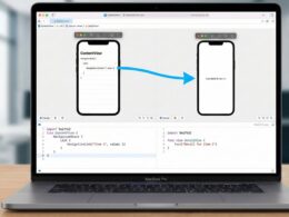
If you are an iOS Developer looking to take your app’s interface to the next level, you have probably run into the limitations of Apple’s native TabView. While it is functional and respects the platform’s design guidelines, in the world of modern development we often need unique interfaces that stand out. This is where the custom Tab Bar in SwiftUI comes into play.
In this tutorial, we will explore in depth what it is, why you should consider building one from scratch, and I will guide you step by step using Swift programming to create a fully tailored bottom navigation system. Furthermore, we will design this component to be compatible not only on iOS, but also on macOS and watchOS, leveraging the versatility offered by Swift, Xcode, and SwiftUI.
What is a Custom Tab Bar and why do you need it?
In the Apple ecosystem, a “Tab Bar” is the primary navigation element usually located at the bottom of the screen in iOS. It allows users to quickly switch between different sections of an application.
The native SwiftUI component for this is TabView. However, if you have tried to change its height, add a protruding central floating button (like Instagram or Twitter), or apply complex animations when switching tabs, you will have noticed that the native system is quite rigid.
Creating a custom Tab Bar in SwiftUI means ditching the native bar (hiding it) or using a ZStack to overlay your own navigation view on top of the content. This gives you absolute control over:
- Animations and transitions.
- Geometric shapes (floating bars, custom rounded corners).
- Responsive behavior across multiple platforms.
Prerequisites
To follow this Swift programming tutorial, make sure you have:
- Xcode 14 or higher (Xcode 15+ recommended for the latest features).
- Intermediate knowledge of SwiftUI (understanding
ZStack,HStack,@State, and@Binding). - A multi-platform project created in Xcode (selecting iOS, macOS, and watchOS if you want to test all the code).
Step 1: Defining the Data Model (The Tabs)
Every good Swift code starts with a solid data model. Instead of using loose strings or integer indices to know which tab we are on, we will use an Enum. This makes our code safe, predictable, and easy to scale.
Create a new file called TabModel.swift in your Xcode project:
import Foundation

// We define the cases for our Tab Bar
enum Tab: String, CaseIterable {
    case home = "house.fill"
    case search = "magnifyingglass"
    case notifications = "bell.fill"
    case profile = "person.fill"

    // Optional title for each tab
    var title: String {
        switch self {
        case .home: return "Home"
        case .search: return "Search"
        case .notifications: return "Alerts"
        case .profile: return "Profile"
        }
    }
}
We use the names of the SF Symbols icons as the raw value (RawValue) of the enum. This will save us time when building the interface in SwiftUI.
Step 2: Building the Custom Tab Bar View
Now we are going to create the visual component. This will be an independent view that receives the currently selected tab through a @Binding, allowing the parent view to update its content when the user taps a button.
Create a file named CustomTabBarView.swift:
import SwiftUI

struct CustomTabBarView: View {
    @Binding var currentTab: Tab

    // We detect the operating system to adjust the design
    #if os(iOS) || os(macOS)
    var iconSize: CGFloat = 24
    #elseif os(watchOS)
    var iconSize: CGFloat = 18
    #endif

    var body: some View {
        HStack(spacing: 0) {
            ForEach(Tab.allCases, id: \.rawValue) { tab in
                Button {
                    withAnimation(.spring(response: 0.3, dampingFraction: 0.7)) {
                        currentTab = tab
                    }
                } label: {
                    VStack(spacing: 4) {
                        Image(systemName: tab.rawValue)
                            .font(.system(size: iconSize, weight: .semibold))
                            // Scale animation when selected
                            .scaleEffect(currentTab == tab ? 1.2 : 1.0)

                        #if !os(watchOS)
                        // We hide the text on watchOS to save space
                        Text(tab.title)
                            .font(.caption2)
                            .fontWeight(currentTab == tab ? .bold : .regular)
                        #endif
                    }
                    .foregroundColor(currentTab == tab ? .blue : .gray)
                    .frame(maxWidth: .infinity)
                    // We add a transparent background to make the whole area clickable
                    .contentShape(Rectangle())
                }
                .buttonStyle(PlainButtonStyle()) // Prevents default styling on macOS
            }
        }
        .padding(.top, 10)
        .padding(.bottom, bottomPadding)
        .background(
            // Custom background with blur and rounded corners
            RoundedRectangle(cornerRadius: 25, style: .continuous)
                .fill(Material.bar)
                .shadow(color: .black.opacity(0.1), radius: 10, x: 0, y: -5)
        )
        .padding(.horizontal)
    }

    // Helper to handle bottom padding based on the platform
    private var bottomPadding: CGFloat {
        #if os(iOS)
        return 15 // Space for the Home Indicator on modern iPhones
        #else
        return 10
        #endif
    }
}
Code Analysis for the iOS Developer
- Animations: We use
withAnimation(.spring(...))inside the button action. This is a fundamental UI technique in Swift programming to give an organic and fluid feel when switching tabs. - Adaptability: Notice the use of the
#if os(iOS)directives. As an iOS Developer, it is vital to remember that SwiftUI is multi-platform, but Apple Watch and Mac screens have different densities and usage patterns. On watchOS, we reduce the icon size and remove the text to avoid cluttering the small screen. - Apple’s Material Design: Using
Material.barin the background provides that translucent effect (glass effect) so characteristic of Apple operating systems.
Step 3: Integrating the Tab Bar into the Main View
With our custom Tab Bar in SwiftUI already designed, we need a place to use it. The strategy here is not to use the standard TabView and hide its bar (although possible, it usually causes “safe area” issues). The best practice in SwiftUI for full control is to use a ZStack and handle the routing manually.
Create (or modify) the ContentView.swift file:
import SwiftUI

struct ContentView: View {
    // Initial application state
    @State private var selectedTab: Tab = .home

    // Hide the native background on macOS if necessary
    init() {
        #if os(iOS)
        UITabBar.appearance().isHidden = true
        #endif
    }

    var body: some View {
        ZStack(alignment: .bottom) {
            // 1. MAIN CONTENT AREA
            Group {
                switch selectedTab {
                case .home:
                    HomeView()
                case .search:
                    SearchView()
                case .notifications:
                    NotificationsView()
                case .profile:
                    ProfileView()
                }
            }
            .frame(maxWidth: .infinity, maxHeight: .infinity)
            // Ensure the content is not hidden behind our floating bar
            .padding(.bottom, 80)

            // 2. OUR CUSTOM TAB BAR
            CustomTabBarView(currentTab: $selectedTab)
                // Use conditional padding to make it float slightly
                .padding(.bottom, 10)
        }
        .ignoresSafeArea(.keyboard, edges: .bottom) // Prevents the keyboard from pushing the Tab Bar up
    }
}

// Example views to populate the content
struct HomeView: View {
    var body: some View {
        ZStack {
            Color.blue.opacity(0.1).ignoresSafeArea()
            Text("Home Screen").font(.largeTitle).bold()
        }
    }
}

struct SearchView: View {
    var body: some View {
        ZStack {
            Color.green.opacity(0.1).ignoresSafeArea()
            Text("Search Screen").font(.largeTitle).bold()
        }
    }
}

struct NotificationsView: View {
    var body: some View {
        ZStack {
            Color.orange.opacity(0.1).ignoresSafeArea()
            Text("Notifications Screen").font(.largeTitle).bold()
        }
    }
}

struct ProfileView: View {
    var body: some View {
        ZStack {
            Color.purple.opacity(0.1).ignoresSafeArea()
            Text("Profile Screen").font(.largeTitle).bold()
        }
    }
}
The Logic behind the ZStack
Storing the views inside a Group controlled by a switch based on the selectedTab is one of the cleanest architectures in declarative Swift programming. When the @State changes in CustomTabBarView, ContentView re-evaluates, the switch falls into a different case, and SwiftUI renders the new view ultra-efficiently.
The .ignoresSafeArea(.keyboard, edges: .bottom) modifier is a critical lifesaver for any iOS Developer. It prevents a very common visual bug where opening a text field on any of your screens pushes the custom Tab Bar toward the center of the screen.
Step 4: Specific Adaptation for macOS and watchOS
The beauty of using Xcode and SwiftUI lies in sharing code. However, a good developer knows that “working” is not the same as “feeling native.”
Considerations for macOS
In desktop applications, a floating Tab Bar at the bottom might look like a direct mobile port. On macOS, users are more accustomed to Sidebars. While the component we made works perfectly on Mac, you could use compiler directives to render an HStack on macOS instead of a ZStack:
// Conceptual example for ContentView adapted to Mac
#if os(macOS)
HStack {
    // We convert our horizontal Tab Bar into a vertical one for Mac
    CustomSidebarView(currentTab: $selectedTab)
        .frame(width: 200)

    // Main Content
    MainContentView(selectedTab: selectedTab)
}
#else
// Original ZStack code for iOS and watchOS
#endif
Considerations for watchOS
For the Apple Watch, space is critical. Our CustomTabBarView code already removes the text and reduces the icon. However, in watchOS 10+, Apple introduced new ways of vertical navigation. If you decide to keep this bottom Tab Bar on the watch, make sure to place it inside a ScrollView if your main view is very tall, or pin it to the bottom of the screen taking care not to cover key elements.
Conclusion
Mastering the creation of a custom Tab Bar in SwiftUI separates you from being a beginner to becoming an advanced iOS Developer. You have learned to bypass the native framework’s limitations using clean and scalable Swift programming.
By using enums for state management, ZStack for routing, and compiler macros (#if os) for cross-platform compatibility, you have created a robust architecture in Xcode that can support anything from simple apps to complex enterprise projects.
If you have any questions about this article, please contact me and I will be happy to help you  . You can contact me on my X profile or on my Instagram profile.