


As an iOS Developer, one of the most critical tasks when designing the user experience (UX) is knowing how and when to interrupt the app’s flow to ask for confirmation, show an error, or present options. In the vast world of Swift programming, declarative interfaces have greatly simplified this process.
If you are using Xcode to build your next big app, you have likely encountered a fundamental design crossroads: Confirmation Dialog vs Alert in SwiftUI. Both tools are essential, but they have very different purposes, behaviors, and visual representations across Apple’s ecosystems (iOS, macOS, and watchOS).
In this extensive tutorial, we will dive deep into the use of alert() and confirmationDialog() using Swift and SwiftUI. We will analyze their differences, similarities, how to implement them correctly, and what Apple’s Human Interface Guidelines (HIG) dictate for each platform.
1. Understanding the Context: User Feedback in SwiftUI
In app development, communication with the user is paramount. When an action is destructive (like deleting a file), when a network error occurs, or when the user has multiple paths to choose from, we need to show transient modals.
In earlier versions of SwiftUI (prior to iOS 15), we used Alert and ActionSheet. However, Apple evolved its API to make it more flexible, introducing generic view modifiers that automatically adapt to the platform they are running on. Today, modern Swift programming dictates the use of alert(_:isPresented:actions:message:) and confirmationDialog(_:isPresented:actions:message:).
2. Deep Dive into alert() in SwiftUI
An Alert is used to convey crucial information related to the state of the app or the device, and often requires immediate action from the user to continue.
Key Features of the Alert
- Total interruption: An alert completely stops the user’s flow. It dims the background (in iOS) and forces the user to make a decision.
- Limited content: According to Apple’s guidelines, an alert should have a short and descriptive title, a clear message, and a maximum of two or three buttons.
- Ideal use: Critical errors (“No internet connection”), irreversible destructive confirmations (“Are you sure you want to delete your account?”), or security warnings.
Implementation in Xcode (Swift 5.5+)
Let’s see how a modern alert is implemented in Xcode:
import SwiftUI

struct AlertExampleView: View {
    @State private var showAlert = false
    @State private var errorMessage = "Could not sync with the server."

    var body: some View {
        VStack {
            Button("Sync Data") {
                // Simulate an error
                showAlert = true
            }
            .padding()
            .background(Color.blue)
            .foregroundColor(.white)
            .cornerRadius(10)
        }
        .alert("Sync Error", isPresented: $showAlert) {
            Button("Retry", role: .cancel) {
                // Action to retry
            }
            Button("Ignore", role: .destructive) {
                // Action to ignore
            }
        } message: {
            Text(errorMessage)
        }
    }
}
Code Breakdown:
@State private var showAlert: Controls the presentation of the alert. SwiftUI is reactive; when changing this value totrue, the view redraws and presents the alert.role: .cancelandrole: .destructive: Swift allows assigning semantic roles to buttons. The operating system takes care of giving them the appropriate color (red for destructive, bold font for cancel).
3. Deep Dive into confirmationDialog() in SwiftUI
The Confirmation Dialog is the evolution of the old ActionSheet. It is used to provide the user with multiple options related to an action they just initiated. Unlike the alert, the confirmation dialog doesn’t feel like an “emergency alarm,” but rather a contextual menu of alternatives or a final validation before proceeding.
Key Features of the Confirmation Dialog
- Multiple options: It is perfect when there are more than two paths to choose from.
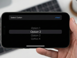
- Less intrusive (generally): In iOS, it appears from the bottom of the screen (Bottom Sheet), making it more accessible for one-handed use.
- Ideal use: Choosing a source to upload a photo (“Camera”, “Gallery”, “Files”), or confirming an action that is not a system error but requires multiple validations.
Implementation in Xcode
import SwiftUI

struct ConfirmationDialogExampleView: View {
    @State private var showDialog = false

    var body: some View {
        VStack {
            Button("Change Profile Picture") {
                showDialog = true
            }
            .padding()
            .background(Color.green)
            .foregroundColor(.white)
            .cornerRadius(10)
        }
        .confirmationDialog("Select image source", isPresented: $showDialog, titleVisibility: .visible) {
            Button("Take Photo") {
                // Open camera
            }
            Button("Choose from Gallery") {
                // Open gallery
            }
            Button("Delete Current Photo", role: .destructive) {
                // Delete photo
            }
            Button("Cancel", role: .cancel) {
                // Cancel action
            }
        } message: {
            Text("You can choose a new photo or delete the current one.")
        }
    }
}
Code Breakdown:
titleVisibility: .visible: Unlike alerts, confirmation dialogs may hide their title by default on some platforms. This modifier forces its appearance.- Button flexibility: You can stack many more buttons elegantly here than in an
alert().
4. The Ultimate Comparison: Confirmation Dialog vs Alert in SwiftUI
For any iOS Developer, choosing between the two is a matter of semantics and user experience. Below, we break down the comparison in a quick reference table.
| Feature / Modifier | alert() |
confirmationDialog() |
|---|---|---|
| Main Purpose | Inform about critical issues, errors, or binary destructive confirmations (Yes/No). | Provide multiple contextual options or confirm a user-initiated action. |
Use of Roles (.destructive, etc.) |
Supported (Renders in red). | Supported (Renders in red). |
| Ideal Number of Buttons | 1 to 2 (Exceptionally 3). | 2 to multiple options + Cancel Button. |
| Behavior in iOS | Appears in the center of the screen. Requires immediate interaction. | Appears from the bottom edge (Bottom Sheet). Easy to dismiss by tapping outside. |
| Behavior in macOS | Modal centered in the window, temporarily interrupts the app. | Renders as a Popover attached to the source button or view. |
| Behavior in watchOS | Takes up the entire screen, blocking the underlying view. | Stacks buttons vertically in a scrollable full-screen view. |
| Title Visibility | Always visible by default. | Hidden by default in iOS (configurable via titleVisibility). |
5. Working with Dynamic Data (Data-Driven Presentation)
One of the hidden gems of Swift programming in SwiftUI is the ability to present alerts and dialogs based on an Identifiable data model. This avoids having multiple boolean @State variables floating around in your code if you need to show different messages based on different errors.
Both modifiers, alert and confirmationDialog, have overloads that accept a presenting: parameter.
import SwiftUI

// Identifiable data model
struct AppError: Identifiable {
    let id = UUID()
    let title: String
    let message: String
}

struct DynamicAlertView: View {
    @State private var currentError: AppError?

    var body: some View {
        Button("Trigger Random Error") {
            currentError = AppError(title: "Error 404", message: "Resource not found on the server.")
        }
        // The alert is presented IF currentError is NOT nil
        .alert("Critical Error", isPresented: Binding(
            get: { currentError != nil },
            set: { if !$0 { currentError = nil } }
        ), presenting: currentError) { error in
            Button("Got it", role: .cancel) { }
        } message: { error in
            Text(error.message)
        }
    }
}
This technique is a “Best Practice” that every iOS Developer should master in Xcode to keep their views clean and free of complex logical states.
6. Cross-Platform Considerations (iOS, macOS, watchOS)
The true magic of SwiftUI lies in its slogan “Learn once, apply anywhere.” However, “apply anywhere” does not mean it looks identical everywhere. Apple’s interfaces respect the idioms of each operating system.
Behavior in iOS / iPadOS
As mentioned, the contrast here is the strongest: Center of screen (Alert) vs Bottom Edge (Dialog). On iPadOS, the confirmationDialog will often present as a popover pointing directly to the view that triggered it, unless specified otherwise, making better use of the space on large screens.
Behavior in macOS
Mac development with Swift has gained immense popularity thanks to Catalyst and native SwiftUI.
- Alert: Shown as a sheet descending from the app window’s title bar or as a floating modal. It blocks interaction with that specific window.
- Dialog: On macOS, the
confirmationDialogdoes not work like a “bottom sheet”. Instead, the Mac system systematically renders it as a standard alert or as a popover attached to the clicked element.
Behavior in watchOS
Given the tiny screen size of the Apple Watch, both modifiers behave similarly spatially: they take up the entire screen.
- The Alert will show the title, text, and buttons below, requiring the user to scroll using the Digital Crown if the content is long.
- The Dialog will show the options as a vertical list of large, highly ‘tappable’ buttons.
7. Accessibility and UX Best Practices
We cannot write an article about Confirmation Dialog vs Alert in SwiftUI without touching on accessibility. When writing Swift programming, make sure to:
- Keep texts short: VoiceOver will read the title and message of your alerts. A 4-line message will be tedious for a visually impaired user.
- Use Roles correctly: Never use a standard button to delete data. Always use
role: .destructive. This not only changes the color but communicates the severity of the action to assistive technologies. - Always provide an escape route: In both alerts and confirmation dialogs, there should always be a button with the
.cancelrole. Users never like to feel cornered with no way back. - Do not overload: If your
confirmationDialoghas 10 buttons, you are designing your interface poorly. You should consider a full-screen List view or a Picker instead.
8. Summary and Conclusion
For any iOS Developer building modern interfaces in Xcode, mastering the paradigm of modal presentations is key.
The answer to Confirmation Dialog vs Alert in SwiftUI boils down to your design intent:
- Use
alert()to notify the user of imminent situations, errors that require acknowledgment, or destructive actions where there is only a “Yes” or “No” option. - Use
confirmationDialog()to offer forks in the user’s path, provide contextual tool menus, or confirm actions where there are multiple variations of what can happen next.
If you have any questions about this article, please contact me and I will be happy to help you  . You can contact me on my X profile or on my Instagram profile.