


As an iOS Developer, creating an immersive and polished user interface is always a top priority. One of the most common questions when making the leap from UIKit, or when diving into modern Swift programming for the first time, is understanding how to control those small operating system details that frame our application. Among them, the most noticeable is the status bar (that top section where the time, battery indicator, and network signal reside).
If you have ever wondered how to change the status bar color in SwiftUI, you have probably realized that the answer isn’t a simple, magic one-liner that works for every scenario. SwiftUI has evolved enormously, and the approach varies not only depending on the operating system version but also on the target platform. Designing for notched iPhone screens is not the same as designing for the unified top bar of a Mac or the tiny screen of an Apple Watch.
In this comprehensive tutorial, we are going to explore step-by-step how to master the status bar using Swift and Xcode. We will tackle specific solutions for iOS, the particularities of macOS, and the minimalist approach of watchOS. Get ready to optimize your apps and take your interface design skills to the next level.
1. Understanding the Status Bar in the Apple Ecosystem
Before writing lines of code in Xcode, it is crucial to understand how the system renders the status bar. Unlike a simple UIView or a conventional View in SwiftUI, the status bar is managed directly by the operating system process (SpringBoard in the case of iOS). Its appearance—that is, the color of the icons and text—traditionally adapts automatically to contrast with the content beneath it, oscillating between a light style (white icons) and a dark style (black icons).
In traditional Swift programming with UIKit, we used the UIStatusBarStyle property within our View Controllers to control this behavior imperatively. In the SwiftUI paradigm, the approach is entirely declarative. We don’t explicitly tell the system what to do second by second; instead, we declare our Environment preferences or manipulate the Safe Area so the system reacts organically accordingly.
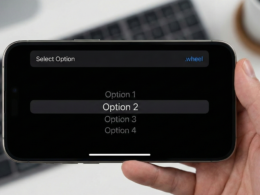
2. How to Change the Status Bar Color in iOS
iOS is undoubtedly the platform where this requirement is most frequent and where designers usually demand more customization. Depending on your view’s architecture and whether you are using navigation containers or independent modal screens, there are different strategies that every good iOS Developer must master.
Strategy A: The Safe Area Approach with Backgrounds
If your screen has a flat design, meaning it is not wrapped in a NavigationStack or a legacy NavigationView, the most direct and cleanest way to “color” the status bar background is to extend your custom background color to the absolute top edge of the physical screen using the .ignoresSafeArea() modifier.
import SwiftUI

struct StatusBarBackgroundView: View {
    var body: some View {
        ZStack {
            // 1. Define the background color we want for the status bar
            Color.blue
                .ignoresSafeArea(edges: .top) // This pushes the color towards the status bar

            // 2. Our main application content
            VStack {
                Text("Hello, iOS Developer")
                    .font(.largeTitle)
                    .foregroundColor(.white)
                    .padding()

                Spacer()
            }
            .background(Color.white) // Interactive content background
        }
    }
}
How does this mechanism work under the hood? By placing a Color component in the deepest layer of a ZStack and explicitly asking it to ignore the top safe area (edges: .top), that color is physically rendered “underneath” the operating system icons. Because the container of your main content (the VStack) maintains a white background and respects the Safe Area margins, the simulated blue color will only be visible exactly in the strip where the status bar resides.
Strategy B: Changing the Icon Style (Light vs. Dark)
Coloring the Safe Area background works excellently in most cases, but it poses a design challenge: What happens if you set a dark blue or black background and the operating system decides to keep the time and indicators in black? The status bar would become completely illegible, breaking the user experience and penalizing accessibility.
To explicitly force the system icons to be a specific color for proper contrast, we must invoke the .preferredColorScheme modifier. This approach tells the framework which global scheme the current view should emulate.
import SwiftUI

struct DarkStatusBarView: View {
    var body: some View {
        ZStack {
            Color.black.ignoresSafeArea()

            Text("Mastering SwiftUI")
                .foregroundColor(.white)
        }
        // Force the dark scheme, which forces the system to paint the status bar WHITE
        .preferredColorScheme(.dark)
    }
}
By declaring .dark, the system assumes the user interface is predominantly dark, so it automatically inverts the status bar colors to a bright white tone, guaranteeing optimal visibility.
Strategy C: The Modern Approach with NavigationStack (iOS 16+)
Swift programming advances at a breakneck pace. With the release of iOS 16 and later versions, Apple introduced a much more robust navigation architecture called NavigationStack. With this change in the SDK, specific modifiers designed to control toolbar backgrounds were incorporated, natively unifying the navigation bar with the device’s status bar.
If your application is structured using hierarchical navigation, the recommended technique in Xcode to change the status bar color in SwiftUI is as follows:
import SwiftUI

struct ModernNavigationView: View {
    var body: some View {
        NavigationStack {
            List {
                Text("Configuration Item 1")
                Text("Configuration Item 2")
                Text("Configuration Item 3")
            }
            .navigationTitle("Advanced Settings")
            // 1. Explicitly make the bar background container visible
            .toolbarBackground(.visible, for: .navigationBar)
            // 2. Assign the brand color required by our app
            .toolbarBackground(Color.indigo, for: .navigationBar)
            // 3. Adjust the color scheme so the status bar texts contrast properly
            .toolbarColorScheme(.dark, for: .navigationBar)
        }
    }
}
This clean syntax avoids visual tricks or complex hacks in the view tree. By specifically defining .toolbarBackground for the .navigationBar role, SwiftUI automatically takes care of extending that background color towards the top area of the screen, natively controlling the translucent scroll effects (Blur effect) when the list content scrolls beneath the bar.
3. Managing the Status Bar in macOS with SwiftUI
If you are a developer focused on mobile platforms who is expanding their catalog to the desktop ecosystem, you will immediately notice that in macOS the traditional concept of a “device status bar” does not exist in the same way. On Apple computers, the environment is divided between the Menu Bar (the system’s global menu bar at the top of the monitor) and the Title Bar (the native title bar of each of our application’s windows).
Due to strict operating system policies and user experience consistency, a third-party development cannot arbitrarily alter the background color of the Mac’s global Menu Bar. However, what is in our hands is to drastically customize our own window’s title bar to adapt it to our application’s corporate palette.
Hiding the Title and Extending Content to the Edge
To achieve a truly immersive (“full-bleed”) design where the content of our interface dictates the color of the window’s top edge, we must alter the window’s scene configuration right at the main entry point of our app’s lifecycle (the struct file bearing the @main annotation).
import SwiftUI

@main
struct MacOSApp: App {
    var body: some Scene {
        WindowGroup {
            ContentView()
                // Prevent system default backgrounds from interfering with our custom color
                .background(Color.purple)
        }
        // 1. Hide the native macOS window title text
        .windowStyle(.hiddenTitleBar)
        // 2. Adopt a unified compact style for window controls
        .windowToolbarStyle(.unifiedCompact)
    }
}
Once the base window is configured in our application scene, we move on to define the internal layout within our root view (ContentView) to ensure the color expands without restrictions:
struct ContentView: View {
    var body: some View {
        VStack {
            Text("Welcome to macOS Development with Swift")
                .font(.title)
                .foregroundColor(.white)
                .padding(.top, 20)
            Spacer()
        }
        .frame(minWidth: 450, minHeight: 350)
        // By applying this background and ignoring the Safe Area, the color will invade the top bar
        .background(Color.purple)
        .ignoresSafeArea()
    }
}
By combining the hidden window style (.hiddenTitleBar) with the .ignoresSafeArea() modifier in the view’s root container, the chosen background color (in this case, purple) will extend to the physical limit of the Mac window’s top edge, elegantly enveloping the classic native window control buttons (the red, yellow, and green buttons colloquially known as traffic lights).
4. The “Status Bar” in watchOS
Developing software for the Apple Watch using Xcode is a continuous exercise in minimalism, optimization, and smart design. On the watchOS platform, the status bar is reduced to a minimum dimension: it is the small top-right area of the screen exclusively dedicated to persistently showing the current time to the user.
Apple’s Human Interface Guidelines (HIG) for the Apple Watch are extremely rigorous. The system time must remain visible at all times to guarantee the watch’s utility as such. Additionally, we do not have modifiers to paint or inject arbitrary opaque colors directly behind the time. This is due to technical and hardware reasons: to maximize battery life on the Apple Watch’s OLED screens, app backgrounds should ideally be pure black (Color.black or hexadecimal #000000), which allows the screen pixels to physically turn off.
Despite these background restrictions, what a Swift developer can control with precision is the text color of the navigation and interactive header elements, thereby indirectly modifying the chromatic impact of the top area.
Configuring the Accent Color and Navigation Titles
The primary mechanism for providing visual identity and chromatic threads to an application in watchOS is the correct assignment of the AccentColor in the project’s global resources. This is done directly from the visual interface of Xcode:
- Open the side file navigator in your Xcode project.
- Navigate to the asset catalog folder named
Assets.xcassets. - Locate and select the system resource called
AccentColor. - In the attributes inspector on the right sidebar, define your brand color (for example, a neon green or a sporty orange).
If you need to dynamically force a specific color for the header elements located immediately below the watch’s time indicator, you can use the tint modifier on your structured navigation stack as follows:
import SwiftUI

struct WatchContentView: View {
    var body: some View {
        NavigationStack {
            VStack {
                Text("Active Monitoring")
                    .font(.headline)
                Text("❤️ 74 BPM")
                    .font(.largeTitle)
                    .foregroundColor(.red)
            }
            .navigationTitle("Health Watch")
            // Force an inline mode so it integrates cleanly into the top area
            .navigationBarTitleDisplayMode(.inline)
            // Apply the tint that the back buttons and header texts will adopt
            .tint(.green)
        }
    }
}
5. Common Issues and Solutions (Troubleshooting)
Any experienced iOS Developer in production environments knows perfectly well that theory can look flawless, but when compiling in Xcode, unexpected behaviors can arise. If you find yourself trying to change the status bar color and the changes do not reflect on screen, review this technical checklist:
- Conflict with View controller-based status bar appearance: If you are working in a hybrid development or integrating SwiftUI screens into a legacy UIKit architecture using
UIHostingControllercontainers, you must mandatorily check your target’sInfo.plistconfiguration file. Ensure you verify the state of theView controller-based status bar appearancekey (internally known asUIViewControllerBasedStatusBarAppearance). In pure SwiftUI projects, it is best to let the framework handle it natively, but in mixed environments, you might need to set it toYESorNOdepending on whether control will be centralized by the global View Controllers’ lifecycle. - Incorrect ZStack hierarchies: A common mistake in declarative syntax is applying the
.ignoresSafeArea()modifier to a component that is not in the deepest layer of the layout. Make sure that the color or gradient object you want to extend is the initial element inside yourZStack. If you later place an intermediate container with a default opaque background color, it will end up blocking and hiding the previously configured Safe Area section. - Update latency in the Xcode Preview Canvas: The real-time simulator integrated into the development environment (Xcode Previews) sometimes suffers from static rendering issues and can fail to process dynamic changes associated with operating system bars, such as the
.preferredColorSchememodifier. In case of any doubt or erratic behavior, the golden rule is to compile and deploy the app directly in a full iOS Simulator (keyboard shortcutCmd + R) or, ideally, test the flow on a real physical device.
6. Design and Accessibility Best Practices
Modifying visual aspects controlled by the operating system carries great aesthetic and functional responsibility. When altering the top colors of your applications, it is essential to keep Apple’s official design guidelines (Human Interface Guidelines) in mind:
- Guarantee the Luminous Contrast Ratio: Never under any circumstances force a light (white) icon style if your custom bar background is bright yellow or pastel white. The typography of critical data like the battery level or time must comply with international accessibility standards (W3C), allowing people with fatigue or visual limitations to read the information effortlessly.
- Native and Fluid Support for Dark Mode: If you choose to set a static and unchanging color using a declaration like
Color.blue, ensure through rigorous testing that said tone behaves harmoniously whether the user uses their device in light mode or night mode. It is highly recommended not to hardcode colors directly in the code, but rather to define semantic colors within yourAssetscatalog in Xcode, configuring specific and fluid variants for the Light and Dark appearances automatically. - Navigation Flow Consistency: Avoid drastically changing the status bar color from one screen to another within the same sequence or user experience flow. If a user profile screen has a blue bar and the subsequent editing screen changes it to red without functional justification, you will generate a feeling of instability and a lack of cohesion in the software product.
Conclusion
The path to becoming an elite iOS Developer demands continuous learning and meticulous attention to detail. Mastering modern Swift programming involves not only writing efficient algorithmic logic but also deeply understanding how our declarative visual components interact with the underlying operating system’s native interfaces.
As we have analyzed throughout this tutorial, solving the challenge of changing the status bar color in SwiftUI is not a homogeneous task nor is it resolved with a single generic recipe. It requires evaluating which platform we are on: using Safe Area expansion techniques in linear iOS architectures, delegating responsibility to the new NavigationStack containers in iOS 16 or higher systems, visually extending the canvas towards the native macOS buttons by hiding the title bar, or respecting the energy efficiency and high contrast guidelines that govern watchOS.