



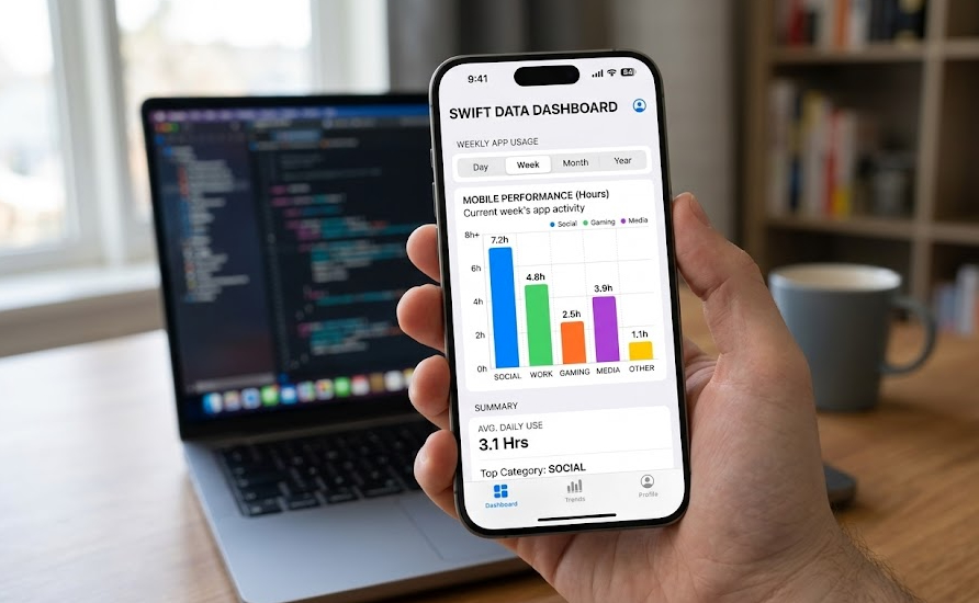

In today’s app development world, data visualization has gone from being a luxury to an absolute necessity. As an iOS Developer, you will likely face the challenge of displaying metrics, usage statistics, financial results, or any kind of quantitative information in a way that is digestible and engaging for the end user. For a long time, developers had to rely on complex third-party libraries, but with the evolution of Swift programming, Apple has provided us with a native, powerful, and wonderfully declarative tool: Swift Charts.
In this article, we are going to dive deep into this framework. Our main goal will be to learn how to create bar charts with Swift Charts in SwiftUI. The best thing about this technology is that, being purely native, the code we write will be perfectly compatible and scalable not only for iOS, but also for macOS and watchOS.
Set up your environment, open Xcode, and join me in this step-by-step tutorial to master chart creation in SwiftUI.
What is Swift Charts and why did it revolutionize Swift programming?
Introduced in iOS 16, macOS 13, and watchOS 9, Swift Charts is a framework designed to transform data into rich and accessible visualizations using a declarative syntax that feels very familiar if you already know SwiftUI.
Before Swift Charts, an iOS Developer had to resort to tools like Core Graphics (which requires a lot of imperative code and complex math) or integrate external dependencies that often bloated the app’s size and brought maintenance issues. Swift Charts eliminates these headaches. Its integration with the Swift ecosystem is so natural that you can create complex charts in just a few lines of code.
Additionally, it includes automatic support for Dark Mode, localization, accessibility (VoiceOver intelligently reads the charts by default), and animations.
Step 1: Setting up our project in Xcode
To get started, we need a proper workspace.
- Open Xcode and select Create a new Xcode project.
- Choose the App template under the iOS tab (or Multiplatform if you wish to test it on macOS immediately).
- Name your project, for example,
DataVisualizerApp. - Make sure the selected interface is SwiftUI and the language is Swift.
Once Xcode has generated your project, head over to your ContentView.swift file. To use the charting tools, we need to import the corresponding framework at the top of our file.
import SwiftUI
import Charts // Essential for accessing Swift Charts
Step 2: Defining the Data Model in Swift
The foundation of any good chart is a solid data structure. In Swift programming, the best practice is to use structures (struct) that conform to the Identifiable protocol. This allows SwiftUI to uniquely identify each element when iterating over them to draw the bars.
Let’s imagine we are developing an app for a coffee shop and we want to show the sales of different types of coffee throughout the week.
struct CoffeeSale: Identifiable {
    let id = UUID()
    let type: String
    let quantitySold: Int
}

// We create an array with test data (Mock Data)
let salesData: [CoffeeSale] = [
    CoffeeSale(type: "Espresso", quantitySold: 120),
    CoffeeSale(type: "Latte", quantitySold: 250),
    CoffeeSale(type: "Cappuccino", quantitySold: 180),
    CoffeeSale(type: "Americano", quantitySold: 300),
    CoffeeSale(type: "Mocha", quantitySold: 150)
]
As an iOS Developer, keeping your code clean and separated is vital. In a real project, this data would likely come from an API or a local database using SwiftData or CoreData.
Step 3: How to create bar charts with Swift Charts in SwiftUI (The basics)
Now comes the magic. To create bar charts with Swift Charts in SwiftUI, we use the Chart component and within it, we declare elements called BarMark.
A Mark is the visual representation of data. For a bar chart, we use BarMark; for a line chart, we would use LineMark, and so on.
Replace the content of your ContentView with the following code:
struct ContentView: View {
    var body: some View {
        VStack(alignment: .leading) {
            Text("Weekly Coffee Sales")
                .font(.title2)
                .bold()
                .padding(.bottom, 10)

            // We initialize our SwiftUI chart
            Chart {
                ForEach(salesData) { sale in
                    BarMark(
                        x: .value("Coffee Type", sale.type),
                        y: .value("Quantity", sale.quantitySold)
                    )
                }
            }
            .frame(height: 300) // We provide a fixed height to display it correctly
        }
        .padding()
    }
}
Understanding the code:
- Chart: It is the main container for our chart.
- ForEach: Iterates over our
salesDataarray. BeingIdentifiable, we don’t need to specify an additionalid. - BarMark: Draws the bar. The
xandyparameters define the axes. We use.value("Label", value)to map our data. The “Label” is crucial, as Swift Charts uses it internally for accessibility (VoiceOver).
By running this in the Xcode simulator, you will immediately see a clean and minimalist vertical bar chart.
Step 4: Taking the design to the next level (Customization)
The default chart is functional, but every good iOS Developer knows that design and user experience (UX) make the difference in the App Store. SwiftUI allows us to inject styles directly into our BarMark elements.
Let’s customize our chart by adding colors, rounded corners, and annotations that show the exact value above each bar.
Chart {
    ForEach(salesData) { sale in
        BarMark(
            x: .value("Coffee Type", sale.type),
            y: .value("Quantity", sale.quantitySold)
        )
        // 1. We assign a color based on the coffee type
        .foregroundStyle(by: .value("Type", sale.type))

        // 2. We round the top corners of the bars
        .cornerRadius(8)

        // 3. We add a text annotation on top of the bar
        .annotation(position: .top) {
            Text("\(sale.quantitySold)")
                .font(.caption)
                .bold()
                .foregroundColor(.secondary)
        }
    }
}
// 4. We hide the legend if we don't need it
.chartLegend(.hidden)
.frame(height: 300)
By using .foregroundStyle(by:), Swift Charts automatically assigns a different color palette to each category and generates a legend. If you don’t want the legend, you can hide it with the .chartLegend(.hidden) modifier.
Step 5: Horizontal bar charts
There are times when the X-axis labels are too long and overlap. In modern Swift programming, solving this is a matter of swapping variables. To create a horizontal bar chart, we simply invert the axes in our BarMark.
Chart {
    ForEach(salesData) { sale in
        BarMark(
            // Now the quantity goes on the X axis
            x: .value("Quantity", sale.quantitySold),
            // And the coffee type on the Y axis
            y: .value("Coffee Type", sale.type)
        )
        .foregroundStyle(.blue.gradient) // An elegant gradient
    }
}
.frame(height: 250)
Notice how we used .blue.gradient. In SwiftUI, applying gradients to views is straightforward and gives a very polished look to iOS, macOS, and watchOS apps.
Step 6: Data Grouping (Complex Charts)
To stand out as an iOS Developer, you must be able to handle multiple data series. Suppose we want to compare this week’s sales with last week’s.
First, we expand our model in Swift:
struct ComparativeSale: Identifiable {
    let id = UUID()
    let type: String
    let quantity: Int
    let period: String // "This week" or "Last week"
}

let comparativeData: [ComparativeSale] = [
    ComparativeSale(type: "Latte", quantity: 250, period: "This week"),
    ComparativeSale(type: "Latte", quantity: 200, period: "Last week"),
    ComparativeSale(type: "Espresso", quantity: 120, period: "This week"),
    ComparativeSale(type: "Espresso", quantity: 150, period: "Last week")
]
Now, we implement the grouped chart in SwiftUI:
Chart {
    ForEach(comparativeData) { sale in
        BarMark(
            x: .value("Coffee Type", sale.type),
            y: .value("Quantity", sale.quantity)
        )
        // We group by type so the bars appear side by side
        .foregroundStyle(by: .value("Period", sale.period))
        .position(by: .value("Period", sale.period))
    }
}
.frame(height: 300)
.chartForegroundStyleScale([
    "This week": .blue,
    "Last week": .gray.opacity(0.5)
])
With the .position(by:) modifier, we instruct Swift Charts to place the bars of different periods next to each other instead of stacking them. Additionally, .chartForegroundStyleScale allows us to define exactly what color we want for each category.
Cross-Platform Scalability: iOS, macOS, and watchOS
One of the main reasons to master Swift programming and SwiftUI today is the Apple ecosystem. The code we just wrote to create bar charts with Swift Charts in SwiftUI does not need to be rewritten to work on an Apple Watch or a Mac.
In watchOS, where screen space is critical, SwiftUI will automatically adjust the margins and font sizes of the chart to fit the user’s wrist. As an iOS Developer, your only concern will perhaps be wrapping the chart in a ScrollView if you have multiple elements, or reducing the amount of data (for example, showing only the Top 3 sales) so as not to clutter the small Apple Watch screen.
In macOS, the chart will expand fluidly. You can take advantage of SwiftUI modifiers to react to the resizing of native desktop windows.
Conclusion
The ability to visualize data quickly, efficiently, and attractively is an invaluable skill. Throughout this article, we have explored everything from the fundamentals to advanced configurations, discovering that creating bar charts with Swift Charts in SwiftUI is a logical, declarative, and highly rewarding process.
Gone are the days of dealing with heavy third-party frameworks in Xcode. As a modern iOS Developer, by mastering Swift Charts and Swift programming, you are adding an official Apple framework to your toolset that guarantees performance optimization, native accessibility, and support across all its platforms.