


In this article, we’re going to review what’s new and the most notable new features of SwiftUI presented by Apple at WWDC25 along with iOS 26, macOS 26, watchOS 26, iPadOS 26, tvOS 26, and visionOS 26, along with Xcode 26.
Liquid Glass Effect
The new Liquid Glass Effect is used for almost all the system-wide apps, controls, and so on. Adopting it for our SwiftUI app is not a big task.
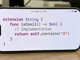
Fortunately, SwiftUI supports the Liquid Glass Effect for both native controls and allows us to add these effects to custom views as well. Here is an example of how we can add the Liquid Glass Effect to a button:
Button("Hello Developer") {
            }
            .buttonStyle(.glass)
Use glass with the buttonStyle(_:) modifier to apply Liquid Glass to instances of Button
The result in Xcode is the following:

Custom Views with Liquid Glass Effect
We can also create custom views with Liquid Glass Effect. Take a look at this example:
Image(systemName: "suit.heart.fill")
                .font(.largeTitle)
                .foregroundStyle(.red.gradient)
                .frame(width: 50, height: 50)
                .glassEffect(.regular, in: .circle)
The result in Xcode is the following:

GlassEffectContainer
SwiftUI offers a native container called GlassEffectContainer. With this container we can effortlessly create morphing effects and group multiple views to achive a single glass effect.
Here you can see an example using the new GlassEffectContainer available in iOS 26, macOS 26, iPadOS 26, watchOS 26 and tvOS 26.
struct ContentView: View {
    @State private var isExpanded: Bool = false
    var body: some View {
        ZStack {
            Image("ios26")
                .resizable()
                .aspectRatio(contentMode: .fill)
                .clipShape(.rect(cornerRadius: 20))
                .ignoresSafeArea()
            GlassEffectContainer(spacing: 20) {
                VStack(spacing: 20) {
                    Spacer()

                    if isExpanded {
                        Group {
                            Image(systemName: "suit.heart.fill")
                                .font(.largeTitle)
                                .foregroundStyle(.red.gradient)
                                .frame(width: 50, height: 50)

                            Image(systemName: "magnifyingglass")
                                .font(.largeTitle)
                                .foregroundStyle(.white.gradient)
                                .frame(width: 50, height: 50)
                        }
                        .glassEffect(.regular, in: .circle)
                    }

                    Button {
                        withAnimation(.smooth(duration: 1, extraBounce: 0)) {
                            isExpanded.toggle()
                        }

                    } label: {
                        Image(systemName: "ellipsis")
                            .font(.largeTitle)
                            .foregroundStyle(.red.gradient)
                            .frame(width: 40, height: 40)
                    }
                    .buttonStyle(.glass)
                }
            }
            .padding(15)
        }
    }
}
The result in Xcode is the following:

glassEffectTransition
If you don’t require animation when a specific setting is enabled in your SwiftUI app, such as the “Reduce Animations” toggle, you can use the modifier glassEffectTransition to eliminate morphing effects and animations. Simply add this line of code to your SwiftUI app:
.glassEffectTransition(.identity)The result in Xcode is the following:
glassEffectUnion
Use the modifier glassEffectUnion if you want to group two views to create a single glass effect without writing a separate HStack or VStack. This modifier will apply the single glass effect instead of each view having its own effects.
Simply, first declare the variable:
@Namespace private var animationand then add the modifier using:
.glassEffectUnion(id: "1", namespace: animation)The result in Xcode will be the following:

Foundation Models framework

Xcode 26 now includes the Foundation Models SDK, enabling developers to utilize the On-Device Intelligence models. Since these models are On-Device, they will function even when the device is offline. This is possible thanks to the local processing that Apple has implemented in its latest chips.
Furthermore, Apple has emphasized that this access to artificial intelligence will come at no additional cost to developers, also promising that user data processing will be done locally on the device.
scrollEdgeEffectStyle
By default, List, Navigation and other UI components now have a soft blur effect at the safe areas also known as Progressive Blurs. However, SwiftUI provides a simple modifier to control these effects.
This modifier is scrollEdgeEffectStyle. Simply add this line of code to your List, for example:
.scrollEdgeEffectStyle(.hard, for: .top)The result in Xcode 26 will be the following:

backgroundExtensionEffect
The new modifier backgroundExtensionEffect extends the view to the available safe areas with subtle blur effects.
Use this modifier when you want to create copies outside of the safe area so the view and its copies together can function as backgrounds for other elements on top. The most common use case is to apply this to a view in the detail column of a navigation split view so it can extend under the sidebar or inspector region to provide seamless immersive visuals.
Simply add this line of code to your Xcode project running iOS 26:
.backgroundExtensionEffect()Let’s see an example, add this code to Xcode, with backgroundExtensionEffect modifier:
var body: some View {
        GeometryReader {
            let size = $0.size

            Image("ios26")
                .resizable()
                .aspectRatio(contentMode: .fill)
                .frame(width: size.width, height: size.height)
                .clipped()
                .backgroundExtensionEffect()
        }
        .scrollEdgeEffectStyle(.hard, for: .top)
The result in Xcode 26 will be the following:

Rich Text Editor in SwiftUI
The TextEditor now supports AttributedString as a Binding, and the native TextEditor also has some useful rich text editor options.
Take a look at this Text Editor example in SwiftUI:
struct ContentView: View {
    @State private var richText = AttributedString()
    var body: some View {

        TextEditor(text: $richText)
            .frame(height: 300)
            .padding(15)
}
The result in Xcode is the following:

WebView in SwiftUI
SwiftUI now supports native WebView with various in-buil features, including tracking scroll positions, updating scrolling positions and disabling certain gestures.
To work with WebKit in SwiftUI simply import the framework in Xcode using this line of code:
import WebKitand then using this code we can use a WebView in our SwiftUI app:
struct ContentView: View {
    var body: some View {
        WebView(url: url)
    }
        var url : URL {
            URL(string: "https://swiftprogramming.com")!
        }
}
The result in Xcode is the following:

Another way to get the same result is use this Swift code:
import WebKit

struct ContentView: View {
    @State private var page = WebPage()
    var body: some View {
        WebView(page)
            .onAppear() {
                page.load(URLRequest(url: url))
            }
    }
        var url : URL {
            URL(string: "https://swiftprogramming.com")!
        }
}
TabView Customizations
By default, SwiftUI automatically adapts into this new iOS 26 glossy tab bar (if the app previously used the native tab bar and not the custom one).

TabViewBottomAccessory()
On iOS 26, the TabView will support adding an accessory view on top of the tab bar, just like the Apple Music app. Let’s see an example:
tabViewBottomAccessory {
            Text("Hello World")
                .padding(.horizontal, 15)
        }
The result in Xcode 26 will be the following:

ToolBarSpacer modifier
By default, all ToolBar items are grouped together on iOS 26. However, there may be instances where we need to separate a button from the group. This new modifier is particularly usefor for separating ToolBar items or even creating multiple groups of ToolBar items.
If you have any questions about this article, please contact me and I will be happy to help you 🙂. You can contact me on my X profile or on my Instagram profile.