


In the vast universe of Swift programming, if there is one element that defines user-machine interaction, it is the button. From the very first “Hello World” to the most complex VIPER or MVVM architectures, knowing how to create a button with SwiftUI is a fundamental skill that every iOS developer must master to perfection.
Gone are the days of wrestling with IBActions, IBOutlets, and Auto Layout constraints in UIKit. With the arrival of SwiftUI and the constant updates to Xcode, Apple has handed us a tool that is declarative, powerful, and surprisingly flexible.
In this tutorial, you won’t just learn how to place a button on the screen. We will break down the anatomy of the Button component, explore the creation of custom styles (ButtonStyle), manage states, and ensure your code works flawlessly across iOS, macOS, and watchOS.
1. Basic Anatomy: Your First Button in SwiftUI
For a developer coming from UIKit, the mental shift is significant. In SwiftUI, a button isn’t an object you “configure”; it’s a view you “declare.”
The simplest structure of a button is made up of two parts:
- Action: The block of code (closure) that executes when tapped.
- Label: The view that defines how the button looks.
Open Xcode, create a new SwiftUI project, and write the following:
struct BasicButtonView: View {
    var body: some View {
        Button(action: {
            print("Button pressed!")
        }) {
            Text("Tap me")
        }
    }
}
Modern Swift Syntax
Thanks to improvements in Swift programming, if the last parameter of a function is a closure, we can use trailing closure syntax. Furthermore, since iOS 15, we have more direct constructors for simple text titles:
Button("Log In") {
    print("Login started")
}
This is the starting point. But as a good iOS developer, we know that the default design (plain blue text) is rarely enough for a professional application.
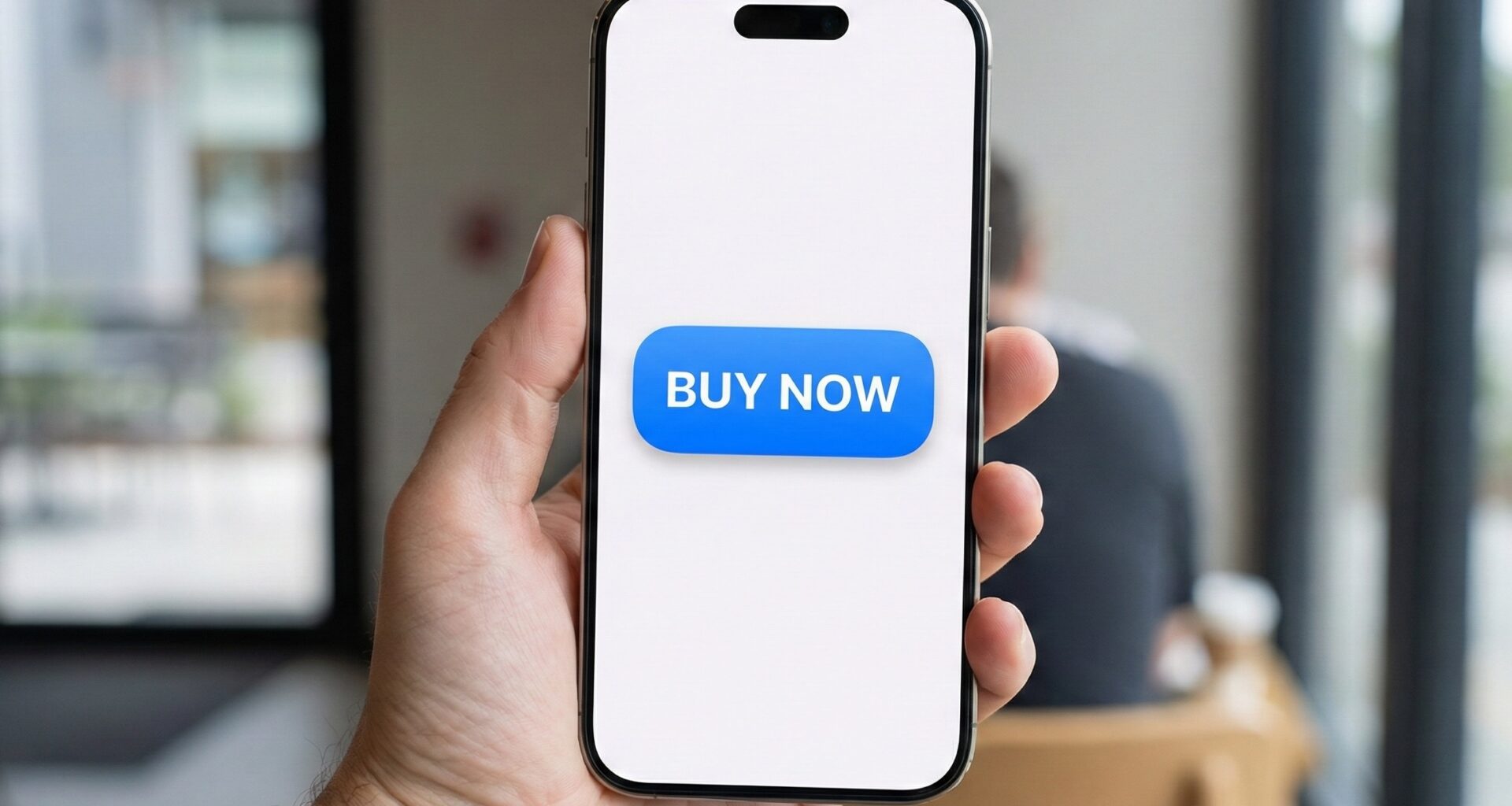
2. Visual Customization: Modifiers and Aesthetics
The power of SwiftUI lies in modifiers. Unlike CSS on the web, here we chain functions to the Text view (or any view inside the Label) to alter it.
Let’s transform simple text into an attractive Call to Action (CTA) button.
Button(action: {
    // Purchase logic
}) {
    Text("Buy Now")
        .font(.headline)
        .fontWeight(.bold)
        .foregroundColor(.white)
        .padding()
        .frame(maxWidth: .infinity) // Occupy all available width
        .background(Color.blue)
        .cornerRadius(10)
        .shadow(color: .blue.opacity(0.3), radius: 5, x: 0, y: 5)
}
.padding(.horizontal)
The order of factors DOES alter the product
In SwiftUI, the order of modifiers is crucial.
- If you put
.backgroundbefore.padding, the color will only cover the text, not the extra space. - Always apply
paddingfirst to give the content “air,” and thenbackgroundto color that air.
3. Beyond Text: Buttons with Icons and Stacks
A modern application requires iconography. Thanks to SF Symbols (integrated into Xcode and the system), we can create a button with SwiftUI that combines text and images easily.
Using Label (The Semantic Way)
SwiftUI introduced the Label view, which is perfect for buttons because it automatically aligns the icon and text.
Button(action: {
    print("Item deleted")
}) {
    Label("Delete", systemImage: "trash.fill")
        .font(.title3)
}
.buttonStyle(.borderedProminent) // Native style iOS 15+
.tint(.red) // Semantic color
Complex Designs with Stacks
If you need something more elaborate, like a card that functions as a button, you can use VStack or HStack within the label closure.
Button(action: {
    print("Opening profile")
}) {
    HStack {
        Image("user-avatar") // Image from your Assets
            .resizable()
            .frame(width: 50, height: 50)
            .clipShape(Circle())

        VStack(alignment: .leading) {
            Text("John Doe")
                .fontWeight(.bold)
            Text("Senior iOS Developer")
                .font(.caption)
                .foregroundColor(.secondary)
        }

        Spacer()

        Image(systemName: "chevron.right")
            .foregroundColor(.gray)
    }
    .padding()
    .background(Color(.systemGray6))
    .cornerRadius(12)
}
.foregroundColor(.primary) // Reset text color so it isn't blue
4. State Management (@State): Real Interactivity
A button that only prints to the console isn’t very useful. In reactive Swift programming, buttons usually alter the “State” of the view.
Imagine a button that changes color when tapped.
struct ToggleButton: View {
    @State private var isActive = false

    var body: some View {
        Button(action: {
            // Animate the state change
            withAnimation(.spring()) {
                isActive.toggle()
            }
        }) {
            HStack {
                Image(systemName: isActive ? "checkmark.circle.fill" : "circle")
                Text(isActive ? "Completed" : "Mark as done")
            }
            .padding()
            .foregroundColor(.white)
            .background(isActive ? Color.green : Color.gray)
            .cornerRadius(30)
        }
    }
}
Here, the button acts as a trigger. By changing the @State variable, SwiftUI automatically redraws the view with the new colors and icons.
5. Button Roles and Standard Styles (iOS 15+)
Apple introduced significant improvements in Xcode to standardize design. We can now assign a role to the button, which helps the system decide how to display it (and aids accessibility).
VStack(spacing: 20) {
    // Standard Button
    Button("Confirm") { }
        .buttonStyle(.borderedProminent)

    // Cancel Button
    Button("Cancel", role: .cancel) { }
        .buttonStyle(.bordered)

    // Destructive Button (Automatically red in many contexts)
    Button("Delete Account", role: .destructive) { }
        .buttonStyle(.borderedProminent)
}
The standard styles (.bordered, .borderedProminent, .plain, .automatic) are excellent for maintaining consistency with the Apple ecosystem effortlessly.
6. Pro Level: Custom ButtonStyle
This is where a junior iOS developer becomes a senior. If you have to copy and paste the same modifiers (.padding, .background, .font) onto 20 different buttons, you are violating the DRY (Don’t Repeat Yourself) principle.
To solve this, we create a custom ButtonStyle. This encapsulates design and interaction.
struct NeumorphicStyle: ButtonStyle {
    var color: Color

    func makeBody(configuration: Configuration) -> some View {
        configuration.label
            .padding(30)
            .background(
                ZStack {
                    color
                    // Light shadow
                    RoundedRectangle(cornerRadius: 10, style: .continuous)
                        .foregroundColor(.white)
                        .blur(radius: 4)
                        .offset(x: -8, y: -8)
                    // Dark shadow
                    RoundedRectangle(cornerRadius: 10, style: .continuous)
                        .fill(Color.black.opacity(0.2))
                        .blur(radius: 4)
                        .offset(x: 8, y: 8)
                }
            )
            .scaleEffect(configuration.isPressed ? 0.95 : 1.0) // Press effect
            .animation(.easeOut(duration: 0.2), value: configuration.isPressed)
            .clipShape(RoundedRectangle(cornerRadius: 10, style: .continuous))
    }
}

// Usage:
Button("Neumorphism") { }
    .buttonStyle(NeumorphicStyle(color: Color(.systemGray6)))
What is configuration?
The ButtonStyle protocol gives us access to configuration.isPressed. This boolean variable tells us if the user is holding their finger on the button. We use this to add scale animations (scaleEffect) or opacity changes, drastically improving the User Experience (UX).
7. Multiplatform Development: iOS, macOS, and watchOS
One of the promises of SwiftUI is “Learn once, apply everywhere.” However, context matters.
Adaptation for macOS
On the Mac, we don’t have fingers; we have a cursor. Buttons must react to “Hover” (mouse over).
Although .buttonStyle(.bordered) works well, sometimes we want a borderless button that reveals its background upon hovering.
Button("Mac Menu") { }
    .buttonStyle(.plain) // Remove native styles
    .padding(10)
    .background(Color.gray.opacity(0.1))
    .cornerRadius(5)
    // .onHover is available on macOS
    #if os(macOS)
    .onHover { isHovered in
        // Change visual state
    }
    #endif
Adaptation for watchOS
On the Apple Watch, buttons usually occupy the full width (.frame(maxWidth: .infinity)) to be easily tappable while walking. Additionally, the .bordered style on watchOS has a very characteristic Pill (Capsule) shape.
For an iOS developer porting their app to the watch, remember to use ScrollView if you have more than two buttons, as the screen is small.
8. Accessibility: An Ethical and Technical Duty
Google and Apple penalize inaccessible apps. When you create a button with SwiftUI, the system does a lot of work for us, but we must help it.
If your button only contains an icon, VoiceOver will say “Button,” which doesn’t help a blind user.
Button(action: {
    // Favorite
}) {
    Image(systemName: "heart.fill")
}
.accessibilityLabel("Add to favorites")
.accessibilityHint("Saves this article to your personal list")
Always add .accessibilityLabel to buttons that do not have explicit text.
9. Common Errors and Solutions (Troubleshooting)
In my experience teaching Swift programming, I see these errors constantly:
The touch area is too small
If you have small text and add an onTapGesture or it’s a simple button, the user will struggle to hit it.
Solution: Add .padding() inside the button’s Label (before the background) or use .contentShape(Rectangle()) if the button is transparent, so the entire area is “tappable.”
Button inside a List
If you put a button inside a List or Form, sometimes the entire cell becomes selectable.
Solution: Use the .buttonStyle(.plain) style on buttons inside cells to prevent the whole cell from hijacking the tap.
Confusion between Button and NavigationLink
- Use Button when you want to perform an action (save, delete, calculate).
- Use NavigationLink when you want to move the user to another screen.
- Note: Since iOS 16, we use
.navigationDestinationalong with data-driven buttons or links for more programmatic navigation.
10. Async/Await in Buttons
With modern versions of Swift, concurrency is native. If your button needs to make an API call, you cannot block the main thread.
Button("Download Data") {
    // Create an asynchronous Task
    Task {
        await viewModel.downloadData()
    }
}
This allows the UI to remain fluid (perhaps showing a ProgressView) while the operation happens in the background.
Conclusion
Knowing how to create a button with SwiftUI is much more than writing four lines of code. It involves understanding the view lifecycle, interaction management, aesthetics through modifiers, and accessibility.
As an iOS developer, mastering ButtonStyle and state modifiers will allow you to build interfaces that not only look good in Xcode but feel professional in the hands of users, whether on an iPhone, a Mac, or an Apple Watch.
The Swift ecosystem evolves every year. Staying updated with new APIs (like bordered styles or async management) is what differentiates an amateur app from one “Featured by Apple.”
If you have any questions about this article, please contact me and I will be happy to help you  . You can contact me on my X profile or on my Instagram profile.