


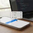
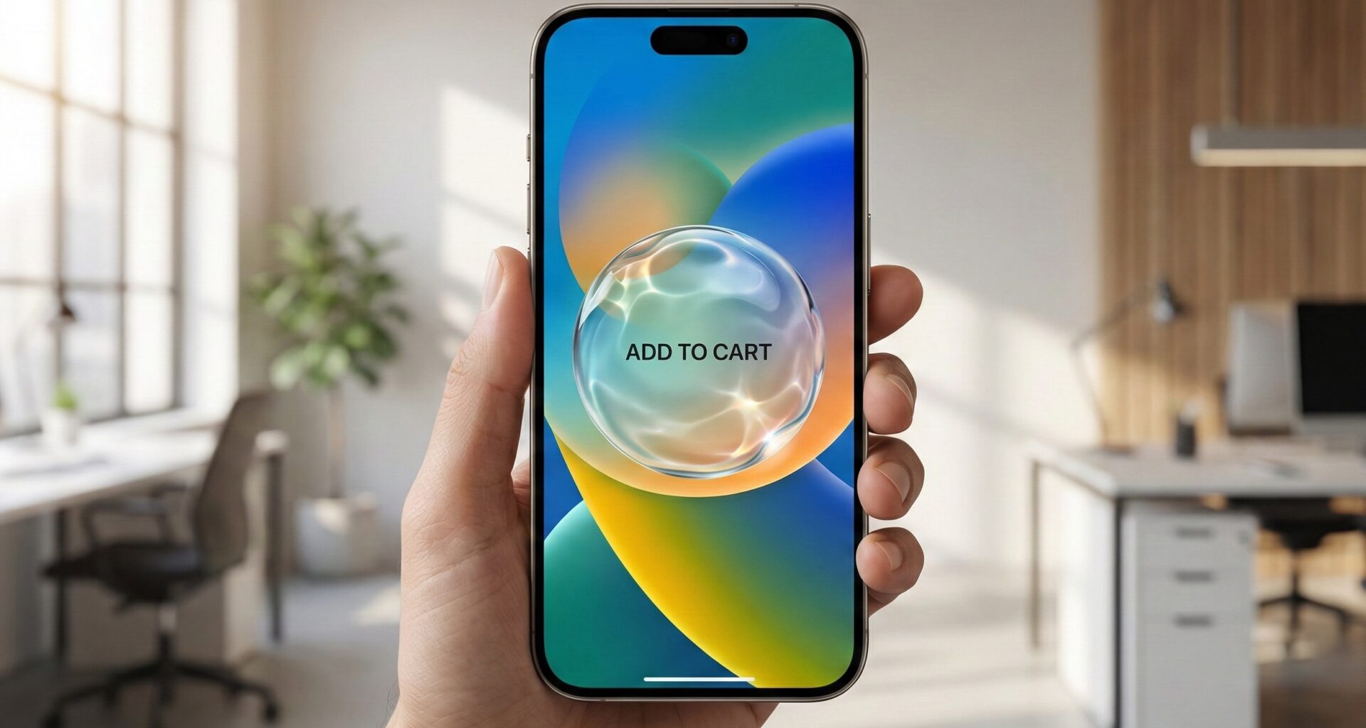
In the fast-paced world of mobile interface design, trends swing like a pendulum. We’ve moved from extreme realism to flat design, and now, we find ourselves in a fascinating middle ground: material depth. For an iOS developer, staying up to date is not just an option; it is a necessity. Today, the trend defining the most premium apps on the App Store is Liquid Glass.
Unlike the static “Glassmorphism” of a few years ago, the Liquid Glass effect adds an organic dimension: it suggests viscosity, realistic light refraction, and tactile interaction that mimics fluid physics.
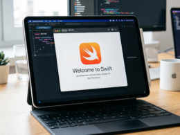
In this Swift programming tutorial, we will set aside abstract theories and open Xcode to build, step-by-step, a crystalline button component that works natively in SwiftUI. We will optimize this component to shine on iOS, adapt to the mouse on macOS, and remain efficient on the wrist with watchOS.
1. Visual Theory: What Makes Glass Look “Liquid”?
Before writing code, we must deconstruct the physics we are about to simulate. If you simply lower the opacity of a button, you don’t get glass; you get a ghost. To achieve the liquid glass effect on a button, we need to combine four factors in our view:
- Background Blur: The object must distort what lies behind it.
- Vibrant Saturation: Glass tends to amplify the colors it refracts.
- Specular Highlights: Light accumulates at the edges. A semi-transparent white border that varies in intensity is crucial to giving it 3D volume.
- Drop Shadow & Ambient Light: The glass floats above the interface, so it needs to be separated from the background via soft shadows.
Thanks to the power of SwiftUI and the latest updates to Swift, we can achieve this with native 60/120 FPS performance without resorting to heavy image assets.
2. Setting Up the Project in Xcode
Open Xcode and create a new project. Make sure to select:
- Interface: SwiftUI
- Language: Swift
- Storage: None (we don’t need Core Data for this)
For this tutorial, we will use the recently introduced material APIs (Material), which are far more powerful than the old UIKit UIVisualEffectView.
3. Step 1: The Stage (The Importance of Background)
The number one mistake when trying to create a liquid glass effect on a button is testing it on a solid white or black background. Glass is invisible if there is nothing behind it to refract.
We are going to create a rich, colorful background view. We will use circles with extreme blur to simulate ambient lights.
import SwiftUI

struct AmbientBackgroundView: View {
    @State private var animateGradient = false

    var body: some View {
        ZStack {
            // Dark base background to highlight the glow
            Color(red: 0.1, green: 0.1, blue: 0.2)
                .ignoresSafeArea()

            // Animated light orbs
            ZStack {
                Circle()
                    .fill(Color.blue)
                    .frame(width: 300, height: 300)
                    .blur(radius: 60)
                    .offset(x: animateGradient ? -100 : 100, y: -100)

                Circle()
                    .fill(Color.purple)
                    .frame(width: 300, height: 300)
                    .blur(radius: 60)
                    .offset(x: animateGradient ? 100 : -100, y: 100)

                Circle()
                    .fill(Color.cyan)
                    .frame(width: 200, height: 200)
                    .blur(radius: 50)
                    .offset(y: animateGradient ? 50 : -50)
            }
            .animation(.easeInOut(duration: 5.0).repeatForever(autoreverses: true), value: animateGradient)
        }
        .onAppear {
            animateGradient.toggle()
        }
    }
}
Note for the iOS developer: Using .blur() modifiers consumes GPU power. In a real app, if the background is static, consider rendering it as an image. However, for dynamic interfaces, SwiftUI handles this efficiently.
4. Step 2: Building the “Liquid Glass” Modifier
In modern Swift programming, reusability is key. Instead of creating a rigid button, we will create a ViewModifier. This allows us to apply the glass effect to anything: a button, a card, or a navigation bar.
This is where the technical magic happens.
The Modifier Code
struct LiquidGlassModifier: ViewModifier {
    var cornerRadius: CGFloat = 20

    func body(content: Content) -> some View {
        content
            .padding()
            // LAYER 1: The Material
            // .ultraThinMaterial is the standard for frosted glass
            .background(.ultraThinMaterial, in: RoundedRectangle(cornerRadius: cornerRadius, style: .continuous))

            // LAYER 2: Subtle Tint
            // Add a bit of white so it isn't totally transparent
            .background(
                RoundedRectangle(cornerRadius: cornerRadius, style: .continuous)
                    .fill(Color.white.opacity(0.1))
            )

            // LAYER 3: The Light Edge (Reflection)
            // This gives the 3D effect. Light comes from the top-left.
            .overlay(
                RoundedRectangle(cornerRadius: cornerRadius, style: .continuous)
                    .stroke(
                        LinearGradient(
                            gradient: Gradient(stops: [
                                .init(color: .white.opacity(0.6), location: 0.0), // Strong highlight top
                                .init(color: .white.opacity(0.2), location: 0.3),
                                .init(color: .clear, location: 0.5),              // Invisible in the center
                                .init(color: .white.opacity(0.3), location: 1.0)  // Soft backlight bottom
                            ]),
                            startPoint: .topLeading,
                            endPoint: .bottomTrailing
                        ),
                        lineWidth: 1.5
                    )
            )
            // LAYER 4: Elevation Shadow
            .shadow(color: Color.black.opacity(0.15), radius: 10, x: 0, y: 10)
    }
}

// Extension for easy usage
extension View {
    func liquidGlassStyle(cornerRadius: CGFloat = 20) -> some View {
        self.modifier(LiquidGlassModifier(cornerRadius: cornerRadius))
    }
}
Technical Analysis
style: .continuous: Notice that we use this in theRoundedRectangle. Apple uses “squircles” (super-ellipses), not perfect arcs. To make your app feel native, always use.continuous.- The Border Gradient: The key to realism. A solid white border (
Color.white) looks fake and flat. A gradient that fades from opaque to transparent simulates how light hits a curved surface.
5. Step 3: Interactivity and ButtonStyle
A pretty button that doesn’t respond well to touch is useless. In SwiftUI, we separate logic from appearance using ButtonStyle.
We want the button to feel “liquid” or rubbery when pressed. We will use a spring animation and a scale change.
struct LiquidButtonStyle: ButtonStyle {
    func makeBody(configuration: Configuration) -> some View {
        configuration.label
            .font(.system(size: 17, weight: .semibold, design: .rounded)) // Rounded font to match style
            .foregroundColor(.white)
            .padding(.horizontal, 20)
            .padding(.vertical, 10)
            // Apply our visual modifier
            .liquidGlassStyle(cornerRadius: 30)
            // Interaction effects
            .scaleEffect(configuration.isPressed ? 0.95 : 1.0)
            .opacity(configuration.isPressed ? 0.8 : 1.0)
            // Fluid animation
            .animation(.spring(response: 0.3, dampingFraction: 0.6), value: configuration.isPressed)
    }
}
6. Step 4: Multiplatform Implementation
The Apple ecosystem is vast. A good iOS developer knows that code must be flexible. How do we adapt this effect for Mac and Watch?
Adaptation for macOS (Hover Effect)
On iOS we tap with a finger, but on macOS we use a cursor. The button must react before being clicked (Hover).
We can modify our style to detect the mouse:
struct LiquidButtonMacOSAdapted: View {
    @State private var isHovered = false
    var title: String
    var action: () -> Void

    var body: some View {
        Button(action: action) {
            Text(title)
        }
        .buttonStyle(PlainButtonStyle()) // Reset native Mac style
        .font(.body.bold())
        .foregroundColor(.white)
        .padding()
        // Conditional Background
        .background(.ultraThinMaterial, in: RoundedRectangle(cornerRadius: 16))
        .overlay(
            RoundedRectangle(cornerRadius: 16)
                .stroke(isHovered ? Color.white.opacity(0.8) : Color.white.opacity(0.3), lineWidth: 1)
        )
        .scaleEffect(isHovered ? 1.02 : 1.0)
        .onHover { hovering in
            withAnimation(.easeInOut(duration: 0.2)) {
                isHovered = hovering
            }
        }
    }
}
Adaptation for watchOS (Performance)
The Apple Watch uses OLED screens and has small batteries. Using ultraThinMaterial over complex animations can drain the battery.
- Tip: On watchOS, reduce the blur radius of background elements or use a semi-transparent solid color (
Color.white.opacity(0.15)) instead of expensive materials if you detect frame drops.
7. Step 5: Bringing It All Together in the Main View
Now, let’s see the final result in our ContentView.
struct ContentView: View {
    var body: some View {
        ZStack {
            // 1. Ambient Background
            AmbientBackgroundView()

            VStack(spacing: 40) {
                Text("SwiftUI Design")
                    .font(.largeTitle.weight(.heavy))
                    .foregroundColor(.white)
                    .shadow(radius: 10)

                // 2. Our Liquid Glass Button
                Button(action: {
                    print("Button pressed")
                }) {
                    HStack {
                        Image(systemName: "drop.fill")
                        Text("Start Experience")
                    }
                }
                .buttonStyle(LiquidButtonStyle())

                // Variation: Information Card
                VStack(alignment: .leading) {
                    Text("Glass Card")
                        .font(.headline)
                        .foregroundStyle(.white)
                    Text("This same effect can be applied to full panels.")
                        .font(.caption)
                        .foregroundStyle(.white.opacity(0.8))
                }
                .liquidGlassStyle(cornerRadius: 15)
                .frame(width: 250)
            }
        }
    }
}
8. Advanced Considerations for Senior Developers
To make this article add real value to your career and knowledge in Xcode, let’s dig deeper into two critical aspects: Accessibility and Performance.
Accessibility (A11y)
The glass effect carries an inherent risk: low contrast.
- Readability: Ensure the text on the button has enough weight (Bold or Semibold).
- Text Shadow: A subtle but vital technique is adding
.shadow(color: .black.opacity(0.3), radius: 1, x: 0, y: 1)to the text inside the button. This guarantees that, even if the background shifts to a light color (due to transparency), the white text remains readable. - Reduce Transparency: iOS allows users to reduce transparency in Settings. You must respect this using the environment variable
@Environment(\.accessibilityReduceTransparency).
@Environment(\.accessibilityReduceTransparency) var reduceTransparency

var backgroundShape: some View {
    if reduceTransparency {
        return Color.black // Solid background for accessibility
    } else {
        return Material.ultraThin // Normal glass effect
    }
}
Rendering Optimization
The .background(.ultraThinMaterial) modifier causes an additional off-screen render pass.
- Do not overuse this effect in cells within a
ListorLazyVStackcontaining hundreds of items. Scrolling could suffer from “stuttering” on older devices. - Use it for static elements or top-level hierarchy items (Call to Action buttons, Navigation Bars, Modals).
Conclusion
Mastering the liquid glass effect on a button in SwiftUI is more than a cosmetic trick; it demonstrates control over view hierarchy, blend modes, and interface physics.
As we have seen, Swift and Xcode provide us with all the necessary native tools without relying on third-party libraries. The key to success lies in subtlety: a good gradient border, a well-cast shadow, and, above all, an interesting background that justifies the use of glass.
By implementing these design patterns, you not only improve the aesthetics of your application but also demonstrate a level of care and detail that Apple users expect and value.
What’s next? Now that you have the button, try applying this modifier to a custom TabBar or a modal window. The limit is your creativity.
Summary of Key Points:
- Use
.ultraThinMaterialfor the blurred base. - The secret to 3D is the
strokewithLinearGradient. - Never use normal arcs; use
style: .continuous. - Adapt the experience for macOS (hover) and watchOS (performance).
- Always respect the user’s accessibility settings.
If you have any questions about this article, please contact me and I will be happy to help you 🙂. You can contact me on my X profile or on my Instagram profile.