


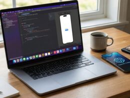
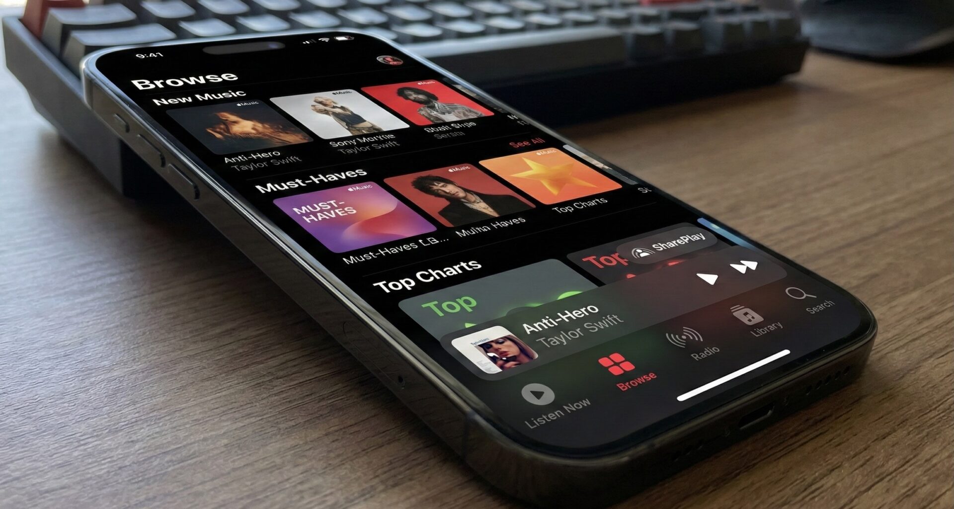
If you are an iOS Developer looking to create modern and fluid interfaces, you’ve probably noticed the mini-player in native apps like Apple Music or Podcasts. In today’s world of Swift programming, replicating this effect is more intuitive than ever. Thanks to the latest updates in SwiftUI, we no longer need complex visual hacks in Xcode.
In this article, we will explore how to master the TabView Bottom Accessory in SwiftUI, a tool for anchoring views directly above your bottom navigation bar introduced in iOS 26.
What is this modifier in SwiftUI and what is it used for?
Historically, placing a global view that floated above the TabView required juggling ZStack, calculating tab heights, and fighting safe areas in Swift. The .tabViewBottomAccessory modifier solves this by natively integrating your view into the TabView ecosystem.
It is the ideal space for:
- Audio or video mini-players.
- Global status indicators (e.g., “Syncing data…”, “Offline”).
- Quick access controls that must be present regardless of the selected tab.
Basic Implementation in Xcode
To add this accessory to your Xcode project, simply chain the modifier directly to your TabView container and provide it with the view you want to render using clean Swift code.
import SwiftUI

struct ContentView: View {
    var body: some View {
        TabView {
            Text("Home Screen")
                .tabItem {
                    Label("Home", systemImage: "house")
                }

            Text("Settings")
                .tabItem {
                    Label("Settings", systemImage: "gear")
                }
        }
        // 1. Add the accessory to the TabView
        .tabViewBottomAccessory {
            HStack {
                Text("Syncing 3 files...")
                Spacer()
                ProgressView()
            }
            .padding()
            .background(.regularMaterial)
            .cornerRadius(10)
            .padding(.horizontal)
        }
    }
}
Showing and hiding the accessory dynamically
As a good iOS Developer, you know that in most real-world cases you won’t want the accessory to be visible all the time (for example, a mini-player only appears when the user starts a track). To manage its appearance, the modifier accepts an isEnabled parameter that is very useful in SwiftUI.
@State private var isPlaying = false

// ... inside your view's layout:
TabView {
    // Your views and tabs here...
}
.tabViewBottomAccessory(isEnabled: isPlaying) {
    // This view will only appear, and take up space, if isPlaying is true
    MiniPlayerView()
}
💡 Swift programming best practice: Always use the isEnabled parameter instead of wrapping your view in an if/else conditional inside the closure. This helps the SwiftUI engine properly calculate layout spaces and prevents erratic animations.
Smart environment adaptation (Inline vs. Expanded)
One of the great advantages of using the TabView Bottom Accessory in SwiftUI over custom solutions is its integration with automatic tab bar hiding. If your tab contains a ScrollView and you enable hiding on scroll (.tabBarMinimizeBehavior), the accessory will visually readapt without you writing extra code.
You can detect this state change using environment variables to modify your interface in real time:
@Environment(\.tabViewBottomAccessoryPlacement) var placement
.expanded: The accessory is floating above the full tab bar..inline: The tab bar has minimized (or collapsed) and the accessory now integrates inline with the controls.
If you have any questions about this article, please contact me and I will be happy to help you 🙂. You can contact me on my X profile or on my Instagram profile.