


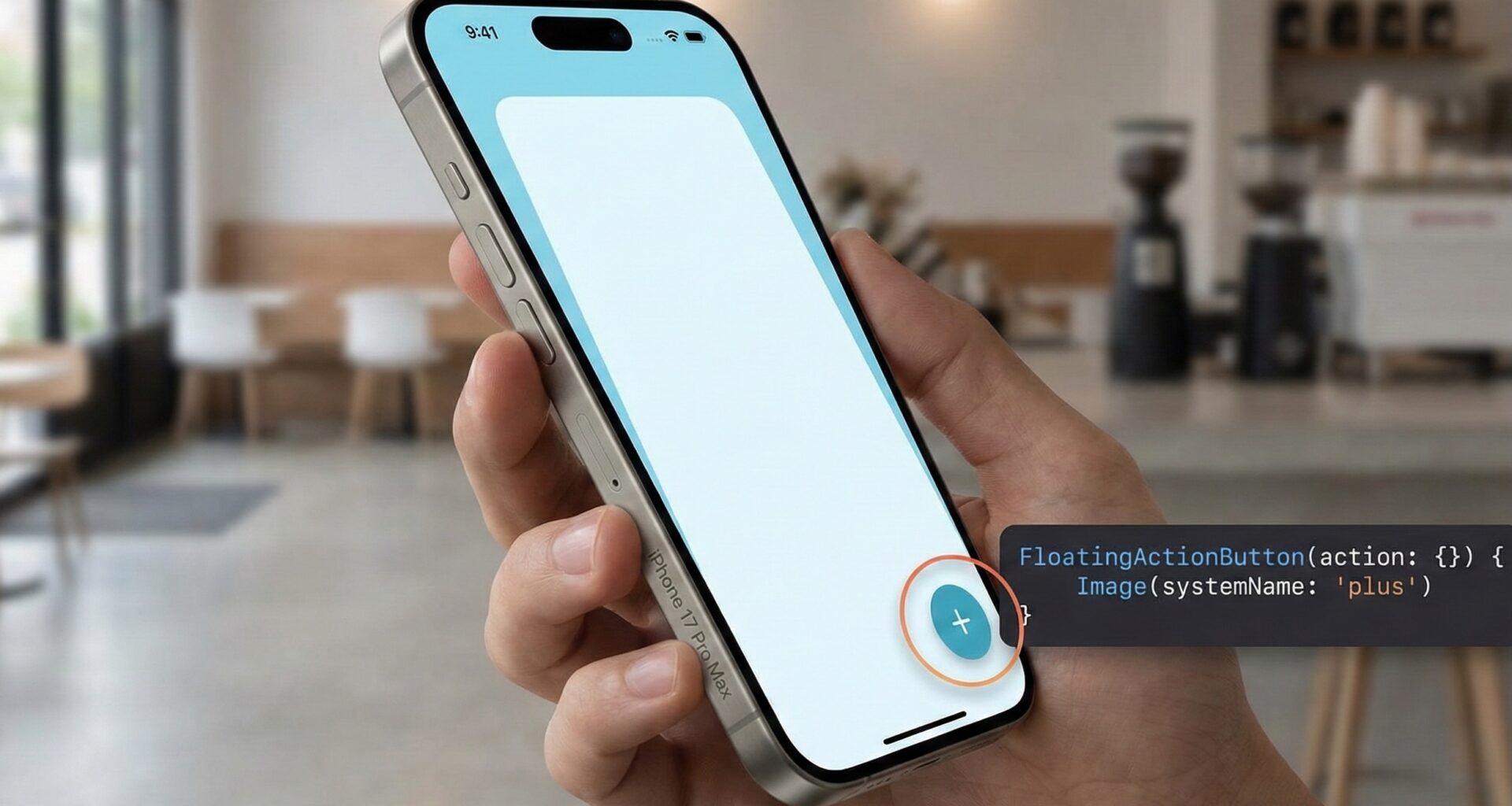
In the current mobile app development ecosystem, usability and visual hierarchy are fundamental. For any iOS Developer looking to stand out, mastering modern design patterns is a must. One of the most recognizable and useful elements is the Floating Action Button (FAB).
Although originally popularized by Material Design, the FAB has found its home in the Apple ecosystem, facilitating primary actions like composing an email, starting a tweet, or adding a task. In this comprehensive tutorial, you will learn step-by-step how to create a floating action button in SwiftUI, optimizing your workflow in Xcode and applying Swift programming best practices.
Why use a FAB in SwiftUI?
Before writing code, let’s understand the theory. A FAB is a circular button that floats above the interface content. Its goal is to promote the screen’s primary action. When developing in SwiftUI, the implementation differs drastically from UIKit; here we leave complex constraints behind to embrace the power of Stacks and Overlays.
Part 1: Basic Implementation with ZStack
To get started in Xcode, we need to understand the ZStack container. Unlike vertical or horizontal stacks, ZStack allows us to layer views on the depth axis (Z). The classic strategy for a beginner developer is often to use Spacers to push the button into a corner.
Let’s look at the first basic code example:
import SwiftUI

struct BasicFABView: View {
    var body: some View {
        ZStack {
            // Layer 1: The Main Content (Sample List)
            NavigationView {
                List(0..<30) { item in
                    Text("List item #\(item)")
                        .padding()
                }
                .navigationTitle("Home")
            }

            // Layer 2: The Floating Action Button (FAB)
            VStack {
                Spacer() // Pushes everything to the bottom
                HStack {
                    Spacer() // Pushes everything to the right

                    Button(action: {
                        print("FAB pressed: Primary Action")
                    }) {
                        Image(systemName: "plus")
                            .font(.title.weight(.semibold))
                            .padding()
                            .background(Color.blue)
                            .foregroundColor(.white)
                            .clipShape(Circle())
                            .shadow(radius: 4, x: 0, y: 4)
                    }
                    .padding() // Margin from the safe edge of the screen
                }
            }
        }
    }
}
This approach works, but as an expert iOS Developer, you’ll notice that cluttering the view with Spacers can make the code messy and hard to read, especially in complex views.
Part 2: The Professional Way using .overlay
A much cleaner and more powerful technique in modern Swift programming is using the .overlay() modifier along with the alignment property. This links the button to the parent container without needing extra ZStack structures wrapping the entire screen.
struct ProfessionalFABView: View {
    var body: some View {
        NavigationView {
            List(0..<20) { i in
                Text("Pending Task \(i)")
            }
            .navigationTitle("My Tasks")
            // Applying SwiftUI magic here
            .overlay(
                Button(action: {
                    // Creation logic here
                }) {
                    Image(systemName: "plus")
                        .font(.title2)
                        .frame(width: 60, height: 60) // Fixed size for touch area
                        .background(Color.accentColor)
                        .foregroundColor(.white)
                        .clipShape(Circle())
                        .shadow(color: .black.opacity(0.3), radius: 5, x: 3, y: 3)
                }
                .padding() // Padding to separate from the edge
                , alignment: .bottomTrailing // Automatic alignment
            )
        }
    }
}
Part 3: Creating a Reusable Component
The DRY (Don’t Repeat Yourself) principle is vital. If you are going to create a floating action button in SwiftUI on multiple screens, ideally you should encapsulate it in a reusable structure. This allows you to change the design in one place and have it reflect across your entire app.
import SwiftUI

struct FloatingActionButton: View {
    // Configurable properties for maximum flexibility
    var icon: String = "plus"
    var backgroundColor: Color = .blue
    var foregroundColor: Color = .white
    var action: () -> Void

    var body: some View {
        Button(action: action) {
            Image(systemName: icon)
                .font(.system(size: 24))
                .foregroundColor(foregroundColor)
                .frame(width: 60, height: 60)
                .background(backgroundColor)
                .clipShape(Circle())
                .shadow(color: Color.black.opacity(0.3), radius: 5, x: 3, y: 3)
                .contentShape(Circle()) // Improves touch area
        }
        .padding()
    }
}
Part 4: Expandable FAB (Animated Menu)
Let’s take this to the next level. Often, a single button isn’t enough. We need a dropdown menu (like a “Speed Dial”). This is where SwiftUI shines with its declarative animations.
We will use @State to control visibility and withAnimation to smooth the transition.
struct ExpandableFAB: View {
    @State private var isExpanded = false

    var body: some View {
        ZStack(alignment: .bottomTrailing) {
            // Dummy background
            Color.gray.opacity(0.1).ignoresSafeArea()

            VStack(spacing: 20) {
                if isExpanded {
                    // Secondary action buttons
                    menuButton(icon: "camera.fill", label: "Camera") { print("Camera") }
                    menuButton(icon: "photo.fill", label: "Gallery") { print("Gallery") }
                }

                // Main Button
                Button(action: {
                    withAnimation(.spring(response: 0.4, dampingFraction: 0.6)) {
                        isExpanded.toggle()
                    }
                }) {
                    Image(systemName: "plus")
                        .font(.title2)
                        .rotationEffect(.degrees(isExpanded ? 45 : 0)) // Rotates to an 'X'
                        .foregroundColor(.white)
                        .frame(width: 60, height: 60)
                        .background(Color.blue)
                        .clipShape(Circle())
                        .shadow(radius: 5)
                }
            }
            .padding()
        }
    }

    // Helper for small buttons
    func menuButton(icon: String, label: String, action: @escaping () -> Void) -> some View {
        HStack {
            Text(label)
                .font(.caption)
                .padding(5)
                .background(Color.white)
                .cornerRadius(5)
                .shadow(radius: 2)

            Button(action: action) {
                Image(systemName: icon)
                    .padding()
                    .background(Color.white)
                    .foregroundColor(.blue)
                    .clipShape(Circle())
                    .shadow(radius: 3)
            }
        }
        .transition(.scale.combined(with: .move(edge: .bottom))) // Combined transition
    }
}
Part 5: Multiplatform Adaptation (macOS and watchOS)
A true iOS Developer knows that SwiftUI code can run on multiple devices, but the User Experience (UX) must adapt. A giant button in the corner doesn’t work the same way on a Mac as it does on a watch.
Adaptation for macOS
On macOS, we need to handle the hover state (when the mouse passes over) and remove the default button styles that add grey borders.
#if os(macOS)
struct MacFAB: View {
    @State private var isHovering = false

    var body: some View {
        ZStack(alignment: .bottomTrailing) {
            Color.white // Content

            Button(action: { print("Action on Mac") }) {
                Image(systemName: "plus")
                    .font(.title)
                    .foregroundColor(.white)
                    .frame(width: 50, height: 50)
            }
            .buttonStyle(.plain) // CRUCIAL on macOS
            .background(isHovering ? Color.blue.opacity(0.8) : Color.blue)
            .clipShape(Circle())
            .shadow(radius: 4)
            .padding(20)
            .onHover { hovering in
                withAnimation(.easeInOut(duration: 0.2)) {
                    isHovering = hovering
                }
            }
        }
        .frame(minWidth: 400, minHeight: 300)
    }
}
#endif
Adaptation for watchOS
On the Apple Watch, corners are dangerous and space is limited. It is often better to place the button at the end of a ScrollView or use the .toolbar, but if you need a floating button, ensure it doesn’t cover content.
struct WatchFAB: View {
    var body: some View {
        ZStack {
            List(0..<10) { _ in Text("Data...") }

            VStack {
                Spacer()
                Button(action: {}) {
                    Image(systemName: "mic.fill")
                        .font(.title3)
                }
                .frame(width: 50, height: 50)
                .background(Color.red)
                .clipShape(Circle())
                .buttonStyle(.plain) // Avoids the full list row style
                .padding(.bottom, 5)
            }
        }
    }
}
Accessibility: The Professional Touch
Don’t forget accessibility. A button containing only an icon can be invisible to users relying on VoiceOver. In Xcode, you can easily test this with the accessibility inspector.
Button(action: {
    // Action
}) {
    Image(systemName: "plus")
}
.accessibilityLabel("Create new note") // What VoiceOver reads
.accessibilityHint("Opens the editor to write a new note") // Additional help
.accessibilityAddTraits(.isButton)
Conclusion
Knowing how to create a floating action button in SwiftUI is an essential skill combining design and functionality. We have journeyed from basic implementation with ZStack to advanced solutions with animated menus and multiplatform support.
As an iOS Developer, your goal should always be to write clean and maintainable code. Using modifiers like .overlay and extracting reusable components not only improves the readability of your project in Xcode, but also facilitates future scalability of your applications. Now it’s your turn to implement these concepts in your next big project!
If you have any questions about this article, please contact me and I will be happy to help you 🙂. You can contact me on my X profile or on my Instagram profile.