


In the vast universe of Swift programming, the user interface is the bridge between your logic and the end user. No matter how complex your backend is or how efficient your algorithms are; if the visual presentation isn’t clear and attractive, the user experience will suffer. For an iOS Developer transitioning from UIKit to SwiftUI, or for those starting from scratch, one of the most fundamental yet nuanced tasks is manipulating typography. Today, we are going to delve into an essential aspect: how to change text color in SwiftUI.
At first glance, it seems trivial. How hard can it be to paint a word blue? However, in professional application development for iOS, macOS, and watchOS using Xcode, color isn’t just aesthetics; it’s semantics, accessibility, and state. In this tutorial, we will explore everything from the basics to advanced techniques like gradients, Dark Mode adaptability, and `AttributedString`.
1. The Evolution: From .foregroundColor to .foregroundStyle
If you’ve been in the world of SwiftUI for a while, your muscle memory likely leads you to write .foregroundColor(). For years, this was the standard norm. However, as a good iOS Developer, you must stay on top of the framework’s evolution.
Since iOS 15, Apple introduced a more powerful and generic modifier: .foregroundStyle(). Why the change? Because foregroundColor limited content to a simple solid color. foregroundStyle, on the other hand, accepts any type that conforms to the `ShapeStyle` protocol. This means you can paint your text not just with flat colors, but with patterns, gradients, and materials.
Let’s look at the basic and modern implementation in Xcode:
import SwiftUI

struct BasicExampleView: View {
    var body: some View {
        VStack(spacing: 20) {
            // Classic Approach (Still works, but less flexible)
            Text("Hello, Classic Swift")
                .foregroundColor(.blue)
                .font(.title)

            // Modern Approach (Recommended for iOS 15+)
            Text("Hello, Modern SwiftUI")
                .foregroundStyle(.indigo)
                .font(.largeTitle)
                .fontWeight(.bold)
        }
    }
}
Note: Although .foregroundColor is not strictly deprecated at the time of writing, Apple strongly pushes towards .foregroundStyle due to its versatility in the view hierarchy.
2. Semantic Colors and Adaptability (Dark Mode)
One of the most common mistakes for a beginner programmer in Swift is “hardcoding” colors (e.g., .black or .white). If you define text as .black, it will look perfect in Light Mode, but it will disappear completely against the black background of Dark Mode.
To develop professional applications on iOS, you must use Semantic Colors. These are colors that describe their purpose rather than their absolute value. SwiftUI (and UIKit under the hood) takes care of changing the RGB value depending on the system environment.
Primary and Secondary Colors
Instead of black or white, use .primary, .secondary, etc.
struct SemanticColorsView: View {
    var body: some View {
        VStack(alignment: .leading) {
            Text("Main Title")
                .font(.title)
                // .primary looks black in Light Mode and white in Dark Mode
                .foregroundStyle(.primary)

            Text("Descriptive Subtitle")
                .font(.subheadline)
                // .secondary is an automatic semi-transparent gray
                // Adds visual hierarchy effortlessly
                .foregroundStyle(.secondary)

            Text("Tertiary Information")
                .font(.caption)
                .foregroundStyle(.tertiary)
        }
        .padding()
    }
}
Using .secondary and .tertiary is vital for creating depth in your interface without needing to design custom gray palettes.
3. Using Assets: Custom Colors in Xcode
Rarely is an application built only with system colors. Your brand has an identity. To manage this correctly in Xcode, you must use the asset catalog (Assets.xcassets).
The process is as follows:
- Open
Assets.xcassets. - Right click -> New Color Set.
- Name it (e.g., “BrandColor”).
- In the attributes inspector, define the color for “Any Appearance” (Light Mode) and “Dark Appearance” (Dark Mode).
Once configured, using it to change text color in SwiftUI is safe and clean:
Text("Corporate Text")
    .foregroundStyle(Color("BrandColor"))
4. Taking Design to the Next Level: Gradients in Text
Here is where .foregroundStyle() really shines and justifies why an iOS Developer should modernize their code. Before, putting a gradient over text required complex masking. Now, it’s native.
We can apply LinearGradient, RadialGradient, or AngularGradient directly onto the text.
struct GradientTextView: View {
    var body: some View {
        Text("SwiftUI is Magic")
            .font(.system(size: 50, weight: .black))
            .foregroundStyle(
                LinearGradient(
                    colors: [.blue, .purple, .pink],
                    startPoint: .topLeading,
                    endPoint: .bottomTrailing
                )
            )
            // Add a shadow to improve contrast
            .shadow(color: .black.opacity(0.3), radius: 5, x: 0, y: 5)
    }
}
This code generates visually striking text, ideal for headers or logos within the app, working perfectly on both iOS and macOS.
5. Coloring Specific Parts of Text
A recurring question in Swift programming forums is: “How do I make one word bold and red inside a normal sentence?”. Historically, this required UIKit’s NSAttributedString, which was verbose and painful to integrate into SwiftUI.
Today we have two elegant ways to do it:
A. Text View Concatenation
SwiftUI allows adding Text views together as if they were strings.
struct ConcatenationView: View {
    var body: some View {
        // The + operator combines texts maintaining their individual modifiers
        (Text("I accept the ")
            .foregroundStyle(.primary) +
         Text("Terms and Conditions")
            .foregroundStyle(.blue)
            .underline() +
         Text(" of the application."))
            .foregroundStyle(.primary)
    }
}
B. Markdown and AttributedString (The Modern Way)
SwiftUI now natively supports basic Markdown. But for specific colors within a string, `AttributedString` is the ultimate tool for the expert developer.
struct AttributedTextView: View {
    var body: some View {
        Text(createAttributedText())
    }

    func createAttributedText() -> AttributedString {
        var string = AttributedString("Learn Swift today")

        // We look for the range of the word "Swift"
        if let range = string.range(of: "Swift") {
            // Apply orange color and bold style only to that range
            string[range].foregroundColor = .orange
            string[range].font = .body.bold()
        }

        return string
    }
}
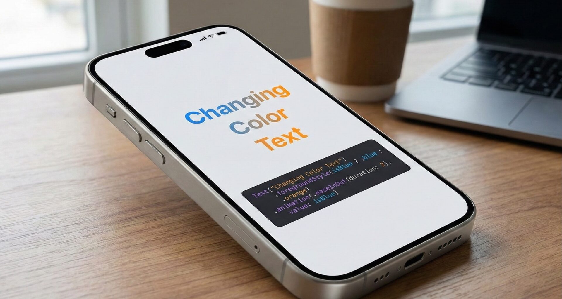
6. Conditional and Reactive Color Changes
The magic of SwiftUI lies in its declarative nature based on states. Changing text color in SwiftUI dynamically in response to a user action is trivial thanks to the @State wrapper.
Let’s imagine a validation form where the text color changes if there is an error.
struct PasswordValidationView: View {
    @State private var password = ""

    // Computed property to determine validity
    var isSecure: Bool {
        password.count >= 8
    }

    var body: some View {
        VStack {
            SecureField("Password", text: $password)
                .textFieldStyle(.roundedBorder)
                .padding()

            Text(isSecure ? "Secure Password" : "Minimum 8 characters")
                // Ternary operator to change color reactively
                .foregroundStyle(isSecure ? .green : .red)
                .animation(.easeInOut, value: isSecure) // Animate color change
        }
    }
}
In this example, the color transitions smoothly between red and green thanks to the .animation modifier, offering a polished user experience.
7. Considerations for watchOS and Widgets
Although SwiftUI is a unified framework, context matters. When developing for watchOS, the background is almost always pure black to save battery on OLED screens. Here, contrast is king. Avoid using dark colors like standard .blue for long texts; prefer brighter variants or use .tint.
In iOS Widgets, the system might tint your content automatically depending on the user’s configuration mode (especially in iOS 18+). Make sure to use WidgetRenderingMode in your previews to test how your text colors react when the system desaturates or colors them.
8. Creating a Custom ViewModifier
To keep your code clean and reusable (DRY – Don’t Repeat Yourself), a good iOS Developer creates their own modifiers. If your app has a specific style for error titles, don’t repeat the color and font code in every view.
struct ErrorTextStyle: ViewModifier {
    func body(content: Content) -> some View {
        content
            .foregroundStyle(.red)
            .font(.system(size: 14, weight: .semibold, design: .rounded))
            .opacity(0.9)
    }
}

// Extension for easy usage
extension View {
    func errorStyle() -> some View {
        modifier(ErrorTextStyle())
    }
}

// Usage
Text("Connection Error")
    .errorStyle()
Conclusion
Knowing how to change text color in SwiftUI involves much more than picking a shade from the palette. It implies understanding visual hierarchy through semantic colors (.primary, .secondary), mastering the modernity of .foregroundStyle to apply gradients, and ensuring accessibility and adaptability through Assets in Xcode.
As a developer working with Swift in the Apple ecosystem, these details make the difference between an amateur application and a professional one. Whether you are building for iPhone, Mac, or Apple Watch, color is your most powerful communication tool.
If you have any questions about this article, please contact me and I will be happy to help you  . You can contact me on my X profile or on my Instagram profile.