


In the modern iOS development ecosystem, navigation and visual hierarchy are the pillars of a great User Experience (UX). In the early versions of SwiftUI, developers relied on modifiers like .navigationBarItems to place buttons in the navigation bar. However, Apple introduced a powerful and semantic evolution: the .toolbar modifier.
This article is a deep, 2000-word dive into the universe of toolbars in SwiftUI. You won’t just learn how to “put a button in the top right corner”; you will understand the philosophy behind the API, how to manage the semantic placement of elements, how to create bottom bars, customize keyboards, and adapt your interface to different platforms (iOS, iPadOS, macOS) with a single codebase.
1. What exactly is the .toolbar modifier?
The .toolbar modifier is the unified, declarative way to populate the navigation and tool areas of an application. Unlike its predecessors, which were strictly tied to the “Navigation Bar,” .toolbar is abstract and adaptive.
Why is this distinction important? Because SwiftUI doesn’t think in fixed pixels, but in roles and contexts. When you use .toolbar, you aren’t telling the system “put this button at coordinate (x,y).” You are telling it: “I have this important action; find the best available place for it based on the device and the current state of the interface.”
The Basic Structure
For a toolbar to work, it generally needs to reside within a navigation context, such as a NavigationStack (or the deprecated NavigationView) or a NavigationSplitView.
NavigationStack {
    Text("My Main Content")
        .toolbar {
            // Your buttons go here
        }
}
2. Creating Your First Toolbar: ToolbarItem
The fundamental building block within the .toolbar modifier is the ToolbarItem. A ToolbarItem wraps the view you want to display (a button, text, image) and, most importantly, defines its location (placement).
Let’s create a basic example: a profile screen with a “Settings” button.
import SwiftUI

struct ProfileView: View {
    var body: some View {
        NavigationStack {
            VStack {
                Image(systemName: "person.circle.fill")
                    .font(.system(size: 100))
                    .foregroundStyle(.blue)
                Text("Guest User")
                    .font(.title)
            }
            .navigationTitle("My Profile")
            .toolbar {
                ToolbarItem(placement: .primaryAction) {
                    Button {
                        print("Open settings")
                    } label: {
                        Image(systemName: "gear")
                    }
                }
            }
        }
    }
}
Breaking Down the Code
NavigationStack: Creates the navigation bar environment. Without this, the toolbar would have nowhere to visually render at the top..toolbar { ... }: The container for our items.placement: .primaryAction: Here is the magic. We didn’t say “right” (trailing). We said “primary action.” On iOS, this is automatically placed on the right. On macOS, it might behave differently. Using semantic roles makes your code more future-proof.
3. The Science of Placement: ToolbarItemPlacement
The placement parameter is what separates novices from SwiftUI experts. Knowing the placement options allows you to create complex interfaces that feel native. Let’s analyze the most important ones:
A. Directional Placements (.topBarLeading and .topBarTrailing)
These are the most straightforward if you are coming from UIKit.
.topBarLeading: The left side of the bar (in Left-to-Right languages). Ideal for “Cancel” buttons or side menus..topBarTrailing: The right side. Ideal for “Save”, “Edit”, or main actions.
(Note: In earlier iOS versions, .navigationBarLeading was used, which is now deprecated in favor of .topBar... for greater clarity).
B. The Principal Role (.principal)
This placement puts the content in the center of the navigation bar. By default, iOS puts the title here (.navigationTitle), but you can override it.
Use Case: You want to display a brand logo or a Picker (segmented control) instead of a simple text title.
ToolbarItem(placement: .principal) {
    VStack {
        Text("My App").font(.headline)
        Text("Status: Online").font(.caption).foregroundStyle(.green)
    }
}
C. The Bottom Bar (.bottomBar)
If you assign this placement, SwiftUI will automatically create a toolbar at the bottom of the screen (similar to Safari on iOS). It is ideal for secondary actions that need to be within thumb’s reach.
ToolbarItem(placement: .bottomBar) {
    HStack {
        Button("Previous") { ... }
        Spacer()
        Button("Next") { ... }
    }
}
D. The Virtual Keyboard (.keyboard)
This is one of the most useful and least known tricks. You can inject buttons directly into the virtual keyboard’s accessory bar.
Common Problem: You have a long form and want a “Done” button to close the numeric keypad. Solution:
TextField("Enter amount", text: $amount)
    .keyboardType(.decimalPad)
    .toolbar {
        ToolbarItem(placement: .keyboard) {
            HStack {
                Spacer() // Pushes the button to the right
                Button("Done") {
                    // Close keyboard
                    UIApplication.shared.sendAction(#selector(UIResponder.resignFirstResponder), to: nil, from: nil, for: nil)
                }
            }
        }
    }
4. Semantic Placements: Speaking the System’s Language
Apple strongly recommends using semantic placements instead of directional ones whenever possible. This allows the system to reorder buttons if iOS design conventions change in the future.
.cancellationAction: The system knows this cancels the current operation. It is generally located on the left (leading)..confirmationAction: Confirms the operation (e.g., “Save”, “Send”). It is located on the right and often automatically uses a bold font weight..destructiveAction: For actions that delete data. The system might color it red or place it separately from other safe actions..status: Displays status information, useful in bottom bars (e.g., “Updated 5 min ago”).
Example of an Edit Modal:
struct EditNoteView: View {
@Environment(\.dismiss) var dismiss
var body: some View {
NavigationStack {
TextEditor(text: .constant("Type here..."))
.toolbar {
ToolbarItem(placement: .cancellationAction) {
Button("Cancel") { dismiss() }
}
ToolbarItem(placement: .confirmationAction) {
Button("Save") {
// Save logic
dismiss()
}
}
}
}
}
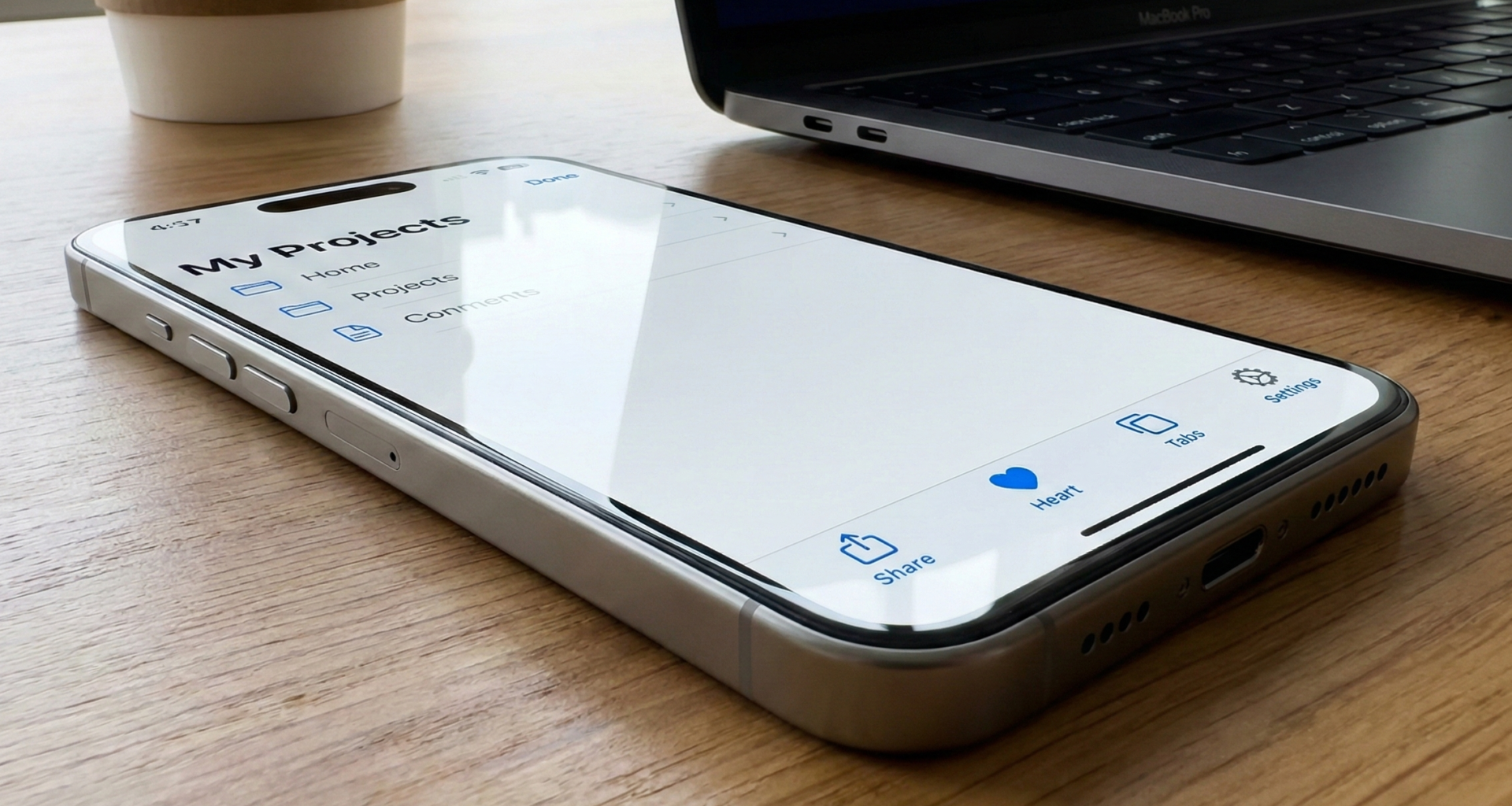
}5. Grouping Elements: ToolbarItemGroup
What happens if you need three buttons on the right? If you create three separate ToolbarItems, it might work, but the code becomes verbose. For this, ToolbarItemGroup exists.
This container allows you to define a single placement for multiple views.
.toolbar {
    ToolbarItemGroup(placement: .topBarTrailing) {
        Button(action: {}) { Image(systemName: "heart") }
        Button(action: {}) { Image(systemName: "square.and.arrow.up") }
        Button(action: {}) { Image(systemName: "plus") }
    }
}
SwiftUI will take care of spacing them correctly according to Apple’s Human Interface Guidelines.
6. Advanced Visual Customization
Once you master placement, the next step is styling. Since iOS 16, we have much more control over the appearance of the bar.
Bar Visibility
Sometimes you want an immersive experience where the bar disappears.
.toolbar(showToolbar ? .visible : .hidden, for: .navigationBar)Backgrounds and Colors (toolbarBackground)
Previously, changing the navigation bar background color required “hacks” with UINavigationBar.appearance(). Now it is native:
.toolbarBackground(.visible, for: .navigationBar)
.toolbarBackground(Color.indigo, for: .navigationBar)
.toolbarColorScheme(.dark, for: .navigationBar) // Forces white text
This code ensures that the bar is always visible (not transparent when scrolling) and has an Indigo color, forcing buttons and titles to be white (.dark scheme) to maintain contrast.
Menu Titles
If you are creating a dropdown menu inside the toolbar, you can control how the main button looks.
ToolbarItem(placement: .topBarTrailing) {
    Menu {
        Button("Duplicate") { }
        Button("Rename") { }
    } label: {
        // Customizing the button that opens the menu
        Label("Options", systemImage: "ellipsis.circle")
    }
}
7. State Management and Logic
A static toolbar isn’t very useful. We need it to react to the application state. The beauty of SwiftUI is that the .toolbarmodifier redraws when the view’s @State changes.
Example: “Save” button disabled until there is text.
struct FormView: View {
    @State private var name: String = ""
    @State private var isSaving: Bool = false

    var body: some View {
        NavigationStack {
            Form {
                TextField("Your name", text: $name)
            }
            .navigationTitle("Register")
            .toolbar {
                ToolbarItem(placement: .confirmationAction) {
                    if isSaving {
                        ProgressView()
                    } else {
                        Button("Submit") {
                            saveData()
                        }
                        .disabled(name.isEmpty) // Reactive validation
                    }
                }
            }
        }
    }

    func saveData() {
        isSaving = true
        // Network simulation
        DispatchQueue.main.asyncAfter(deadline: .now() + 2) {
            isSaving = false
        }
    }
}
In this example, we see two key patterns:
- Validation: The
.disabledmodifier reads thenamevariable. If it’s empty, the toolbar button automatically dims. - State Change: When
isSavingistrue, we replace the button with aProgressView(spinner). This happens smoothly within the same bar.
8. Multiplatform Considerations (iOS vs iPadOS vs macOS)
One of the biggest benefits of .toolbar is its adaptability.
- iOS (iPhone): Actions like
.primaryActionor.topBarTrailingusually go top right. If there are many, iOS might automatically collapse them or reduce title space. - iPadOS: Depending on the screen size and if you use
NavigationSplitView, toolbar elements can move dynamically. - macOS: Here the transformation is radical. A toolbar in macOS resides outside the main window content (at the top of the Finder/App window). Buttons render as native AppKit controls. The
placement: .principaldoes not work the same way; on macOS, the toolbar is a unified space.
If you are developing for macOS with SwiftUI, it is vital to group related commands. The system will attempt to show icons without text unless you specify otherwise, and contextual menus are more common.
9. Common Mistakes and Best Practices
Over the years working with SwiftUI, I’ve seen recurring mistakes when using toolbars. Here is how to avoid them:
A. Overload
Mistake: Putting 5 icons in the top bar. Solution: Use at most 2 visible primary actions. For the rest, group them in a Menu or move them to a .bottomBar. On mobile screens, horizontal space is gold.
B. Hit Targets
Mistake: Using only small text for important buttons. Solution: Ensure your buttons have enough touch area. Although the system handles this well by default, if you use complex custom views inside a ToolbarItem, you could break accessibility. Use Label("Text", systemImage: "icon") whenever possible, as it adapts better.
C. Modifier Hierarchy
Mistake: Applying .toolbar to the NavigationStack instead of the internal view. Solution: The modifier must be attached to the content inside the stack.
// INCORRECT ❌
NavigationStack {
   Text("Hello")
}
.toolbar { ... } // This tries to add the toolbar to the external stack, often fails or doesn't update on navigation.

// CORRECT ✅
NavigationStack {
   Text("Hello")
       .toolbar { ... } // The toolbar belongs to this specific view.
}
D. Ignoring Accessibility
Icon buttons (e.g., a gear icon) do not have visible text. VoiceOver won’t know what to say unless you specify it.Solution:
Button { ... } label: {
    Image(systemName: "gear")
}
.accessibilityLabel("Open Settings")
However, if you use the standard Label type or text buttons, SwiftUI handles this automatically.
10. Master Class Example: A Complete Task Manager
To finish, let’s combine everything we’ve learned into a realistic example. We will create a task list view that features:
- Main Title.
- Filter button (left).
- Add button (right).
- Bottom bar with task count.
- Keyboard toolbar to add tasks quickly.
import SwiftUI

struct TaskManagerView: View {
    @State private var tasks = ["Buy milk", "Call doctor", "Pay electricity"]
    @State private var newTask = ""
    @State private var isFilterActive = false
    @FocusState private var isInputFocused: Bool

    var body: some View {
        NavigationStack {
            List {
                if isFilterActive {
                    Text("Showing priority tasks only (Simulated)")
                        .foregroundStyle(.secondary)
                }

                ForEach(tasks, id: \.self) { task in
                    Text(task)
                }
                .onDelete { tasks.remove(atOffsets: $0) }

                // Integrated input field
                TextField("New task...", text: $newTask)
                    .focused($isInputFocused)
            }
            .navigationTitle("My Tasks")
            .toolbar {
                // 1. Filter Button on the left
                ToolbarItem(placement: .topBarLeading) {
                    Button {
                        isFilterActive.toggle()
                    } label: {
                        Image(systemName: isFilterActive ? "line.3.horizontal.decrease.circle.fill" : "line.3.horizontal.decrease.circle")
                    }
                }

                // 2. Standard Edit Button on the right
                ToolbarItem(placement: .topBarTrailing) {
                    EditButton() // SwiftUI provides this native button
                }

                // 3. Bottom status bar
                ToolbarItem(placement: .bottomBar) {
                    HStack {
                        Text("\(tasks.count) Tasks")
                            .font(.caption)
                        Spacer()
                    }
                }

                // 4. Custom bar above the keyboard
                ToolbarItemGroup(placement: .keyboard) {
                    Spacer()
                    Button("Add Task") {
                        if !newTask.isEmpty {
                            tasks.append(newTask)
                            newTask = ""
                            // Keep focus or dismiss based on preference
                        }
                    }
                    .disabled(newTask.isEmpty)
                    .bold()
                }
            }
        }
    }
}
Example Analysis
This code demonstrates the extreme flexibility of .toolbar. We have elements interacting with state (isFilterActive), native system elements (EditButton), informational elements at the bottom (.bottomBar), and productivity enhancements on the keyboard (.keyboard). Everything declared cleanly and maintainably.
Conclusion
The .toolbar modifier in SwiftUI isn’t just a way to place buttons; it’s an intent management system. By adopting this modifier and its semantic ToolbarItemPlacements, you ensure that your application:
- Looks native on all versions of iOS.
- Automatically adapts to iPadOS and macOS.
- Is accessible and easy to navigate.
Moving away from fixed coordinate thinking and embracing the declarative nature of the toolbar is an essential step in maturing as a SwiftUI developer.
If you have any questions about this article, please contact me and I will be happy to help you 🙂. You can contact me on my X profile or on my Instagram profile.


