


The arrival of SwiftUI at WWDC 2019 marked a turning point in the Apple development ecosystem. We left behind the imperative nature of UIKit (where we told the system how to do things step-by-step) to embrace a declarative paradigm: now we simply tell the system what we want to see, and it handles the rest.
However, for developers facing this blank canvas, two fundamental questions arise: What are the components available to me? and, more importantly, Where on earth are those pieces and their documentation hiding?
In this tutorial, we will break down the anatomy of SwiftUI and teach you how to fish in the vast ocean of Apple’s libraries.
Part 1: The Philosophy — “Everything is a View”
To understand the components, you must first understand the golden rule: In SwiftUI, everything is a View.
Unlike other frameworks where you have controllers, views, models, and delegates scattered around, here a button is a view, text is a view, a color is a view, and even the spacing between two elements can be treated as a view.
The basic structure always obeys the View protocol:
import SwiftUI

struct MyFirstView: View {
    var body: some View {
        Text("Hello, world")
    }
}
That body property is the heart of your component. It is what will be rendered on the screen.
Part 2: The Main Components (Your Building Blocks)
We can categorize native SwiftUI components into three main groups: Structural (Layout), Control, and Information.
1. Structural Components (Layout Containers)
Since SwiftUI calculates layout automatically, we need containers to group elements. The three pillars of design are:
- VStack (Vertical Stack): Stacks views vertically. It is the backbone of most screens.
- HStack (Horizontal Stack): Aligns views horizontally, side by side.
- ZStack (Depth Stack): Stacks views on top of each other (on the Z-axis). It is fundamental for placing backgrounds behind text or creating complex layers.
Pro Tip: Unlike AutoLayout, Stacks don’t need complex constraints. They use
Spacersto push content toward the edges.
2. Control and Interaction Components
These are the elements the user interacts with.
- Button: The most basic. Accepts an action (code to execute) and a label (what is seen).
- TextField: For text input. Requires a binding (a link to a state variable) to know where to save what the user types.
- Toggle / Slider / Stepper: Classic interface controls for boolean or numeric values.
- TabView: Allows navigation via tabs at the bottom, ideal for the main sections of an app.
3. Information Components
These display static or dynamic data.
- Text: Displays strings. Supports basic Markdown formatting and string interpolation.
- Image: Renders images from assets or system symbols (SF Symbols).
- List: The modern equivalent of the old
UITableView. Creates scrolling lists incredibly easily.
Part 3: The Modifier System
In SwiftUI, you rarely configure object properties directly (e.g., label.textColor = .red). Instead, you use Modifiers.
A modifier is a method that wraps a view and returns a new view with the change applied.
Text("SwiftUI is awesome")
    .font(.title)             // Modifier 1
    .foregroundColor(.blue)   // Modifier 2
    .padding()                // Modifier 3
    .background(Color.yellow) // Modifier 4
Watch out for the order! The order of modifiers matters. If you apply
backgroundbeforepadding, the background color will only cover the text. If you applypaddingand thenbackground, the color will cover the text plus the extra space.
Part 4: Where are the libraries?
This is where many developers get confused. When you ask “Where are the libraries?”, the answer has three levels.
Level 1: The Xcode Visual Library (The Magic Shortcut)
If you are a visual learner and can’t remember how to write a component, Xcode has a built-in library ready for “drag and drop.”
- Open your SwiftUI file in Xcode.
- Press the key combination:
Shift + Command + L. - A floating window with tabs will appear.
- The first tab (square icon) contains all views (Text, Button, List, etc.).
- The second contains the modifiers.
- You can drag an element from that window directly into your code.
Level 2: The SwiftUI Framework (Source Code)
Physically, the library resides in the iOS SDK. To access it, you only need one line at the beginning of your file:
import SwiftUIIf you want to see how a view is built internally (its “signature”), you can do the following:
- Hold down the Command (⌘) key.
- Click on any component in your code (e.g., on the word
VStack). - Select “Jump to Definition”.
This will take you to the public interface of the framework, where you will see what parameters that component accepts and what data types it requires.
Level 3: Apple Developer Documentation
This is the “Bible.” It is not in your code, but on the web or in Xcode’s help viewer.
- Quick Access: In Xcode, go to the menu Window > Developer Documentation (or press
Shift + Command + 0). - Search: Type “SwiftUI” or the name of any component.
- Content: Here you will see not only the definition but also code examples, interactive tutorials, and notes on which iOS versions support each component.
Part 5: State Management (The Engine)
We can’t talk about components without mentioning how they move. SwiftUI uses a State-Driven architecture.
If you want a component to change (for example, a color turning from red to green), you don’t change the color manually. You change a state variable, and SwiftUI redraws the view for you.
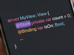
@State: For simple variables that belong to a single view (e.g., anon/offboolean).@Binding: To pass control of a state from a parent to a child.@Environment: To access global system values (like dark or light mode).
Part 6: Practical Tutorial – Creating a Profile Card
Let’s bring everything we’ve learned together (Components + Modifiers + State) in a real-world example. We will create a user card.
import SwiftUI

struct ProfileCard: View {
    // 1. STATE: A variable to control if we are following the user
    @State private var isFollowing = false

    var body: some View {
        // 2. LAYOUT: ZStack for the background
        ZStack {
            Color(.systemGray6)
                .edgesIgnoringSafeArea(.all)

            // 3. LAYOUT: VStack to stack info
            VStack(spacing: 20) {

                // 4. COMPONENT: Image
                Image(systemName: "person.crop.circle.fill")
                    .resizable()
                    .aspectRatio(contentMode: .fit)
                    .frame(width: 100, height: 100)
                    .foregroundColor(.blue)
                    .padding()
                    .background(Color.white)
                    .clipShape(Circle())
                    .shadow(radius: 10)

                // 5. COMPONENT: Text
                Text("SwiftUI Engineer")
                    .font(.title2)
                    .fontWeight(.bold)

                Text("Expert in components and libraries")
                    .font(.subheadline)
                    .foregroundColor(.secondary)

                // 6. COMPONENT: Control (Button)
                Button(action: {
                    // Change state with an animation
                    withAnimation {
                        isFollowing.toggle()
                    }
                }) {
                    Text(isFollowing ? "Following" : "Follow")
                        .fontWeight(.bold)
                        .padding()
                        .frame(maxWidth: .infinity)
                        .background(isFollowing ? Color.green : Color.blue)
                        .foregroundColor(.white)
                        .cornerRadius(10)
                }
                .padding(.horizontal)
            }
            .padding()
            .background(Color.white)
            .cornerRadius(20)
            .shadow(radius: 5)
            .padding()
        }
    }
}

#Preview {
    ProfileCard()
}
Code Analysis:
- Import:
import SwiftUIbrings in the entire library. @State: TheisFollowingvariable is the source of truth.- VStack & ZStack: Organize elements visually.
- Modifiers:
.padding(),.background(),.shadow()beautify the raw views. - Logic: The button does not change its color directly; it changes the
isFollowingvariable, and the button reacts to that change automatically.
Conclusion: The Future is Declarative
Mastering SwiftUI isn’t about memorizing every component, but understanding how to compose them and how data flows between them.
Remember:
- Use
Shift + Command + Lto explore components visually. - Use
Shift + Command + 0to read the deep documentation. - Always think in states, not imperative steps.
SwiftUI continues to evolve (especially with iOS 17 and 18), adding new APIs and performance improvements. The best way to keep up is to explore the official documentation regularly and experiment in Xcode.
If you have any questions about this article, please contact me and I will be happy to help you 🙂. You can contact me on my X profile or on my Instagram profile.