


Frustrated because the default gray placeholder ruins your SwiftUI app design? Learn modern (iOS 15+) and classic techniques to customize the placeholder text color in Xcode. Step-by-step tutorial with code.
Introduction: The Art of Small Details in UI
In the vast universe of mobile app development, we often focus on the grand architectures: state management, complex networking, or fluid navigation. However, User Experience (UX) is defined by the details. A flawless design can be tarnished by an element that doesn’t quite fit, a color that clashes, or a lack of contrast that hinders readability.
If you’ve been developing interfaces with SwiftUI in Xcode for any length of time, you’ve likely stumbled upon one of those “little big problems” that seem disproportionately difficult to solve: changing the placeholder color of a TextField.
It is an extremely common design request. Your designer hands you a beautiful mockup with a dark background and a text field where the placeholder needs to be a subtle white, or perhaps a specific brand color. You open Xcode, type TextField("Search...", text: $text), and try to apply a modifier like .placeholderColor(.red).
And then you realize: that modifier doesn’t exist.
The default gray color Apple imposes on SwiftUI placeholders is elegant, but it isn’t universal. Sometimes it’s too light for light backgrounds, and other times it simply doesn’t fit your color palette.
In this definitive tutorial for your trusted tech blog, we are going to dissect this issue. We won’t just give you a quick fix; we’ll explore why this happens and teach you the different ways to tackle it, depending on the iOS version you are targeting. From the modern, native solution introduced in iOS 15 to the classic tricks using ZStack for older versions,you’ll leave here mastering this aspect of your SwiftUI forms.
Open your Xcode, and let’s get started!
Understanding the Problem: The Native TextField
Before jumping into solutions, it is crucial to understand how SwiftUI handles the TextField component.
In its initial versions, SwiftUI was famous for being a declarative layer over UIKit components (like UITextField). The old-world UITextField had an attributedPlaceholder property that allowed for easy colorization.
However, the SwiftUI TextField aims to be more abstract. When we write:
@State private var username: String = ""

var body: some View {
    TextField("Username", text: $username)
        .padding()
        .background(Color.gray.opacity(0.2))
        .cornerRadius(10)
}
The first string, “Username,” serves a dual purpose in early versions of SwiftUI. It acts as the accessibility label and as the visual placeholder text if the field is empty.
The natural instinct of any developer is to try changing the text color using the standard modifier:
TextField("Username", text: $username)
    .foregroundColor(.red) // SPOILER ALERT: This doesn't do what you think!
If you run this, you will see that the .foregroundColor(.red) modifier changes the color of the text the user types, but the placeholder remains that stubborn gray.
This limitation led the community to create creative solutions during the early years of SwiftUI. Fortunately, Apple answered our prayers at WWDC21.
Solution 1: The Modern Way (iOS 15 and above)
If your application only needs to support iOS 15, macOS 12, and later versions (which is increasingly common in 2024), you are in luck. The solution is clean, native, and powerful.
The key lies in a subtle but fundamental change in the TextField initializers introduced in Swift 5.5.
Apple separated the concept of “label” (for accessibility and form titles) from the concept of “prompt” (the visual placeholder). And most importantly: the prompt parameter now accepts a view of type Text, not just a simple String.
The Power of Accepting a Text View
The fact that the placeholder is now a Text view means we can apply standard text modifiers to it before passing it to the TextField.
Let’s look at the simplified signature of the modern initializer:
// Simplified signature
TextField(text: Binding<String>, prompt: Text?) {
    // Label View
}
Or the more common version using a visible title key:
TextField(_ titleKey: LocalizedStringKey, text: Binding<String>, prompt: Text?)That prompt: Text? parameter is our gateway to customization.
Step-by-Step Implementation
We are going to create a simple view with a text field that has a custom blue placeholder.
Step 1: Basic Configuration
Open a new SwiftUI project in Xcode. Ensure the “Deployment Target” is iOS 15.0 or higher.
import SwiftUI

struct ModernPlaceholderView: View {
    @State private var email: String = ""

    var body: some View {
        VStack {
            Text("Modern Form")
                .font(.headline)

            // Our TextField will go here
        }
        .padding()
    }
}
Step 2: Using the New Initializer
Instead of using the classic initializer TextField("Placeholder", text: $...), we are going to be explicit with the prompt parameter.
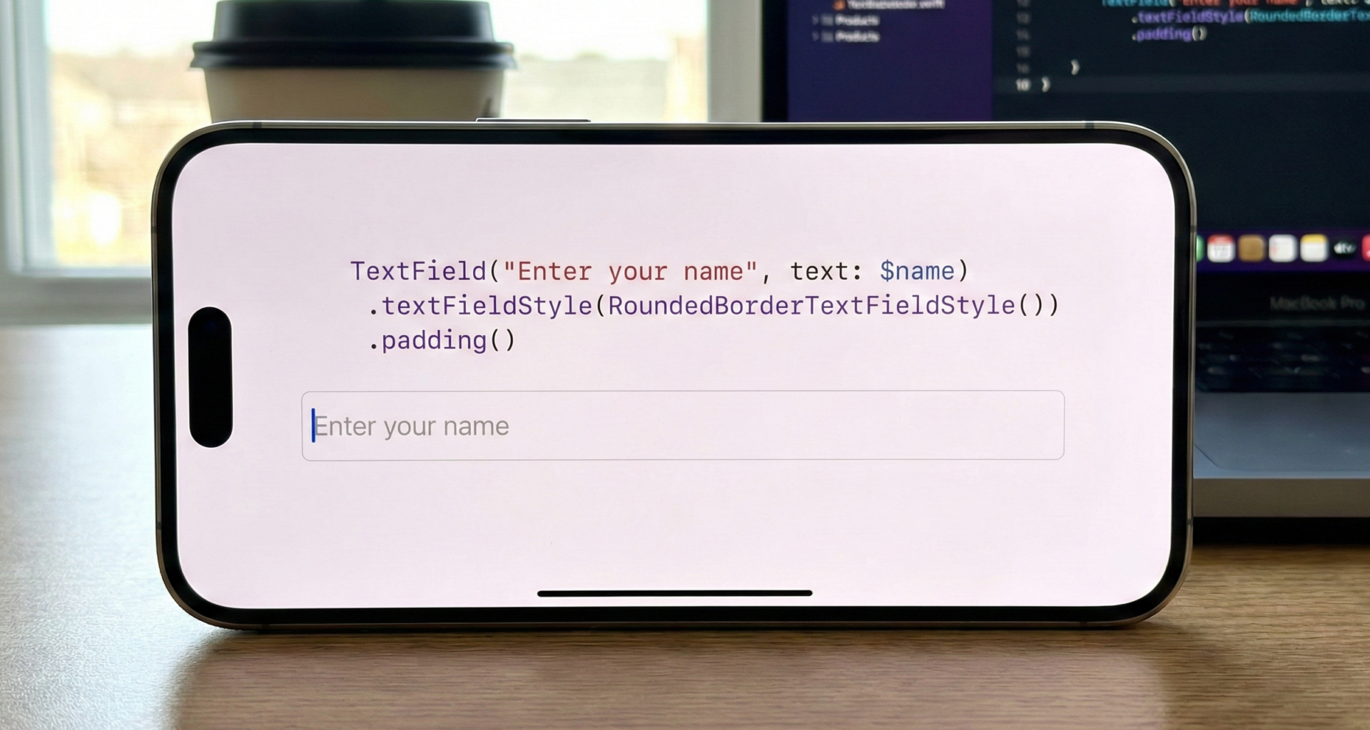
TextField("Email", text: $email, prompt: Text("Enter your email..."))
    .textFieldStyle(.roundedBorder)
If you run this, you will still see the default gray. We’ve changed how we declare it, but not the style.
Step 3: Applying Color to the Prompt
Here comes the magic. Since the prompt is a Text view, we can apply .foregroundColor (or the more modern .foregroundStyle in iOS 17) directly to that Text object.
import SwiftUI

struct ModernPlaceholderView: View {
    @State private var email: String = ""

    // Define a custom color for the example
    let placeholderColor = Color.blue.opacity(0.6)

    var body: some View {
        VStack(spacing: 20) {
            Text("Solution iOS 15+")
                .font(.title2)
                .fontWeight(.bold)

            TextField(
                "Email Label (Accessibility)", // This isn't seen as the placeholder
                text: $email,
                prompt: Text("Type your email here...")
                        .foregroundColor(placeholderColor) // Here is the trick!
                        .font(.system(size: 16, weight: .light, design: .serif)) // We can even change the font
            )
            .padding()
            .background(Color.gray.opacity(0.1))
            .cornerRadius(12)
            .overlay(
                RoundedRectangle(cornerRadius: 12)
                    .stroke(Color.blue, lineWidth: 1)
            )

            Text("Typed text: \(email)")
                .font(.caption)
        }
        .padding()
    }
}

#Preview {
    ModernPlaceholderView()
}
Code Analysis:
Notice the key line: prompt: Text("...").foregroundColor(...).
We are creating a Text view, styling it to be blue with a specific font, and then handing that already-styled view to the TextField to use when there is no user input.
This is, without a doubt, the recommended and most efficient way to achieve this goal in current SwiftUI development. It is semantically correct and leverages Swift’s type system.
Solution 2: The Classic Approach with ZStack (For Backward Compatibility)
What if your boss or client tells you the app must support iOS 14 or even iOS 13? The modern prompt: Text solution won’t compile.
In this scenario, we must resort to community ingenuity. The most robust technique before iOS 15 involved visually “tricking” the user by layering elements.
The logic is as follows: if the TextField doesn’t let us change its placeholder, we won’t use its placeholder. We’ll leave the native placeholder empty and, instead, place a Text view of our own right on top of the TextField using a ZStack.
The trick is to show our Text view only when the state variable (the text the user types) is empty.
Step-by-Step Implementation (Classic Style)
Step 1: The ZStack Structure
We need a ZStack containing our custom placeholder in the background and the real TextField in the foreground. It is important that the ZStack has .leading alignment so the texts match up.
import SwiftUI

struct ClassicPlaceholderView: View {
    @State private var searchText: String = ""

    var body: some View {
        ZStack(alignment: .leading) {
            // Layer 1: The Fake Placeholder
            // Layer 2: The Real TextField
        }
        .padding()
    }
}
Step 2: Adding Conditional Logic
Let’s implement the two layers. The fake placeholder should only be visible if searchText.isEmpty is true.
import SwiftUI

struct ClassicPlaceholderView: View {
    @State private var searchText: String = ""

    var body: some View {
        VStack(spacing: 25) {
            Text("Classic Solution (iOS 13-14)")
                .font(.headline)

            // The text field container
            ZStack(alignment: .leading) {

                // BACK LAYER: Our custom placeholder
                if searchText.isEmpty {
                    Text("Search products...")
                        .foregroundColor(.orange) // The color we wanted!
                        .font(.body) // Important: match the TextField font
                        .padding(.leading, 4) // Tiny tweak to align perfectly
                }

                // FRONT LAYER: The functional TextField
                TextField("", text: $searchText)
                    .foregroundColor(.black) // Color of text user types
                    .font(.body)
            }
            .padding()
            .background(Color.orange.opacity(0.1))
            .cornerRadius(8)
        }
        .padding()
    }
}

#Preview {
    ClassicPlaceholderView()
}
Analysis and Drawbacks of this method:
This method works perfectly on older iOS versions, but it has its “gotchas”:
- Fragile Alignment: You have to manually ensure that the font size and padding of the superimposed
Textmatch the nativeTextFieldexactly. If not, the text will “jump” when the user starts typing. Note the.padding(.leading, 4)I had to add in the example; that value can vary depending on theTextFieldStyle. - More Verbose Code: It requires more lines of code and conditional logic in your main view.
- Accessibility: You must be careful. By using
TextField("", text:...), you are leaving the field without a label for VoiceOver. You should explicitly add.accessibilityLabel("Search products")to theTextField.
Expert Level: Creating a Reusable Modifier
If you are working on a large application, you don’t want to be copying and pasting ZStacks everywhere. The beauty of SwiftUI is its composability.
We are going to take the classic solution (the ZStack one, as it is the most complex to write repeatedly) and package it into an elegant ViewModifier. This will allow us to use clean syntax like .customPlaceholder(...) on any TextField.
import SwiftUI

// 1. Define the ViewModifier
struct CustomPlaceholderModifier: ViewModifier {
    var placeholderText: String
    var placeholderColor: Color
    // We need to know the text state to hide/show
    @Binding var text: String
    var font: Font = .body

    func body(content: Content) -> some View {
        ZStack(alignment: .leading) {
            if text.isEmpty {
                Text(placeholderText)
                    .foregroundColor(placeholderColor)
                    .font(font)
                    .padding(.leading, 4) // Alignment tweak
            }
            content
                .font(font) // Ensure TextField has same font
        }
    }
}

// 2. Extend View to make it easy to use
extension View {
    func customPlaceholder(
        _ text: String,
        color: Color,
        binding: Binding<String>,
        font: Font = .body
    ) -> some View {
        self.modifier(CustomPlaceholderModifier(
            placeholderText: text,
            placeholderColor: color,
            text: binding,
            font: font
        ))
    }
}

// 3. Usage in a real view
struct ReusableModifierExample: View {
    @State private var comment: String = ""

    var body: some View {
        VStack {
            Text("Using Reusable ViewModifier")
                .font(.title3)

            TextField("", text: $comment)
                // Look how clean it is now!
                .customPlaceholder(
                    "Write your comment here...",
                    color: .purple.opacity(0.7),
                    binding: $comment,
                    font: .system(size: 18, design: .rounded)
                )
                .padding()
                .background(Color.purple.opacity(0.05))
                .cornerRadius(15)
        }
        .padding()
    }
}

#Preview {
    ReusableModifierExample()
}
With this approach, we encapsulate the complexity of the ZStack and the conditional logic. Now, any developer on the team can apply a colored placeholder with a single line of code, keeping views clean and readable.
Conclusion
Changing the placeholder color in a SwiftUI TextField is the perfect example of how the framework has matured. What used to require overlay tricks and manual state management is now solved elegantly and natively in modern iOS versions.
Strategy Summary:
- Does your app require iOS 15+? Use the modern solution:
TextField(..., prompt: Text("...").foregroundColor(.yourColor)). It is the best option, the cleanest, and the least error-prone. - Must you support iOS 14 or lower? You have no choice but to use the
ZStacktechnique overlaying a conditionalText. If you do this, seriously consider creating a reusableViewModifierto keep your code sane.
As SwiftUI developers, it is vital to know both the new tools and the old techniques. You never know when you’ll have to maintain a legacy project or when you’ll be able to enjoy Apple’s latest APIs.
If you have any questions about this article, please contact me and I will be happy to help you 🙂. You can contact me on my X profile or on my Instagram profile.