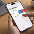


In modern mobile app development, screen real estate is the most valuable asset. The user interface must be clean,intuitive, and above all, functional. This is where the Toolbar comes into play. It is no longer just that bar at the top where the title lives; in SwiftUI, the Toolbar is an intelligent, semantic action management system that adapts to iOS, iPadOS,macOS, and watchOS.
If you come from UIKit, you will remember the days of configuring navigationItem.rightBarButtonItem and dealing with the view controller lifecycle. SwiftUI changes the game with the declarative .toolbar modifier.
In this exhaustive tutorial, we are going to dissect how to add buttons, manage their placement, control their state, and style the toolbar in Xcode to create top-tier user experiences.
1. The Foundation: NavigationStack
Before we can place a single button, we need a context. Toolbars in SwiftUI do not float in a vacuum; they generally live within a navigation structure.
Until iOS 15, we used NavigationView, but the modern standard (and the one you should be using in 2025) is NavigationStack.This container provides the upper “canvas” (the navigation bar) and the ability to stack views.
Initial Project Setup
import SwiftUI

struct ContentView: View {
    var body: some View {
        NavigationStack {
            VStack {
                Image(systemName: "globe")
                    .imageScale(.large)
                    .foregroundStyle(.tint)
                Text("Welcome to the Toolbar Tutorial")
            }
            .navigationTitle("Home")
            .navigationBarTitleDisplayMode(.large)
        }
    }
}
Running this, you will see an empty navigation bar with the title “Home”. Now we are ready to populate it.
2. Anatomy of the .toolbar Modifier
The .toolbar modifier is applied to the view inside the navigation stack, not to the stack itself. This is crucial: the toolbar belongs to the content, not the container.
To add a button, we use the ToolbarItem structure.
.toolbar {
    ToolbarItem(placement: .topBarTrailing) {
        Button("Save") {
            print("Save action executed")
        }
    }
}
Why ToolbarItem?
You could simply throw a Button inside .toolbar and it would sometimes work, but ToolbarItem gives you explicit control over the placement. SwiftUI uses a semantic system to determine where to place elements.
3. Mastering Placements (ToolbarItemPlacement)
The placement parameter is where the magic happens. Instead of thinking in pixels (x, y), we think in roles. Let’s look at the most important options and when to use them.
A. .topBarTrailing and .topBarLeading (The Top)
These are the standard locations on the top navigation bar.
.topBarLeading: The leading edge (Left in LTR languages). Ideal for “Cancel”, “Close” buttons, or side menus (Hamburger menu)..topBarTrailing: The trailing edge (Right in LTR languages). Ideal for the screen’s primary action: “Save”, “Edit”, “Add”.
Compatibility Note: If you support versions prior to iOS 17, you will see
navigationBarLeadingandnavigationBarTrailing. Apple renamed these totopBar...to generalize their usage, but the behavior is identical.
Practical Example:
.toolbar {
    ToolbarItem(placement: .topBarLeading) {
        Button("Cancel", role: .cancel) { }
    }
    ToolbarItem(placement: .topBarTrailing) {
        Button(action: saveDocument) {
            Label("Save", systemImage: "square.and.arrow.down")
        }
    }
}
B. .principal (Center Stage)
By default, the center of the navigation bar displays the navigationTitle. However, sometimes you need something more complex: a brand logo, a date picker, or a Picker (segmented control).
The .principal placement replaces the standard title with your custom view.
ToolbarItem(placement: .principal) {
    VStack {
        Text("Document 1").font(.headline)
        Text("Edited 5 min ago").font(.caption2).foregroundStyle(.secondary)
    }
}
C. .bottomBar (The Bottom Bar)
Many developers forget that SwiftUI can automatically generate a bottom toolbar (similar to Safari on iOS) simply by changing the placement. This is useful for moving secondary actions and keeping the top clean.
ToolbarItem(placement: .bottomBar) {
    HStack {
        Button(action: {}) { Image(systemName: "chevron.left") }
        Spacer() // Pushes buttons to the edges
        Button(action: {}) { Image(systemName: "square.and.arrow.up") }
    }
}
D. .keyboard (The Productivity Trick)
This is perhaps the most useful placement for forms. It allows you to add buttons directly above the system’s virtual keyboard. It is perfect for adding a “Done” button on numeric keypads that lack a return key.
ToolbarItem(placement: .keyboard) {
    HStack {
        Spacer()
        Button("Done") {
            // Code to dismiss the keyboard
            UIApplication.shared.sendAction(#selector(UIResponder.resignFirstResponder), to: nil, from: nil, for: nil)
        }
    }
}
4. Grouping Buttons: ToolbarItemGroup
Imagine you need three buttons on the right: “Search”, “Filter”, and “Profile”. If you write three ToolbarItems with the same .topBarTrailing placement, it will work, but the code will be repetitive.
For this, ToolbarItemGroup exists. It groups multiple views under a single location and lets SwiftUI manage the spacing (padding) between them.
.toolbar {
    ToolbarItemGroup(placement: .topBarTrailing) {
        Button(action: {}) { Image(systemName: "magnifyingglass") }
        Button(action: {}) { Image(systemName: "slider.horizontal.3") }

        Link(destination: URL(string: "https://apple.com")!) {
            Image(systemName: "person.circle")
        }
    }
}
Design Tip: Avoid cluttering the top bar. If you have more than 2 or 3 main actions, consider moving them to a context menu or the bottom bar.
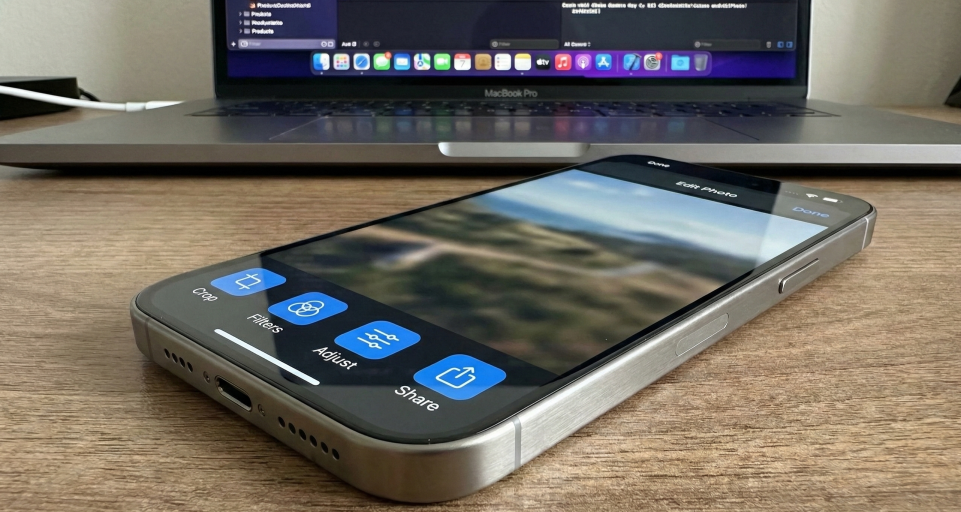
5. Design and Styling of Buttons
Buttons in the toolbar don’t have to be simple blue text. SwiftUI gives us tools to style them and make them more accessible.
Using Label for Accessibility
Instead of using Image(systemName: "plus"), get in the habit of using Label("Add", systemImage: "plus"). In the toolbar, SwiftUI will automatically show only the icon to save space, but VoiceOver will read the text “Add”. It is a free accessibility win.
Changing Color (.tint)
You can change the color of buttons using the .tint modifier.
Button("Delete") { ... }
    .tint(.red)
Prominent Buttons
Sometimes you want the main action to stand out visually, for example, a button with a colored background (“capsule”). Since iOS 16, we can apply button styles inside the toolbar.
ToolbarItem(placement: .topBarTrailing) {
    Button("Buy") { }
        .buttonStyle(.borderedProminent)
        .tint(.green)
        .clipShape(Capsule())
}
Note: Use this sparingly. A bordered button in the navigation bar draws a lot of attention.
6. State Logic: Enabling and Disabling Buttons
A static toolbar is boring. We want it to react to what the user does. For example, the “Save” button should be disabled if the form is empty.
struct FormView: View {
    @State private var name: String = ""
    @State private var isSaving: Bool = false

    var body: some View {
        NavigationStack {
            Form {
                TextField("Product Name", text: $name)
            }
            .navigationTitle("New Product")
            .toolbar {
                ToolbarItem(placement: .confirmationAction) {
                    if isSaving {
                        ProgressView()
                    } else {
                        Button("Save") {
                            simulateSave()
                        }
                        .disabled(name.isEmpty) // Disabled if text is empty
                    }
                }
            }
        }
    }

    func simulateSave() {
        isSaving = true
        DispatchQueue.main.asyncAfter(deadline: .now() + 2) {
            isSaving = false
            name = ""
        }
    }
}
In this example, we use .confirmationAction (a semantic alias for the positive action on the right) and connect the .disabledmodifier to our state variable. We also dynamically replace the button with a ProgressView while the action is performed.
7. Dropdown Menus in the Toolbar
When space is limited, the Menu component is your best friend. It allows grouping secondary actions under a single button.
ToolbarItem(placement: .topBarTrailing) {
    Menu {
        Button("Duplicate", systemImage: "plus.square.on.square") { }
        Button("Rename", systemImage: "pencil") { }
        Divider()
        Button("Delete", systemImage: "trash", role: .destructive) { }
    } label: {
        Label("Options", systemImage: "ellipsis.circle")
    }
}
This displays an elegant and functional native iOS menu, keeping your interface clean.
8. Customizing the Toolbar Background
Until recently, changing the navigation bar background color in SwiftUI was a nightmare requiring UIKit hacks (UINavigationBar.appearance). Now, we have a native API: .toolbarBackground.
Visibility and Color
By default, the bar is transparent and becomes translucent when scrolling. To force a corporate color:
.toolbarBackground(Color.indigo, for: .navigationBar)
.toolbarBackground(.visible, for: .navigationBar)
.toolbarColorScheme(.dark, for: .navigationBar)- Color: Defines the background (can be a
Color,Gradient, orMaterial). - Visible: Forces the bar to appear solid even without scrolling.
- ColorScheme:
.darkindicates that the background is dark, so SwiftUI will paint text and buttons white.
9. Full Example: The Notes Editor
Let’s combine everything we’ve learned into a realistic screen. Imagine a notes app where we can write, view the character count, and have formatting actions.
import SwiftUI

struct NotesEditorView: View {
    @State private var text: String = "Write your next big idea..."
    @State private var isFavorite: Bool = false
    @FocusState private var keyboardFocus: Bool

    var body: some View {
        NavigationStack {
            TextEditor(text: $text)
                .padding()
                .focused($keyboardFocus)
                .navigationTitle("Quick Note")
                .navigationBarTitleDisplayMode(.inline)
                .toolbar {
                    // 1. Group on the left: Dismiss keyboard
                    ToolbarItem(placement: .topBarLeading) {
                        if keyboardFocus {
                            Button("Done") {
                                keyboardFocus = false
                            }
                        }
                    }

                    // 2. Group on the right: Favorite and Share
                    ToolbarItemGroup(placement: .topBarTrailing) {
                        Button {
                            withAnimation { isFavorite.toggle() }
                        } label: {
                            Image(systemName: isFavorite ? "star.fill" : "star")
                                .foregroundStyle(isFavorite ? .yellow : .primary)
                                .symbolEffect(.bounce, value: isFavorite) // iOS 17 animation
                        }

                        ShareLink(item: text) {
                            Image(systemName: "square.and.arrow.up")
                        }
                    }

                    // 3. Bottom bar: Character counter
                    ToolbarItem(placement: .bottomBar) {
                        HStack {
                            Text("\(text.count) characters")
                                .font(.caption)
                                .foregroundStyle(.secondary)
                            Spacer()
                            Text("Last edited: Today")
                                .font(.caption)
                                .foregroundStyle(.secondary)
                        }
                    }
                }
        }
    }
}
Breakdown of the Pro Example:
- Reactivity: The “Done” button on the left only appears if the keyboard is active (
keyboardFocus). - Visual Feedback: The star button changes icon (
fillvsoutline) and color. Additionally, we use.symbolEffect(new in iOS 17) to give it an animated bounce when tapped. - ShareLink: We use a native SwiftUI component inside the toolbar to share the text.
- Informative Bottom Bar: We use the bottom space for metadata, balancing the interface.
Conclusion
Managing buttons in the SwiftUI Toolbar has evolved to be an incredibly powerful and flexible tool. It is no longer about placing views at coordinates; it is about defining semantic intentions and letting the system optimize the user experience.
Remember the key pillars:
- Always use
ToolbarItemwith the correctplacement. - Group related actions with
ToolbarItemGrouporMenu. - Don’t forget accessibility by using
Label. - Take advantage of the
.bottomBarand the.keyboardbar to improve ergonomics.
With these techniques in your arsenal, you are ready to create professional, clean, and native user interfaces that your users will love.
If you have any questions about this article, please contact me and I will be happy to help you 🙂. You can contact me on my X profile or on my Instagram profile.