


In the world of mobile development, adaptability is everything. As an iOS developer, one of the most common yet crucial challenges is ensuring our applications respond fluidly when the user rotates their device. In modern Swift programming, especially with the advent of SwiftUI, the rules of the game have changed compared to the old UIKit days. We no longer rely solely on massive view controllers; we now think in terms of states and reactive environments.
This tutorial is a deep dive on how to detect orientation and handle device rotation using Swift and SwiftUI. We will cover everything from simple native solutions to complex architectures for iOS, and see how this concept translates to macOS and watchOS.
Understanding the Problem: Orientation vs. Size
Before writing a single line of code, it is vital to understand a philosophical distinction in Apple’s design that affects every iOS developer.
Formerly, we asked: “Is the device in Landscape or Portrait?” Today, in the era of SwiftUI and iPad Multitasking, the correct question is: “How much space do I have available?”
However, there are specific use cases (video players, custom cameras, games) where you need to know the exact physical rotation. Therefore, we will divide this tutorial into two approaches:
- The Responsive Design Approach (Size Classes): Apple’s recommended way.
- The Physical Rotation Approach (Device Orientation): For specific needs.
1. The “SwiftUI” Way: Size Classes and GeometryReader
For 90% of applications, you don’t need to detect rotation; you need to detect dimension changes.
The Power of @Environment
SwiftUI gifts us “Size Classes” through the environment. This is fundamental for your app to work not only when rotating an iPhone but also in Split View on an iPad.
import SwiftUI

struct ResponsiveView: View {
    // We access environment variables to detect the "Size Class"
    @Environment(\.verticalSizeClass) var verticalSizeClass
    @Environment(\.horizontalSizeClass) var horizontalSizeClass

    var body: some View {
        GeometryReader { proxy in
            if self.isLandscape(geo: proxy) {
                HStack {
                    // Landscape Layout: Side-by-side elements
                    Image(systemName: "iphone.landscape")
                        .font(.system(size: 50))
                    Text("You are in Landscape mode")
                }
            } else {
                VStack {
                    // Portrait Layout: Stacked elements
                    Image(systemName: "iphone")
                        .font(.system(size: 50))
                    Text("You are in Portrait mode")
                }
            }
        }
    }

    // Helper logic to determine if width is greater than height
    func isLandscape(geo: GeometryProxy) -> Bool {
        if horizontalSizeClass == .compact && verticalSizeClass == .regular {
            // Typical iPhone in Portrait
            return false
        } else if horizontalSizeClass == .regular && verticalSizeClass == .compact {
            // Typical iPhone Max in Landscape
            return true
        } else {
            // Fallback based on pure geometry
            return geo.size.width > geo.size.height
        }
    }
}
Why use GeometryReader?
GeometryReader is the ultimate Swift programming tool for reading the parent container’s size. By combining it with conditionals, you can restructure your view dynamically. If the width is greater than the height, mathematically, you are in a landscape format.
2. Detecting Physical Rotation (The Classic Approach)
Sometimes, Size Class isn’t enough. Perhaps you need to rotate a camera icon without changing the entire layout, or lock a specific view. This is where we enter the realm of UIDevice.
Although we are in SwiftUI, sometimes we need to listen to the underlying operating system. We will use NotificationCenterto listen for rotation events.
Creating a Reusable ViewModifier
As a good iOS developer, you must encapsulate logic. We are going to create a custom ViewModifier that you can apply to any view to detect orientation changes.
import SwiftUI
import Combine

// We define our custom orientation type to simplify
enum DeviceRotation {
    case portrait
    case landscape
    case flat // Device lying on a table
}

struct DeviceRotationViewModifier: ViewModifier {
    let action: (DeviceRotation) -> Void

    func body(content: Content) -> some View {
        content
            .onAppear()
            .onReceive(NotificationCenter.default.publisher(for: UIDevice.orientationDidChangeNotification)) { _ in
                // Callback when orientation changes
                let orientation = UIDevice.current.orientation

                // We map UIDeviceOrientation to our simple enum
                switch orientation {
                case .portrait, .portraitUpsideDown:
                    action(.portrait)
                case .landscapeLeft, .landscapeRight:
                    action(.landscape)
                case .faceUp, .faceDown:
                    action(.flat)
                default:
                    break
                }
            }
    }
}

// Extension to make it easier to use in SwiftUI
extension View {
    func onRotate(perform action: @escaping (DeviceRotation) -> Void) -> some View {
        self.modifier(DeviceRotationViewModifier(action: action))
    }
}
Implementation in the View
Now, using this in your code is incredibly clean and readable:
struct CameraOverlayView: View {
    @State private var rotation: DeviceRotation = .portrait

    var body: some View {
        ZStack {
            Color.black.edgesIgnoringSafeArea(.all)

            VStack {
                Text("Camera Active")
                    .foregroundColor(.white)

                Image(systemName: "camera.shutter.button")
                    .font(.largeTitle)
                    .foregroundColor(.yellow)
                    // We rotate only the icon, not the interface
                    .rotationEffect(rotation == .landscape ? .degrees(90) : .degrees(0))
                    .animation(.spring(), value: rotation)
            }
        }
        .onRotate { newOrientation in
            self.rotation = newOrientation
        }
    }
}
This approach is vital for Swift programming applications that require fine control over UX, avoiding unnecessary redraws of the entire screen.
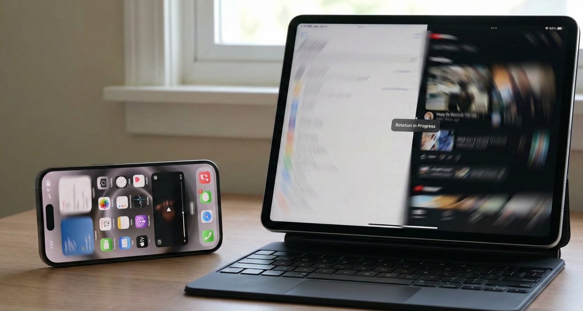
3. The Challenge of macOS and watchOS
The premise of “detecting orientation” changes drastically when we leave iOS. As ecosystem developers, we must adapt our code.
macOS: The Concept of “Window Resizing”
On macOS, devices don’t rotate (unless you pick up your monitor, which is rare). Here, “orientation” is the aspect ratio of the window.
A user can resize your Swift app window at any time. Here UIDevice does not exist. You must rely purely on GeometryReader.
// Cross-Platform Approach for macOS and iOS
struct UniversalLayout: View {
    var body: some View {
        GeometryReader { geo in
            let isWide = geo.size.width > 800 // Arbitrary threshold for desktop

            if isWide {
                HStack {
                    SidebarView()
                    MainContentView()
                }
            } else {
                VStack {
                    MainContentView()
                    // Bottom or compressed menu
                }
            }
        }
    }
}
For an iOS developer porting to Mac with Catalyst or native SwiftUI, thinking in “breakpoints” (CSS style) is more useful than thinking about rotation.
watchOS: Wrist Orientation
On the Apple Watch, the general interface does not rotate with gravity (unlike the iPhone). The UI is designed to be viewed in a fixed orientation. However, there is an important nuance in Swift programming for the watch: Digital Crown Orientation.
You can detect if the user wears the watch on the left or right wrist and where the crown is, which is vital for games or ergonomics apps.
import WatchKit

func checkWatchOrientation() {
    let device = WKInterfaceDevice.current()

    switch device.crownOrientation {
    case .left:
        print("Crown on the left")
    case .right:
        print("Crown on the right")
    @unknown default:
        break
    }

    switch device.wristLocation {
    case .left:
        print("Left wrist")
    case .right:
        print("Right wrist")
    @unknown default:
        break
    }
}
In watchOS, “detecting orientation” usually refers to motion sensors (accelerometer/gyroscope) rather than UI layout changes. If you are making a tennis app to measure a swing, you will use CoreMotion, not SwiftUI view changes.
4. ViewModel and Clean Architecture
A common mistake of the novice iOS developer is filling the View (View) with logic. To keep our code clean and testable, rotation logic should live in a ViewModel.
The OrientationManager
We will create an ObservableObject class that serves as the source of truth for the entire app.
import SwiftUI
import Combine

class OrientationManager: ObservableObject {
    @Published var orientation: UIDeviceOrientation = .unknown

    private var cancellables = Set<AnyCancellable>()

    init() {
        // Initialize with current orientation
        self.orientation = UIDevice.current.orientation

        // Subscribe to changes
        NotificationCenter.default.publisher(for: UIDevice.orientationDidChangeNotification)
            .map { _ in UIDevice.current.orientation }
            .sink { [weak self] newOrientation in
                self?.orientation = newOrientation
            }
            .store(in: &cancellables)
    }

    var isLandscape: Bool {
        return orientation.isLandscape
    }
}
Now, we inject this into our view hierarchy:
@main
struct MySuperApp: App {
    @StateObject var orientationManager = OrientationManager()

    var body: some Scene {
        WindowGroup {
            ContentView()
                .environmentObject(orientationManager)
        }
    }
}
Any view in your app can now react to rotation simply by declaring @EnvironmentObject var orientationInfo: OrientationManager. This centralizes logic and optimizes SwiftUI performance.
5. Advanced Use Cases and Best Practices
As an expert in Swift programming, there are fine details that distinguish a professional app from an amateur one when handling rotations.
A. Locking Orientation in SwiftUI
Sometimes you want to force a specific view to be portrait-only, even if the app supports rotation. In UIKit, this was supportedInterfaceOrientations, but in pure SwiftUI, it is more complex.
The most common solution today is to interact with the AppDelegate (or adapt the SceneDelegate) via a bridge.
class AppDelegate: NSObject, UIApplicationDelegate {
    static var orientationLock = UIInterfaceOrientationMask.all

    func application(_ application: UIApplication, supportedInterfaceOrientationsFor window: UIWindow?) -> UIInterfaceOrientationMask {
        return AppDelegate.orientationLock
    }
}
And then, in your SwiftUI views, you can change this static variable in .onAppear and restore it in .onDisappear.
B. Animations and Transitions
When you detect an orientation change and switch, for example, from an HStack to a VStack, the change can be abrupt.
Use matchedGeometryEffect so that elements “float” to their new positions instead of teleporting.
@Namespace var nspace

if isLandscape {
    HStack {
        ViewA().matchedGeometryEffect(id: "A", in: nspace)
        ViewB().matchedGeometryEffect(id: "B", in: nspace)
    }
} else {
    VStack {
        ViewA().matchedGeometryEffect(id: "A", in: nspace)
        ViewB().matchedGeometryEffect(id: "B", in: nspace)
    }
}
C. The Safe Area
When rotating, the “Notch” (or Dynamic Island) changes position. In portrait, it is at the top; in landscape, it is on the left or right. Make sure to use .ignoresSafeArea() carefully. Generally, you want the background to ignore the safe area, but the content to respect it.
ZStack {
    Color.blue.ignoresSafeArea() // Background always covers everything

    VStack {
        // Content respecting the notch margins
        Text("Hello World")
    }
}
Conclusion
For an iOS developer, mastering SwiftUI implies understanding that the view is a function of its state. Orientation is simply another state variable.
- Use Size Classes and
GeometryReaderfor responsive layouts (most cases). - Use
UIDevice.orientationDidChangeNotificationfor hardware-specific logic (cameras, games). - Implement an
OrientationManagerto keep your code clean and testable. - Remember that in macOS and watchOS, the context changes, and adaptability is more important than physical rotation.
Swift programming is elegant and powerful. By applying these patterns, you ensure that your application feels native, modern, and professional, regardless of how the user holds their device.
If you have any questions about this article, please contact me and I will be happy to help you 🙂. You can contact me on my X profile or on my Instagram profile.