


Introduction
When working with SwiftUI to create user interfaces (UI) for iOS, macOS, watchOS, and tvOS, one of the most fundamental tools provided by this framework is Stacks. Stacks in SwiftUI are containers that allow you to organize and align views in a simple and efficient way. Among the most commonly used stacks are VStack, HStack, and ZStack. In this article, we will explain in detail what a SwiftUI stack is, how each one works, and the differences between them.
What Is a SwiftUI Stack?
A Stack in SwiftUI is a container that arranges views sequentially or layered. Each type of stack has a specific purpose depending on the layout you want to achieve in the user interface. Stacks allow views to be organized on the screen in an orderly manner according to a particular axis: vertical, horizontal, or layered.
Using stacks is essential when developing user interfaces with SwiftUI, as they help control the flow and alignment of views without dealing with complex coordinate systems.
The three most common stacks are:
- VStack: A vertical stack, where views are arranged from top to bottom.
- HStack: A horizontal stack, where views are arranged from left to right.
- ZStack: A layered stack, where views are placed on top of each other.
VStack: Vertical Stack
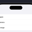
A VStack is a container that arranges views in a column, one below another, following the vertical axis (Y-axis). This is useful when you want to display elements in an organized way, aligned from top to bottom. It is one of the most commonly used stacks, especially when displaying lists of items or a series of buttons, images, or text in a vertical layout.
Basic VStack Syntax:
VStack {
    Text("First Element")
    Text("Second Element")
    Text("Third Element")
}
VStack Properties:
- Spacing (
spacing): Allows you to control the space between views inside the stack. If no value is specified, a default spacing is applied.
VStack(spacing: 20) {
    Text("First Element")
    Text("Second Element")
    Text("Third Element")
}
Alignment (alignment): Controls how views are aligned inside the VStack. The default value is .center, but it can be changed to options such as .leading, .trailing, or .firstTextBaseline.
VStack(alignment: .leading) {
    Text("First Element")
    Text("Second Element")
    Text("Third Element")
}
Practical VStack Example:
Imagine you are creating a home screen for a weather application and want to display the city name, temperature, and weather description. You can use a VStack to organize these elements vertically.
VStack(spacing: 10) {
    Text("City: Buenos Aires")
        .font(.title)
    Text("25°C")
        .font(.largeTitle)
    Text("Sunny")
        .font(.subheadline)
}
When to Use VStack?
VStack is ideal when you want to display a series of elements in a column. Typical examples include forms where input fields appear one below another or product lists in an online store.
HStack: Horizontal Stack
An HStack, unlike a VStack, arranges views in a row, aligning them from left to right along the horizontal axis (X-axis). This type of stack is useful when you want to present elements in a row, such as buttons, icons, or images laid out horizontally.
Basic HStack Syntax:
HStack {
    Text("First Element")
    Text("Second Element")
    Text("Third Element")
}
HStack Properties:
Spacing (spacing): As with VStack, you can control the spacing between elements.
HStack(spacing: 15) {
    Text("Button 1")
    Text("Button 2")
    Text("Button 3")
}
Alignment (alignment): Controls how views are vertically aligned within the HStack. By default, they are center-aligned, but you can align them to the top or bottom.
HStack(alignment: .top) {
    Text("Icon 1")
    Text("Icon 2")
    Text("Icon 3")
}
Practical HStack Example:
Suppose you are designing a navigation bar with several icons that users can tap to access different sections of the app. An HStack allows you to distribute these icons horizontally.
HStack(spacing: 30) {
    Image(systemName: "house.fill")
    Image(systemName: "heart.fill")
    Image(systemName: "message.fill")
}
When to Use HStack?
Use an HStack when you need to distribute elements horizontally, such as toolbar buttons, icon rows, or image galleries.
ZStack: Layered Stack
A ZStack behaves differently from VStack and HStack. While the latter arrange views sequentially in one plane, a ZStackplaces views on top of each other, creating a layered effect along the Z-axis. This stack is ideal for overlapping views, such as placing text or icons over a background image.
Basic ZStack Syntax:
ZStack {
    Image("background")
    Text("Text on top of the image")
}
ZStack Properties:
- Alignment (
alignment): Allows you to specify how views are aligned within the stack.
ZStack(alignment: .topLeading) {
    Image("background")
    Text("Text in the top-left corner")
}- Spacing:
ZStackdoes not use spacing in the same way asVStackorHStacksince views overlap. Instead, modifiers like.offset()and.padding()are used to adjust positioning.
Practical ZStack Example:
Imagine you are creating a map interface and want to display a marker on top of the map view. A ZStack lets you layer the marker over the map.
ZStack {
    MapView() // Background map
    Image(systemName: "pin.fill")
        .foregroundColor(.red)
        .offset(y: -50)
}
When to Use ZStack?
ZStack is ideal when you need overlapping views, such as background images with text overlays, floating buttons, or layered UI effects.
Conclusion
Stacks in SwiftUI—namely VStack, HStack, and ZStack—are essential building blocks for organizing and aligning views efficiently in user interfaces.
- VStack is best suited for vertical layouts, such as forms or lists.
- HStack is ideal for horizontal arrangements, like navigation bars or toolbars.
- ZStack excels at layering views on top of one another, enabling rich visual compositions.
Understanding how and when to use each type of stack allows developers to design clean, flexible, and visually appealing interfaces in Xcode using SwiftUI. Mastering these layout tools will significantly improve your ability to build professional and responsive applications with less code and greater clarity.
If you have any questions about this article, please contact me and I will be happy to help you 😊. You can contact me on my X profile or on my Instagram profile.