


Mastering Multiline Text Fields in SwiftUI: From TextField to TextEditor
SwiftUI has revolutionized the way we build interfaces in the Apple ecosystem. However, one of the most common tasks—creating a simple text field that accepts multiple lines—has had an interesting evolution. The basic TextField we all know is designed for a single line of input, like a username or an email subject.
But what happens when you need your user to write a biography, a long note, or a detailed comment?
In this comprehensive tutorial, we will explore the two primary ways to handle multiline text input in SwiftUI. First, we’ll look at the modern and preferred solution introduced in iOS 16: using TextField with a vertical axis. Second, we’ll dive into the classic and more robust solution for large blocks of text, available since iOS 14: the TextEditor.
We will cover everything from basic implementation to advanced customization, including how to add placeholders, limit characters, and manage keyboard focus.
The Dilemma: TextField(axis: .vertical) or TextEditor?
Before writing any code, it’s crucial to understand which tool to use. The choice depends on your use case and the iOS version you need to support.
TextField(axis: .vertical)(iOS 16+): This is the evolution of the standardTextField. It’s not a full text editor, but rather a text field that grows dynamically with the user’s content. Think of a chat input field or a social media comment box. It starts small (one line) and expands vertically as the user types, up to a limit you can define.TextEditor(iOS 14+): This is the “heavyweight.” It is the direct equivalent of UIKit’sUITextView. It’s designed to handle large blocks of text and is scrollable by default. Think of Apple’s Notes app. It is ideal for anything that goes beyond a few sentences.
Modern Solution (iOS 16+): TextField with a Vertical Axis
If your app’s minimum target is iOS 16, this is the simplest and most elegant way to create an expanding text field.
Basic Implementation
Let’s start with the simplest example. You just need a @State variable to store the text and the TextField initializer that accepts an axis.
import SwiftUI
struct ExpandingTextFieldView: View {
@State private var messageText: String = ""
var body: some View {
NavigationStack {
VStack {
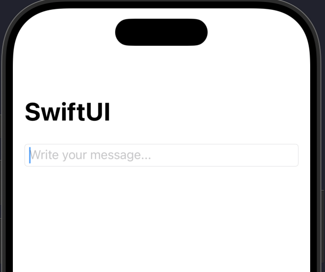
TextField("Write your message...",
text: $messageText,
axis: .vertical) // Here's the magic!
.textFieldStyle(.roundedBorder)
.padding()
Spacer()
}
.navigationTitle("Quick Chat")
}
}
}
#Preview {
ExpandingTextFieldView()
}When you run this, you’ll see a normal TextField. But as you type and reach the end of the line, instead of stopping, the field will grow vertically to accommodate the new line.
Controlling the Expansion: .lineLimit()
By default, the TextField will grow indefinitely. This can be a problem for your layout. Fortunately, we can use the .lineLimit() modifier to control this behavior.
.lineLimit() can take an exact number or a range.
1. Fixed Limit: This tells the TextField to grow up to 5 lines. After that, the field will stop growing and become internally scrollable.
TextField("Write your comment (max 5 lines)...",
          text: $messageText,
          axis: .vertical)
    .lineLimit(5) // Grows up to 5 lines, then scrolls
    .textFieldStyle(.roundedBorder)
    .padding()
2. Range Limit (More Powerful): This is the most flexible option. You can define a range of lines. The text field will always occupy at least 3 lines and will expand up to a maximum of 10.
@State private var userBio: String = ""

// ... in the body ...

TextField("Tell us about yourself...",
          text: $userBio,
          axis: .vertical)
    .lineLimit(3...10) // Occupies 3 to 10 lines
    .padding()
    .background(Color(.systemGray6))
    .cornerRadius(10)
    .padding(.horizontal)
This is incredibly useful for forms where you want the text field to have a reasonable initial size but also allow for more input if needed.
Classic Solution (iOS 14+): TextEditor
If you need to support versions older than iOS 16 or if you need a full, scrollable text editor (like for a notes app), TextEditor is your choice.
However, TextEditor comes with two major caveats:
- It has no native placeholder.
- By default, it has a transparent background and does not respect
TextFieldstyles.
Let’s see how to solve both problems.
Basic Implementation
First, the basics. It’s as simple to initialize as a TextField.
import SwiftUI

struct NotesEditorView: View {
    @State private var notesBody: String = ""

    var body: some View {
        NavigationStack {
            VStack {
                TextEditor(text: $notesBody)
                    .padding()
            }
            .navigationTitle("My Notes")
        }
    }
}
When you run this, you’ll see… almost nothing. Just a blinking cursor. You can type and it will scroll, but there are no borders or background. And most importantly, there’s no “placeholder” to tell the user what to do.
The Big Problem: Adding a Placeholder
The canonical way to add a placeholder to a TextEditor is by using a ZStack. We place the TextEditor in the back and a Textview (our placeholder) on top. Then, we simply hide the Text when the TextEditor is no longer empty.
struct TextEditorWithPlaceholder: View {
    @State private var notesBody: String = ""

    var body: some View {
        NavigationStack {
            ZStack(alignment: .topLeading) {
                // 1. The TextEditor
                TextEditor(text: $notesBody)
                    .padding(4) // A little internal padding

                // 2. The Placeholder
                if notesBody.isEmpty {
                    Text("Write your notes here...")
                        .font(.body) // Make sure it matches the TextEditor's font
                        .foregroundColor(Color(.placeholderText))
                        .padding(8) // Adjust to match the TextEditor's padding
                        .allowsHitTesting(false) // Allows taps to "pass through" the text
                }
            }
            .frame(minHeight: 100, maxHeight: 300) // Give it a size
            .overlay(
                RoundedRectangle(cornerRadius: 10)
                    .stroke(Color.gray, lineWidth: 1)
            )
            .padding()
            .navigationTitle("Notes with Placeholder")
        }
    }
}
Let’s break down the key parts of this solution:
ZStack(alignment: .topLeading): Aligns everything in the top-left corner.if notesBody.isEmpty: This is the main logic. The placeholder is only shown if theStringis empty.foregroundColor(Color(.placeholderText)): Uses the system’s semantic placeholder color so it looks correct in light and dark mode..allowsHitTesting(false): Very important! This makes the placeholderText“invisible” to taps, so the user can tap that area and activate theTextEditorunderneath..frame(...)and.overlay(...): SinceTextEditorhas no style, we give it a frame and a border ourselves to make it look like an input field.
TextEditor Customization and Styling
Unlike TextField, TextEditor does not have a .textFieldStyle(). You have to apply modifiers directly to it.
Changing the background (iOS 16+): Starting in iOS 16, SwiftUI gave us a clean way to change the background of UIScrollView-based views (like TextEditor).
TextEditor(text: $notesBody)
    .scrollContentBackground(.hidden) // Hides the default white background
    .background(Color.cyan.opacity(0.1)) // Apply your own background
    .cornerRadius(10)
Changing the background (iOS 14/15): Before iOS 16, this was a well-known “hack.” You had to disable the UITextViewbackground globally.
// Place this in your @main App struct or in an .onAppear
UITextView.appearance().backgroundColor = .clear

// ... then in your view ...
TextEditor(text: $notesBody)
    .background(Color.cyan.opacity(0.1)) // Now this works
    .cornerRadius(10)
This is less than ideal because it’s global, but it was the only way. If you only need to support iOS 16+, use .scrollContentBackground(.hidden).
Advanced Topics and Common Recipes
Now that you’ve mastered the basics, let’s look at some common problems and how to solve them.
1. Managing Focus and Dismissing the Keyboard
This is a classic problem, especially with TextEditor. The user finishes typing, but the keyboard doesn’t hide. There is no “Return” button that dismisses it.
The solution is to use @FocusState.
@FocusState allows us to bind a boolean variable to the focus state of a text field. We can then add a button to the toolbar (.toolbar) to set that boolean to false, which dismisses the keyboard.
struct DismissingKeyboardView: View {
    @State private var notesBody: String = ""

    // 1. Define a focus state
    @FocusState private var isEditorFocused: Bool

    var body: some View {
        NavigationStack {
            VStack {
                TextEditor(text: $notesBody)
                    .padding()
                    // 2. Bind the focus state to the editor
                    .focused($isEditorFocused)
            }
            .navigationTitle("Focus Editor")
            .toolbar {
                // 3. Add a button to the toolbar
                ToolbarItemGroup(placement: .keyboard) {
                    Spacer() // Pushes the button to the right
                    Button("Done") {
                        isEditorFocused = false // 4. On tap, remove focus
                    }
                }
            }
        }
    }
}
This pattern is essential for a good user experience. The ToolbarItemGroup(placement: .keyboard) places the “Done” button right above the keyboard, where the user expects to find it.
2. Limiting the Character Count
You’ll often want to limit the user’s input (e.g., to 280 characters for a “tweet”). SwiftUI doesn’t have a built-in .characterLimit() modifier, but we can easily build it using .onChange().
We watch the text variable, and if it exceeds our limit, we simply trim it.
struct CharacterLimitView: View {
    @State private var tweetContent: String = ""
    let maxChars = 280

    var body: some View {
        VStack(alignment: .leading) {
            TextEditor(text: $tweetContent)
                .frame(height: 150)
                .border(Color.gray, width: 1)
                .padding()
                .onChange(of: tweetContent) { oldValue, newValue in
                    // Trim the text if it exceeds the limit
                    if newValue.count > maxChars {
                        tweetContent = String(newValue.prefix(maxChars))
                    }
                }

            // A helpful character counter
            Text("\(tweetContent.count) / \(maxChars)")
                .foregroundColor(tweetContent.count > maxChars ? .red : .gray)
                .font(.caption)
                .padding(.horizontal)
        }
        .padding()
    }
}
This code not only limits the input using .onChange and prefix(maxChars), but it also adds a handy character counter that turns red if the limit is reached (even though our code already prevents exceeding it).
3. The TextEditor inside a ScrollView or Form
Warning! A TextEditor is, itself, a ScrollView. Putting a ScrollView inside another ScrollView (like a Form or a vertical ScrollView) causes ambiguous scrolling behavior and, usually, a broken layout.
The TextEditor will try to collapse its height to a minimum.
The Solution: You must give the TextEditor a fixed height or a height range using .frame(). This tells the TextEditor “you are X height and you will handle your own internal scrolling,” while the parent ScrollView handles the scrolling for the entire page.
struct FormWithTextEditor: View {
    @State private var title: String = ""
    @State private var articleBody: String = ""

    var body: some View {
        Form {
            Section(header: Text("Article Details")) {
                TextField("Title", text: $title)
            }

            Section(header: Text("Content")) {
                // DO NOT DO THIS!
                // TextEditor(text: $articleBody) // This will collapse

                // DO THIS!
                TextEditor(text: $articleBody)
                    .frame(minHeight: 200) // Give it a minimum height
            }

            Button("Publish") {
                // ...
            }
        }
    }
}
Conclusion
Multiline text input in SwiftUI is powerful once you know the right tools.
- For iOS 16+ and dynamic inputs (chats, comments): Use
TextField(axis: .vertical). It’s simple, supports native placeholders, and integrates perfectly with.lineLimit()to control its growth. - For iOS 14+ or large text editors (notes, bios): Use
TextEditor. Remember that you’ll have to build your own placeholder using aZStackand manage its style (background and borders) manually. Don’t forget to give it a fixed height.frame()when it’s inside aFormorScrollView.
Both benefit greatly from using @FocusState and a “Done” button in the keyboard toolbar for a polished user experience. With these techniques, you can handle any multiline text input requirement your designs demand.
If you have any questions about this article, please contact me and I will be happy to help you 🙂. You can contact me on my X profile or on my Instagram profile.