



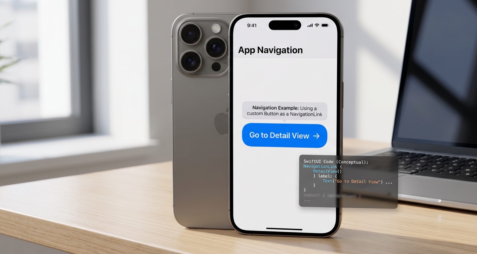

In the modern era of Apple development, the line between different platforms—iOS, macOS, and watchOS—is blurring. As an iOS Developer, mastering SwiftUI isn’t just a luxury; it’s a requirement for building scalable, responsive, and maintainable applications.
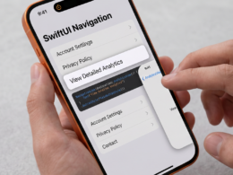
One of the most common hurdles beginners and intermediate developers face is the default behavior of navigation components. Specifically, many developers ask: cómo mostrar un NavigationLink como un botón en SwiftUI (how to show a NavigationLink as a button in SwiftUI). While a NavigationLink inherently acts as a trigger, its default styling often mimics a list row or a simple text link.
In this comprehensive guide, we will dive deep into Swift programming to transform these links into fully interactive, high-fidelity buttons that work seamlessly across Xcode projects for iPhone, Mac, and Apple Watch.
Understanding the Core: NavigationLink vs. Button
Before we write the code, we need to understand the architectural difference.
- Button: Executes an action (like saving data or toggling a state).
- NavigationLink: Moves the user to a new view within a
NavigationStackorNavigationSplitView.
The challenge is that we often want the visual aesthetics and tactile feedback of a Button, but the functional routing of a NavigationLink.
Phase 1: The Basic Implementation
The most straightforward way to make a NavigationLink look like a button is to wrap your custom button UI inside the label closure of the link.
NavigationLink(destination: DetailView()) {
    Text("Get Started")
        .font(.headline)
        .foregroundColor(.white)
        .padding()
        .frame(maxWidth: .infinity)
        .background(Color.blue)
        .cornerRadius(10)
}
.padding()
While this works, it’s not the most “SwiftUI-centric” way to handle complex apps. As an iOS Developer, you should strive for reusability.
Phase 2: Programmatic Navigation (The Professional Approach)
In modern Swift development, especially with the introduction of NavigationStack in iOS 16+, programmatic navigation is the gold standard. This allows you to trigger a navigation event using a standard Button component.
1. Define your Navigation Routes
First, use an enum to define where the user can go. This makes your code type-safe.
enum Route: Hashable {
    case settings
    case profile(username: String)
}
2. Setup the NavigationStack
In your main view, maintain a path state.
struct ContentView: View {
    @State private var path = [Route]()

    var body: some View {
        NavigationStack(path: $path) {
            VStack(spacing: 20) {
                // This is a REAL Button acting as a NavigationLink
                Button(action: {
                    path.append(.settings)
                }) {
                    Label("Go to Settings", systemImage: "gear")
                        .modifier(PrimaryButtonStyle())
                }
            }
            .navigationDestination(for: Route.self) { route in
                switch route in {
                case .settings:
                    SettingsView()
                case .profile(let name):
                    ProfileView(name: name)
                }
            }
        }
    }
}
Phase 3: Cross-Platform Optimization (iOS, macOS, watchOS)
SwiftUI shines because of its “Learn once, apply anywhere” philosophy. However, a button that looks great on an iPhone might be too cramped for a watchOS complication or look out of place on a macOS utility window.
Styling for macOS
On macOS, buttons often require a different hover effect. Use .buttonStyle(.borderedProminent) to align with the system’s aesthetic.
Styling for watchOS
On the Apple Watch, the screen real estate is tiny. Your “Button-Link” should almost always occupy the full width of the screen.
Pro Tip: Use
ControlSizeto adapt your buttons..controlSize(.large)works wonders on iOS but might need to be.smallfor certain macOS sidebars.
Phase 4: Creating a Reusable Button Modifier
To keep your Xcode project clean, don’t repeat your styling code. Create a ViewModifier.
struct PrimaryButtonStyle: ViewModifier {
    func body(content: Content) -> some View {
        content
            .fontWeight(.bold)
            .padding()
            .background(LinearGradient(gradient: Gradient(colors: [.blue, .purple]), startPoint: .leading, endPoint: .trailing))
            .foregroundColor(.white)
            .clipShape(Capsule())
            .shadow(radius: 5)
    }
}
Now, your programación Swift becomes much more readable:
Text("Click Me").modifier(PrimaryButtonStyle())
Phase 5: Common Pitfalls and SEO Best Practices
When searching for cómo mostrar un NavigationLink como un botón en SwiftUI, many developers encounter the “Double Tap” bug or “Ghost Selections.”
- The List Hitbox Issue: If your
NavigationLinkis inside aList, the entire row becomes clickable. If you want a specific button inside that row to trigger navigation, use the programmatic method mentioned in Phase 2. - Accessibility: Always ensure your “Button-Link” has a high enough contrast ratio. Use
AccessibilityLabelif your button only uses an icon. - Performance: Avoid passing large data objects through
NavigationLink. Pass an ID and let the destination view fetch the data.
Comparison: Navigation Methods in SwiftUI
| Method | Best For | Platform |
|---|---|---|
| Simple Label | Quick prototypes | iOS, watchOS |
| Programmatic Path | Complex Apps / Deep Linking | iOS, macOS |
| Button with State | Conditional Navigation | All |
Conclusion
Becoming a top-tier iOS Developer means understanding the nuances of the framework. Knowing cómo mostrar un NavigationLink como un botón en SwiftUI allows you to create interfaces that feel natural and polished. Whether you are using Xcode to build the next big social media app or a niche productivity tool for macOS, the combination of NavigationStack and custom ViewModifiers is your best friend.