


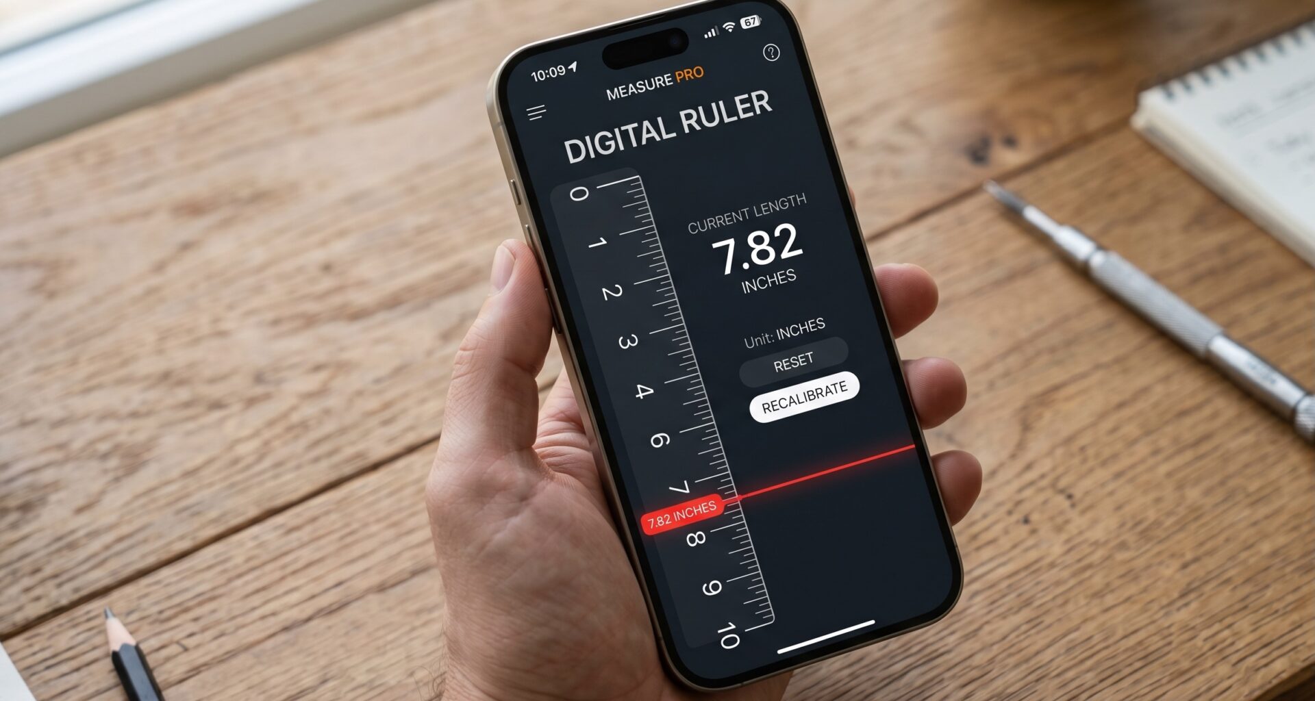
In the fascinating world of app development for the Apple ecosystem, creating adaptable and responsive user interfaces is a fundamental skill for any iOS Developer. With the evolution of devices, from the tiny screens of the Apple Watch to the vast monitors of Macs, knowing how to get the screen size in SwiftUI has become an indispensable requirement in Swift programming.
If you come from the UIKit world, you were probably used to calling UIScreen.main.bounds and considering the problem solved. However, in SwiftUI, the paradigm has drastically changed. Apps can now run in Split View mode on iPad, in resizable windows on macOS, or on different Apple Watch models. Therefore, the “screen” size does not always equal the space available for your application.
In this extensive Swift programming tutorial, we will deeply explore the best practices, techniques, and tools available in Xcode to master handling dimensions and sizes in SwiftUI for iOS, macOS, and watchOS.
1. The Paradigm Shift: From UIKit to SwiftUI
Before diving into the Swift code, it is crucial to understand why SwiftUI handles sizes differently than its predecessors.
In UIKit, the approach was imperative: you told the interface exactly where to position itself based on the absolute coordinates of the screen. In SwiftUI, the approach is declarative. The framework uses a layout negotiation process that consists of three steps:
- The parent view proposes a size for the child view.
- The child view chooses its own size (based on its needs and the parent’s proposal).
- The parent view positions the child in its coordinate space.
Because of this, explicitly asking for the physical screen size is often an “anti-pattern” in SwiftUI. Instead, we should ask for the available space for our view. However, there are legitimate scenarios (such as positioning background elements, complex scaling calculations, or game physics) where an iOS Developer needs to know the exact dimensions.
2. The Classic Approach (And why you should avoid it in the future)
The fastest and most well-known way for Swift programming veterans to get the screen size has historically been through UIScreen.
import SwiftUI

struct ScreenSizeClassicView: View {
    // Getting the size (Not recommended for modern cross-platform apps)
    let screenWidth = UIScreen.main.bounds.width
    let screenHeight = UIScreen.main.bounds.height

    var body: some View {
        VStack {
            Text("Screen width: \(screenWidth)")
            Text("Screen height: \(screenHeight)")
        }
        .padding()
        .background(Color.blue.opacity(0.2))
        .cornerRadius(10)
    }
}
Problems with UIScreen.main.bounds
Although this code will compile in Xcode for iOS, it presents several serious issues:
- Deprecation: As of iOS 16, Apple has marked
UIScreen.mainas deprecated. Modern applications can have multiple scenes (windows) active at once. - Lack of cross-platform support: This code will fail if you try to compile it for macOS or watchOS, since
UIScreenis part of UIKit, not AppKit or WatchKit. - Multitasking on iPad: If the user puts your app in Split View,
UIScreen.main.boundswill give you the physical screen size of the iPad, not the space of the half-screen where your app is running, breaking your layout.
3. The Native SwiftUI Solution: GeometryReader
If you are wondering how to get the screen size in SwiftUI the right way and respecting the framework’s layout flow, the answer is GeometryReader.
GeometryReader is a view that takes up all the space offered to it and provides its content with a GeometryProxy object, which contains information about the available size and safe area.
import SwiftUI

struct GeometryReaderExampleView: View {
    var body: some View {
        GeometryReader { geometry in
            VStack(spacing: 20) {
                Text("Available width: \(geometry.size.width)")
                Text("Available height: \(geometry.size.height)")

                // Using proportions to create a responsive design
                Rectangle()
                    .fill(Color.orange)
                    .frame(width: geometry.size.width * 0.8, height: geometry.size.height * 0.3)
                    .overlay(Text("80% Width / 30% Height").foregroundColor(.white))
            }
            // Centering the content inside the GeometryReader
            .frame(width: geometry.size.width, height: geometry.size.height)
        }
        // Ignoring safe edges if we want the full screen size on a mobile device
        .edgesIgnoringSafeArea(.all)
    }
}
Advantages of GeometryReader
- Fully compatible: It works perfectly in SwiftUI for iOS, macOS, and watchOS without changing a single line of code.
- Responds to environment changes: If you rotate the device from portrait to landscape, or resize the window on Mac, the
GeometryReaderrecalculates and updates the view instantly. - Respects multitasking: On an iPad in Split View,
geometry.sizewill reflect the size of the screen portion assigned to your app.
Precautions as an iOS Developer
GeometryReader is a very “greedy” tool. Unlike a VStack or a Text view that shrinks to fit its content, GeometryReader will try to take up all the space the parent offers. Using it indiscriminately can lead to collapsed layouts or unexpected behaviors in Xcode. Use it only when you really need to read relative proportions or dimensions.
4. Cross-Platform: Getting the Actual Physical Size on iOS, macOS, and watchOS
If your requirement strictly demands knowing the hardware resolution (for example, to send device analytics or initialize a custom graphics engine in Swift), you must adapt your code according to the operating system.
Fortunately, modern Swift programming uses conditional compilation macros (#if os(...)) that allow us to compile different code blocks based on the target platform in Xcode.
Let’s create a “Wrapper” or extension that any iOS Developer can carry in their toolbox to get the screen size on any Apple device.
import SwiftUI

#if canImport(UIKit)
import UIKit
#elseif canImport(AppKit)
import AppKit
#elseif canImport(WatchKit)
import WatchKit
#endif

extension View {
    /// Returns the physical size of the primary screen based on the platform.
    func getDeviceScreenSize() -> CGSize {
        #if os(iOS) || os(tvOS)
        // For iOS 15 or higher, it's better to iterate over connected scenes
        if let windowScene = UIApplication.shared.connectedScenes.first as? UIWindowScene {
            return windowScene.screen.bounds.size
        }
        return CGSize.zero

        #elseif os(macOS)
        // On macOS we get the main screen
        if let screen = NSScreen.main {
            return screen.frame.size
        }
        return CGSize.zero

        #elseif os(watchOS)
        // On watchOS we use the current device
        return WKInterfaceDevice.current().screenBounds.size

        #else
        return CGSize.zero
        #endif
    }
}
How to use this extension in SwiftUI
Now that we have abstracted the complexity of the different platforms (UIKit, AppKit, WatchKit), we can use this extension cleanly in our views.
struct MultiplatformScreenSizeView: View {
    @State private var screenSize: CGSize = .zero

    var body: some View {
        VStack {
            Text("Physical Device Resolution:")
                .font(.headline)
            Text("\(screenSize.width, specifier: "%.0f") x \(screenSize.height, specifier: "%.0f") px")
                .font(.system(size: 24, weight: .bold, design: .monospaced))
                .foregroundColor(.green)
        }
        .onAppear {
            // Calculate the size once the view appears
            self.screenSize = getDeviceScreenSize()
        }
    }
}
This approach ensures your code compiles in Xcode regardless of the target you select (iPhone, Mac, Apple Watch), solidifying your advanced level in Swift programming.
5. The Future of SwiftUI: Environment Variables and Advanced Modifiers
Apple updates the SwiftUI framework every year. For developers targeting newer versions (iOS 16+ / macOS 13+), the use of Environment Variables (@Environment) is replacing many needs to read physical metrics.
Although a direct @Environment(\.screenSize) does not exist yet, Apple provides powerful tools to adapt the layout without explicitly knowing the pixels.
ViewThatFits
If the reason you’re wondering how to get the screen size in SwiftUI is simply to decide whether to show a vertical or horizontal layout, ViewThatFits (introduced in iOS 16) is the perfect solution every iOS Developer should master.
struct AdaptiveLayoutView: View {
    var body: some View {
        // ViewThatFits will evaluate the options and choose the first one that isn't clipped.
        ViewThatFits {
            // Option 1: Horizontal (if there is enough space)
            HStack {
                FeatureCard(title: "Fast", icon: "bolt")
                FeatureCard(title: "Secure", icon: "lock")
                FeatureCard(title: "Reliable", icon: "shield")
            }

            // Option 2: Vertical (if the screen is narrow, like an iPhone SE or a Watch)
            VStack {
                FeatureCard(title: "Fast", icon: "bolt")
                FeatureCard(title: "Secure", icon: "lock")
                FeatureCard(title: "Reliable", icon: "shield")
            }
        }
    }
}

// Helper subview
struct FeatureCard: View {
    let title: String
    let icon: String

    var body: some View {
        VStack {
            Image(systemName: icon).font(.largeTitle)
            Text(title)
        }
        .padding()
        .background(Color.secondary.opacity(0.2))
        .cornerRadius(12)
    }
}
With ViewThatFits, the framework performs the size calculation for you internally, keeping your Swift code clean, declarative, and highly efficient.
6. Best Practices and Tips for the iOS Developer
As you master Swift programming and delve into the inner workings of Xcode, adopting a Fluid Design mindset is vital. Here are the key commandments related to screen size in SwiftUI:
- Avoid magic numbers: Do not set
.frame(width: 320, height: 480). What looks good on an iPhone 13 Pro Max will look clipped on an iPhone SE or tiny on an iPad. Use relative margins (.padding()),Spacer(), and proportions viaGeometryReader. - Prioritize Flexible Layouts: Use
HStack,VStack,Grid(iOS 16+), and leave the mathematical layout calculations to SwiftUI. - Context Matters: Remember that with Stage Manager on macOS and iPadOS, apps now live in fully flexible windows. Asking for the size of the main monitor will rarely be useful for positioning a button. Design for the Window, not the Screen.
- Test thoroughly in Xcode Previews: Take advantage of the Xcode Canvas. You can configure multiple simultaneous previews for the same code, targeting an iPhone, an iPad, and an Apple Watch to see how your code responds to different screen metrics.
// Example of multiple previews
#Preview("iPhone") {
    GeometryReaderExampleView()
}

#Preview("iPad Split View", traits: .landscapeLeft) {
    GeometryReaderExampleView()
}
Conclusion
Knowing how to get the screen size in SwiftUI effectively separates a novice from a true Swift programming professional. We have reviewed why the old UIScreen method is becoming obsolete, how GeometryReader is the Swiss Army knife for relative measurements, and how to abstract the underlying hardware to create truly universal components across iOS, macOS, and watchOS.


