


The macOS ecosystem has undergone a radical transformation in its design language since the arrival of macOS Big Sur. The old title bar and toolbar have merged into a single unified, clean, and minimalist surface.
In SwiftUI, creating these toolbars is not just a matter of aesthetics; it is fundamental to your application’s navigation and functionality. Unlike iOS, where the navigation bar is rigid, on macOS, the Toolbar is a flexible canvas where search bars, filters, primary actions, and navigation live.
In this tutorial, you will learn how to build a world-class toolbar in macOS while respecting Apple’s Human Interface Guidelines.
1. The Architecture: NavigationSplitView and the .toolbar Modifier
To start, we must position ourselves in the correct container. In modern macOS, the standard structure is not a single flat view, but a split view (Sidebar + Content).
Since SwiftUI 4.0, NavigationView has been deprecated in favor of NavigationSplitView. This is the canvas where our toolbar will shine.
The Base Code
The key modifier is .toolbar { ... }. This modifier is placed inside the view shown in the detail or content area, not necessarily on the parent container.
import SwiftUI

struct MacToolbarTutorialApp: App {
    var body: some Scene {
        WindowGroup {
            ContentView()
        }
        // Unified window style (crucial for the modern look)
        .windowToolbarStyle(.unified)
    }
}

struct ContentView: View {
    @State private var selectedItem: String?

    var body: some View {
        NavigationSplitView {
            List(["Project A", "Project B"], id: \.self, selection: $selectedItem) { item in
                Text(item)
            }
            .navigationSplitViewColumnWidth(min: 200, ideal: 250, max: 300)
        } detail: {
            VStack {
                Text("Select a project")
                    .font(.largeTitle)
                    .foregroundStyle(.secondary)
            }
            // HERE is where we define the toolbar
            .toolbar {
                // Toolbar Content
                ToolbarItem(placement: .primaryAction) {
                    Button(action: { print("New") }) {
                        Label("New", systemImage: "plus")
                    }
                }
            }
        }
    }
}
Important note on lifecycle: SwiftUI rebuilds the toolbar dynamically. If the user switches from one view to another in the detail area, the toolbar will transform with an animation to show the buttons relevant to that new view.
2. Positioning: The Art of ToolbarItemPlacement
On iOS, positions are limited (left, right, center). On macOS, semantics are vital. The operating system decides where to place elements based on their purpose, not just their coordinates.
Key Positions in macOS
.primaryAction: The most important button. It is generally located at the far right or right next to the search bar. Used for actions like “Create New”, “Save”, or “Send”..navigation: Located at the far left. On macOS, this is usually reserved for the button that collapses or expands the Sidebar..automatic: Let SwiftUI decide. It is often the safest option if you don’t have a strict preference..cancellationActionand.confirmationAction: Used in modal sheets, less so in the main window..status: Rarely used in modern designs, but allows placing informational text (like “Saving…”) in the center or edge of the bar.
Layout Example
.toolbar {
    // 1. Sidebar toggle button (SwiftUI often handles this automatically, but we can force it)
    // Note: NavigationSplitView usually handles this natively.

    // 2. Group of actions on the left
    ToolbarItemGroup(placement: .navigation) {
        Button(action: { }) {
            Label("Back", systemImage: "chevron.left")
        }
    }

    // 3. Primary actions on the right
    ToolbarItemGroup(placement: .primaryAction) {
        Button(action: filterData) {
            Label("Filter", systemImage: "line.3.horizontal.decrease.circle")
        }

        Button(action: addItem) {
            Label("Add", systemImage: "plus")
        }
    }
}
3. macOS Specific Elements: Spacers and Groups
This is where macOS differs drastically from iOS. On an iPad, buttons are spread out. On a Mac, we tend to group related tools.
ToolbarItemGroup
This container groups buttons visually. In older versions of macOS, this created a physical border around the buttons (segmented control style). In macOS Sonoma/Sequoia, it simply keeps them together with logical spacing.
ToolbarSpacer
On iOS, using Spacer() inside a toolbar sometimes doesn’t work as expected. On macOS, ToolbarSpacer() is an explicit component that pushes content.
Do you want a button on the far left and another on the far right, leaving the center empty (or for the title)?
.toolbar {
    ToolbarItem(placement: .navigation) {
        Button("Left") { }
    }

    // This spacer pushes the following content to the right
    ToolbarItem(placement: .automatic) {
        // On macOS, sometimes we need tricks with Spacer if we don't use semantic placements
        // But ideally, trust the system.
    }

    ToolbarItem(placement: .primaryAction) {
        Button("Right") { }
    }
}
Note: In modern macOS, the window title usually occupies the center, or the search bar does. The use of manual spacers is less common than in old AppKit, but still useful for custom layouts.
4. The Search Bar (.searchable)
A Mac application without search feels incomplete. SwiftUI makes integrating the native search bar trivial. The magic is that on macOS, the search bar doesn’t float below the toolbar (as in iOS), but integrates inside it, to the right, expanding when clicked.
struct ProductListView: View {
    @State private var searchText = ""

    var body: some View {
        List {
            // Filtered content
        }
        .searchable(text: $searchText, placement: .toolbar, prompt: "Search documents...")
    }
}
Pro Tip: On macOS, you can add search “tokens” (small filter capsules) using .searchScopes if you need advanced filtering directly in the bar.
5. Advanced Controls: Pickers and Menus
A Mac toolbar isn’t just for buttons. It is common to see view selectors (Icons vs. List) or drop-down menus.
Segmented Control in the Toolbar
It’s a classic Finder feature: changing how you view files.
@State private var viewMode: ViewMode = .list

enum ViewMode: String, CaseIterable, Identifiable {
    case grid, list, gallery
    var id: Self { self }
    var icon: String {
        switch self {
        case .grid: return "square.grid.2x2"
        case .list: return "list.bullet"
        case .gallery: return "rectangle.grid.1x2"
        }
    }
}

// Inside the .toolbar modifier
ToolbarItem(placement: .automatic) {
    Picker("View Mode", selection: $viewMode) {
        ForEach(ViewMode.allCases) { mode in
            Image(systemName: mode.icon)
                .tag(mode)
        }
    }
    .pickerStyle(.segmented) // Native visual style
}
This will render a segmented control perfectly integrated into the gray of the toolbar.
6. User Customization: The “Holy Grail” of macOS
One of the most powerful and exclusive features of macOS is that users can right-click on the toolbar and select “Customize Toolbar…”.
To enable this in SwiftUI, we need two things:
- Give a unique ID to the toolbar.
- Give a unique ID to each item.
- Configure the
toolbarRole.
.toolbar(id: "main_toolbar") { // 1. Toolbar ID
    ToolbarItem(id: "filter_button", placement: .primaryAction) { // 2. Item ID
        Button(action: toggleFilter) {
            Label("Filter", systemImage: "line.3.horizontal.decrease.circle")
        }
    }

    ToolbarItem(id: "add_button", placement: .primaryAction) {
        Button(action: addItem) {
            Label("Add", systemImage: "plus")
        }
    }

    // Elements that the user can add if they want,
    // but are not there by default (secondaryAction)
    ToolbarItem(id: "print_button", placement: .secondaryAction) {
        Button(action: printDoc) {
            Label("Print", systemImage: "printer")
        }
    }
}
.toolbarRole(.editor) // Enables customization
By doing this, SwiftUI automatically enables the native macOS drag-and-drop panel. If the user removes a button, the system remembers that preference for the next time they open the app.
7. Style and Aesthetics (LabelStyle)
On iOS, navigation bar buttons are usually text (“Edit”, “Done”) or simple icons. On macOS, we have more flexibility.
By default, items show only the icon if space is tight, or icon and text if the user sets it in accessibility. But we can force styles.
Also:
Button(...) { ... }
    .help("Create a new document") // Tooltip on hover (Vital in macOS)
Important: The .help() modifier is crucial on macOS. Unlike a touch device, on a Mac we have a cursor. When the user pauses the cursor over a cryptic icon, text must appear explaining what it does. Do not skip this.
8. Title and Subtitle Management
The toolbar shares space with the window title.
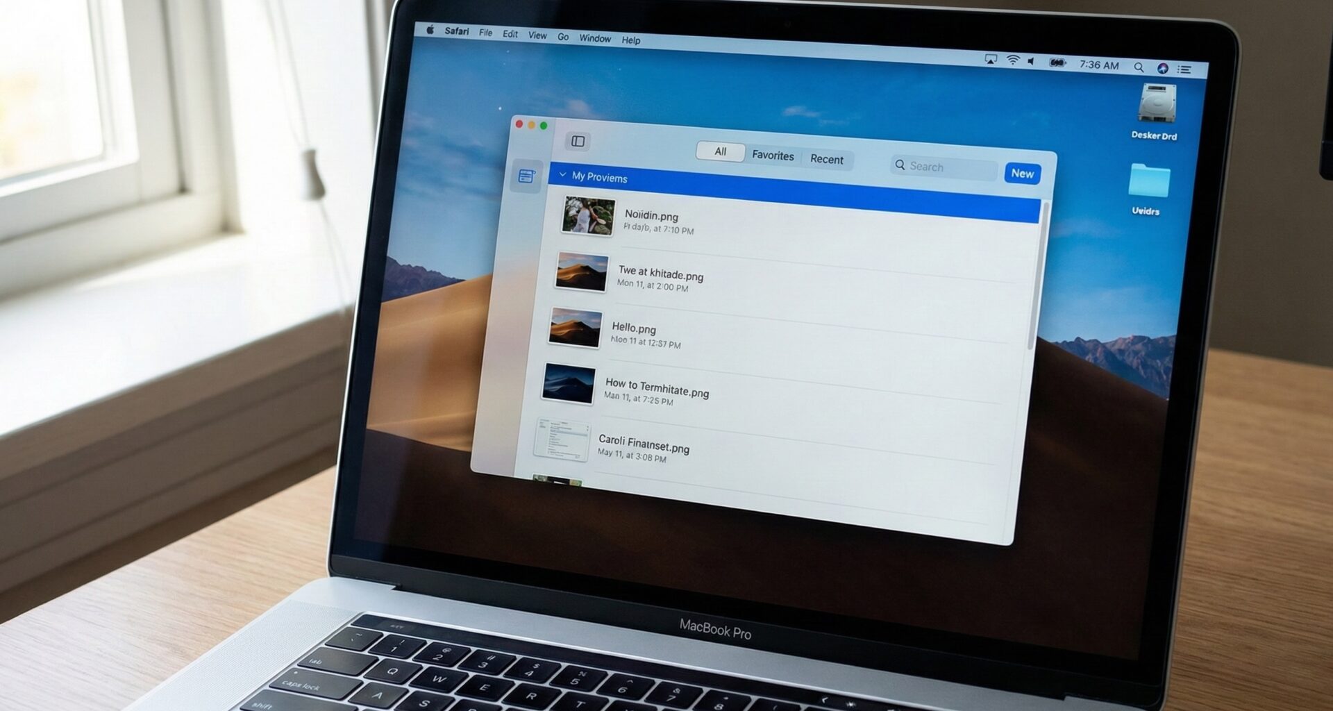
.navigationTitle("My Projects")
.navigationSubtitle("\(projects.count) items") // Exclusive to macOS
The subtitle is very useful for showing context (sync status, item count, file path) without cluttering the main interface. It appears in small print, right below the main title, integrated into the bar.
9. Keyboard Interaction
Power users on Mac hate lifting their hands from the keyboard. Every important button in your toolbar should have an associated keyboard shortcut.
Button(action: save) {
    Label("Save", systemImage: "square.and.arrow.down")
}
.keyboardShortcut("s", modifiers: .command) // Cmd + S
This not only makes the shortcut work, but if the button is visible in the toolbar (or in a menu), it will flash visually when the user presses the keys, teaching the user that the action has been received.
10. Common Errors and Solutions
A. The Double “Back” Button
Sometimes, when using NavigationStack inside a poorly configured NavigationSplitView, an unwanted back button appears.Solution: Ensure the navigation structure is correct. On macOS, navigation is usually lateral (changing selection in the sidebar), not stacked (push), except in deep details.
B. Inactive Controls (Grayed out)
If a toolbar button depends on an optional variable that is nil, ensure you use .disabled(variable == nil) explicitly instead of not rendering the button. On macOS, it is better to show a disabled (gray) button than to have buttons appear and disappear, which causes the interface to “jump” and confuses the user’s muscle memory.
C. Icons Too Big or Small
SwiftUI scales SF Symbols automatically, but sometimes you need fine-tuning. Solution: Use variants of SF Symbols. For example, plus.circle looks better in toolbars than a plain plus. Avoid .font(.system(size: 50)); let the system handle the standard toolbar size to maintain consistency with Finder and Safari.
11. Full Example: The Text Editor
Let’s put everything together in a realistic example. Imagine a note-taking app.
import SwiftUI

struct NotesToolbar: View {
    @Binding var text: String
    @Binding var isBold: Bool
    @Binding var isItalic: Bool

    var body: some View {
        TextEditor(text: $text)
            .font(.body)
            .padding()
            .toolbar(id: "notes_toolbar") {
                // Formatting Group
                ToolbarItemGroup(id: "format_group", placement: .primaryAction) {
                    Toggle(isOn: $isBold) {
                        Label("Bold", systemImage: "bold")
                    }
                    .keyboardShortcut("b", modifiers: .command)

                    Toggle(isOn: $isItalic) {
                        Label("Italic", systemImage: "italic")
                    }
                    .keyboardShortcut("i", modifiers: .command)
                }

                // Spacer (optional, system usually handles it)
                // ToolbarSpacer()

                // Share Action
                ToolbarItem(id: "share_item", placement: .primaryAction) {
                    ShareLink(item: text) {
                        Label("Share", systemImage: "square.and.arrow.up")
                    }
                }

                // Secondary Action (menu overflow)
                ToolbarItem(id: "options_menu", placement: .secondaryAction) {
                    Menu {
                        Button("Export PDF") { /* ... */ }
                        Button("Statistics") { /* ... */ }
                    } label: {
                        Label("Options", systemImage: "ellipsis.circle")
                    }
                }
            }
            .toolbarRole(.editor)
            .navigationTitle("Meeting Note")
            .navigationSubtitle("Edited 5 min ago")
    }
}
Analysis of the Example
- Toggles instead of Buttons: For bold/italic, we use
Toggle. In the macOS toolbar, this renders as a button that stays “depressed” or has a gray background when active. It is the correct UX for binary states. - ShareLink: A native component that invokes the macOS share menu.
- SecondaryAction: Places the “Options” menu in a discreet location if space is lacking, or to the right if there is plenty.
12. Conclusion
Mastering the toolbar in macOS with SwiftUI is the definitive step to stop making “iPad ports” and start creating real, professional desktop applications.
The key lies in respecting semantics (placement), embracing user customization (id and toolbarRole), and never forgetting keyboard shortcuts and tooltips (.help).
With NavigationSplitView and the new SwiftUI APIs, you have the power to create interfaces that feel as native as Apple’s own applications. Now, the next step is to experiment with layouts and observe how your toolbars behave when the user drastically resizes the window.
If you have any questions about this article, please contact me and I will be happy to help you 🙂. You can contact me on my X profile or on my Instagram profile.