


SwiftUI has revolutionized the way we build interfaces for the Apple ecosystem. Its declarative syntax and real-time previews are a blessing. However, despite its immense advantages, developers coming from UIKit or the web often hit a wall when trying to implement interface patterns that seem trivial but lack a direct native component.
One of the most notorious cases is the Multi-Select Picker.
SwiftUI’s native Picker component is excellent for mutually exclusive options (“one of many”), but what if you want your user to select multiple categories, tags, or recipients from a list? In UIKit, this would require a UITableView with cell state management. In HTML, it would be a simple <select multiple>. In SwiftUI, surprisingly, there is no native “MultiPicker” out of the box that behaves like a standard form input.
In this comprehensive tutorial, we won’t just build a solution; we will design a generic, reusable, and professionalcomponent that you can copy and paste into any of your projects. We will learn about Generics, state management with Set, performance optimization, and accessibility.
The Problem: Why Not Just Use a List?
Before writing code, let’s define the UX (User Experience) problem.
You might think: “I’ll just use a List with an EditButton“. SwiftUI allows multiple selection in lists when the environment is in edit mode (.environment(\.editMode, .constant(.active))).
However, this solution has design limitations:
- Editing Aesthetic: It shows selection circles on the left, which screams “I’m deleting emails,” not “I’m selecting my interests.”
- Context: We often want this component inside a
Form, where the user taps a row, navigates to a detail screen, selects several options, and returns. The list in edit mode breaks this standard iOS navigation flow.
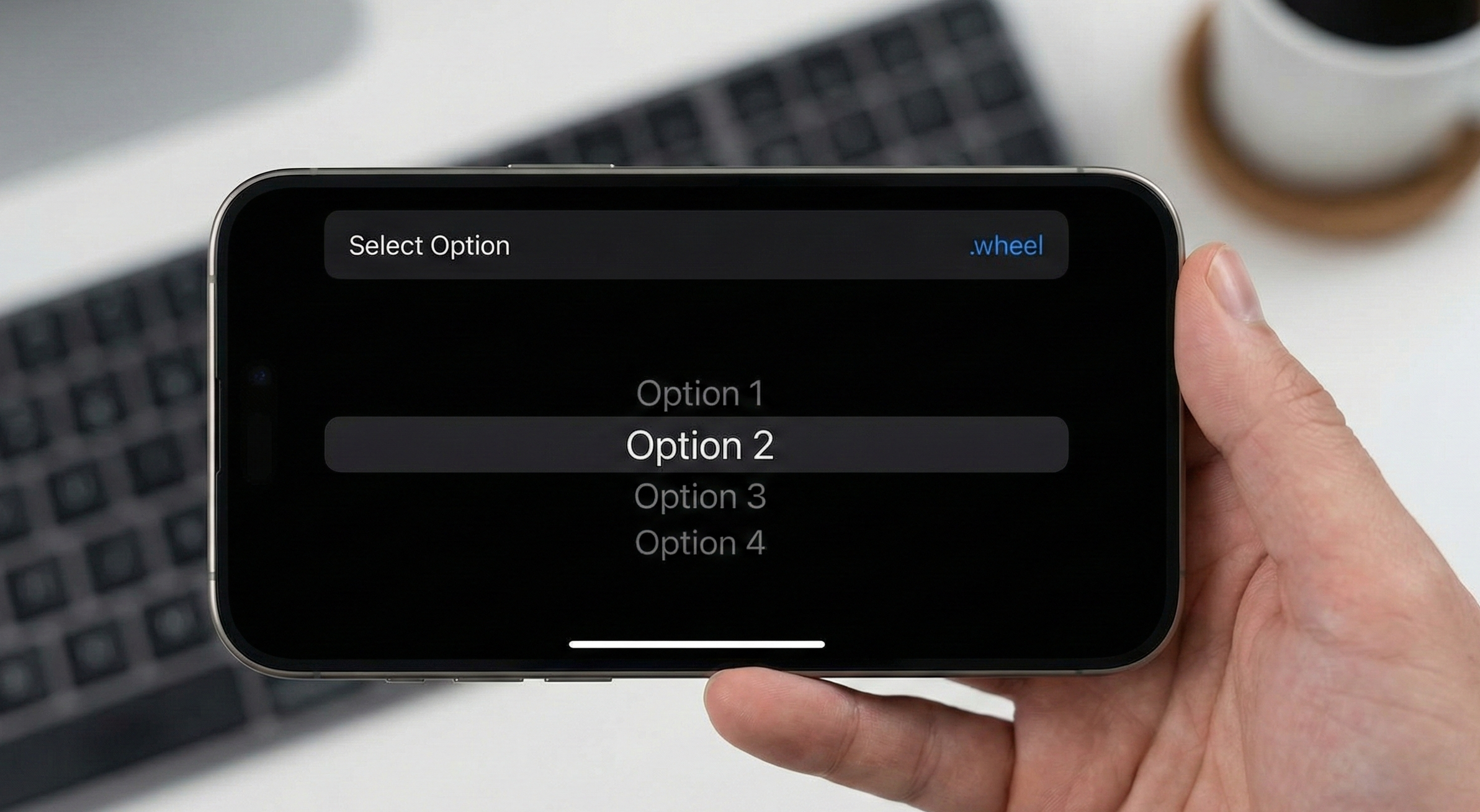
Our goal is to replicate the multi-selection experience seen in iOS Settings apps: clean navigation, checkmarks on the right, and a summary of what is selected on the parent view.
Part 1: Fundamentals and Data Structure
To do this correctly, we need to move away from simple data types. We don’t want to select just Strings; we want to select full objects (Users, Products, Tags).
For our component to work, we need our data to conform to two key protocols:
Identifiable: So SwiftUI can distinguish each row.Hashable: So we can store the selection in aSetefficiently.
The Data Model
Let’s imagine we are building an app to manage project teams. We need to select several members for a task.
struct TeamMember: Identifiable, Hashable {
    let id = UUID()
    let name: String
    let role: String
    let avatar: String // SF Symbol name
}

// Mock Data
let allMembers = [
    TeamMember(name: "Ana Garcia", role: "iOS Dev", avatar: "iphone"),
    TeamMember(name: "Carlos Ruiz", role: "Backend", avatar: "server.rack"),
    TeamMember(name: "Elena Torres", role: "Designer", avatar: "paintpalette"),
    TeamMember(name: "David Kim", role: "PM", avatar: "briefcase"),
    TeamMember(name: "Sofia L.", role: "QA", avatar: "ant")
]
Part 2: Selection Logic (Sets vs. Arrays)
This is where many tutorials fail. They often use an Array to save the selected items.
Common Mistake: Using [TeamMember]. Pro Solution: Using Set<TeamMember>.
Why?
- Performance: Checking if an item is selected in an Array is an O(n) operation (it has to scan the list). In a Set, it is O(1) (constant time thanks to hashing). If you have a list of 500 items, the difference is noticeable in scroll smoothness.
- Uniqueness: A Set mathematically guarantees that you won’t have the same user selected twice by mistake.
Part 3: Building the Selection View (The “Detail View”)
First, we will create the screen the user navigates to in order to mark the options. We’ll call it MultiSelectionView.
We want this view to be Generic. It shouldn’t know anything about TeamMember. It must work with any type T.
import SwiftUI

struct MultiSelectionView<T: Identifiable & Hashable>: View {
    // Navigation Title
    let title: String

    // All possible options
    let options: [T]

    // Binding to external selection. Using Set for O(1) lookup.
    @Binding var selection: Set<T>

    // A closure to know how to display the text for each cell
    let textRepresentation: (T) -> String

    var body: some View {
        List {
            ForEach(options) { item in
                Button(action: {
                    toggleSelection(item)
                }) {
                    HStack {
                        Text(textRepresentation(item))
                            .foregroundColor(.primary)

                        Spacer()

                        // Visual Checkmark Logic
                        if selection.contains(item) {
                            Image(systemName: "checkmark")
                                .foregroundColor(.blue)
                                .fontWeight(.bold)
                        }
                    }
                }
                .tag(item.id) // Good practice for testing
            }
        }
        .navigationTitle(title)
        .listStyle(.insetGrouped) // Modern iOS style
    }

    // Private logic to handle selection
    private func toggleSelection(_ item: T) {
        if selection.contains(item) {
            selection.remove(item)
        } else {
            selection.insert(item)
        }
    }
}
Code Analysis
- Generics
<T: ...>: By definingT, we make this view agnostic to the data type. @Binding: We do not own the state here. We modify the state that lives in the parent view (the form).Buttoninstead ofNavigationLink: Inside the list, we use buttons. When tapping the row, we don’t navigate elsewhere; we simply executetoggleSelection.- Visual Feedback: The
Spacer()pushes the checkmark to the right, mimicking Apple’s native style.
Part 4: The Picker Component (The Form Row)
Now we need the row that lives in the main form. This row must display what has been selected (or a summary) and act as the navigation link.
We’ll call this MultiSelector.
struct MultiSelector<T: Identifiable & Hashable>: View {
    let title: String
    let options: [T]
    @Binding var selection: Set<T>
    let textRepresentation: (T) -> String

    var body: some View {
        NavigationLink(destination: MultiSelectionView(
            title: title,
            options: options,
            selection: $selection,
            textRepresentation: textRepresentation
        )) {
            HStack {
                Text(title)
                Spacer()
                // Show selection summary
                Text(summary)
                    .foregroundColor(.gray)
                    .lineLimit(1)
            }
        }
    }

    // Computed property for summary text
    private var summary: String {
        if selection.isEmpty {
            return "None"
        } else {
            // Convert Set to Array, map to String, and join
            let names = selection.map(textRepresentation)
            return names.joined(separator: ", ")
        }
    }
}
This component encapsulates the complexity. The developer using MultiSelector doesn’t need to worry about configuring the detail view, they just pass the data.
Part 5: Final Implementation (Putting It All Together)
Now, let’s see how we would use this in a real scenario inside our ContentView.
struct ContentView: View {
    // Local state to store selection
    @State private var selectedMembers: Set<TeamMember> = []

    var body: some View {
        NavigationStack {
            Form {
                Section(header: Text("Project Configuration")) {
                    TextField("Project Name", text: .constant(""))

                    // Here we use our custom component
                    MultiSelector(
                        title: "Assign Members",
                        options: allMembers,
                        selection: $selectedMembers,
                        textRepresentation: { member in
                            return "\(member.name) (\(member.role))"
                        }
                    )
                }

                Section(header: Text("Summary")) {
                    if selectedMembers.isEmpty {
                        Text("No members assigned.")
                            .italic()
                            .foregroundColor(.secondary)
                    } else {
                        ForEach(Array(selectedMembers), id: \.self) { member in
                            Label(member.name, systemImage: member.avatar)
                        }
                    }
                }
            }
            .navigationTitle("New Project")
        }
    }
}
Part 6: Leveling Up (Search & Accessibility)
A tutorial wouldn’t be complete without polishing the details that separate a junior from a senior developer. Let’s improve our MultiSelectionView.
Adding a Search Bar (.searchable)
If the list of options is long (e.g., countries), the user needs to search. Thanks to SwiftUI, this is trivial, but we must filter the data correctly.
Let’s modify MultiSelectionView:
struct MultiSelectionView<T: Identifiable & Hashable>: View {
    // ... previous properties ...
    @State private var searchText = "" // New local state

    // Filter options dynamically
    var filteredOptions: [T] {
        if searchText.isEmpty {
            return options
        } else {
            return options.filter { item in
                textRepresentation(item).localizedCaseInsensitiveContains(searchText)
            }
        }
    }

    var body: some View {
        List {
            ForEach(filteredOptions) { item in
                Button(action: { toggleSelection(item) }) {
                    HStack {
                        Text(textRepresentation(item))
                        Spacer()
                        if selection.contains(item) {
                            Image(systemName: "checkmark")
                                .foregroundColor(.blue)
                        }
                    }
                }
                // Accessibility is key
                .accessibilityElement(children: .combine)
                .accessibilityAddTraits(selection.contains(item) ? [.isSelected] : [])
            }
        }
        .searchable(text: $searchText, placement: .navigationBarDrawer(displayMode: .always))
        .navigationTitle(title)
    }
    // ... toggleSelection ...
}
Accessibility: A Moral and Technical Duty
Notice the accessibility lines added above. By default, VoiceOver will read “Button, Carlos Ruiz”. A blind user won’t know if it is selected or not just by the checkmark image (images are decorative unless stated otherwise).
By using .accessibilityAddTraits(selection.contains(item) ? [.isSelected] : []), VoiceOver will announce: “Carlos Ruiz, selected, Button”. This small detail drastically improves the usability of your app.
Part 7: Advanced Cell Customization
Our current MultiSelector takes a simple (T) -> String closure to display text. But what if we want to show avatars, icons, or complex subtitles in the selection list?
To do this, we need to evolve our Generics to accept a ViewBuilder.
This is an advanced technique. We will transform MultiSelectionView to accept custom cell content.
struct CustomMultiSelectionView<T: Identifiable & Hashable, Cell: View>: View {
    let title: String
    let options: [T]
    @Binding var selection: Set<T>
    // Closure that returns a View instead of a String
    let cellContent: (T) -> Cell

    var body: some View {
        List(options) { item in
            Button(action: { toggleSelection(item) }) {
                HStack {
                    // Render custom view here
                    cellContent(item)

                    Spacer()
                    if selection.contains(item) {
                        Image(systemName: "checkmark")
                            .foregroundColor(.accentColor)
                    }
                }
            }
            .buttonStyle(.plain) // Important for complex lists
        }
        .navigationTitle(title)
    }

    // ... toggleSelection and other logic ...
}
Now, when calling this selector, we can inject complex layouts:
// Usage in parent
CustomMultiSelectionView(
    title: "Team",
    options: allMembers,
    selection: $selectedMembers
) { member in
    // Here we define the layout for each row
    HStack {
        Image(systemName: member.avatar)
            .padding(8)
            .background(Color.blue.opacity(0.1))
            .clipShape(Circle())

        VStack(alignment: .leading) {
            Text(member.name).font(.headline)
            Text(member.role).font(.caption).foregroundColor(.secondary)
        }
    }
}
This transforms our simple selector into a world-class UI component capable of handling media-rich lists.
Performance Considerations and Common Pitfalls
To wrap up this tutorial, let’s review some critical points that can cause your implementation to fail in production.
1. Stable Identifiers
Ensure your object’s id property is stable. If you use UUID() generated inside a computed property or in a view’s init, SwiftUI will lose track of selection upon refreshing the view. Your data models should be immutable structs or classes with persistent identifiers.
2. Large Datasets
If you are filtering a list of 10,000 items, real-time filtering inside the view body (var filteredOptions: ...) can cause typing lag.
- Solution: Move the filtering logic to a
ViewModel(ObservableObject) and use Combine’s.debounceoperator or the new@Observablemacro to delay the list update until the user stops typing for a few milliseconds.
3. Navigation in SwiftUI 4+
In the code, we use NavigationStack (available since iOS 16). If you support older versions (iOS 14/15), you will need to use NavigationView. However, NavigationStack handles memory state much better in deep lists and is the current standard.
Conclusion
Creating custom components in SwiftUI might seem intimidating at first, especially when coming from systems where everything is given to us. However, the flexibility of creating your own Multi-Selector gives you total control over the user experience.
We have gone from:
- Understanding the native
Pickerlimitation. - Implementing a
Setbased solution for mathematical efficiency. - Creating a reusable Generic architecture.
- Adding accessibility and search.
- Allowing custom cells with
ViewBuilder.
This component is not just a patch; it is a robust tool you can add to your internal UI library (Design System) and use across dozens of different screens.
SwiftUI continues to evolve, and perhaps at next year’s WWDC, Apple will gift us a Picker(selection: Set<T>). Until then, you now have the power and knowledge to build it yourself, and better.
If you have any questions about this article, please contact me and I will be happy to help you 🙂. You can contact me on my X profile or on my Instagram profile.


