


In the vast universe of Swift programming, navigation and accessibility to core actions are the backbone of a good user experience. If you come from the UIKit world, you will remember the complexities of managing UINavigationBar and UIToolbar separately. However, for a modern iOS developer using Xcode and SwiftUI, Apple has unified these concepts into a powerful and polymorphic tool: the Toolbar.
In this comprehensive tutorial, we will break down exactly what a toolbar is in the declarative paradigm, how to efficiently add a toolbar in SwiftUI, and how to adapt your code so it works magically on iOS, macOS, and watchOS. Get ready to level up your applications.
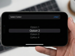
What is really a Toolbar in SwiftUI?
Unlike UIKit, where a toolbar was a specific visual object anchored at the bottom or top, in SwiftUI a Toolbar is a semantic description of actions. You don’t tell the system “draw a button at pixel (x, y)”; you tell it “I need a confirmation action in this view”.
The system, depending on the platform (iOS, iPadOS, macOS, watchOS), decides where to place that button. This is fundamental to the “write once, run anywhere” philosophy of Swift programming.
- On iOS: It can appear in the top navigation bar or a bottom bar.
- On macOS: It integrates into the window title bar or the Touch Bar.
- On watchOS: It adapts to the top corners or contextual menus.
Your First Toolbar: Basic Implementation
To start to add a toolbar in SwiftUI, we need a navigation context. Since iOS 16, the standard is to use NavigationStack. The key modifier is .toolbar().
Let’s look at a simple example where we add a “Save” button to our screen.
import SwiftUI

struct BasicToolbarView: View {
    var body: some View {
        NavigationStack {
            VStack {
                Image(systemName: "globe")
                    .imageScale(.large)
                    .foregroundColor(.accentColor)
                Text("Hello, iOS Developer")
            }
            .navigationTitle("Home")
            .toolbar {
                Button("Save") {
                    print("Document saved")
                }
            }
        }
    }
}
By default, if we don’t specify anything else, SwiftUI will place this button in the “automatic” position, which on an iPhone is usually the top right corner of the navigation bar (the “Trailing” area).
Controlling Position: ToolbarItem and ToolbarItemGroup
A good iOS developer needs precision. To control where items appear, we wrap our buttons inside a ToolbarItem or a ToolbarItemGroup. This allows us to access the placement parameter.
Positioning on iOS (Top Bar vs Bottom Bar)
In mobile interface design, we sometimes need actions on the left (cancel), right (save), or at the bottom (filters, share). Let’s see how to distribute these elements in Xcode.
struct AdvancedToolbarView: View {
    var body: some View {
        NavigationStack {
            Text("Content Editor")
                .navigationTitle("Edit")
                .toolbar {
                    // Button on the left (Leading)
                    ToolbarItem(placement: .topBarLeading) {
                        Button("Cancel") {
                            print("Cancelled")
                        }
                    }

                    // Button on the right (Trailing)
                    ToolbarItem(placement: .topBarTrailing) {
                        Button(action: { print("Saved") }) {
                            Label("Save", systemImage: "square.and.arrow.down")
                        }
                    }

                    // Bottom Bar
                    ToolbarItemGroup(placement: .bottomBar) {
                        Button(action: { print("Filter") }) {
                            Image(systemName: "line.3.horizontal.decrease.circle")
                        }

                        Spacer() // Pushes icons to the edges

                        Button(action: { print("New") }) {
                            Image(systemName: "square.and.pencil")
                        }
                    }
                }
        }
    }
}
Notice how we use .topBarLeading and .topBarTrailing. In earlier versions of SwiftUI, .navigationBarLeading was used, but Apple has updated the naming convention to be more inclusive of other platforms.
Semantic Magic: Principal, Confirmation, and Cancellation
Here is where Swift programming shines. Instead of thinking “left” or “right”, we should think “primary action” or “cancellation”. If you use semantic locations, your app will look native in any language (including right-to-left ones like Arabic) and on any device.
.cancellationAction: The system places it where the user expects to find a “Cancel” button (left on iOS, but can vary)..confirmationAction: For affirmative actions like “Done”, “Save”, or “Send”. Usually placed on the right and bolded..principal: Places content in the center of the navigation bar. Ideal for logos or segment pickers.
struct SemanticToolbarView: View {
    @State private var text = ""

    var body: some View {
        NavigationStack {
            TextField("Type something...", text: $text)
                .padding()
                .navigationTitle("Note")
                .navigationBarTitleDisplayMode(.inline)
                .toolbar {
                    // Semantic placement: Confirmation
                    ToolbarItem(placement: .confirmationAction) {
                        Button("Done") {
                            // Save logic
                        }
                    }

                    // Semantic placement: Cancellation
                    ToolbarItem(placement: .cancellationAction) {
                        Button("Close") {
                            // Close logic
                        }
                    }

                    // Principal Placement (Center)
                    ToolbarItem(placement: .principal) {
                        VStack {
                            Text("Details").font(.headline)
                            Text("Editing now").font(.caption2).foregroundStyle(.secondary)
                        }
                    }
                }
        }
    }
}
By using .principal, you can replace the standard text title with any complex view, such as a brand icon or a dynamic subtitle, something highly requested by any client to an iOS developer.
Toolbar on the Keyboard (Keyboard Toolbar)
One of the most requested features in form development is the ability to add buttons above the keyboard (like “Next” or “Done”). In UIKit, we required an inputAccessoryView. When adding a toolbar in SwiftUI, this is incredibly simple using .keyboard.
struct KeyboardToolbarView: View {
    @State private var name: String = ""
    @FocusState private var isInputActive: Bool

    var body: some View {
        NavigationStack {
            Form {
                TextField("Your name", text: $name)
                    .focused($isInputActive)
            }
            .toolbar {
                ToolbarItemGroup(placement: .keyboard) {
                    Spacer() // Push the button to the right

                    Button("Done") {
                        isInputActive = false // Dismiss the keyboard
                    }
                    .bold()
                }
            }
        }
    }
}
This code automatically creates a bar above the iOS virtual keyboard with a “Done” button aligned to the right. The Spacer() is crucial so the button doesn’t appear on the left.
Multiplatform Adaptation: macOS and watchOS
The power of SwiftUI lies in its adaptability. The same code we just wrote behaves differently (and correctly) on other platforms.
macOS
On macOS, items defined with .primaryAction or .automatic often move out of the content area and are placed at the top of the window, next to the title. Items in .bottomBar do not exist as such in standard Mac windows, so SwiftUI attempts to adapt them, or you may need to use conditional compilation (#if os(macOS)) to change the layout.
watchOS
On Apple Watch, space is premium. The toolbar usually places the primary button (.primaryAction) below the navigation bar or floating in the top left. If you use NavigationStack, the button usually appears in the top corner opposite the clock.
#if os(watchOS)
// Specific code to adjust the toolbar on the watch if necessary
#endif
State and Visibility of the Toolbar
As an iOS developer, you will often need to dynamically hide or show the toolbar. SwiftUI offers modifiers for this.
.toolbarBackground(.visible, for: .navigationBar) // Forces background visibility
.toolbarBackground(Color.blue, for: .navigationBar) // Changes the color
.toolbarColorScheme(.dark, for: .navigationBar) // Forces white text
It is also common to disable toolbar buttons based on form validation. Simply use the standard .disabled() modifier on the button inside the toolbar.
ToolbarItem(placement: .confirmationAction) {
    Button("Submit") {
        submitData()
    }
    .disabled(text.isEmpty) // Disabled if text is empty
}
New in iOS 16: ToolbarTitleMenu
A very modern feature seen in apps like Apple’s “Files” or “Notes” is a dropdown menu when tapping the navigation title. This is achieved with .toolbarTitleMenu.
.navigationTitle("Document")
.toolbarTitleMenu {
    Button("Rename") { ... }
    Button("Export") { ... }
    Button(role: .destructive, action: { ... }) {
        Label("Delete", systemImage: "trash")
    }
}
This automatically adds a small chevron next to the title and reveals a native menu, raising the perceived quality of your application.
Best Practices for Professional Development
To close this tutorial, here is a list of tips to apply in Xcode and improve your Swift programming workflow:
- Use Label instead of Text: Inside a toolbar,
Label("Save", systemImage: "disk")is superior. On iOS it will show the icon, but in accessibility contexts (VoiceOver) it will read the text. On macOS, it can show both depending on user settings. - Don’t abuse the Bottom Bar: On modern iPhones without a home button, the bottom bar competes with the system gesture bar. Use it sparingly.
- Test Rotation: What looks good in portrait might clutter the bar in landscape. SwiftUI usually handles this by collapsing items, but always verify.
- Semantics over Position: Whenever possible, use
.confirmationActioninstead of.topBarTrailing. This guarantees system consistency in future iOS updates.
Conclusion
Learning to add a toolbar in SwiftUI is a fundamental step for any iOS developer. We have moved from manually placing buttons to declaring semantic intentions that the operating system interprets intelligently.
Next time you open Xcode to start a project, remember that the toolbar is not just decoration; it is the control center of your interface. Use ToolbarItem, take advantage of the keyboard with .keyboard, and don’t forget to experiment with new features like toolbarTitleMenu.
If you have any questions about this article, please contact me and I will be happy to help you 🙂. You can contact me on my X profile or on my Instagram profile.