



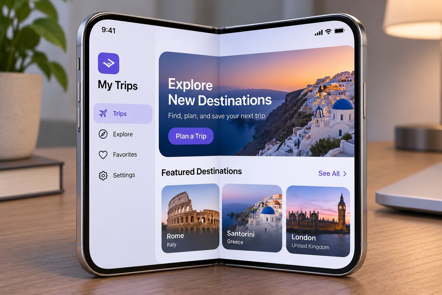

The arrival of the iPhone Duo introduces a new challenge and opportunity for the Apple development ecosystem. Apple’s first foldable iPhone changes how users interact with applications, making adaptive layouts, responsive interfaces, and flexible navigation more important than ever.
For every iOS Developer, understanding how to adapt your app for iPhone Duo is essential to delivering a consistent user experience across different screen sizes and device configurations.
In this tutorial, we’ll explore the most important considerations when adapting an existing iOS application using Swift, Xcode, and SwiftUI.
1. Understand the iPhone Duo Display Architecture
The first thing to understand is that iPhone Duo features two displays:
- An outer display measuring 5.4 inches, designed for one-handed interaction.
- An inner foldable display measuring 7.6 inches, providing more space for content and multitasking.
Your application needs to work naturally on both displays. Users should be able to start a task with the device closed, unfold their iPhone, and continue without losing their current context.
This means you shouldn’t build two completely separate applications. Instead, create one flexible interface that adapts to the available space.
Think about how your navigation, buttons, images, lists, and content should behave when the available width changes.
2. Use Adaptive Layouts with SwiftUI
One of the most important recommendations is to avoid fixed dimensions.
If your application relies on hardcoded widths and heights, some elements might appear stretched, clipped, or incorrectly positioned when the device unfolds.
With SwiftUI, you can build interfaces that automatically respond to the available space.
Use components such as:
VStackfor vertical layouts.HStackfor horizontal arrangements.LazyVGridfor adaptive grid structures.GeometryReaderto understand the available dimensions.ViewThatFitsto select an appropriate layout.
You should also use size classes to distinguish between compact and regular layouts.
For example:
@Environment(\.horizontalSizeClass)
private var horizontalSizeClass

var body: some View {
    Group {
        if horizontalSizeClass == .compact {
            CompactContentView()
        } else {
            ExpandedContentView()
        }
    }
}
This approach allows your interface to adapt without relying on specific device models.
3. Avoid Hardcoded Screen Dimensions
A common mistake in existing iOS applications is relying on UIScreen.main.bounds to calculate interface dimensions.
This approach is no longer reliable when your application can resize dynamically.
Instead, calculate dimensions using the current view or window.
In SwiftUI, GeometryReader and the onGeometryChange modifier can help you respond to changes in available space.
For UIKit applications, use the current view’s bounds and respond to layout changes through the appropriate view lifecycle methods.
Also, avoid assuming that a particular screen width, height, or device orientation identifies a specific device.
Your application should respond to its actual available space, not assumptions about the hardware.
4. Adapt Navigation and Toolbars
Another important consideration is navigation.
iPhone Duo introduces a different interface arrangement, with toolbars and tab bars positioned vertically along the side to maximize the available vertical content area.
Review your existing navigation architecture and make sure your controls work naturally in both configurations.
Pay particular attention to:
- Tab bars and navigation bars.
- Toolbar buttons and contextual actions.
- Search interfaces.
- Menus and popovers.
- Sheets and modal presentations.
Avoid placing essential controls in positions that become uncomfortable or inaccessible when the device changes configuration.
Whenever possible, use native SwiftUI navigation components so the operating system can handle much of the adaptation automatically.
5. Consider the Fold and Content Continuity
The central hinge introduces another important design consideration.
When the device is partially folded, the available content area changes. You need to make sure that important information, buttons, and interactive elements remain easy to see and use.
Avoid positioning critical content directly across the central fold.
For applications with large images, videos, maps, or documents, review how content is displayed when the device changes between folded and unfolded configurations.
You should also preserve the user’s current state. For example, if someone is reading an article on the outer display and unfolds the device, they should continue from the same position.
6. Take Advantage of the Larger Display
The inner display offers opportunities to improve your application’s functionality rather than simply making everything bigger.
Consider introducing richer layouts when additional space becomes available.
For example:
- Display a list and its detail view simultaneously.
- Show additional information alongside charts.
- Provide more advanced editing interfaces.
- Display larger collections of images.
- Improve productivity with contextual panels.
The goal is to use the additional space meaningfully while keeping the interface familiar.
7. Test Your Application Using Xcode
Testing is essential before releasing an iPhone Duo-compatible application.
Use the latest Xcode version and the iPhone Duo simulator to inspect your application across different device poses and configurations.
Pay special attention to:
- Opening and closing the device.
- Switching between displays.
- Changing orientation.
- Resizing the available content area.
- Navigation and modal presentations.
- Scrolling and keyboard interactions.
Also, test your application on physical hardware whenever possible.
Apple recommends using the iOS 27.1 SDK or later to provide the optimized iPhone Duo experience, including support for the updated vertical toolbar and tab bar arrangements.
Conclusion
Adapting an existing application for iPhone Duo is not simply about supporting a larger screen. It requires rethinking how your interface responds to changing dimensions, device poses, navigation arrangements, and user interactions.
As an iOS Developer, prioritizing adaptive layouts, native SwiftUI components, clean Swift code, and comprehensive testing in Xcode will make the transition much easier.
The most important principle is simple: build flexible interfaces that adapt to the available space instead of designing around a single device configuration.
By following these recommendations, you can create an application that feels natural, consistent, and ready for the next generation of iPhone experiences.